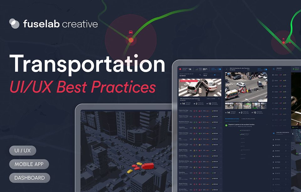
How to Design a Travel App UI/UX (& Case Study)
Travel App UI/UX
Sometimes we search travel apps just to dream about a vacation. We look at travel pictures shared by friends, family, and total strangers and immediately ask ourselves if we’d like to travel there as well. The desire to explore new places and have novel experiences is part of being human. The travel app UI/UX design needs to do one thing, above all else, it needs to somehow make the travel experience better through a digital user experience. Lastly, creating a travel app UI design is always going to be a challenging task because you need to enhance the experience of your users while at the same time, meeting the business goals of your company.
The first rule of designing a travel app is to map out a plan. You can do this by:
- Thinking about the types of users you want to attract.
- Defining what makes your app unique, and then using those features in all aspects of the design process.
- Analyzing your competitors’ apps for inspiration and learning from them as well as their mistakes – no one wants to see you copy their designs!
Having said that, bear in mind that these are only the basics because designing a travel app is much more complex than this. A large part of our travel app design services is brainstorming ideas and mapping out strategies that would ultimately bring the entire user experience together.
As a travel app designer, you have to think about the user experience from their point of view. Therefore, the most important thing is to understand what users need and what they want. Since it can be a daunting process, our design experts have created an in-depth guide on how to design a travel app along with a travel app UI/UX design case study that will help you visualize the design process.
The primary goal of any travel app design
Ideally, the main objective of any travel app design is to add value to the user’s life. As a UI/UX design agency, when developing a travel mobile app’s design, we ensure that we create a travel app that is meant to be used repeatedly because it assists travelers with their trips by providing information, tips, and advice.
For instance, if the purpose of your travel app help users plan their trips from start to finish, the user should have an overall experience that is better than just having a simple itinerary when using your app. This could mean they can check out maps and directions, read reviews and comments, share their experiences on social media, keep track of their expenses (if they use them), find local attractions, or more!
Besides, there should also be a clear incentive for the user to use your app. Whether the user will save money at the end by using the app or have a seamless travel experience, your app’s use case should make its final reward evident right from the get-go.
For this to happen, there should be a clear connection between your app and its user base. A good example of this would be Uber, which has been able to gain popularity because of its ability to solve problems that many people have had with transportation; in particular, the lack of dependability in the public Taxi market. The app allows users to easily procure a car from anywhere in their town or city, providing them with more options when it comes to transportation. Here, Uber’s end reward for the user is convenience and regional coverage.
On the other hand, consider companies like Airbnb and TripAdvisor; their apps give users more options when looking for accommodations or places to eat around town. In this case, the end reward is an overall better travel experience.
Simply put, if you are going to make people look into their phones while they are traveling, your overall travel app design should be able to give them a solid return on their investment in your app.
In our experience the basic principles of a travel app UI design are as follows:
Simplicity
Simplicity is the key to great user experience.
You don’t have to stuff all the latest UI/UX design trends in your travel app’s interface to improve its usability. The best travel app designs are simple so that users can understand it well and use it easily when they are traveling to an unfamiliar place. This concept is evident in every aspect of the design process, from brainstorming ideas from scratch to implementing them on a wireframe. As a rule of thumb, the fewer elements you use, the easier it is for your users to understand the usefulness of the app.
A good example of this is the iPhone’s user interface, which has been praised for its functional minimalism throughout its entire history. Everything is designed within a thumb’s reach, allowing even a novice to use the device effortlessly.
Structure
Structure makes sense of complexity.
The travel app UI/UX needs to have a structure with a clear hierarchy and elements. So, the organization of your content needs to be obvious for users to immediately be able to navigate around, which helps them feel less overwhelmed and more at ease with your app. A good structure will also help them find their way around quickly and efficiently as well as prevent them from getting lost in the app.
Visual appeal
Visual appeal is essential for any design project!
Your design should be easy on the eyes because it is part of developing trust and respect from the user. We’ve all heard a friend say that a certain app “sucks!” Whereas the truth is that the developers probably spent endless hours on it and spent hundreds of thousands of dollars, but one bad user experience and it deleted from a user’s phone and filed away in his or her mental file under “sucks!” So, travel UX design is not just about making things clear and comprehensible but also about making things visually engaging and immediately usable.
Functionality
Functionality could be present in every aspect of a mobile travel app UI design through its navigation or its features.
This principle helps users make sense of the information presented in the interface and do what they need to do with it.
Consider this to be the UI/UX design version of Chekov’s Gun principle, which applies to movies. According to the principle, each element in the narrative needs to have a meaningful contribution to the story. If something doesn’t add value to the story, it should be eliminated.
Quite literally, Chekov’s Gun principle states that if a gun is introduced in a story, it has to be used as an active part of the narrative. Similarly, each element used in your travel mobile app design must have a purpose for its existence. If it doesn’t improve your app’s functionality, it needs to be eliminated.
Reusability
What makes an app successful?
If it brings users back to it as intended, it is a good app. It is that simple. Your travel app design template must be developed with only one key goal in mind: make it reusable.
If your travel app dashboard isn’t experiencing consistency in user behavior, you need to rethink your template and possibly recreate one from scratch. Since app redesign is almost always more challenging than creating a new one, it is wiser to get everything right on the first attempt.
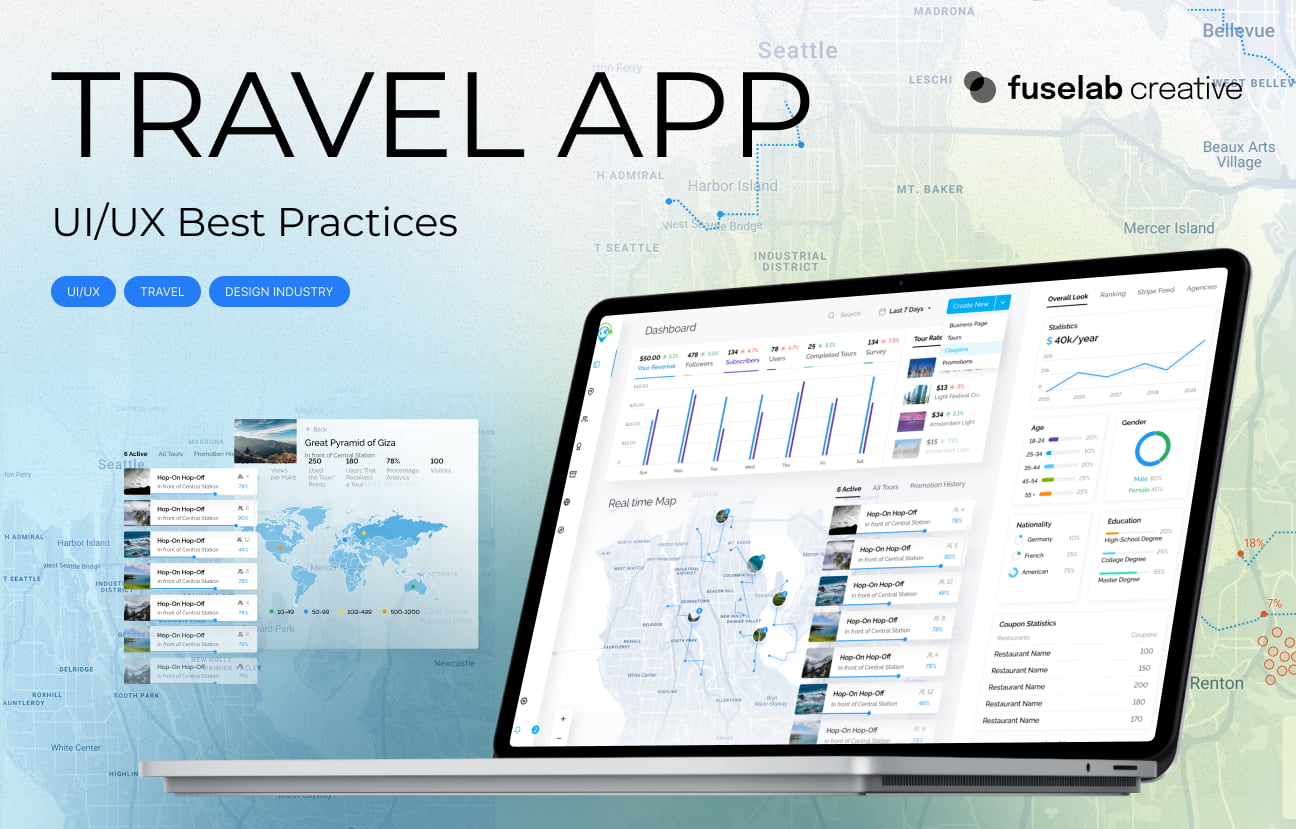
Developing your travel app dashboard
Travel app requirements that designers shouldn’t ignore
The best travel apps help users get more out of their trips by providing them with everything they need to make it a great experience. Let’s take one of our travel apps as an example and dive deeper.
Fuselab helped build Geotourist, an app that allows tourists to find routes and first-hand accounts of travelers on their destinations ahead of their trips. You can read more about it in our travel app case study. But for now, let’s take a look at the specific issues and goals that were addressed by our team during the design process.
Performing travel app UX research to meet the key goals first
When you design travel apps, you need to ensure that they help users complete their goals, whether it be booking travel or finding the right hotel, restaurant, or attractions.
For Geoturist app UI/UX design, our research concluded three important goals: publish user-generated content in as many major cities as possible, attract users who are willing to add in-depth reviews and make the app media-rich with videos and audio for each destination.
So, our team focused on these three things when planning the UI/UX design. We also studied all the travel app design inspirations that we could shortlist to understand if they were meeting the same goals and what gaps we could fill when designing our app.
The result? After our re-design, the app had a 30% increase in its monthly customers – all because it offered the value that its users were looking for.

Organizing content and elements sensibly
A creative travel app design doesn’t necessarily have to value aesthetics over the basics. Every travel app UX design should accommodate its user’s sensibility. This means organizing the content within the app into logical groups of information or functionality that can be accessed more quickly and easily than, say by browsing through all available options individually.
To reiterate, ask yourself the most ridiculously obvious question on earth: “why should users download this app when they can simply Google everything?” before determining your app’s value.
Let’s take social media apps for instance. An app like Instagram is now designed to let users find and access eateries in a specific location – some of which are not even listed on Google, perhaps because the people running the place don’t know about Google listings but know about Instagram.
All you must do is type in a keyword or tag and locate the places targeting those tags on the map. This is much faster than scrolling down endlessly through posts or profiles to discover new places. This type of organization also gives people more time to spend on their favorite social network.
In the case of Geotourist, our team utilized familiar icons and intuitive navigation for the app’s users. This eliminated the need for demos or tutorials for using the app because everything was self-explanatory. As a result, tourists were able to download the app and derive immediate value from it.
Balancing the words with numbers in your travel mobile app design
Some of the biggest travel app design problems can be easily resolved. For instance, too many words are bound to confuse you, so we need to balance them using numbers that appeal to your rationale. Moreover, the value perceived in digits is always given more importance than if it is perceived in terms because the former allows you to quantify your returns.
For the Geotourist app, we used the dashboard to show our clients how much value their users were gaining from the app. A dashboard has a collection of information (mainly related to the multiple aspects of the app’s data) that allows users to view and interact with it.
The best way to do this is by using data and analytics. Analytics is used to measure and analyze data from several different sources, such as website traffic, app usage, and customer feedback. We organized the data regarding user behavior and engagement on Geotourist into meaningful datasets, allowing our client to see the real-time interaction on the app – from social media interactions to tourist reviews.
The purpose of this was to give the creators of Geotourist detailed insights into their users without making them create charts or reports to make sense of all the data generated by the app. The app automated the analytics for them.
Using the analytics from Geotourist, they can now see what’s working and what isn’t, so they can quickly adjust to keep their customers happy and coming back for more.
Keeping all elements interactive
When designing a travel app dashboard, you are not only responsible for the layout of the pages but you also have to consider how it all works together.
According to the latest transportation app UI/UX design best practices, an effective design can help increase engagement, retention, and conversion rates by increasing perceived value and brand awareness among users. This was evident in the Geotourist app because we religiously stuck to the design fundamentals – one of which was improving the responsiveness of the app.
Everything clicks! Our team designed the user interface of the Geotourist app in such a way that it gave users a lot of room and opportunities to engage with the app. All of this happened because the high “clickability” encouraged users to explore the app and dig deeper to find out what else they could do with it.
User experience is an unavoidable part of any app. Since user experience heavily relies on the user interface, even a single element can affect your engagement rate. So, it is always wiser to work with a professional travel app design agency to build one for you. Get in touch with our team to discuss your needs.