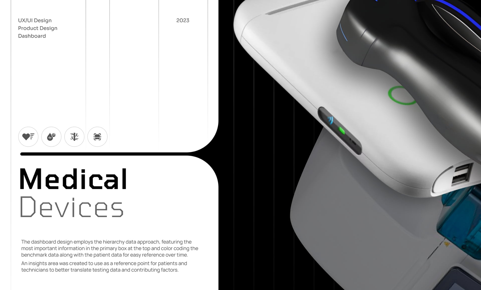
Medical Devices
Many medical device design companies get stuck in a rut in terms of their approach to design and ignore the fact that medical device users now expect these devices to evolve just like other industries.
We meet with medical device manufacturers and software developers all the time and hear the same thing over and over, “our user experience is outdated.” In some cases, it’s like looking back in time to when all digital screens glowed with green text and you had to memorize specific prompts to accomplish tasks.

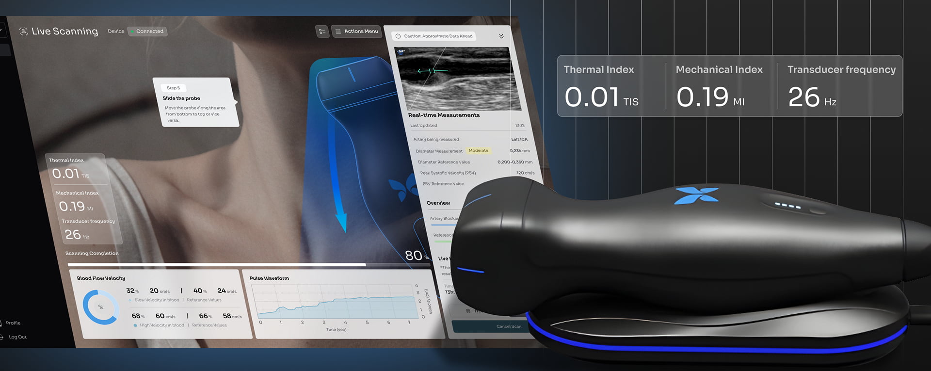
Carotid Artery Scanning
Interface
Obviously not all medical devices have the same size screens or contain the same level of visual resolution. However, all medical device UI design, should, whenever possible, create a visually engaging interface that users will enjoy using. For some lab techs, the screen we design will be utilized hundreds of times per day – we owe them something worthy for their hard work, right?

Device
The most important phase of our work takes place during our usability testing. Usability testing for medical devices hinges on the unique need of delivering something exceptionally data-rich, while at the same time, designing an experience that is intuitive and a pleasure to use.

Project
Overview
Vasolabs artery scanning tool was created to become a vital asset for the medical community. The design team at Fuselab Creative wanted to simplify the details of cardiovascular health data, making it clear for both individuals and healthcare experts. Interactive graphs are used throughout the software to specifically flag potential cardio risks, letting you quickly assess alignment between your vascular and chronological age.

Human-Centered
Design Process
The Fuselab Creative design process follows a strict and proven sequence of activities, while at the same time carves out time for ongoing experimentation throughout every phase.

How It Works
A medical device user interface design becomes exponentially more critical to the usability of the device the smaller the screen size gets.


Live Scanning
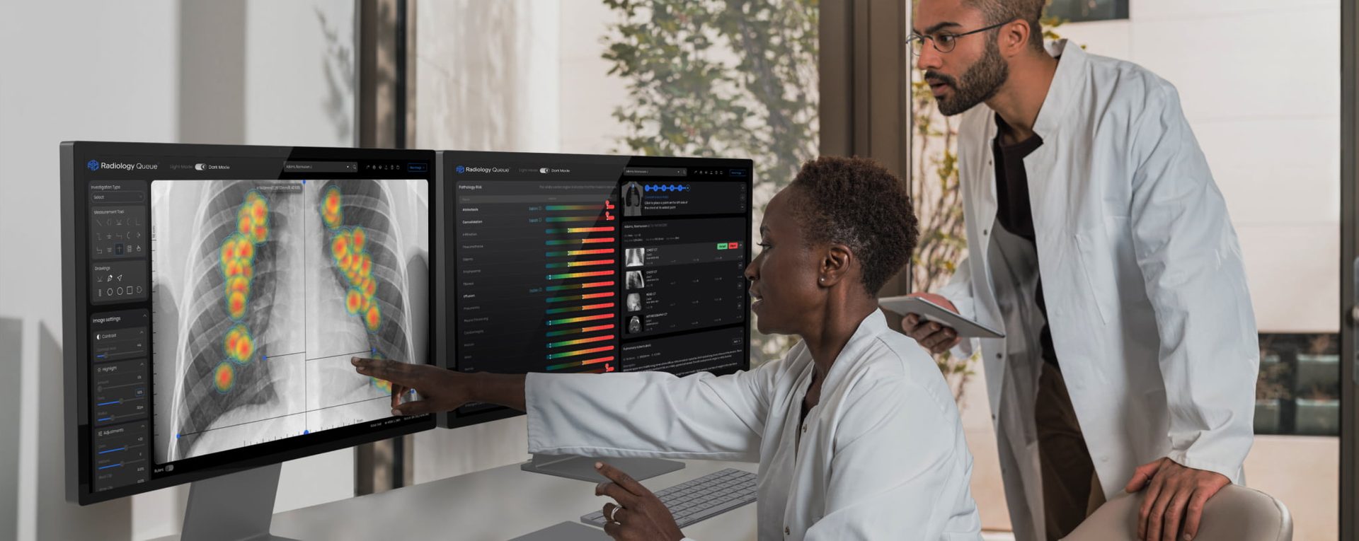
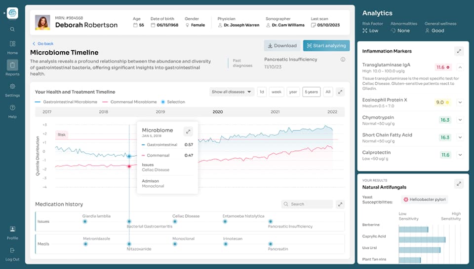
The success of designing a healthcare data dashboard hinges on the its ability to communicate as much critical information as quickly and effortlessly as possible. While at the same time, make this information as simple as possible through the use of strategic iconography and content hierarchy.


User Benefits
A graphical user interface, or GUI design for the healthcare sector, has the potential of playing a small role in saving lives, helping people live healthier and longer lives, and helping those who care for us struggle a little less because we have done our job with them in mind.
Not all dashboard design is the same, however, when taking on a medical dashboard design project, there is an extra layer of importance and meaning that everyone at Fuselab takes very seriously and is inspired to tackle every day.
The human arteries are multi-dimensional vessel with our bodies with layers and texture that make them very unique. Our user interface design visually simplified arteries to make communicating their unique health condition simply effortless.

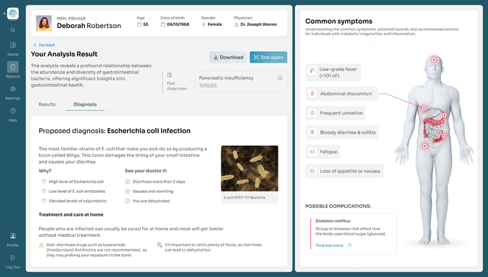
Digest Scanning
Interface
The level of specification of data is at the heart of any interactive screen for lab technician’s tools. The key, or the art of this kind of work is finding the nexus between data, visuals, and very unique types of functionality.

Digest
Scanner
All technology devices used in a lab setting, almost always produce some kind of lab results based on the tests that are run. It’s often our job to take these requirements and insert our humanity back in and decide how humans can make sense of the information they are presented.

Project
Overview
Our project management and deployment process can vary slightly depending on the tasks but there are a few things that never change. We keep two key things in mind as we design and develop: 1. Humans make mistakes, and 2. Nothing we design should need explaining or training to use.
Specimen
Analysis
The system employs immunochemical principles to identify the presence of specific biomarkers associated with colorectal abnormalities. The abstract highlights the automated and high-throughput nature of the analyzer, emphasizing its efficiency in meeting the demands of laboratories and organizations engaged in colorectal cancer screening. The focus is on the molecular analysis of fecal specimens, underscoring the significance of accurate and reliable results in the early detection and diagnosis of colorectal cancer.

User Benefits
With an articulate and strategically devised medical UI, medical providers are able to immediately determine where health abnormalities exist and immediately address associated symptoms.
Dashboard design for medical providers is always a balancing act between content overload, content hierarchy, and usability. For instance, medical providers are much more concerned with negative test results as opposed to normal or expected results, and this fact needs to be taken into account when creating a dashboard taxonomy.
Dashboard analytics rely heavily on data visualization and multi-layered data for additional data where needed, such as hover data at particular points in a graph or chart. This helps create a personalized experience for the users, allowing them to make use of the dashboard according to their requirements for that particular patient and that specific time in their care plan.


BrainMed+
Scanning
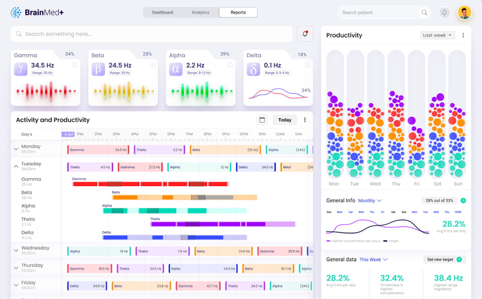
Understanding brain activity can be daunting, and we keep learning more about the brain, which makes this kind of interface design particularly interesting to everyone at Fuselab. It’s a moving target, one that has an enormous capacity to understand the human condition.

Overview
Any medical device that goes through testing by FDA must prove itself to be consistently accurate, a valuable diagnostic tool, and most importantly, be 100% safe to use.

The understanding discussed above would not be possible without the well thought out and thoroughly tested interface/dashboard design. Understanding how to categorize and organize the data in a way that medical providers can easily digest an act upon is not a simple task. This is particularly true for Brain-Computer Interfaces, or BCIs, which enable users to communicate and control devices through brain signals.
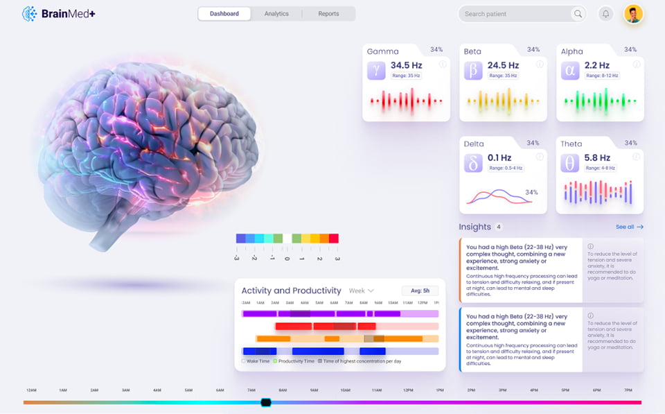
Data reporting isn’t about reporting all the data that is produced, it’s about articulating specific calculations and tracking trends and anomalies over time. Insights are gained when users can clearly see changes that help them understand the patient data in ways that are only possible because of the way in which the UX/UI design has been created to draw the medical providers eye to the most important data first.


Designed by:
Art Direction
George Railean
Project management
Vladimir Bobu
Design
Marcel Sendrea
Do you want to create something similar?
Get a free estimation for your project requirements and start it within 24 hours.