Data becomes useful when it evolves into actionable insights through intuitive design and user-centric interfaces.
Our affinity with dashboard and interface design has powered our most extensive projects at Fuselab Creative. We are committed to collab with organizations helping people live healthier and more successful lives by using various data sources and facilitating their seamless use.

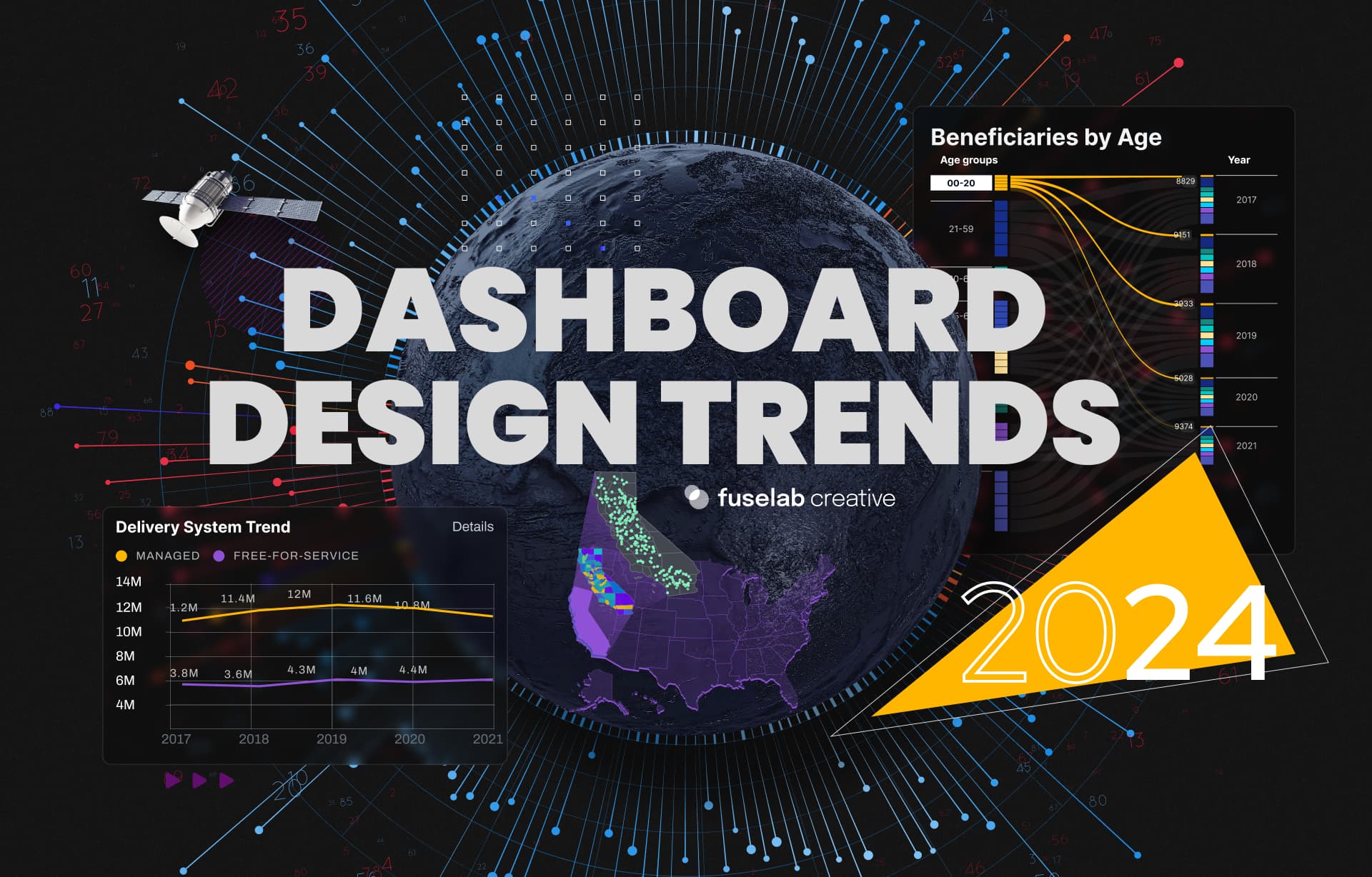
Crafting Actionable
Insights
6 phases to effective Dashboard System Design
When it comes to designing an effective dashboard system - we follow a systematic approach, ensuring that user needs align with data functionality. Here are the main phases defined in crafting a functional and user-centric dashboard.

- Identify the Dashboard’s scope and intended audience.
- Determine the major objectives it should deliver for users.
- Aling user needs with the Dashboard’s functionality.

- Compily a list of main data sources for the Dashboard.
- Identify the most effective methods for data collection and integration strategfies.
- Ensure that collected data is compatible with the Dashboard’s objectives.

- Design wireframes defining the Dashboard’s structural framework.
- Elaborate visual prototypes to explore functionality and interface layout.
- Iterate through designs to enhance UX and functionality.

- Create a solid backend architecture for data processing.
- Integrate the identified data sources into the Dashboard System.
- Ensure that integrated components interact and operate correctly.

- User interface development based on the design prototypes.
- Ensure usability and functionality aligns with user requirements.
- Prioritize UX within the implementation phase.

- Conduct extensice QA testing to assess Dashboard usability and performance.
- Collect user feedback and iterate on design components to refine them.
- Deploy the Dashboard System and provide user support and maintenance.
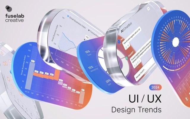
What features should a
data dashboard have?
A data dashboard is a term people understand, however, it includes everything under the sun, including screen design for ATMs, social media platforms, and system designs for mobile phones and tablets, to name just a few.
Visual-Engagement
Engaging interface design is a multi-dimensional term. The primary goal is to consistently design with the goal of creating a completely intuitive user experience, which means that no explanation, training, or even explainer balloons will be necessary to successfully navigate the application.

Customization
Customization is just a way of saying that users can filter or choose the way in which they view information. Personalizing how data is delivered is one of the hottest topics going right now. The more users can actually choose what they want to see the more successful the system we have created is, and the the more useful it will be.

Real-time Analytics
Access to data is always made more useful based on how timely the data, which adds to the ability to make timely decisions as well. However, the last, and most important phase is the UX/UI is where we create the visual interface and paths in which a user will navigate through our interface design.

Keys To UI
Dashboard Design
Data dashboard design keeps evolving over time, and so does our approach to UI/UX design. There was a time when usability was the most important factor when considering the design, but we live in a different time that demands so much more!
Consistent color scheme
Color often indicates a hierarchy of content and functionality, which helps make it easier to interact with any kind of digital product and to move backward and forward through a software system without getting lost, confused, or frustrated.
Consistent formatting
How do the hovers work? How do the menus work? What design elements are clickable and not clickable, and how do we indicate the difference? Everything from the wireframes to the actual UI needs to be designed using same look and feel, and followed throughout every block, page, or menu.
The "menuless" approach
Unique to Fuselab is our “menuless” approach to dashboard design, which means that everything on the screen a user sees should is also part of the navigation experience. To see more information, the user clicks or touches an area to navigate for deeper content areas, taking away the need for elements like drop down menus that force user to guess what a menu item represents.
What data to show and not show
Almost no one wants to do extra reading online to get the information they are looking for. With this in mind, we employ an upside down funnel-like approach to the display of data. We push the most critical and frequently accessed content to the top of the funnel, or first layer of the dashboard and save the more in-depth or expansive content deeper into the experience. This reduces clicks and frustrations at the same time.
Persona-based UX
There has been a lot written about the development of personas in our industry, but what it all comes down to is gaining an in-depth insight into those that will be utilizing the final dashboard, interface, or software. With this knowledge, we can bake-in the kind of functionality and design they find intuitive and attempt to pay more respect to a user’s time and bring them back to the platform.
Device-specific UI
Most people, even those outside the design world have at least heard of responsive design, which is actually a simple process of stacking and elongating content. However, in many cases, this is no longer enough, and adaptive design is needed instead, which involves creating specific designs for specific devices and device sizes. In this way we fix some of the common usability issues with an experience that feels squeezed and stretched instead of designed.
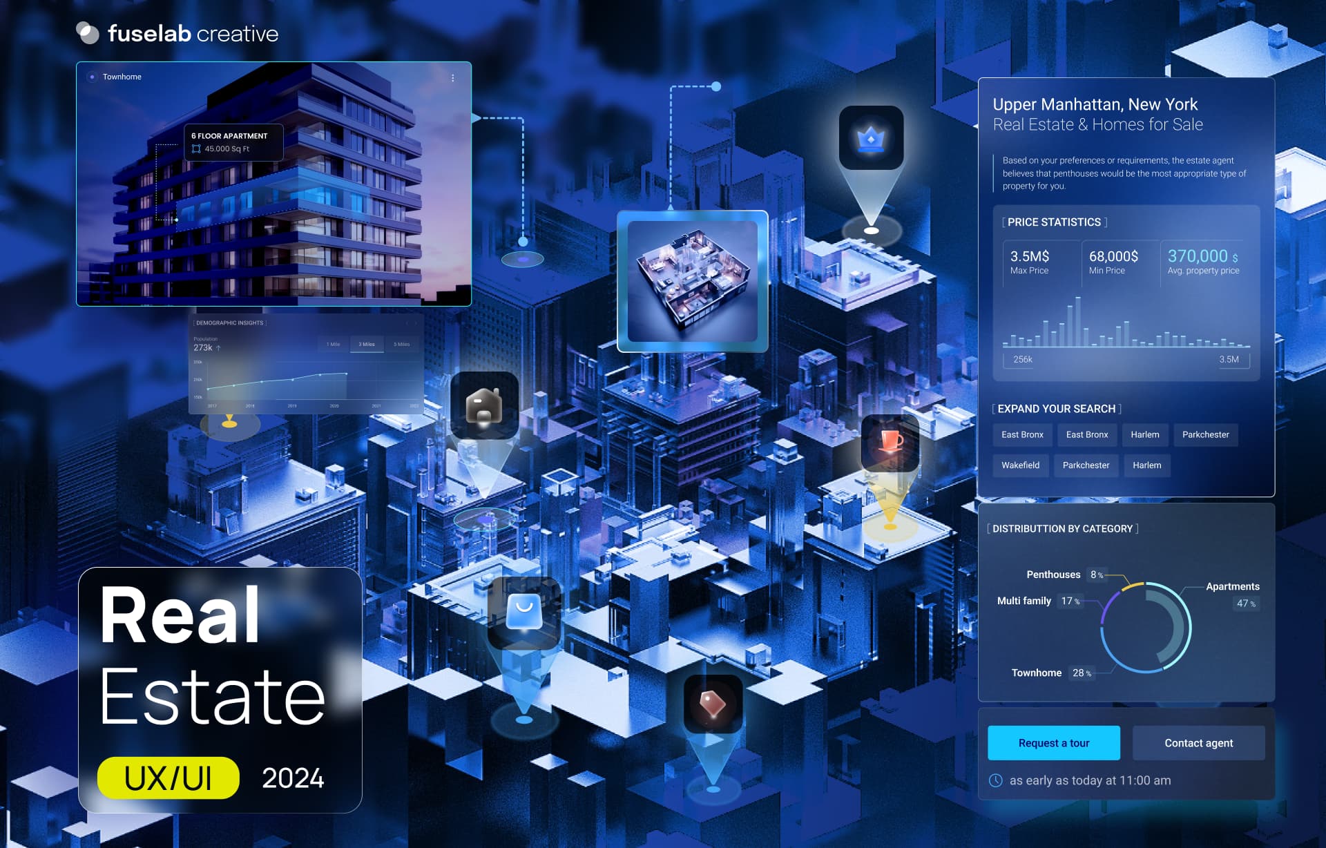
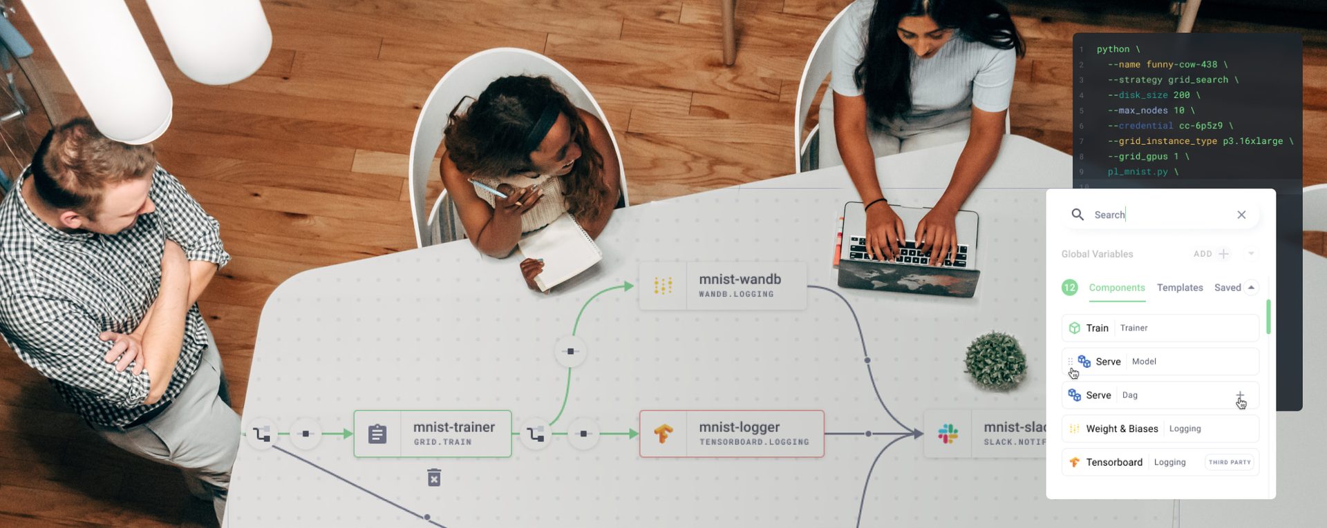
Grid.ai
Design system for Artificial Intelligence agency
Our approach to design system development helps our clients like Grid.ai and others future proof their products and create a maintenance tool that make eventual changes, updates, and content additions a breeze to implement.

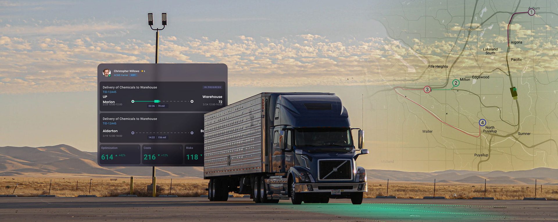
Automatize
Design system for supply chain and telematics company
Our dashboard system design service for Automatize helped them revamp their fleet management tool. With our design system as a service, we delivered real-time vehicle monitoring, which included hundreds of data points for more informed decision-making in real-time. Our solution also provided comprehensive data analysis, highlighting KPIs in a all-in-one dashboard experience.

Dashboard
Interface Portfolio
The future, the present, and the past.
5 Golden Rules For
Building Great Dashboard Design
The strategic use of space on a dashboard is as important as the content itself. Fuselab creates multi-layer dashboards that work to keep everything needed in front of the user with very little need for scrolling. All information fits within the original dashboard parameters and continues allow for deeper dives.
Possibly one of the most important details to consider in the development of a dashboard is how all of the content blocks relate to each other. Additionally, when a user clicks on a tab or “view more” what happens to the rest of the interface, do things rearrange, does the selected content expand and contract? All very important questions.
As certain selections are made on a dashboard, the selection itself is feeding the dashboard information, and given this fact, the UX should support that selection by offering similar content and additional options within that same category, or at least something that is in some way similar in its context or data type.
It’s not what you know about your audience, it’s what you don’t know and how you can design a system to service the tech savvy as well as the first time user. For instance, if your UX does not offer a clear path to desired information for a savvy user, they will immediately look elsewhere for what they need. With most people you have one chance, so make the most of it and study your audience.
Possibly the easiest task in dashboard design is to track your user’s experience. Maybe you use Hotjar, maybe you are just watching simple analytics; whatever the case may be, watching how people interact with your platform, making continuous changes as they are warranted, and having a set of KPI goals will help keep you on track and serve your users better over time.
Related Services and Solutions
Design System
Dashboard Design
UX/UI Design
Data Visualization
Digital Product Design
Design For Enterprise
Industries we love to
work with

Our specialized UI design system for healthcare improves user interfaces to deliver intuitive experiences for both medical professionals and patients alike. Our healthcare design solutions include streamlined workflows, intuitive user experiences and accessibility, and next-level data visualization.

Implementing dashboard design principles in the travel industry promotes improved decision-making processes. Our methodology focuses on clear data representation and user-centric interfaces, making sure that travelers and travel app developers have access to unique insights and timely information.

Managing the complex issues of transportation and logistics requires a strong design framework. Our logistic system design solutions are meant to optimize workflows, increase visibility and boost overall operational efficiency for seamless and effective management.

In the constantly evolving Metaverse, a solid UI/UX design system is crucial. Our approach combines creative innovations and human-centered design in order to create engaging experiences that can easily evolve as this dynamic digital landscape continuously evolves too.

Developing AI systems requires precision and the utmost flexibility. Our AI system design expertise is targeted on scalability, algorithmic interfaces and user-friendly experiences to make sure that machine learning capabilities are used effectively, but also remain simple to use.

Applying dashboard design principles in fintech enhances overall financial data representation. The focus we place on user-friendly interfaces and robust data visualization provides fintech entities with actionable insights to help them make educated decisions in an efficient way.
Contact Us
Fill out the form!
Read Our Blogs
Digital strategy is no longer a term saved for web development teams.