Fuselab Creative is the best Dashboard Systems Design Agency for your next project.
Dashboards in a car give you everything you need to know, at a glance. But they also allow you to control the car — at a turn of a knob and push of a button.In our increasingly digital world, modern professional dashboard design impacts how we interact, understand and process our digital environment — and in most cases, we don’t even think about how much we now rely on them. They are just part of our daily life. Unless they don’t make sense or aren’t working right, then we go nuts!

Our Dashboard UI/UX
Design Company Offers
At Fuselab we follow the most state-of-the-art UX design standards when we create custom dashboards. The dashboard environment demands the functional excellence along with seamless visual clarity, as there is often very little room design extravagance or confusion.
Dashboard Interface Design
We have become quite well-known in the Washington D.C. region for our dashboard design systems. Aesthetically engaging design influences usability by sub-consciously producing a positive emotional response in the user. It’s crazy, but great dashboard UI design can actually convince people that a dashboard actually works better than it does.
Dashboard Data Visualization
Data visualization is often the heart of a data dashboard, as it allows for the maximum amount of data transfer within the smallest amount of dashboard real estate. We produce this work through a combination of expert graphic design and illustration, coupled with strategic UX design to deliver the most informative and easy-to-use dashboards on earth.
Web App Dashboard Design
Almost all Web applications deploy varying dashboard design elements. Whether we are talking about the use of a progress bar within the UI design, or the continuous use of data filtering tools, web application dashboard design is becoming a ubiquitous feature for organizations looking to build the best user experiences possible for their apps.
Mobile Dashboard Design
Mobile dashboard design is really just another way to say mobile interface design. UI design for IOS and Android requires a sophisticated approach to digital design in order to be deemed useful while also being easy to use. Both of these qualifiers are equally important when users test mobile applications.
Software Dashboard Design
Anyone that has used an ERP or a CRM system knows that the dashboard interface design is the pulmonary artery of the entire system. SaaS dashboard design is one of our specialties at Fuselab, as it brings together the best UI and the best UX to produce the most intuitive digital experience possible.
Website Dashboard Design
A big part of creating digitally designed products is an exercise in augmenting human capacities and processes to create greater efficiencies. Creating UI design for web dashboards is an act of constant and evolving invention, ending with a customized tool built just for that client or project.
Effective Dashboards
Key Characteristics
A good dashboard or interface design is non-verbally communicative. It anticipates a user experience, or needs, and gives them the tools to satisfy those needs.
We have a need to be in control of our environment, but we rely on the information available within our environment to cement this control. Design is a way in which we can help people take better control their environments, whether they be work, social or other.
We all experience information overload, but with a good dashboard UX design, we are guided through a hierarchy of the most important information and functions, so that we intuitively understand what is most important and the options for interaction.
In our increasingly digital world, user interface design and user experience flows affect the ways we interact, understand and process our environment — which require our design approach to be completely intuitive in order to be immediately clear and actionable.
The best part of digital dashboards is that they are highly visual, intuitive, and are built for a human’s most common behavioral processes and requirements. They also can be continuously updated to keep up with users as their needs and expectations evolve.
Dashboard
Design Principles
A user interface that can capture all the most important functions, visualizations and information and present them right away creates an environment where information thrives. This information, presented in a logical, design-friendly way, also allows users to perform multiple tasks at once. But there’s one more advantage that effective dashboard design provides: it visually guides the user through a hierarchy of the most important information and functions so that they’re never overwhelmed or confused.

The Need
Elegant and simplified user interaction design also allows users to cut down on the amount of time it takes to both use and become familiarized with the interface capabilities, and ultimately gives them more time to spend with family, friends, and careers.

The Importance
Digital dashboards and interfaces, like a payment terminal in a department store or a public transportation system, work in the same way. Within the span of a few clicks or a few selections, a user is in control of the important information and functions.

The Purpose
Dashboards are really about making the complex simple. It takes several experts trained in the language and mindset of UI/UX and dashboard design to truly create expert functionality and the type of user flows that make something so complex seem completely successful and consequently, effortless.

The Results
Designers are behind the machines we interact with every day, although we rarely think about them until something doesn’t work the way we think it should. Designers are constantly making calculated design decisions that impact our daily lives while we use ATM machines credit card terminals and the list goes on and on.
Dashboard Web
Design Portfolio


Analytics Dashboard
Design
We govern the majority of our actions in modern business by utilizing real-time and collected analytics. However, this is just numbers and to see trends or gain insights we need experts to come up with data analytics dashboard designs to help us better understand what we are looking at without spending endless hours reviewing and exporting tables of data to conduct some kind of side-by-side data comparison.

Business Intelligence
Dashboard Design
We all want to know how we can run our business better and feel more confident when making critical budget and staffing decisions. This is where BI dashboard design comes in. Designing for this area is about finding ways to track and understand KPI data and how to use this data to produce better performance next quarter.

Management Dashboard
Design
Our custom approach to CRM dashboard design is exactly that “custom.” Every project and every client is different, however, they all want to see some kind or regular on real-time report and most want to find a way to directly implement the insights gained into their current project management dashboard or software system. At the end of the day, our work here is about helping companies create reliable growth through data.

Statistics Dashboard
Design
It’s one thing to design an information-based dashboard design, but it’s an entirely different beast to design a dashboard that features full customization based on user needs. We believe a dashboard design should allow users to monitor and customize the metrics that are most relevant to their needs. This flexibility ensures that users can focus on the key statistics and performance indicators that are important for their specific analysis or decision-making processes.

Executive Dashboard
Design
CEOs and executive corporate leadership in general can benefit enormously from a well-designed and strategic data dashboard. Business-related dashboards are designed to present critical information in a visually appealing and easily understandable format, allowing executives to quickly assess the overall health, progress, and trends within their organization. In the future, the use of these dashboards will be as common as using email to communicate.

Enterprise Dashboard
Design
Enterprise dashboard design, or what many people refer to as ERP dashboard design needs to contain one critical feature, which is its ability to scale. Dashboard users at the enterprise level have constantly evolving needs and need to integrate ever-expanding datasets. Designing for this market means we need to accommodate the use of multiple data sources and devise new metrics for new data as it is integrated into the system without major disruption.

Industries We Love
to Create Dashboards For

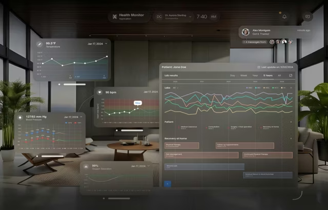
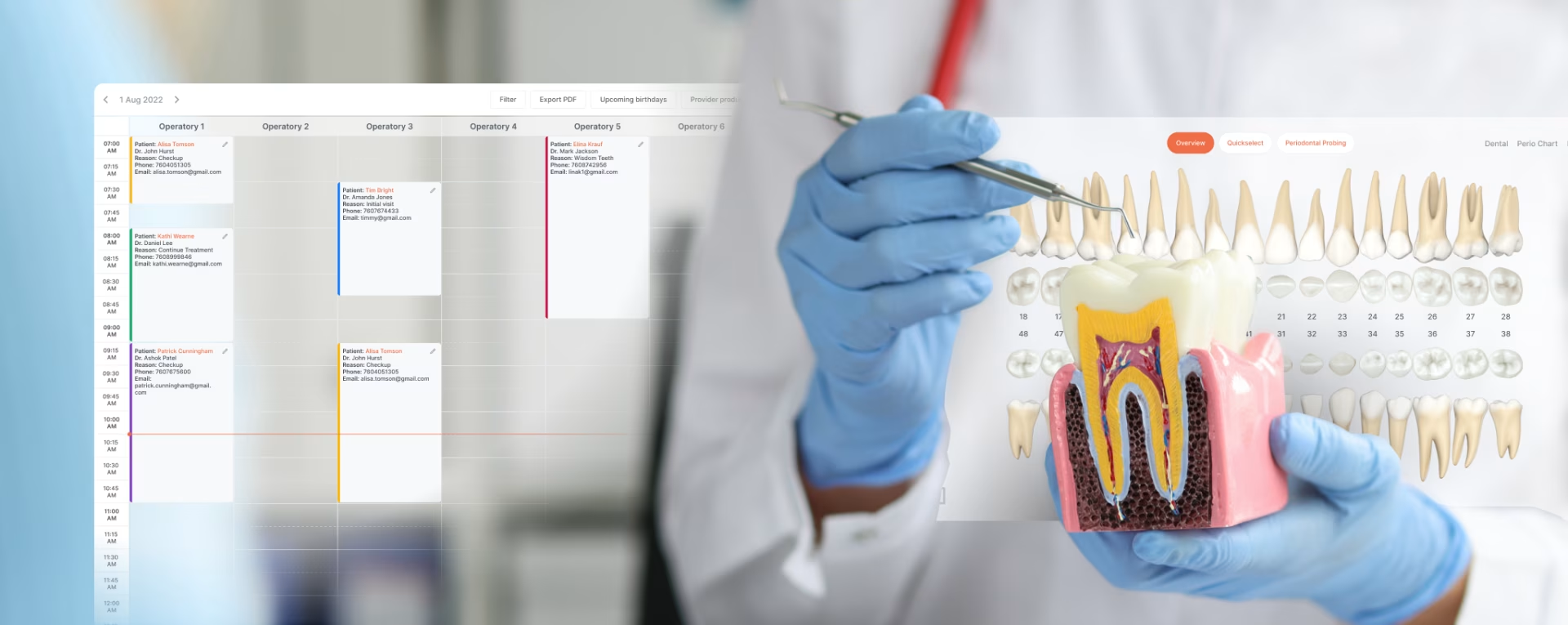
If you are involved in HealthIT, you have heard endless discussions about interoperability. But what you may not have heard is that it is up to those developing sophisticated medical and healthcare dashboard design systems and software that are the lynchpin between success and failure. Doctors know this but more patients need to become aware so that the community better understands where funding is needed most.

Who doesn’t love to explore and travel to new places. Every travel site and app includes some kind of travel or booking dashboard. And each of these services survives for fails based on their user experience. One weak link in the travel booking process and that customer is gone, most likely never to return. Fuselab love a challenge like this and is always seeking out new ways to make the happy tourist even happier by making digital products that enhance their overall travel experience.

All major supply chains rely heavily on logistics dashboard design. Of course the integration possibly thousands of datapoints is critical, but equally important is the design of real-time hover capabilities, as this is how management makes workflow decisions that impact profitability, inventory turnover, on-time rates, and customer satisfaction.

In order for real estate dashboard design to be effective it needs to include effective data visualizations, such as maps, charts, and graphs, and comparisons of property prices, market demand, rental rates, and the list goes on. The UX also needs to accommodate for users from both sides of the real estate sales process, agents as well as buyers.

AI dashboard design is possibly the most exciting, yet uncharted from of design work. The fact that machine learning, by definition, is a process of change, our design approach to these systems focuses on the reproduction of clear and comprehensive metrics and visualizations to consistently and intuitively monitor the performance of AI/ML models.

For an e-commerce dashboard design to be truly effective it needs to include three key functional content areas: 1. Sales and marketing analytics, 2. Inventory and fulfillment management, and 3. Customer engagement and analytics. With these datapoints in-hand, users can calculate important markers like cost per acquisition (CPA) numbers.
Contact Us
Fill out the form!
Dashboard UI/UX Design Blogs
Find out why so many companies consider us dashboard design experts.