Users of an AI dashboard have to read a model's output, judge how reliable it is, see why the system produced it, and act on it.
AI dashboard design covers AI dashboards that aggregate predictions, AI agent dashboards that monitor autonomous workflows, and the design decisions that separate both from a traditional dashboard built to display data. The discipline shapes how the user reads model output, how confidence is communicated, what gets explained, and what happens when the model cannot deliver.
What is an Artificial Intelligence Dashboard?
Built to display machine learning model output rather than raw data, an AI dashboard shows users predictions, anomaly flags, and recommendations alongside the system's confidence in each one.
Three broad categories cover most AI dashboard work: analytics dashboards built on machine learning predictions, monitoring dashboards for deployed models, and control surfaces for AI agents that take action on the user’s behalf. What distinguishes any of these from a regular dashboard is what the user is reading: not the data itself, but the model’s interpretation of that data, including how confident the model is and what reasoning led to each output.

AI dashboard design vs traditional dashboard design
Three interface elements distinguish an AI dashboard from a traditional dashboard: a confidence indicator showing how reliable each output is, an explanation surface showing why the system produced it, and a fallback state for moments the model cannot produce a reliable result. AI dashboard design has to account for all three, while traditional dashboard design does not. The user reading either has to know how much to trust each value before acting on it.
Each element is its own design decision. Confidence indicators get skipped most often, displayed as a flat number the way a KPI is, when the right pattern depends on whether the user reads probabilities or needs a categorical signal pattern instead. Explanation surfaces tend to over-design, exposing every factor the model considered when one or two driving the recommendation is enough; what we see in shipped products is users treat the existence of an explanation as legitimacy and never read the contents.
Fallback states are the element most often missing entirely, with silence as the wrong response when a model cannot deliver. On a regulated-industry dashboard where decisions get audited, that absence is a compliance gap, not a polish gap.

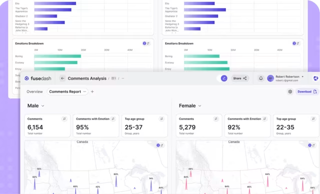
Automatize Project in Telematics & Supply Chain
By incorporating an AI-driven dashboard, we helped Automatize revolutionize their fleet management and supply chain software systems. This dashboard harnesses predictive analytics, anomaly detection, and dynamic routing to empower fleet managers with real-time insights and optimization tools. It plays a pivotal role in enhancing efficiency, reducing costs, and improving overall operational performance.

Project Goals
Hired as a result of our reputation as one of the best AI dashboard design companies, we sought to empower fleet managers with real-time data and predictive insights, enabling them to make better decisions and optimize fleet operations, reduce costs, and enhance overall efficiency. We aimed to transform ridiculously complex data across multiple systems into actionable information brought together in one screen, and providing fleet management a new level of productivity and effectiveness.

Using Live Video in Dashboard Design
By equipping the dashboard with live video, the Automatize platform puts fleet management and monitors in the driver’s seat even when they are thousands of miles away. Live video gives users access to real-time traffic information in a visual, on-the-ground perspective (A huge asset for collision claims). This dynamic feature allows fleet owners and managers to monitor their fleets and make decisions as if they too are stuck in traffic.

All-in-One Dashboard Design View
The Automatize dashboard seamlessly integrates the diverse data sources of 10 different systems and presents them in an all-in-one view, allowing fleet managers to identify comprehensive insights with just a cursory glance.
Real-Time Analytics With Actionable Insights
By harnessing real-time data, this dynamic dashboard facilitates immediate analytics, providing practical insights that empower fleet owners and managers to make informed decisions faster than ever.
Health Monitor
Dashboard
Healthcare records management is reimagined with the help of an AI monitoring dashboard. By leveraging AI algorithms to provide real-time insights and predictive analytics, we equipped healthcare professionals with immediate access to the most critical patient information with only a 30-sec review.
Project Goals
Our AI dashboard design agency strives to provide healthcare professionals with an intuitive and data-rich interface to streamline patient care and give providers a little time back into their day, which is possibly the most important commodity in healthcare today. By harnessing the power of artificial intelligence, we enhanced clinical decision-making, optimized resource allocation, and elevated the quality of patient care across the healthcare ecosystem.
How EHR Design is Different
When it comes to Electronic Health Records, the more information the better. Healthcare providers want to see as much data as possible about their patients so they can feel more confident in their decision making. Dashboards allow for greater information density and AI can help identify patterns and deviations in the data to quickly give providers a heads up, allowing for better and more informed decision making.

Real-Time Trends
Through advanced data processing and visualization, an AI-driven dashboard empowers users to stay ahead of the curve by detecting and highlighting evolving trends. This ensures swift, informed decision-making in dynamic and pressure-packed clinical environments.

A Holistic View
An AI-driven dashboard seamlessly integrates data from multiple sources onto a single dashboard screen, allowing for a more holistic view of each patient. Time-series visualizations generated by AI highlight trends and changes in health indicators are surfaced, while historical data is suppressed for clarity.
Health Radiology Queue
Time is a crucial factor in radiology. An AI dashboard user interface combines the power of AI with intuitive UX/ UI design to help radiologists identify real-time trends in medical imaging and make faster diagnoses.
Project Goals
This dashboard revolutionized the way medical imaging is managed and interpreted, empowering radiology specialists with cutting-edge technology to streamline their workflows and enhance diagnostic precision. By integrating AI capabilities into this platform, we aimed to significantly reduce the time required for image analysis, enabling medical providers to access real-time insights and confirm their own diagnoses swiftly, ultimately raising the quality of care, reducing errors and improving outcomes.
Streamlining Radiology for the Better
The introduction of AI into radiology gives radiologists a head start on their analysis, freeing up more time to spend with patients. Automated measuring replaces what once was a time-consuming, tedious task with a faster and more accurate workflow. Color coding ensures other providers can easily scan the same x-ray to confirm the diagnosis. Sharing, editing, and searching is now easier than ever.

Everything You Need, All at a Glance
Utilizing AI to consolidate large amounts of patient data into a single, accessible dashboard streamlines healthcare workflows, enhances decision-making, and ultimately leads to more efficient and personalized patient care.

Automated Measurement
Much of the work in radiology analysis is manual. Although AI won’t replace radiologists anytime soon, automated measurements and color coding help technicians get started on their analysis, leading to faster diagnoses.
Dental App
Design
When EM Dental needed a way to manage their growing list of patients, they turned to us. This AI dashboard UI example showcases how integrating AI-driven tools and user-centric design optimizes efficiency and elevates patient care.
Project Goals
We wanted a way to empower this dental implant practice with a sophisticated yet user-friendly tool for comprehensive practice management. By seamlessly integrating AI capabilities, this dashboard aimed to streamline tasks, reduce administrative burdens, and enhance decision-making in real-time. By providing dental professionals with a centralized hub, we can improve operational efficiency and allow them to focus on what matters: the patients.
How AI is Changing Dashboard Design
AI is revolutionizing dashboard design by enabling dynamic personalization and real-time insights, paving the way for more user-friendly platforms. Machine learning algorithms analyze user behavior and data patterns to tailor dashboard content, ensuring that relevant information is prominently displayed. Additionally, AI-driven predictive analytics anticipate trends and anomalies, allowing users to proactively address issues and make data-driven decisions faster than ever before.

Improved scheduling
By integrating AI into an easy-to-use dashboard, we were able to address longstanding challenges with patient scheduling. AI algorithms optimize time slots based on historical data and predictive analytics, reducing wait times and increasing patient satisfaction.

A Better Way to Chart
AI-assisted charting provides dental professionals with everything they need to focus on patient care and track each procedure and historical visit details in record time and with a new level of detail and unmatched efficiency.
InMarket Technology Performance Ranking
In terms of AI-based dashboard design and the industries that have jumped in with both feet, the financial sector is simply exploding with innovation. And this is for good reason, as now it is possible to do predictive analytics on a completely different level. What used to take analysts tedious and inefficient days to research is now available to them in seconds, and everyone wants to harness this new found benefit as quickly and effectively as possible before any formal restrictions are put in place.
Project Goals
The primary goal for this project was to create a real-time data environment where financial professionals can see how certain events that have taken place impact the performance of their investments. Other goals included creating a visual hierarchy of information that is easy to manage and is immediately intuitive for less skilled, or first-time users.
Why We Love Financial Dashboard Design
Designing feeds and filters for users to see where their money is, what direction their investments are headed, and what is causing the change is just the kind of multidimensional design challenge we love to tackle. The UX/UI needs to work flawlessly to show critical information quickly, while also allowing for a deeper dive by users when they want to understand the “why’s” associated with their investment outcomes.

Dynamic Performance Insights
Insights in the financial arena is only helpful if the information is timely enough to take action. Our dashboard design uses extreme contrast and alert colors to call users attention to those areas the require immediate decisions to be made, while also providing dark and light mode options to deal with different ambient lighting.

Unleashing the Power of Data
Connecting real-time data with current market information has resulted in a truly unique dashboard experience, as well as the most powerful financial tools available for those that live and die by the fluctuation of temperamental financial markets.
Tectonic Plates Earthquake Prediction
AI dashboard design for areas of the world that experience regular seismic events is one of the few projects where UX/UI designers get to play a role in saving people’s lives. There’s a lot that goes into earthquake predictions and the data associated with this type of scientific predictions is literally changing every second of every day.
Project Goals
AI will no doubt be playing a significant role in seismic activity predictions from now on. Our primary goals focused on creating a dashboard and topographical map interface that would allow scientists to choose any region of the world where significant amounts of data has be collected and be able to not only predict the next event, but also be able to determine the level of possible damage that is possible.
Combining 3D, 2D and Interface Design
Deploying topographic maps with data visualizations and the ability for users to dig into the interface to discover the data associated with their particular region, make this interface unlike anything else. The UX/UI includes both 3D and 2D elements allowing users to see below the surface of the earth and better understand important shifts in plates that cause seismic events and better plan for the future of seismic activity.
Understanding the Numbers
Analysts can search for data suing specific cities or regions, GIS coordinates, or by areas with the most recent or with most activity. Once they have selected the region they then can begin to study activity by specific depths.

3D Model - A Peek Below the Surface
3D data visualization color coded for analysts to see actual shifts below the surface and static areas with little movement have been brought together for the ultimate x-ray view just below our feet.
Smart Streets
Traffic
An AI-driven dashboard can offer real time insights into congestion patterns, enabling drivers to make informed decisions about their route. With Smart Streets, users can see around every corner of their city.
Goal
Smart Streets was designed to provide timely and accurate insights into traffic patterns in your city. It aims to identify bottlenecks, congestion hot spots, and traffic flow patterns so you can plan your best route. This dashboard helps drivers navigate their city, reduce their commute time, and reduce some of life’s most common stressors: being late or stuck in traffic. Oh, and we are also helping cut down on the honking.
Managing City Streets with Data Viz
Managing city streets with data visualization is a game-changer in traffic management, and our AI-powered dashboard exemplifies this innovation. By harnessing the power of artificial intelligence, we’ve created a dynamic platform that offers real-time insights into traffic and congestion, helping city officials optimize traffic flow and reduce gridlock. Data visualization paves the way to smarter, more efficient transportation management systems.

Traffic Management and Optimization
Traffic management and optimization is at the heart of this project. An AI powered dashboard enables drivers to make informed decisions, reduce congestion, and greatly improve urban mobility of all shapes and sizes.

Real-Time Information
Drivers now have a bird’s-eye view of their city. AI harnesses data from a variety of sources and aggregates it to create real-time traffic analysis, enabling commuters to make informed decisions about their path.
Contact Us
Scope an AI dashboard design project
Whether you're building from scratch or auditing an existing product, we can scope the work and start within two weeks
Frequently Asked
Questions
What does an AI dashboard design project at Fuselab include?
An AI dashboard design project at Fuselab runs from discovery through to design system handoff, with research and interface design as the two largest phases by time. Deliverables are Figma files with components, states, interactions, and the rationale behind each design decision. Projects can include front-end engineering through Fuselab or hand off to your existing developers, depending on scope.
Does our AI model need to be production-ready before design starts?
Design work can begin before the model is in production, and often should. The interface decisions about confidence display, explanation surface, and fallback behavior shape what the model needs to expose through its API. Starting design too late forces the model team to retrofit the API around interface constraints they could have planned for.
Can you audit an existing AI dashboard before committing to a full redesign?
An AI dashboard audit is a 2 to 4 week engagement that examines what’s working in the current product and what’s costing the user time. Most audits surface 8 to 15 specific recommendations ranked by impact, with the option to use the findings for an in-house redesign or to scope a Fuselab redesign engagement. Audits are how most Fuselab projects start when the client already has a product in market.
Do you design AI agent dashboards or only standard AI dashboards?
Yes to both. Standard AI dashboard work is decision support and analytics where the model recommends and the user acts. AI agent dashboard UI is a different design problem where the system is already acting, and the interface has to support intervention, audit, and handoff between agents. The right format depends on whether the system is recommending action or already taking it.
How much does an AI dashboard project cost?
AI dashboard design projects at Fuselab Creative typically start at $25,000, with hourly rates between $100 and $149 verified on the Fuselab Clutch profile. The final cost depends on the number of model outputs being displayed, the user roles requiring different views, and whether the project includes a full design system or only the dashboard screens.
How long does an AI dashboard engagement take?
Most engagements run 8 to 16 weeks from kickoff to design system handoff. Healthcare and government projects extend the discovery phase because compliance review runs in parallel with research. Pure enterprise SaaS projects move faster because the constraints are scoped earlier.
What should I look for when evaluating an AI dashboard design agency?
AI dashboard design agencies separate into two groups: agencies that have shipped production AI interfaces with named clients, and agencies whose portfolios show static visualizations of model output framed as case studies. The first signal is whether you can read what was actually built and for whom. The second is whether the agency can describe its process for handling model uncertainty, not just describe its design aesthetic.
Read Our Blogs