SaaS UI/UX Design in 2026: What Changed, What Still Works

SaaS user experience has changed substantially in the last 18 months. The familiar playbook of clean onboarding, responsive layouts, and minimalist interfaces still serves as a baseline, but the actual challenge now lies in a different reality: AI features built into the product, role-based dashboards as the default, and vertical specialization that pulls B2B SaaS away from generic templates. Product design for SaaS in 2026 is about how these new constraints reshape what an interface actually needs to do.
This guide covers Fuselab’s five-step SaaS design process, nine SaaS design principles that separate strong interfaces from forgettable ones, and what shifted as AI features moved from optional to default across the SaaS category. UI/UX design for SaaS now requires a perspective that neither older best-practices articles nor surface-level AI guides fully capture. Named examples include Notion, Linear, Figma, and Slack, as well as Fuselab’s own enterprise SaaS work.
Why SaaS UI/UX design matters more in 2026
SaaS products live or die on retention, and retention is the engine behind sustainable SaaS growth. A subscription customer who finds the SaaS interface confusing during the first session will not pay for a second month, regardless of how good the underlying functionality is. The interface is not the product wrapper. It is what makes the product usable.
Reducing churn, expanding adoption, and converting trials to paid plans all depend on whether the SaaS UI design supports the work users return to do every day. This is why UX design for SaaS growth compounds: every month of retention is also a month of product usage, more user research data, and more opportunities to refine the interface based on actual behavior instead of assumptions. Over time, teams investing in SaaS interface design build products that retain users not because the design impresses them, but because it stops getting in their way.
Understanding the SaaS UI/UX Design Process:
Before we look more deeply at the best practices associated with SaaS interface design, let’s understand the SaaS product design process:
Step 1: User Research
SaaS app design begins with a thorough understanding of the target audience. UI/UX design agencies conduct in-depth user research to identify user personas, pain points, and preferences. With these valuable insights, designers can create interfaces that resonate with the end-users and will most likely lead to customer delight and retention.
Step 2: Information Architecture
Crafting a solid information architecture is crucial for organizing and presenting information logically and intuitively. SaaS UI/UX designers use wireframing and prototyping to create a straightforward navigation structure, ensuring users can effortlessly locate the features and functions they need.
An excellent example of a clean and simple UI SaaS design is Dropbox, which makes sharing and accessing files a hassle-free experience.
Step 3: Prototyping and Iteration
Prototyping is the next phase in SaaS design and this enables designers to test the functionality and flow of the application before development. This iterative approach with interactive prototypes ensures that agencies can gather user feedback early in the process, meet user expectations, and address potential usability issues.
InVision, a prototyping tool, is used extensively in the UI design SaaS process. It allows designers to create interactive prototypes, collaborate with team members, and gather feedback, streamlining the iteration process.
Step 4: Visual Design
Once functionality and structure are set, the focus shifts to building a visually consistent interface that aligns with the brand identity while supporting the user research findings from earlier phases. Consistent use of color, typography, and imagery are critical areas of SaaS application design and SaaS application UI work specifically. Canva and Linear both demonstrate that strong visual systems for SaaS interfaces support clarity under heavy daily use, not just initial impression.
Step 5: User Testing
The final step of the SaaS design system is user testing. Once the design is finalized and the app is ready, it is released to a small set of real users. Their interactions, feedback, and interface navigation actions are used to identify and resolve potential issues in the SaaS application. This is an iterative process where each roadblock is solved, keeping the final user at the heart of the design process.
A team running a disciplined process will still ship weak interfaces if its pattern library is outdated, and a team with strong design instincts will ship inconsistent work without process discipline.
9 SaaS UI/UX design principles that work in 2026
The principles below separate SaaS interfaces that earn long-term subscription revenue from those that lose users to competitors within the first 30 days. Some are refinements of established practice, adapted to current standards. Others emerged in the last 18 months as AI features moved from optional to default across the SaaS category.
1. Conversational onboarding and in-app AI guidance
Most 2026 SaaS interfaces have moved away from passive onboarding tours and tooltip overlays. The dominant pattern uses embedded AI to introduce features at the moment the user needs them, instead of all at once at signup. Notion handles this through inline suggestions tied to document state, Linear through workflow-stage hints, and Cursor through context from recent file activity. The unifying logic is straightforward: the right onboarding is the one users do not realize is onboarding.
2. Information density done right
Information density is the 2026 SaaS UX pattern that most agency guides miss. Linear is the textbook example. Its interface is denser than what most design teams currently ship, but every visible element earns its position through ruthless prioritization of what engineering teams do daily. Information density and clarity coexist there because the design team holds strong opinions about workflow. Most SaaS teams default to minimalism because density is harder to execute well, and Linear’s 2026 traction proves the harder path is worth the effort for tools used dozens of times per day.
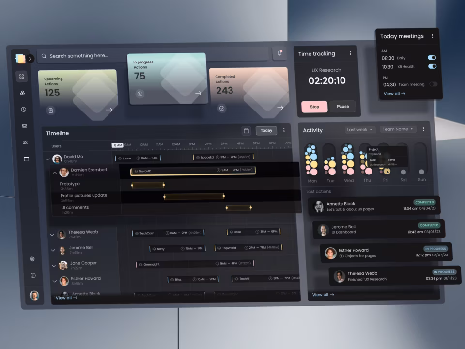
3. Role-based dashboards as default, not feature
Role-based views were enterprise-only configuration until recently. In 2026 they ship as the default experience for any SaaS handling more than one user role. The CFO opens to a different first screen than the analyst, who opens to a different first screen than the executive viewing the same underlying data. Single-view dashboards now signal a SaaS team that has not yet thought through their actual user base. The fix is to design role-based defaults from the first sprint, not retrofit them later.
4. AI-assisted support layers
In-app AI agents are replacing traditional ticket-based customer support across SaaS in 2026. The design problem is not whether to add this layer. It is how to make the AI’s reasoning visible enough that users trust the answers. AI support layers that show their work, including what the system knows, what it does not know, and how it arrived at the response, earn the trust that converts trial users to paying ones. The ones that hide the reasoning and generate plausible text get switched off the second a user notices an error.
5. Workflow automation surfaces
Automation surfaces are now primary interface elements in modern SaaS, not advanced settings. Zapier integrations, Slack workflows, and Notion automations sit visible to all users instead of behind permission gates and admin menus. SaaS interfaces still treating automation as a power-user feature look dated to anyone who has used Notion or Linear in the last 18 months. The shift is real, and product teams that have not made it yet are accumulating UX debt that compounds with each new feature added on top of the old configuration model.
6. Pricing page as conversion UX
The pricing page is conversion-critical SaaS interface design, not marketing collateral. Stripe, Linear, and Vercel each treat pricing as a primary product surface, with plan comparison, usage estimation, and self-serve checkout integrated into a single flow. Most SaaS UX guides skip the pricing page entirely. The teams that take it seriously convert significantly more visitors than teams that hand pricing off to a separate marketing team and a different design system.
7. Responsive design, refined
Responsive design is the 2026 SaaS baseline, not the differentiator it once was. The current standard treats mobile and desktop as parallel primary tracks, with feature parity expected from day one rather than as a roadmap goal. Desktop-first SaaS interfaces that add mobile support later still ship, but senior buyers evaluating tools treat that pattern as a signal of weak product investment. Mobile parity is now the floor, not the differentiator.
8. Accessibility and Section 508 / WCAG 2.1 compliance
Accessibility moved from competitive differentiator to baseline procurement requirement. Federal contracts require Section 508 compliance, and most enterprise procurement now requires WCAG 2.1 AA, meaning SaaS interfaces that handle accessibility as a post-launch checklist lose deals before the demo even runs. The 2026 baseline is proper semantic HTML, full keyboard navigation, and tested screen reader support shipped with the first release, not retrofitted into version 1.3.
9. Data security and privacy as visible interface concerns
Security used to be an admin-panel concern. In 2026 it has moved into the daily user interface, and SaaS products serving regulated industries treat that move as foundational. Permission visibility, data export controls, encryption status, and audit logs now appear as primary UI elements instead of buried settings. Users handling sensitive data want to read their security posture, not infer it from a compliance page they never visit. The trust that visible security builds is the trust that closes deals in healthcare, fintech, and government SaaS.
What strong SaaS interface design looks like in 2026
The four interfaces below illustrate the patterns that separate 2026 SaaS UX from earlier eras. Each was chosen for a specific design lesson relevant to teams scoping a custom SaaS design project, not because the product is universally beloved by its users.
Notion: AI as default, not feature
Notion’s recent evolution shows what AI integration looks like when the design team respects the original product. Block-based editing still anchors the experience. AI features extend that anchor instead of replacing it, surfacing as inline suggestions that users can accept, edit, or dismiss without leaving the document. SaaS teams adding AI features in 2026 should look at Notion before redesigning their own interface around AI: the strongest pattern is augmentation, not replacement of what users already know.
In our Stardog Voicebox work, a conversational AI interface for an enterprise knowledge graph SaaS, the design challenge was teaching users that the AI was not a chatbot. Voicebox executes multi-step retrieval and synthesis on the user’s behalf, but the surface looks conversational. The activity panel separation we shipped, where the AI’s reasoning is visible alongside the response, is now part of how we approach AI integration in any SaaS interface. That pattern came directly from this project before it generalized.
Linear: information density that works
Linear is the textbook counter-argument to the assumption that SaaS interfaces should default to minimalism. The interface is denser than what most design teams ship in 2026, but every visible element earns its position through ruthless prioritization of what engineering teams do daily. Information density and clarity coexist there because the design team holds strong opinions about workflow. Most SaaS teams default to minimalism because density is harder to execute well, but Linear’s traction proves the harder path is worth the effort for tools used dozens of times per day.
Figma: collaboration as primary surface
Figma’s interface treats collaboration as the foundational surface, not a feature added to a single-user product. Multiplayer cursors, comments, and version history are part of the original architecture, not bolted on. SaaS interfaces handling shared assets, shared dashboards, or shared workflows in 2026 increasingly follow the same approach: design the multi-user case first, then the single-user experience becomes a simplified subset of the team experience instead of the other way around.
Slack: the cost of message-first architecture
Slack is a useful counter-example for SaaS designers studying interface architecture decisions. The original product was built around messaging as the primary surface, which worked when Slack was a chat tool. As Slack expanded into workflow automation, integration management, and Canvas, the message-first architecture started competing with itself. Notifications, channels, and message threads now share screen space with workflow runs and shared documents that fundamentally do not behave like messages. The lesson for SaaS teams scoping a new product is to choose the primary user activity carefully, because the interface that serves it best becomes the hardest part to redesign later.

Conclusion
SaaS UI/UX design in 2026 sits at a turning point. The five-step design process still serves as a foundation, but the patterns it produces have shifted: AI integration as the default, role-based dashboards from sprint one, automation surfaces in the primary view, and pricing pages designed for conversion rather than marketing. The agencies that recognize this shift are the ones building SaaS interfaces that subscribers stay with. We have shipped this kind of work for Automatize, Stardog Voicebox, and clients in healthcare, fintech, and government SaaS, where this distinction is the difference between adoption and abandonment. If that sounds like the project on your desk, our SaaS UI/UX design services team should be your next e-mail: info@fuselabcreative.com.
Frequently Asked Questions
What is SaaS UI/UX design?
SaaS UI/UX design is the practice of building interfaces for subscription software products that users return to repeatedly, with retention as the primary success metric instead of one-time conversion. In 2026, the discipline covers AI integration patterns, role-based dashboards, information density choices, and pricing page conversion flows alongside traditional concerns like onboarding, accessibility, and responsive layouts. Strong SaaS UI design supports the work users come back to do every day, not the impression the product makes at first launch.
What changed in SaaS UX between 2024 and 2026?
SaaS UX shifted as AI features moved from optional product additions to default user expectations. Role-based dashboards became baseline rather than enterprise-only configuration, automation surfaces moved out of admin panels into primary interface elements, and pricing pages became conversion-critical product surfaces rather than marketing collateral. SaaS interfaces still treating these as future roadmap items now signal weak product investment to senior buyers evaluating tools.
How is SaaS UX different from traditional software UX?
SaaS UX is built around continuous engagement and recurring revenue, which means every screen affects retention. Traditional software UX historically optimized for a one-time purchase decision, with less pressure on session frequency or feature discovery over time. SaaS designers think about the long-term cost of design debt, the compounding value of retained users, and the interface as the renewal mechanism in ways that one-time software UX rarely required.
How much does SaaS UI/UX design cost in 2026?
SaaS UI/UX design projects with US-based specialist agencies typically cost between $40,000 and $200,000 for a focused redesign, with hourly rates from $125 to $300 depending on agency seniority and team composition. Full design system delivery for a multi-product SaaS adds $50,000 to $150,000 on top. Offshore generalist agencies charge less per hour but typically require more revision cycles, which closes the gap on total project cost.
How long does a SaaS UX redesign take?
A focused SaaS UX redesign typically takes 12 to 20 weeks from kickoff to engineering-ready specifications. The variability depends on user role count, feature complexity, and whether the engagement includes a design system. Discovery and research usually take 3 to 5 weeks, design and prototyping 6 to 10 weeks, and validation plus handoff 2 to 5 weeks. Compressed timelines below 12 weeks usually trade research depth for delivery speed, which surfaces as scope changes during implementation.
How do I evaluate a SaaS UX design agency?
A qualified SaaS UX agency demonstrates shipped subscription products in their portfolio, names specific clients rather than describing “leading SaaS brands,” and explains their approach to retention design beyond first-session usability. Look for evidence of role-based dashboard work, AI-integrated SaaS interfaces shipped in the last 18 months, and at least one project that addresses retention or churn directly. Confirm whether senior practitioners or junior designers will lead the engagement.
What is the difference between SaaS UI design and SaaS interface design?
SaaS UI design refers specifically to the visual layer of a SaaS product, including layout, typography, color systems, component design, and interactive elements. SaaS interface design covers the broader system of how users navigate, interact with, and accomplish tasks within the product, including information architecture, role-based defaults, and workflow integration. Most SaaS projects need both, delivered together, which is why SaaS UI/UX design is often discussed as a single discipline rather than two separate ones.