13
min read
13
min read
 Oct 7, 2026
How to Design a Mobile Dashboard

Mobile dashboard design is the discipline of choosing the single metric, alert, or status a phone screen must answer in the few seconds someone actually gives it, then removing everything else from the opening view. Steven Hoober’s street study for UXmatters found that among the 780 people he observed touching a phone screen, 49 percent were doing it one-handed (The other holding a Starbucks cup), and that grip changed every few seconds, so the reachable area a mobile dashboard can rely on is never fixed.
What mobile dashboard design actually requires
Mobile dashboard design requires naming the single question a phone screen exists to answer before any layout decision, because a shrunk desktop report keeps the reading habits of a bigger screen even after the pixels change size. Everything that does not serve that one question moves to a second screen, since a phone changes reading distance, interaction model, and available attention.
In other words, subtraction comes before decoration, and that is where learning how to design a mobile dashboard begins. Cramming the same information into less space has missed the point by a mile. What the screen owes its reader is the KPI, alert, or status change surfaced quickly enough to act on without opening a larger analytics workspace.
Grip instability is the practical constraint, and a serious one for sure. A layout that assumes a fixed thumb arc will be wrong for most of any given session, because the same person switches between one hand, a cradle, and two hands within a minute. We design the opening view for the one-handed glance and keep secondary interaction available for the moment a second hand frees up.
Research outranks the wireframe here. A team needs the user’s role, how often they check the screen, the conditions they check it in, and the task the dashboard supports. Naming that task is the deliverable, and it comes out of interviews and on-device testing- the part of user research teams shorten first and regret last.
Deciding what to leave off the small screen: progressive disclosure and the four-chunk limit
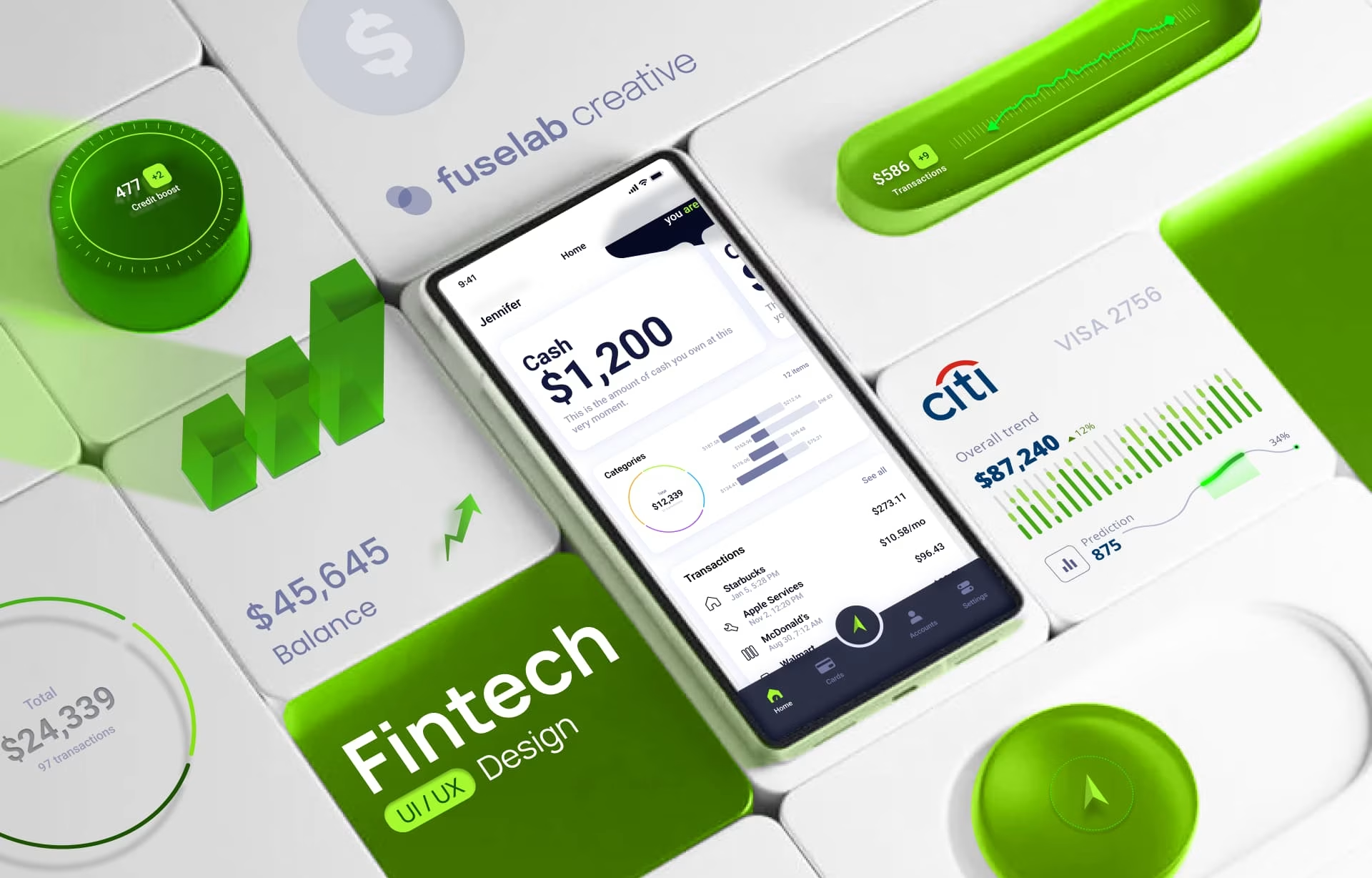
Deciding what to leave off a mobile dashboard means testing every candidate metric against one condition: does the user need it this session? Nielsen Norman Group’s account of progressive disclosure keeps one entry point on the primary screen and pushes supporting detail a tap away, while Nelson Cowan’s reconsideration of working memory sets that entry point’s ceiling near four chunks, not the folklore figure of seven.
That condition is what keeps the guidance from becoming a slogan. If the number matters every time the app opens, it stays visible. If the detail matters only after the user has already made a call, it belongs deeper. Frequency is the test, and we apply it literally.
The old five-to-nine idea survives because it is easy to remember, not because it is a useful limit. Cowan’s reconsideration in Behavioral and Brain Sciences put the real ceiling nearer four chunks, and attached a condition: the limit shows up mainly where recoding into larger chunks is blocked, which a dashboard rarely does. What that gives you is a ceiling on interpretation rather than a card count.
That is why our mobile work usually lands in the three-to-five range for primary data points, though the exact count depends on how much thinking each one requires. Five plain values with trend arrows often read faster than three cards carrying a status, a sparkline, and a comparison. The moment each item starts asking for explanation, the screen has already exceeded what a phone can hold well.
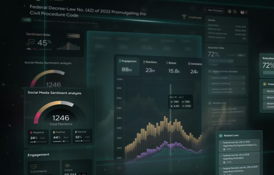
On the Fiserv spending index we built, the desktop view carried interactive charts, GIS mapping, and search across sector and region. The same content on a phone couldn’t hold it all at once, so the mobile view led with the index movement and pushed sector and region breakdowns behind a tap. The data stayed available; it stopped competing for the opening view. What this boils down to is taking an adaptive design approach versus the typical responsive design approach.
Reduce and simplify
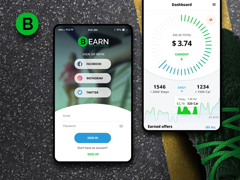
Reducing a mobile dashboard means the opening view carries only what the user acts on most often, and everything else moves into drill-downs or secondary screens. Reduction comes before visual refinement, because a screen that shows too much cannot be rescued by better styling later.
The difficult part is deciding what earns a place on that opening view. Every additional metric competes for attention, so the question is rarely whether a value is useful. The question is whether it helps the user take the first action or only adds context afterward. Metrics in the second category belong in drill-downs, even when someone senior argues for keeping them visible.
If the user must scroll through a cluttered stack of cards or controls before the status is clear, the design has missed its purpose. For each metric, show the current value, a comparison to the previous period in gray, and a trend indicator reading up, down, or flat. Users rarely need raw data. They need to know whether the number is good and whether it is moving the right way.
The exception is any metric where direction means little without a distribution. Response times are the clearest case: a median and an arrow hide the tail that generates the complaints. That is the judgment call we make on every project.
Remove decoration on the same logic. Gradients, shadows, and icons that communicate nothing compete for the attention the KPI needs, and a control styled decoratively gets read as a label. The usual failure is a dashboard UI where every card carries identical weight, so the reader has to find the hierarchy alone.
The same subtraction applies to charts. A chart has to justify its presence against a labeled number, so trend lines and compact bars survive while dense forms that need zooming do not. If the visual takes longer to read than the figure it replaces, use the figure.
Filters follow the same test. Keep them few and visible, with a default that makes the view useful before anyone touches a control. Baymard’s desktop e-commerce benchmark found 28 percent of sites show no overview of which filters are applied, and the mechanism transfers to reporting: a filtered dashboard mistaken for the whole picture is worse than none.
Use color strategically
Color earns a place in a mobile dashboard only when it improves interpretation. On a phone, it should reinforce hierarchy, status, and contrast, never carry meaning alone or compensate for a layout that is already too dense. The test is simple: does the view still read correctly with the color stripped out? Or at least it should be simple, but you would be surprised how often this test is skipped.
Red indicates a problem or a negative trend, green indicates health, gray indicates neutral or missing data. Users learned that vocabulary from banking apps and traffic lights, and redefining it inside one product is more expensive than it looks. The exception is narrow: in markets where red conventionally signals a rising value, follow the market.
Color also has to survive real conditions. Bright light and hurried reading make color-only systems fragile, so labels and spacing have to carry the same message. A reader with red-green color vision deficiency sees two muted tones where the design assumed an opposition, which is why we never let color do the whole job.
Contrast is the measurable part. The W3C sets a minimum of 4.5:1 between text and background at level AA, dropping to 3:1 for large text. The second figure is where dashboards get caught, because a big KPI number qualifies as large text while the small comparison underneath it does not.
That comparison is usually the one set in pale gray, so we check the small type first. Pair every color signal with an icon or a value as well, because a check mark on a green field still reads when the green does not.
Layout: thumb zones, touch-target sizing, and familiar patterns
Layout on a mobile dashboard decides what earns the first vertical position, thumb zones decide where controls sit, and touch-target sizing decides whether a tap lands. All three have platform-specific answers rather than one universal rule that holds across iOS and Android.
Layout decides whether a mobile dashboard reads or congests. Give the most important information the first vertical position and size modules so they can be scanned without panning. A single column is the safe default below roughly 400 points of width; above that, two columns work, but only if the hierarchy stays stable when the phone rotates.
Reach decides where controls go. Hoober has since asked designers to stop treating the reach diagram from his 2013 column as a standard, because people prefer to view and touch the center of the screen and shift grip when they need to. Put drill-downs, filters, and refresh controls in the center band. A timestamp is only read, so it can sit in a corner.
Touch targets need size and separation because a fingertip is a blunt pointer. WCAG 2.2 sets 24 by 24 CSS pixels as the level AA floor, and even that carries a spacing exception that lets smaller targets pass. Apple asks for 44 by 44 points, Google for 48 by 48 density-independent pixels.
We design to the platform numbers and treat 24 as a compliance floor we never aim at. The WCAG figure has to pass on every input device, including a mouse. The platform numbers are sized for a thumb in motion, which is the condition a dashboard actually meets.
Use patterns people already own. A menu at the top, a persistent bottom toolbar, a card layout for metrics, and swipe-to-reveal actions all carry over from banking and social apps. Familiarity is the cheapest feature in mobile app design, and that matters more on a small screen because relearning is more costly when the user is moving quickly.
Offline, stale, and error states on mobile
A mobile dashboard has to tell the user three things at once: what is current, what is pending, and what is last known. It has to say all three without a spinner standing in for an answer while the data loads.
Show the most recent downloaded data when the device is offline, timestamp it plainly, and give the user a refresh control for the moment the connection returns. “ Last updated two minutes ago” does more work than any spinner, because it tells the user exactly how much confidence to place in the screen.
Frozen values and vague refresh behavior read as a broken product even when the system is healthy, and that doubt transfers straight to the data. A dashboard that admits it is stale keeps more trust than one that quietly serves an old number. Silence is not neutrality when the user is acting on the screen. However, the longer this state exists, the more likely the user will jump ship and is not likely to return.
Error messages have to be specific. Network error tells the user nothing. “ Could not load recent transactions, check your connection and try again” names the failure and the next step. The retry logic behind that message is a solved engineering problem. The product question is whether the view tells the truth about its own state while that logic runs.
We have watched this cost more credibility than any layout problem. When stale states are left as a late engineering detail, the first round of executive feedback is about trust in the numbers, not UI polish. That is why we treat state design as part of the dashboard, not as an afterthought.
Role-based views and when they are worth building
Role-based views are worth the added engineering only when a dashboard genuinely serves three or more different jobs. Below that threshold, the maintenance cost outweighs the clarity gained, and a single simplified view will ship sooner and survive future changes better.
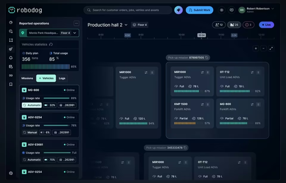
An executive wants one number, a manager wants a working set, an analyst wants the underlying detail. A single view built for all three will overwhelm the first user and starve the third. Take a travel product: a traveller follows an audio route, a guide checks how published tours perform, an administrator retires stale content.
Almost no overlap exists in the opening view each of them needs. Core metrics and interaction patterns should still stay identical across all three, so nobody relearns the product when their permissions change. The aim is a stable shared structure with a different entry point, not three products.
The cost is conditional logic, a wider test surface, and permanent maintenance on every future change. What settles it is whether roles can be assigned from something the system already knows, such as a permission group. We have seen role logic retrofitted in month six where the permission model was left unmapped in week one, at several times the original cost.
Testing on real hardware
Testing a mobile dashboard on a laptop screen tells you almost nothing. Contrast, tap accuracy, and reading order all behave differently on a phone held outdoors, at high noon, than they do in a dim office at 100 percent zoom on a 27-inch monitor.
Test on real hardware, outdoors, one-handed, and confirm readability, tap accuracy, and task completion without anyone explaining the screen first. Walk with the build outside at midday. Contrast that looked good in the mockup disappears, hierarchy that looked obvious at 200 percent zoom collapses, and the target sized generously in Figma sits under your thumb.
Responsive dashboard design needs its own pass, because a layout that reflows correctly between breakpoints can still fail when someone rotates the phone mid-glance and the KPI they were reading moves. Check rotation, the largest supported text size, and the oldest device still in your analytics. The condition here is simple: if the screen changes shape, the reading order still has to make sense.
Where mobile dashboards usually go wrong
The common failure is shrinking a desktop screen and shipping it, which leaves too much information, too many controls, and too little hierarchy for anyone to know what matters first. The second is treating the phone as the secondary version of the product. Both come from designing outward from the data model instead of inward from the task.
The hardest discipline to hold is subtraction, because the pressure to add one more metric arrives from someone senior with a legitimate reason, and no single addition ever looks like the one that broke the view. Treating the phone as one surface inside a broader dashboard design system makes that easier, since every metric that leaves the opening view still has a logical home.
Conclusion
Mobile dashboard design keeps rewarding subtraction over addition, and that discipline will only matter more as more decisions move to a phone before they reach a desk. Teams that name the one question a screen answers, and design the offline and role states around it, end up with a product people open by choice.
Frequently asked questions
What is a mobile dashboard?
A mobile dashboard is a compact interface that surfaces the most important data on a phone screen. Its job is a fast read on KPIs, alerts, or status changes without opening a full analytics workspace. The strongest versions answer one question quickly and push everything else into a drill-down.
What is the thumb zone on a mobile screen?
The thumb zone is the area a person can reach comfortably while holding a phone in one hand. Grip changes every few seconds, and people tend to touch the center of the screen rather than the corners. Treat the zone as a guide for placing primary controls, not a fixed map.
How is mobile dashboard design different from desktop dashboard design?
Mobile dashboard design works with less space, touch input, and faster scanning than desktop dashboard design. It has to be more selective about what appears first, because a phone leaves no room to recover from a crowded layout. The real difference is how much interpretation the user must do before acting.
Is responsive dashboard design enough for a mobile dashboard?
Responsive dashboard design solves the layout problem by reflowing a grid into a smaller viewport. It does not decide what earns the first position on a phone, and that decision is where mobile dashboards succeed or fail. The two approaches work together, but one does not replace the other.
What should I look for in a mobile dashboard design agency?
A mobile dashboard design agency should be able to point to a named project where a phone-first dashboard shipped, not a portfolio of desktop reports resized down. Ask how they decide what to leave off the opening view and how they handle offline and stale states, since both separate practitioners from generalists. A team that cannot name the question their last dashboard answered has not done this work.
How much does mobile dashboard design cost?
Mobile dashboard design with a US-based specialist typically starts at $25,000, at hourly rates of $100 to $149. Cost is driven by the number of distinct user roles, the state of the data pipeline behind the screen, and how much discovery the team still owes. A single view on a clean feed sits near that floor; role-based views on an unstable pipeline run several times higher.
How long does a mobile dashboard project take?
Mobile dashboard timelines follow scope, and our completed design engagements have run three to seven months end to end. A single view on a clean data feed lands at the short end of that. Multiple user roles, complex integrations, device testing, and accessibility review push toward the long one.