15
min read
15
min read
 Oct 9, 2026
Best Practices for Enterprise Application Design
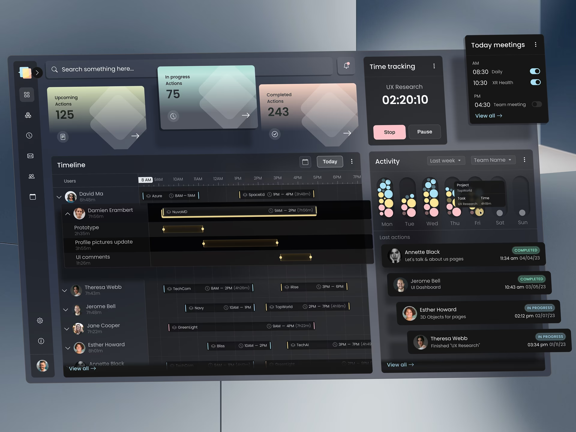
Enterprise application design is the discipline of building internal software interfaces that thousands of employees rely on daily across complex workflows, role hierarchies, and regulatory constraints, where the standard best practices are widely shared and uncontroversial. What separates a working enterprise application from a beautiful failure is which of those practices the design team prioritized when they conflicted, and most of those decisions are made before the first wireframe is ever presented.
What is enterprise application design?
Enterprise application design is the practice of designing internal-facing software that supports large-organization workflows, role-based permissions, integration with existing systems, and audit-grade traceability. The discipline covers CRM platforms, ERP systems, financial workflows, healthcare operations, and the custom business applications that run companies from the inside. We’ve heard clients refer to these applications as the pulmonary artery of their organization. Unlike consumer apps designed for first impressions, this work is built for the 200th use by trained professionals who feel every small inefficiency through repeated daily use.
The category is wider than the name suggests. An enterprise application can be a CRM customized for a 5,000-person sales organization, an ERP that runs a hospital network, a custom claims-processing system for a state agency, or a permissions-aware document workflow used by every employee at a financial services firm. What ties them together is not a feature set but a constraint set: many users, many roles, hard integration requirements, and consequences for getting any of those wrong.
This sits in a different tradition from consumer mobile apps or marketing websites. The work is closer to airline operations dashboards or laboratory information systems, and the trade-offs are genuinely different from what a consumer designer is trained to optimize for. A senior practitioner who has shipped enterprise software and a senior practitioner who has shipped consumer apps tend to disagree productively, because the problems they have learned to solve are not the same problems.
How this work differs from consumer apps and enterprise development
The discipline differs from consumer app design and from enterprise application development in concrete ways. The user is a trained employee rather than a consumer jumping into a digital experience for the first time. The workflow runs through several roles with different permissions rather than a single user. The application has to integrate with systems older than itself. Each difference changes design decisions that consumer designers can leave to convention.
A consumer designer optimizes for the first ten seconds of a stranger’s attention. An enterprise designer optimizes for the 200th use of a familiar tool by a trained professional whose goals are more complex than simply enjoying the experience. Repetition tolerance, default behavior, keyboard navigation, and the speed of bulk actions matter more than animation timing or first-impression aesthetics.
The distinction between design work and development work matters because each involves different decisions. Development owns implementation: database structure, API contracts, and deployment infrastructure. Design owns the role hierarchy, information architecture, interaction patterns, and the application’s behavior when its underlying systems disagree. Treating the two as a single concern is how role hierarchies get bolted on at the end of a project, which is one of the most common reasons enterprise applications fail to land with their users.
The enterprise application design best practices that decide success when they conflict
The best practices for this work are widely shared and largely uncontroversial: design for the user, document the system, plan for scale, integrate carefully, secure everything. They become controversial when they conflict with each other, which they always do under real budget and timeline pressure. These five practices receive less attention than they deserve, and when they collide with the celebrated ones, these are the ones that decide whether the application gets used.
1. The role hierarchy is the spine of the design, not a layer added later
Many enterprise applications fail to be adopted because the role hierarchy was bolted on after the wireframes were approved. The team designs the screens, asks who can see and edit each field, and discovers that the answer changes on each screen. In other words, it’s a slow march into hell. To avoid this catastrophe, the roles, their permissions, and the approval chains have to be decided first. This is information architecture work, not visual design work, and it happens before any screen is drawn. Under regulatory regimes like SOC 2 and HIPAA, this work is also a compliance prerequisite, not an optional design phase.
This was the central design problem on the Fiserv financial services work, where every interface decision had to account for roles that did not exist in the original product specification: branch staff, regional managers, compliance reviewers and internal auditors. The screens themselves were not visually complex. The hard work was deciding which role could see which data at which moment in a workflow, before any screen was drawn. The role of architecture became the document the design team protected most carefully, because every later decision depended on it.
McKinsey’s research on the business value of design tracked 300 publicly listed companies over five years and found that more than 40 percent did not engage end users during development. In enterprise contexts, that gap is exactly the role-hierarchy problem: the team designs for an imagined average user, then discovers that real roles need different things from the same screens, and reworks the wireframes after the fact. The cost of that rework is what shows up later as missed deadlines, scope arguments, and adoption that never lands. Oh, and we’re not even mentioning how much money was wasted.
2. Designing for the 200th use, not the first impression
Consumer app design is taught around first impressions. The user arrives, evaluates within seconds, and either continues or bounces. Enterprise applications operate under the opposite dynamic. The user has been trained, has used the application hundreds of times, and will use it again tomorrow morning. The first session is irrelevant to whether the design succeeds. The 200th session is everything.
This changes specific design decisions. Onboarding animations disappear or become aggressively skippable. Keyboard shortcuts and bulk actions become first-class features rather than power-user afterthoughts. Defaults learned from the user’s history reduce the number of clicks per task. The visual restraint that consumer designers learn to avoid, including dense tables, full-width data grids, and four-deep filter trees, becomes the right answer, because the user is reading data, not browsing it.
Slack is a canonical example of this thinking applied to enterprise software. The keyboard shortcut layer is the part that decides whether the product earns daily use: command-K to switch channels, slash commands to take action, arrow keys to move through threads. None of these features matter on the first day. By the fiftieth day, they are the difference between a user who tolerates Slack and a user who depends on it. Bloomberg Terminal has been built around the same principle since the 1980s: every screen is designed for the fiftieth use, with deliberate disregard for first-impression aesthetics.
Pendo’s 2019 Feature Adoption Report, based on usage data from 615 software products, found that 80 percent of features in the average software product are rarely or never used. Enterprise applications are not immune to this pattern. Designing for the 200th use is partly about resisting the temptation to add features that look impressive in the demo and end up in the 80 percent.
3. Audit trail UX is a design surface, not a database table
Most enterprise applications treat audit logs as backend infrastructure. The application records what happened in a database table, accessible to administrators through query tools. Compliance teams and managers cannot use it without engineering help. Clunky, clunky, clunky. The decision that separates working enterprise applications from beautiful ones is to treat the audit trail as a surface that compliance staff, managers, and auditors actually use, not merely a record that only engineers can read.
The engineering side usually does its part. CorLab Tech, describing an on-premise BI platform built for organisations that cannot use the cloud, reports that every change in the system is logged, so it can answer who asked what and when. That record is the raw material. Whether a compliance officer can read it without calling an engineer is the design question.
This means designing for the question “show me everything user X did last Tuesday” as a real workflow, not a database query. It means versioning records visibly, surfacing before-and-after comparisons on edited fields, marking which actions are reversible, and giving the audit interface its own search and filter hierarchy. Audit becomes a navigable space rather than a logging endpoint, and that distinction shows up in user trust earlier than most teams expect.
The DHCS Medi-Cal interface required this approach because state programs are subject to audit obligations that extend beyond technical logging. State auditors, program reviewers, and federal oversight under HIPAA need to see history in human terms, and that requirement shapes design decisions, including how individual fields are versioned and how status transitions are displayed in the workflow. An audit trail designed only for engineers fails compliance review the first time a state auditor asks a question that the engineering query tool cannot answer in plain English.
4. Designing for the moments when systems disagree
Every enterprise application sits between systems that were not designed to interoperate. The CRM has one record of a customer. Billing has another. The support tool has a third. The data warehouse reconciles them on a delay measured in hours or days. The design problem is not which system is the source of truth. It is what the interface does when two systems disagree about a record the user is looking at.
Resolving this in the database layer is an engineering decision. Resolving it in the interface is a design decision, and the choice has consequences. Showing both values invites confusion. Showing one value silently invites distrust later, when the user discovers the other value somewhere else. The working pattern is to surface the disagreement, name the systems that disagree, and give the user a path forward whose audit trail makes the resolution traceable. Many enterprise applications get this wrong by pretending the disagreement does not exist.
This pattern shows up most often in cross-departmental enterprise applications: a CRM that integrates with a separate billing system, a healthcare application that pulls from multiple EHR vendors, a financial workflow that reconciles vendor feeds with internal ledgers. The design team that anticipates the disagreement and designs the interface for it ships an application that compliance trusts. The team that does not ship a beautiful application whose users learn to mistrust the data within months.
5. Maintenance and update of UX is part of the design
Enterprise applications live for five to ten years and receive feature updates throughout that lifetime. Most projects treat the update experience as an IT problem: schedule the deployment, push the release, send the email. Applications that retain user trust over their lifetimes treat it as a design problem. How does the user learn that a workflow has changed? How does the system explain why a feature moved? Can the user roll back if the new behavior breaks their work?
This requires design decisions during version one that most teams defer until much later. The decisions that matter are in-application change notes for any workflow modification, a visible history of recent product changes within the relevant feature rather than a release notes page nobody reads, default behaviors that preserve user customization across updates, and rollback paths designed for the user rather than just for IT. These look like small features in a backlog. They are the difference between an application that compounds value over its lifetime and one that loses adoption with every update cycle.
Enterprise app UI design: density, hierarchy, and the constraints that shape the interface
Enterprise app UI design operates under constraints that consumer interface design does not face: information density requirements, role-specific layouts, workflow continuity across screens, and the need to remain learnable when the underlying business processes change. The result looks more like a professional tool than a marketing surface, and the design language follows accordingly.
Dense tables replace cards, because the user is reading data rather than browsing it, and a card layout would force scrolling that a table does not. Typography carries the hierarchy that color carries in consumer interfaces, and motion mostly disappears because trained users do not need animation to understand state.
Density gets criticized in consumer design contexts where users are scanning unfamiliar content. In enterprise contexts, the user is reading data they already understand, and the design has to support reading dozens of records per minute. A table with twelve columns visible at once is the right answer for a procurement specialist scanning vendor invoices, even though the same density would look overwhelming on a consumer marketing site. Optimizing for the wrong context is one of the most common UI mistakes in this discipline.
For government and regulated-industry applications, density also has to clear federal accessibility standards like Section 508, which means every dense table needs keyboard navigation and screen reader support designed from the start rather than retrofitted at QA.
Role-specific layouts mean the same application looks different to different users, not as a personalization choice but as a structural one. A claims processor sees the work queue and the customer record. A regional manager sees the team metrics and the queue summary. A compliance reviewer sees the audit interface and the most recently flagged transactions. The interface is the same application, but the surface the user lands on is governed by their role, not by their preferences.
These UI decisions trace back to the role-hierarchy work in practice one. Designing the interface before the role hierarchy is settled produces UI that has to be reworked when the role decisions catch up. After designing it, the layout naturally accommodates the differences. This is one reason the role hierarchy comes first in the practice sequence, and it is why, in our experience, the strongest enterprise designers spend as much time on permission architecture as on visual design. We understand this sounds a little nuts, but it’s so true.
Common mistakes in enterprise application design
The most common mistakes here are not aesthetic. They are sequencing mistakes: doing one set of design work before another set of work that should have preceded it. The five most damaging are designing wireframes before settling the role hierarchy, treating audit as backend infrastructure rather than a design surface, optimizing the first impression instead of the 200th use, treating integration disagreements as engineering problems, and treating updates as IT events rather than user experiences.
The pattern across all five is the same. The team starts with the screens because screens are visible and gratifying to produce, then discovers that the underlying decisions about roles, audit, integration, and lifecycle have to be made anyway, and now they have to be made with a wireframe already approved. The wireframe becomes a constraint on decisions that should have constrained the wireframe.
The second pattern is treating enterprise applications as larger versions of consumer apps. They are not. The user is different, the workflow is different, the constraints are different, and the metric of success is different. A consumer designer applying consumer best practices to enterprise contexts ships interfaces that look modern at launch and lose adoption once the novelty wears off. The fix is to recognize the work as its own discipline with its own conventions, and to hire or partner with practitioners who have actually shipped enterprise software, not those in adjacent categories.
Many agencies marketing themselves as enterprise application specialists have actually shipped marketing websites and consumer SaaS products. The portfolios show interfaces that look enterprise-adjacent but were built for a single-user persona, with no role hierarchy and no integration constraints. This is the most consequential evaluation question a buyer can ask: show me an application you shipped that has more than three user roles with different permissions, and tell me how the role architecture was decided. Most of the time, you will be met with the sound of crickets.
Conclusion
This work is its own discipline, with its own trade-offs and its own measure of success. The applications that earn long-term user trust are not the most visually striking. They are the ones designed by teams who knew which best practices to prioritize when the trade-offs collided, and made those decisions before any screen was drawn. Teams that need a partner with that experience can engage Fuselab Creative’s enterprise UI/UX design practice, which was built around exactly this kind of work. Feel free to test us, and you and I will see!
Frequently asked questions
What is enterprise application design?
Enterprise application design is the practice of designing internal-facing software interfaces for organizations with many users, multiple roles, and integration with existing systems. The discipline covers CRM platforms, ERP systems, financial workflows, healthcare applications, and the custom business tools that run companies internally. Unlike consumer app design, the work optimizes for repetitive daily use by trained employees rather than first-impression discovery by new visitors.
What does the work actually cover?
An enterprise design engagement typically includes role hierarchy definition, information architecture for permissioned workflows, interface design for high-density data tables, audit trail UX, integration design for cases when underlying systems disagree, and the design of update and maintenance experiences that preserve user trust across multi-year application lifetimes. Each is a design surface, not an engineering concern, even though some of them touch infrastructure decisions.
How does this work differ from consumer app design?
Enterprise applications are designed for the 200th use by a trained employee, while consumer apps are designed for the first impression with a discovering visitor. The result is different conventions for density, navigation, animation, and onboarding. Enterprise applications also have to handle role-based permissions, audit obligations, and integration with older systems, none of which consumer applications typically face.
How does enterprise app design differ from enterprise app development?
Design owns the role hierarchy, the information architecture, the interaction patterns, and the way the application behaves when underlying systems disagree. Development owns the technical implementation: the database structure, the API contracts, the deployment infrastructure. The two disciplines work together but make distinct decisions, and treating them as a single concern is how role hierarchies get bolted on after wireframes are approved.
How much does an enterprise design project cost?
Project costs in the United States typically run from $50,000 for a focused redesign of a specific workflow to $500,000 or more for a multi-year platform engagement covering research, role architecture, design system, and the full interface across all user roles. Hourly rates for US-based specialist agencies range from $100 to $300, depending on agency size and the regulatory complexity of the work.
How long does a typical engagement take?
Most engagements take three to nine months for the core design phase, with longer timelines common when the application spans multiple departments, multiple user roles, or regulated industries with compliance review built into the design process. The first month is usually role architecture and discovery; the interface design follows once those decisions are settled, and the time saved by sequencing the work this way usually exceeds the time spent on the discovery phase.
What should buyers look for in an enterprise design agency?
Strong candidates demonstrate shipped enterprise software in their portfolio with named clients, document their approach to role hierarchy and audit UX, and show how they handle integration disagreements between systems. An agency that primarily ships consumer apps or marketing sites does not have the trade-off experience the work requires, regardless of how strong their visual design is. The right evaluation question is not how the agency designs, but which decisions they sequence first.