How to Design for Multi-User and Multi-Touch Platforms
When Microsoft first launched its “Surface” tablet in 2012, reviews were mixed.
Some loved it, some loved to hate it but all could agree on one thing: What started as a perceived bid to capture back their market share from Apple quickly became Microsoft’s bold critique and contribution to the future of computing.
Just six years later, in 2018, “Surface revenue has jumped 25% Y.O.Y. this quarter to $1.1 billion, ‘driven by strong performance of the latest editions of Surface’”, reports Tom Warren for The Verge.
The evolution of the Surface range has made a firm statement as to Microsoft’s focus: Let the Apple and Google kids innovate and optimize for mobile. We’ll be over here, doing our part for computing.
To extend the use and functionality of its hardware, Microsoft then turned its attention to software that takes the Surface and integrates all your favorite computing functions, making full use of the Surface’s features.
Suddenly, a tiny little “tablet” (which was not a tablet at all), was able to deploy cloud-based offerings like Office, Outlook365, OneDrive, and the Azure enterprise.
The Surface is an important hardware development and UI/UX segue to what comes next because its design and functionality reveal Microsoft’s vision for the future of computing hardware and modern working.
Meanwhile, design principles for the web have been trundling along in parallel, becoming more sophisticated and more user-focused than ever before.
They’ve finally converged at this particular point: A multi-touch, multi-user, gesture-based platform is the future of design and computing.

What is Multi-Touch, Multi-User?
Once upon a time, Burberry was notoriously unfashionable. The brand was known for frumpy overcoats that “moms pushing baby strollers” would quickly put on and head out in.
Then, Angela Ahrendts got hauled in and the rest, as they say, was digital transformation history. Or, rather, Ahrendts’ unapologetic overhaul of the brand, its operations, its strategies, and its in-store operations made history.
In an interview with CapGemini, Ahrendts both reflects on and explains how the use of screens was both the integral first step and an ongoing technological commitment that cemented the path of much of what Burberry is today.
When you walked into a Burberry store after 2006, you would be likely to see “retail theatre”, broadcasting the Burberry history, heritage, and story across massive in-store screens.
With associates communicating and processing orders on iPads and customers being treated to a cohesive in-store and online shopping experience through their mobile devices.
“Everything should be connected digitally, as it was in reality,” explained Ahrendts, of the company’s new screen-based, experience-centric focus. “Today’s reality is that a marketing department can’t execute without a strong technology partner.”
If the “goal”, as Ahrendts says, “is to bring the customer closer to the brand,” multi-touch, multi-user design is the next wave of digital transformation, touching everything from the way users interact to the methods which design and marketing teams employ to capture attention and bring value.
Types of Multi-Touch Tech Available Today
What are the kinds of multi-touch tech available to us today?
According to BCC Research, the market for multi-touch technology is finding its hay day in the Asia-Pacific region first — here the market is currently set at $7.3 billion for 2018. Meanwhile, North America’s 34% growth in multi-touch technologies puts it at $2.1 billion.
We’re set to see multi-touch interface technology all around us:
“[Multi-touch technology is] redefining the way consumers interact with machines and is quickly replacing keypads in personal-computing products such as smartphones and tablets.”
The shift from responsive to adaptive design is just one example of this human-centric (or, rather, “user”-focused) priority. Multi-touch, multi-user and gesture-based platforms will usually feature one or more of these types of interactions.
This means that the hardware a user is working on is likely to engage multiple senses and accept feedback from multiple sources.
At the end of the day, we simply want to be able to please our users everywhere, no matter where they’re interacting. That is, after all, the key driver of adaptive design — anticipating the user. With multi-touch, multi-user design, however, the goals have increased. It’s also about anticipating, educating and engaging the user.
This means that multi-user, multi-touch design presents its own sets of challenges and has its own sets of best practices to ensure the best experience for users.
As much as the multi-touch, multi-user, and gesture-based design follows standard principles, it’s also very much determined by the extent of the hardware — as we’ll soon see here.
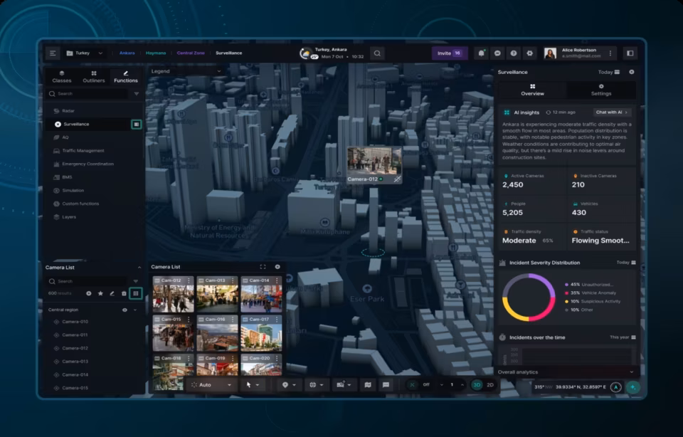
Key aspects of a multi-touch, multi-user experience
To begin designing for a multi-touch, multi-user experience, there are four key principles you’ll need to consider incorporating into your designed environments, interactions and layouts. Let’s take a look.
Affordances
What are “affordances”? It’s the level of support and guidance given to a user when interacting with the software.
Affordances are almost a mark of usability, how obvious it is to the user regarding how they’re supposed to interact with a screen element or use the hardware/platform.
Think of it this way: When we walk up to a door, there is a knob or a handle. If we’ve never faced an object like a door before, the fact that there’s only one “interactive” element asking for action will tell us that it must be manipulated somehow to open, be dissolved, resolved, or get going to the next action.
We don’t waste any time — we get right to work, twisting the handle, pressing the button, and using it to move the larger “door” object around.
The same is true of elements we encounter in multi-touch, multi-user screens: Affordances tell us how we can “afford” to interact or act with the clickable object or element (or whether we can at all).

This means that a major goal of gesture-based platforms is to mimic this natural feeling of interacting with real-world objects in an almost reflexive way.
To do this, you’ll have to observe how natural human tendencies go when dealing with familiar objects.
When we see a book, we pick it up and flip through it — it’s our instinct to do so because this leads to more discovery.
You’ll have to do the same for each element within a gesture-based platform; leverage how people already interact with day-to-day objects and infuse this into your design choices.
Using “phicons”, which are physical icons, harnesses the full scope (both hardware and software) of a gesture-based platform.
Here, interactions between a user and a platform are “mediated” by a small, familiar device.
There is usually a pre-programmed code or script that recognizes these “physical” pieces when they’re laid on a screen. Using the device’s optical systems (such as a camera, seen above), a user can interact with the content on the screen by manipulating the phicons.
Designing for “engagement”
Let’s go back to this idea of a phicon. Using everyday devices, we already know (or have some reasonable expectation) that using our index finger and thumb in an outward sweeping motion will cause a touch-screen to zoom in.
But where did we learn that? Affordances allowed us to quickly understand and build a new vocabulary of gesture-based interactions.
But engagement is what keeps us learning and looking.
Instead of using our fingers, what if we could place a weighted magnifying glass on a screen to signal zooming in?
We may start off by trying to use our fingers, in fact; and when that doesn’t work, we may accidentally discover that this “phicon” does, simply by placing it on the screen.
Suddenly, we want to learn more. We want to explore the rest of the interface and its library of actions and reactions.
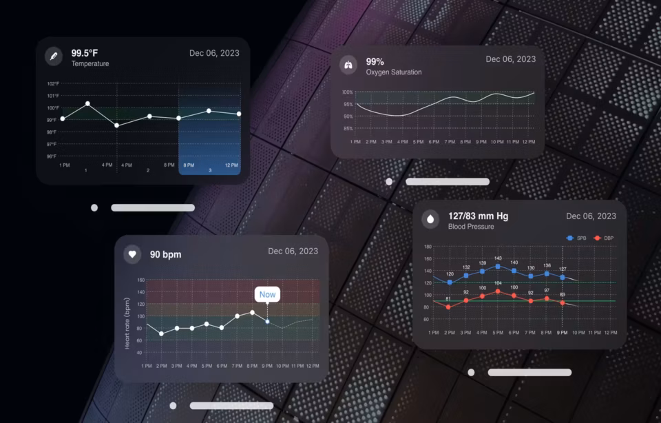
It’s incredibly important that a multi-touch, multi-user experience engages our full senses in the way that it harnesses the full extent of the hardware’s capabilities to deliver content and interactivity to us.
In gesture-based systems, interactions are “3D”. In other words, it’s not just about visual aesthetics — it’s also about interaction aesthetics. While visual aesthetics are about how we feel when we visually look upon an item, object, or action, interaction aesthetics are far more experiential.
It’s all about how we feel when we use a product, over time. For example, the first time a user discovered that they could use one finger to flip between screens by swiping left and right, the delight and engagement level would have been high.
Over time, this becomes a subtle and almost take-for-granted action. Does this mean they’re not engaged? No. It means the action has been repeated so many times, it has built a new expectation in our brains. We now expect that same seamless feeling of scrolling or swiping everywhere.
Successful multi-touch, multi-user designers will understand this and use it to their advantage to keep producing that “feel-good” feeling.
Remember that, with screen-based inputs, you never want to force your users to look for hidden features, actions or interactions.
Having to do so removes them from their “exploration” or “discovery” phase and makes everything more tedious.

When users look at elements on a screen, it should be clear which are items that can be acted on and what those actions encompass.
Feedback
Known as the “three-click rule”, this design commandment says that it should never take a user more than three clicks to find information.
Like navigating within a maze puzzle, this suggests that each click should have its purpose, leading to the completion of the larger goal.
But how does a user know that a click or a tap did anything?
Usually, there’s a resulting icon (like a wheel spinning or a link button color changing) that gives the user information. It’s called feedback.
Feedback becomes even more important in a multi-touch, multi-user environment where gestures are coming from multiple directions and the user is still learning the extent of their manipulations.
The feedback should be noticeable because we’re going for interaction aesthetics. If they performed an unintended action, it should be very clear (through sight and sound) what happened.
When sending an email, for example, it’s standard now that hitting the send button be accompanied by a “whoosh” noise, almost as though something is whizzing through the air (ostensibly, to the receiver).
When dumping something in the trash on a Macbook, the document visually gets sucked in and a noise like a can being thrown into a garbage chute sounds out, telling the user about the context of the action and reaction.
Every action taken by users should result in some sort of noticeable feedback.
This tells the user two things: firstly, whether their action was completed and, secondly, whether they took the right action.
In touch-based systems, it’s important to focus on the immediacy of the feedback — since touch is instant. This automatically means that you should be using visual cues and positioning of objects that can be noticed visually (supported by the aural).
There are a few more things to keep in mind about feedback when designing for a multi-touch, multi-user platform:
- Feedback from multiple actions can add up to providing information about the current state of the system
- Feedback related to any user’s actions may be relevant to (and so should be visible by) other users
- Feedback that occurs in a way that multiple users can easily notice will increase the usability of a multi-touch, multi-user experience.
“Don’t make us think”
The above three components of multi-touch, multi-user, gesture-based design are tied together in this final point. In other words, if you design and deliver the previous three aspects well, you’ll be able to make certain gestures part and parcel of a user’s cognitive functioning and expectations.
See, users are excited about gesture-based devices and platforms because it affords them an entirely new experience. But designers get something even more elemental: While trying to “get closer to the user”, they end up observing the user even more deeply.
User-centered design is, after all, all about observing people in the context of use and feeding back those expectations, thoughts, and actions through design.
Gesture-based systems take that to the next level because there’s a modicum of “automatic” or reflexive reaction going on. These are non-verbal, non-textual interactions that must be felt and therefore enhance our experience of the everyday.
Learning from and collaborating with partners on a gesture-based system is not only more pleasurable, but it’s also more rewarding.
Designers should keep in mind that users will be looking at others interacting on the same screen to learn what’s possible and what isn’t.
That’s a huge advantage because the experience is not isolated.
At the same time, the instantaneous nature of gesture-based interactions and multiple users means that any issues are also amplified. Bar eliminating these “issues”, you should plan for your design to allow users to learn from the system as well as learn from each other.

5 Keys to a Successful Multi-User, Multi-Touch Design Experience
1) Put performance first
Before you even think about design, layout and delivered content, you need to make sure that your setup is designed to give the best possible user performance. This means no lags, no downtimes and no stalls in interaction.
This is a part of interaction aesthetics. it’s likely that anything with a slow load or response time will significantly reduce enjoyment and will likely lead users to think that the “device” is functioning poorly.
2) Place the user in control
Always have your audience in mind when designing.
Multi-touch applications call for multiple interactions from multiple users. Designers will have to be aware of that when creating a layout that is visible and able to be interacted with from multiple perspectives.
Remember also that particular audiences will have particular experiences.
For example, a salesperson might be more well-seasoned with a multi-touch interface than a shopper in a store, who may require the design to afford them more support and guidance.
3) Design concerning hardware
Some gesture-based platforms are small-screen tablets. Others are table-like, horizontal kiosks. Others are equally as large but vertical and standalone. When you’re designing, you’ll want to keep these specs in mind.
It’s not only about harnessing the full capabilities of your hardware (for example, screens that brighten or darken according to an environment’s natural light).
It’s also about making sure that you, as the designer, are aware of whether the hardware will be wall-mounted vertically or displayed flat, horizontally; whether the user needs a “lock” to keep the screen from changing;
Or how content will look to individuals gathered around a table (where some elements may be “upside down”). You’ll need to anticipate this and then design for it.
4) Integrate into your pre-existing IT architecture
This is a powerful way to delight and engage your end user — make it easy for them to use the combination of hardware and software by integrating it with their pre-existing tools.
Let’s say, for example, that users have a piece of information in front of them that must be saved in their CRM and their e-commerce app.
You’ll need to find a way to educate them on how to save this file so that it populates both pre-existing apps or updates the information already sitting within these apps, using their gestures to manipulate the elements on the screen.
When the Surface first came out, reviewers called it “vaporware”, saying that it didn’t even exist yet.
It was purely conceptual and those who had claimed to interact “with it” were just dealing with a prototype that approximated what the Surface intended to do.
But multi-user, multi-touch, and gesture-based devices are not vaporware. They already exist and designers would be well-positioned to successfully architect seamless user experiences using these principles.
Our dashboard design agency has a great team of designers and offers the best design solutions.