The Role of Responsive Versus Adaptive Design When Designing for Mobile
For every second that it takes for a page to load, conversions fall by 12%. And if your business makes $100,000 through your website every day, a simple improvement of 1 second in page speed could mean an increase in revenue:
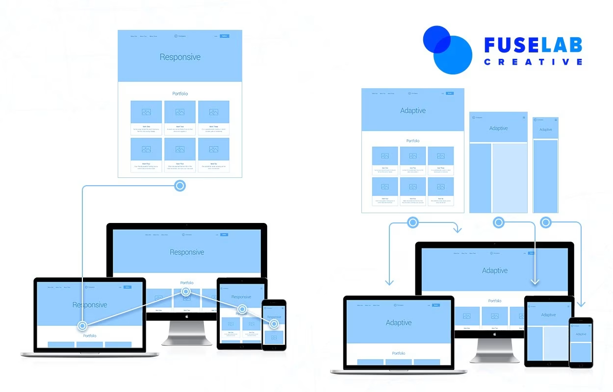
Responsive Web Design
$4.3 million every year, to be exact. If you’re making income directly through your site, via e-commerce functions, these details matter.
Now, there was a point at which responsive design used to be the industry standard for website design, facilitating the functionality as well as the user-friendliness of a website.
It came at precisely the right moment when websites — even ones designed primarily as blogs—began to become more about running a business, giving the user an experience and building command central from which to run traffic to.
So conversions mattered.
But with the bevy of businesses and brands out there, creating content and interacting with audiences in what feels like non-scalable ways, conversions matter even more.
Cutting through the digital noise is not only about “one-upping” the competition, it’s also about creating a memorable and personalized customer experience.
And this is where the choice between responsive design and adaptive design starts to matter.
As you’ll see, it’s not an “either-or” choice—your website’s and business’s specific goals matter when choosing one over the other.
Responsive web design is as it sounds: A single design and layout are created for a website and scaled according to the size of the window (or device) it displays on.
Designers (and developers) use a simple media query to create thresholds based on a resolution with the stylesheet. When the window is resized on a device that matches the media query’s dimensions, elements on the page realign to fit the screen size.
The key to “responsive” web design is that it keeps the major design elements of the layout intact. While small details may or may not be shifted out of the window, resized, or repositioned, the look and feel of the website remain intact, so that a website displayed on a mobile screen remains consistent in look and feel.
Consistency in visual design matters. It’s one of the key principles to successful UX design and helps to enhance the brand’s recognizability. As the screen resizes, elements shuffle around, which requires a lot of upfront selling.
You want to make sure that, for example, if you’re designing an e-commerce site, the most important aspects, such as great pictures, product descriptions, specs, reviews, and “add to cart” buttons, amongst others, are not only still there but present themselves in a way that clearly shows the user a hierarchy.
When responsive web design came out, it was delightful — mostly because the transition between screen sizes, if well-designed and planned, flowed like a liquid container pouring elements together in a neat stack or spacing them out again on bigger screen sizes.

Adaptive Web Design
Given users’ positive experience with responsive web design, you may well be wondering: Why would we reinvent the wheel? What was so wrong about RWD that we needed adaptive design?
Well, there wasn’t anything wrong, per se. The adaptive design was less about correcting an ill and more about translating principles of customer-centricity, personalization, and a need for better conversion rates into a way to re-imagine the user experience across devices.
The fact of the matter is that businesses and brands must respond to the digital environment we’re in.
It’s one in which segmentation comes standard in all marketing automation software, personalization is the key to spurring sales and conversions and businesses are wondering how to scale the unscalable opting for one-to-one conversations occurring on social media and review sites.
In adaptive web design, designers focus on anticipating the device their customer is using and create multiple instances of a layout for each device.
Part of this is because of device fragmentation: As customers, we’re experiencing a brand on multiple devices, over multiple interactions.
In the world of adaptive design, screens don’t “flow,” they’re built beforehand. To do this, designers must, essentially, craft specific situations, according to specific user preferences, which means that adaptive design is a bespoke, tailor-made solution.
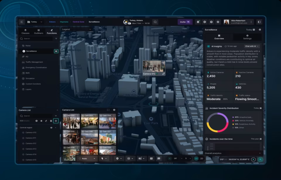
The choice of adaptive design seems to tell users that a brand is in tune with their needs. But, for designers, choosing adaptive design requires them to start with the lowest resolution of the website, working their way up to the highest. Mobile dashboard design allows your users to see the most important information while using your app.
Designers start with a minimum of six designs and then branch out to more, depending on the users’ data of the historical site use. This is segmentation and versioning for the digital, online space.
Of course, given that a website’s layout is pre-made and designed according to a user’s history of needs and capabilities, the end experience feels much more relevant. No longer is the desktop version of the website the first standard, while all other designs flow from this.
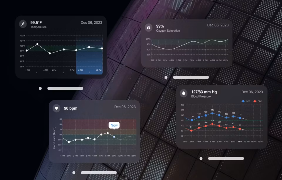
Instead, adaptive design starts “from scratch” at each device, incorporating the particular capabilities of each design. So mobile dashboard design experiences, for example, take full advantage of mobile-only features such as touch and voice control.
It’s easy to remember the difference between the two if you think about it like this: While responsive design is consistent, adaptive design is contextual.
It depends on your goals. An e-commerce website, for example, might do better with a choice of adaptive design because this means that users — who truly are potential customers, whether repeat or new — have the opportunity of an experience based on their device.
The goal here is to make that conversion — which is a sale, and designers, in conjunction with marketers, will want to use every instance, every opportunity to do precisely this
Meanwhile, responsive design may work just fine for a photography website where users can’t necessarily purchase a package, but the goal is to display visual elements in a seamless, flowing consistent way.
Here, the focus is not on a shopping experience. Rather, the goal is to have the user learn more about the site owner’s offerings and reach out. In other words, it’s about contact, not customization.
Upfront work
No doubt choosing adaptive design calls for upfront work in anticipating the user’s device, the user’s behavior, and the kind of experience that will work best, given where they are in the buyer’s journey.
Meanwhile, a responsive design would enable designers to shift focus on enhancing other parts of the experience because media queries are simply a matter of code. The layout remains the same and while they do have to anticipate how the layout will shift from size to size, this form of design is detached from larger marketing considerations like user personas and the buyer’s journey.
The verdict: Since e-commerce is primarily occurring over mobile, effectively making transactions and the shopping experience more about “m-commerce”, using adaptive design, while requiring much more upfront work, makes more sense.
And it might be less work than you think: Since your marketing and sales team will be working together to formulate user personas and refine the customer journey over time, as more data flows in, design teams can harness this information as well.
In other words, since segmentation is already present in other functions, design teams would have data already available to create experiences that personalize the user experience.
In terms of e-commerce occurring on mobile devices, an adaptive design would allow brands to streamline the order and payment process for mobile devices.
Load times
Because responsive design is a “one size stretches to all” sort of situation, load times on mobile are significantly slower. It takes a while for all the elements to load and, even then, major aspects — like retargeted ads — can sometimes be missing.
Meanwhile, because adaptive design has several fixed layouts, ads are more stable and are geared toward the device being used. When testing adaptive sites, load times have been two to three times faster than responsive sites, since designers need less overall “code” or data for the intended user experience, crafted for that specific device.
Ads themselves can also be customized in adaptive design. The rapidly shrinking attention spans of customers coupled with the preference for a personalized experience can often seem like an opportunity cost when using responsive design.
The verdict: For e-commerce conducted on mobile devices, the adaptive design promotes faster load times, which will be standard across versions of devices.
Since many customers still use older versions of smartphones, design teams can work to deliver the same or a similar kind of experience, maximizing the device’s in-built capabilities to deliver the best experience.
An older version of a phone might require more processing power so simplifying the design would help stabilize load times across devices.

Custom user experiences
From omni-channel marketing to omni-device shopping, the customer’s journey is not confined to one terminal. A customer are just as likely to browse on a laptop as they are to then pull out their tablet and, when on-the-go, resort to their smartphone.
So the question for design teams is simple: “Are we equipped to meet our customers where they are, upon each new action?”
We already know that it takes, on average, seven interactions with a brand or business for a customer to convert and make a purchase. The fragmentation of devices has further fractured these interactions into about 15 touchpoints.
And now, it’s all occurring over various devices. This means that designers of e-commerce businesses will need to respond to the needs of users and anticipate their path to conversion.
The verdict: Here, as well, adaptive design is the perfect solution. It’s no surprise that 70% of users report being more willing to purchase a product or service from a website if the site is mobile-friendly.
Custom user experiences don’t only need to deliver a personalized design, based on the user’s previous behavior or purchase history, it also needs to account for the device they’re using. Ultimately, this leads to a surefire increase in conversion rates.
Whether it’s getting information from visitors such as their email or increasing sales on your website, conversion rates are an important metric for businesses.
To give you the best chance of success, website performance needs to take center stage. By using adaptive design, you can improve page load times and deliver personalized experiences in a scalable way.
SEO
For now, at least, Google’s current SEO setup favors responsive design. Sites that use responsive design are more search-engine friendly because there’s only one version of the site.
Since Google penalizes “duplicate content,” it’s unclear, for now, whether websites with multiple versions are going to be ranked lower.
The verdict: Responsive design is the clear winner for SEO purposes.
However, as Google itself gets into the shopping arena and begins to offer its solutions (and especially as the ongoing war between Google and Amazon heats up), the search engine giant might very well re-consider this most fundamental of SEO rules. In other words, adaptive design may yet be in the running.
Contact Fuselab Creative UI/UX design agency for the best design services.
Designers, developers, and technologists in general often have to face “Shiny Object Syndrome.”
The fast-evolving nature of the web, coupled with the convergence between marketing, sales, and user experience on devices means that there is always an emerging “best practice” to adopt. And it changes just as rapidly.
The key is not to jump on the bandwagon without having done your homework. Businesses and brands hoping to maximize their online sales and optimize the user experience may well find that, given the scale they’re operating at, responsive design is best for them.
Yet, adaptive design has a promise built right into its name, which makes it well-positioned to be much more than a flitting trend; rather, it has the chance to become a new standard. Precisely because of the fast-evolving nature of online experiences, only something equally as “adaptive” can hope not just to survive but thrive in the next generation of online sales and conversions.

Responsive is good, but adaptive is better, let us explain why.
Most companies with websites have probably heard of responsive design for mobile devices. However, this is often far from effective use of your time and money. Whereas, adaptive design addresses the most critical issue with mobile environments: usability.