AG.Drone
Farming is now joining the technology revolution with the invention of AG.Drone.
The entire project sought to help create a tool to aid in the effort to create a more sustainable and environmentally land use system for farmers and ranchers.
Drone Technology
Revolution

Challenge
The challenge presented to Fuselab was to create a holistic interface to manage the flight and operation of a very unique type of drone.
We evaluated the most reliable, cost-effective and user-friendly drone platforms and sensors for monitoring and managing stressors in agriculture and natural resources. From this research we learned a lot and then, as usual, we asked our designers how we could design something better?

Strategy
Our strategy was to deliver access to every functional area of the required drone operations from one screen. This includes monitoring specific plots of land with multi-media functions like video and photography, while also developing one of the most accurate pesticide spraying technology systems.
User Research
We began by doing our UX research and developing very specific and detailed user persona’s to represent all of the foreseeable users of the drone system. This included farmers that wanted to monitor their irrigation systems better to see where water was most needed and where water was going to waste. We also developed personas for ranchers that were simply interested in monitoring and controlling their grazing herds to not over deplete specific areas used to feed their livestock.

Overview
A set of universally understood tools were deployed in hope of creating the most accessible and easy to use systems available in this market.
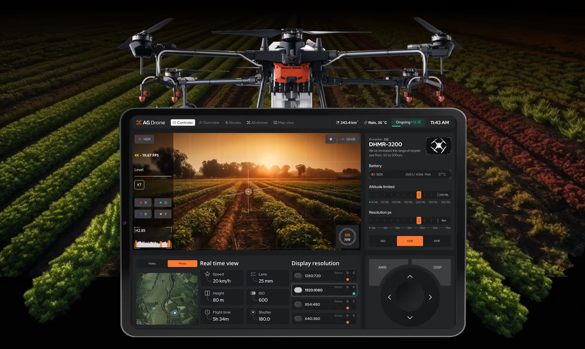
The pinpoint accuracy and 4k camera provided the ultimate visual canvas for Fuselab designers to work with. With real-time data collection we were able to build in a data visualization feature for exceptionally user-friendly graphics and monitoring systems.
Additionally, because this technology can be deployed from anywhere, users can remain indoors, miles away from the site of interest and still manage operations with ease.

Real-time data and notifications are delivered according to the user’s needs and a unique set of iconography and color coding was designed to provide an obvious visual hierarchy to all the information provided.

Every visual element needed to indicate its own usage in a 100% intuitive fashion. Users needed to be able to take action upon first usage with little to no training at all.

The task and schedule features were designed to be manipulated with simple swipe gestures or a maximum of two clicks/touches for each task setting.

Real-Time
Overview
A large live video feed along with data visualization tools make this application a game changer.
With AG.Drone in hand, users can actually systematically plan their approach to land and livestock management according to weather patterns and real time data in a way that was not possible only a few years back.
The UX/UI design included real world testing in every possible environment, including rain and thunder storms and blistering hot weather as well.

The all-drone view allows pilots to see the entire fleet activity in real-time, while also allowing for addressing individual drone activities and warnings/issues.
Since we had access to users, we started with interviews to identify the most problematic areas first and then moved on to the more routine activities of drone management and successful flight patterns. With the ability to record changes over time, farmers can play a much more active role in getting the highest yield possible from their crops.

A highly sophisticated data visualization tool was included as just one of the many unique informational display options.
The data visualization graphics designed by Fuselab focused on real-world usability and supporting the needs of the agricultural community to make more informed decisions.

Dashboard
Almost every visual element of the UX/UI design contains an actionable insight or associated task for the user to take action on. The interface is as attractive as it is useful, and quickly becomes the most important tool in shed for land managers and agriculture staff that have only had their own first-hand experience to rely on before drone technology was introduced to this vital sector of the world’s economy.
3D graphics along with real photography were brought together to create a rich informational experience that inspires productivity and precise, action-oriented data visualizations.
Drone Management
To be as effective as possible in land management multiple drones are needed, especially for large farms and/or livestock management. As a result, our interface design and functionality allow for simultaneous management of multiple aircraft as well as real time flags for issues that need immediate attention.
For statistics details, users can select a specific drone from the list and drill down to find hour-by-hour activity details, locations, and types of activities indicated by contrasting colors for visual clarity throughout the app.

The drones table includes a list of all drones inflight and grounded along with the current types of activity taking place, battery usage, and numerous other critical details.

Notifications, including low battery warnings, low spray solution, or other types of mechanical issues are delivered via different levels of importance. We designed everything from flashing warnings to different types of sound warnings as well as a combination of flashing lights, sounds, and vibrations for critical messaging.

Route Management
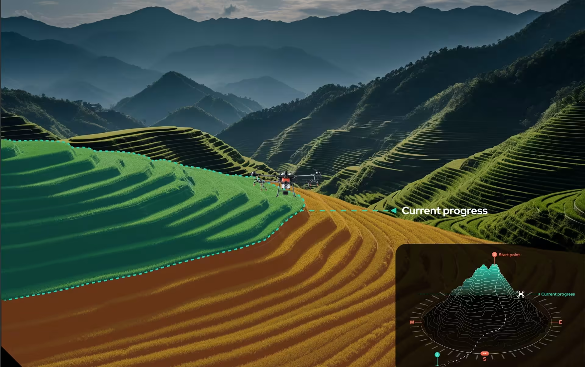
Unlike recreational drone software, this platform needed a specific and pixel perfect graphical design mapping system to allow users to understand what has been accomplished and what sectors have yet to be addressed.
All route activities are initiated through specific schedules and are video recorded and can be played back as needed to see the effectiveness of activities over time.

Route management is critical to both spraying and land management and observation.
The success of specific routes hinges on a lot of factors, such as speed and weather. Every detail is logged for each route allowing users to make the best use of each drone in action.

Map View
Not every user manages their drones the same. This is why it was important for us to design multiple types of user experiences, such as managing individual drones via real-time mapping or through minute-by-minute timelines.

Our visual progress graphics make monitoring drone progress simple, and the color-coded graphics give immediate visual progress feedback without having to read a single word or number.

The visual timeline, like any other project management software, uses a sophisticated Gantt chart style to give pilots a simple view of their entire fleet in seconds. Which makes decision-making and effective resource management a breeze.

Scheduler
The drone routes scheduler dashboard interface offers real-time tracking and optimization tools for efficient and safe drone mission planning.

Designed by:
Art Direction
George Railean
Project management
Vladimir Bobu
Design
Marcel Sendrea
Lina Ghimp
Do you want to create something similar?
Get a free estimation for your project requirements and start it within 24 hours.
Related Services and Solutions
Don't Listen to Us, Read What Our Clients Are Saying.
We know that trusting an outsider with your vision can be scary. This is why if you're not satisfied with us after the first two weeks, you can walk away owing us nothing.
"We went from prototype to usable software lightening fast, and our customer reviews have never been better."
"Their creativity and mastery of UX UI design has made our years of working together enjoyable and incredibly successful!"
"If you need to re-think your product and need some truly unique design talent , Fuselab Creative design team is your answer."
"We needed a nimble team of UI UX designers to work with our development team and they quickly became one of our most vital resources and far exceeded our expectations."