Health Monitor Application
Change the approach to Electronic Healthcare records to meet the needs of the modern provider’s needs.
How can we take
what is currently available in the EHR space and make it more effective?

Challenge
Create a patient electronic healthcare record that is interactive and that can house all of the data currently included in current EHR systems.

Strategy
There were two UI/UX design principles that we needed to address first, and they were: 1. Data Density and 2. Speed of Use. Medical providers need as much critical data as possible, while not be overwhelmed or confused, and the utility of the dashboard needed to be self explanatory. Working in an ER does not provide a lot of free time for learning new technologies.
Problem Statement
Create a patient electronic healthcare record that is interactive and that can house all of the data currently included in current EHR systems. We began addressing this task by listing, grouping, and organizing all of the components that were going to be required to create a system that is as comprehensive as possible. As a UX design agency we were quite used to conducting this kind of research, but quickly realized the enormous design task that was in front of us.


UX/UI Design Strategy
Beginning with Sketches and low fidelity wireframes.
The design process begins with hundreds or rough wireframes. Some of the wires were simply data visualization blocks that showed how many different ways we could illustrate the same health record data. While other wires included full mock-ups of landing areas with high-level patient data, critical data, and the most recent medical interactions or events with a particular patient. One of our primary goals during this process was to find a way to simplify and reduce the amount of clicks or touches needed to satisfy the medical provider’s immediate needs.
Integral to our UI design was that whatever gets built needs to address the medical provider’s need to multi-task, such as looking at labs, notes, orders, tests, exams and see these kinds of information at the same time in one simplified view.
Our UI design strategy began by taking the approved UX wireframes and reducing them down to their most intuitive functions and then designing a series of data visualizations, iconography, and meaningful color theory based design to play well with what the medical community has become accustomed to. Additionally all the panels you see can slide up or down to discover more data.

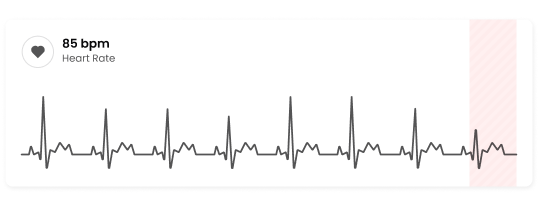
Heart rate
Banded red bars illustrate heart rate deviation.
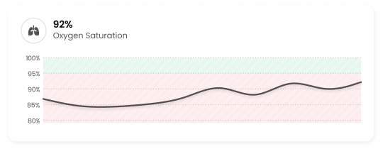
Oxygen Saturation
Upper levels indicate the healthy saturation and the solid line indicates a consistent regimine of testing.
Results
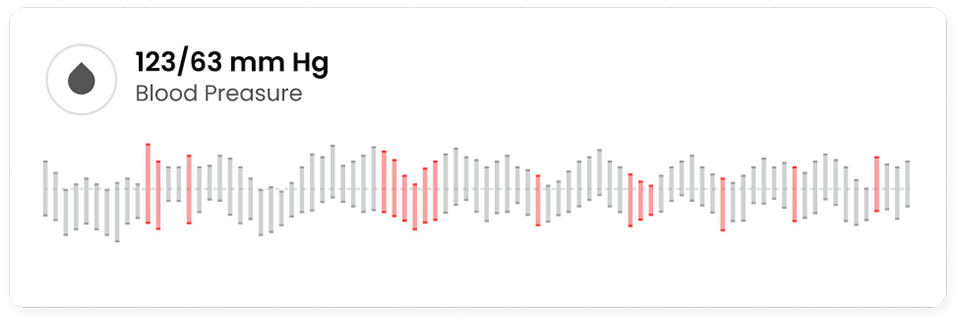
One of the key results we found when working with the medical community is that the more dense the data is the better. Doctors and nurses are looking for signals in the noise, and feel more confident in their decision making when provided with enormous amounts of data.
The boxes below show the maximum amount of data for different vitals over time in the least amount of space. For example, the blood pressure data visualization shows each time blood pressure was taken, the highs and lows, abnormal readings in red, and the baseline for a healthy marker across the middle of the graph.
Is indicated on each test at the bottom of each line and systolic pressure indicated by the height of each line. Red being used to indicate abnormal reading.

Labs
The Ma (Mass) and Ca (Calcium) variables play crucial roles in understanding the body's composition and overall health.
Imaging
Body imaging techniques provide a fascinating glimpse beneath the surface, revealing the intricate landscapes of our internal anatomy with remarkable detail and precision.
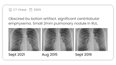
Notes & Graphs
To better treat patients, all current patient data has been converted into a one-page visual summary with live links to X- Rays, MRI’s, and other important patient data, and depending on the date selected this patient’s information can be viewed over time, significantly adding to the value of this kind of system.


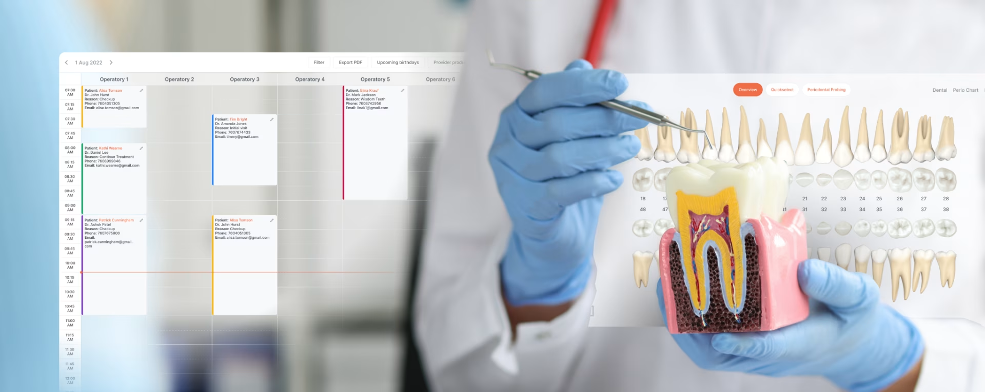
Departments Scheduler
Scheduling has been the Achilles heal of the medical community for as long as there has been waiting rooms. Including a scheduling interface that can be viewed by department, provider, or patient was essential.

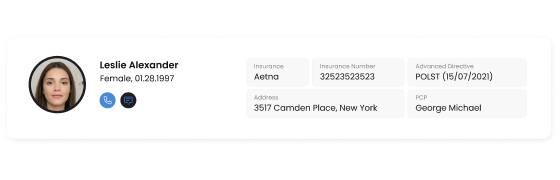
Pacient
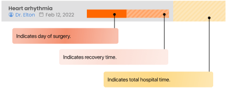
An important aspect of tracking some conditions such as heart arrythmia is daily monitoring to detect when and how often fluctuations take place.
Color Coding
Color coding, size of blocks, and types of patterns are added to results to give the most information in the least amout of space
Departments/ Management
Department specific view can be adjusted to see capacity by day, week or month, while also viewing the increase or decrease in appointments within the same category of time.

Designed by:
Art Direction
George Railean
Project management
Vladimir Bobu
Design
Marcel Sendrea
Lina Ghimp
Do you want to create something similar?
Get a free estimation for your project requirements and start it within 24 hours.
Related Services and Solutions
Don't Listen to Us, Read What Our Clients Are Saying.
We know that trusting an outsider with your vision can be scary. This is why if you're not satisfied with us after the first two weeks, you can walk away owing us nothing.
"We went from prototype to usable software lightening fast, and our customer reviews have never been better."
"Their creativity and mastery of UX UI design has made our years of working together enjoyable and incredibly successful!"
"If you need to re-think your product and need some truly unique design talent , Fuselab Creative design team is your answer."
"We needed a nimble team of UI UX designers to work with our development team and they quickly became one of our most vital resources and far exceeded our expectations."