ORIP
How do you create an identity for the office that does all of the major infrastructure research for all the laboratory work that takes place across every center across the National Institutes of Health?
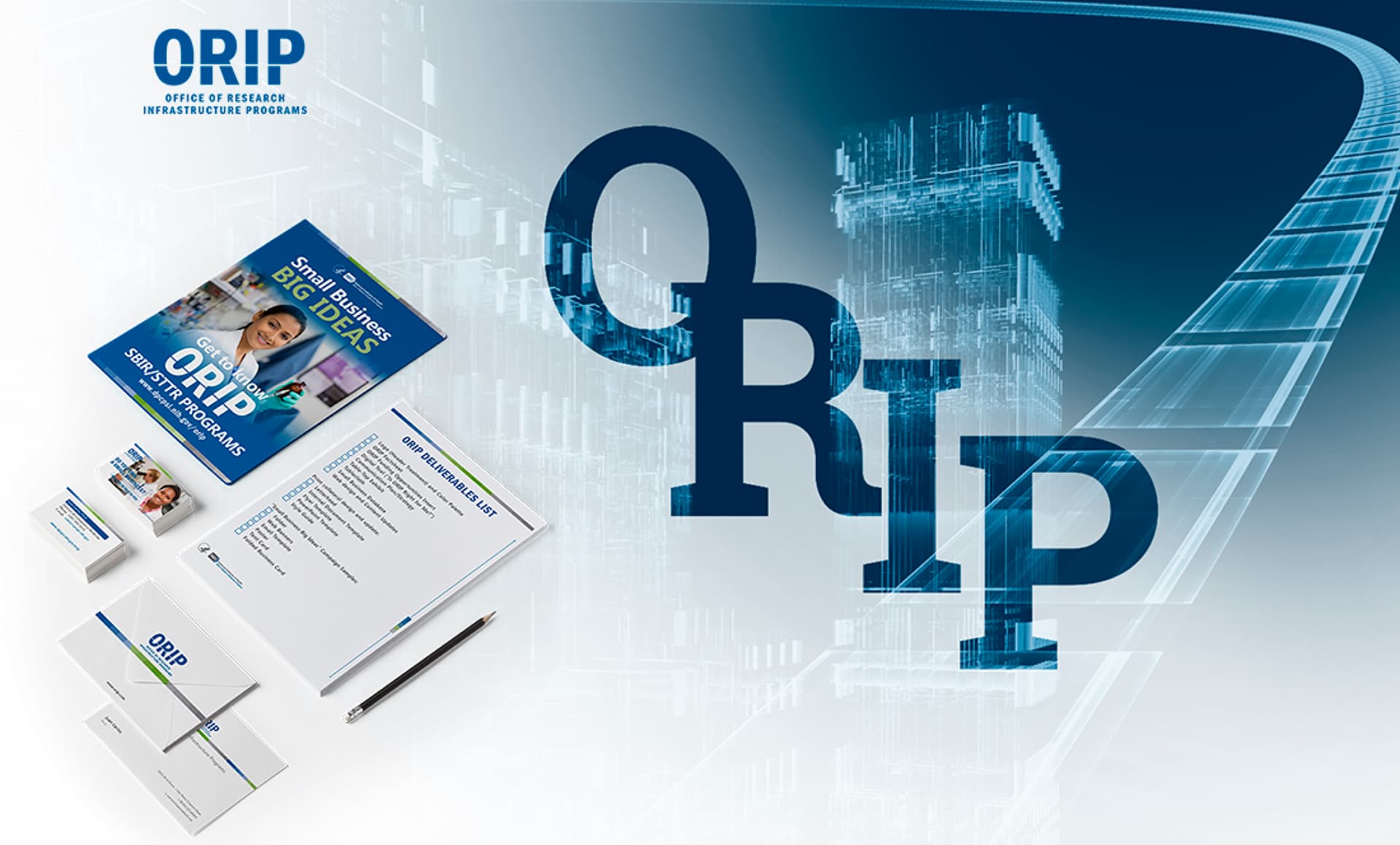
Creating a memorable identity and a easy-to-use collateral system that differentiates itself from all other NIH Offices, while still holding onto the one element that makes research possible: The human element.
Branding
The Beauty of Simplicity
There is a fine line of thought, research, and progress that ties together everything ORIP does into a tight-knit, multi-disciplinary office at NIH. In the end, it was this line – seen cutting across the logo, that tied together everything we designed for them; it was this simple yet elegant theme that brought this identity system to fruition.

Branding
Colors & Typography
A subtle use of color and traditional fonts mixed with a clean use of white space and a modern approach to design.

Branding
A Thin Gray Line
All of the communications collateral ORIP had before this project seemed to be about cramming as much information in as little space as possible. We went in the completely opposite direction. A thin line of demarcation weaved throughout their brand and content blocks was used to visually guide the reader and reinforce a focus on clean, well organized design layouts.

Communications
All Facts Start Out as Ideas
A subtle use of color and traditional fonts mixed with a clean use of white space and a modern approach to design.

Communications
All Facts Start Out as Ideas
A subtle use of color and traditional fonts mixed with a clean use of white space and a modern approach to design.


Communications
All Facts Start Out as Ideas
A subtle use of color and traditional fonts mixed with a clean use of white space and a modern approach to design.

Designed by:
Art Direction
George Railean
Project management
Vladimir Bobu
Design
Lina Ghimp
Do you want to create something similar?
Get a free estimation for your project requirements and start it within 24 hours.
Related Services and Solutions
Don't Listen to Us, Read What Our Clients Are Saying.
We know that trusting an outsider with your vision can be scary. This is why if you're not satisfied with us after the first two weeks, you can walk away owing us nothing.
"We went from prototype to usable software lightening fast, and our customer reviews have never been better."
"Their creativity and mastery of UX UI design has made our years of working together enjoyable and incredibly successful!"
"If you need to re-think your product and need some truly unique design talent , Fuselab Creative design team is your answer."
"We needed a nimble team of UI UX designers to work with our development team and they quickly became one of our most vital resources and far exceeded our expectations."

