Vasolabs
Create a healthcare platform to help diagnose major vein and artery health through a ultrasound-based artery scan for use by medical technicians, medical providers, and the patients themselves.
The Fuselab strategy was focused on helping users identify localized plaque, and then to further help illustrate these problem areas with 3D medical visualizations. Via the combination of visuals and informative data/information, patients and medical providers can take health-related action along with their patients.
User Flow
Vasolabs is dedicated to promoting heart health by providing innovative, easy-to-access test. They empower people with insights into their vascular health for early risk detection.
Fuselab helped Vasolabs design an exceptionally effective and personalized platform and report to help with early detection of heart disease risks.
The results provided, both real-time data and visuals, along with high-impact data visualizations help medical providers tailor a treatment plan to reduce the risk of heart attack or stroke, which is the leading cause of death and disability across the world.

Dashboard
The medical dashboard design employs the hierarchy data approach, featuring the most important information in the primary box at the top and color coding the benchmark data along with the patient data for easy reference over time.
An insights area was created to use as a reference point for patients and clinical technicians to better translate testing data and contributing factors.

Results come in many different types of data and visuals. We created a 3D model to illustrate the layers of arteries, the types and severity of plaque, and how the plaque can reduce blood flow.
Below you can see additional plaque illustrations for both left and right arteries, the amount of blockage broken down into percentages of severity, and color-coded to indicate the most problematic areas that providers and patients need to address immediately with prescribed lifestyle and diet changes.

Vasolabs scan results can be confusing for patients to decipher between what is considered healthy and what are signs of a potential or existing health issue.
Our dashboard clearly displays the patient’s vascular age versus that patient’s actual age, which helps a patient understand their risk status for developing cardiovascular disease.

Illustrations of arteries were designed with color layers to indicate percentages of blockage or plaque found. The scans require a technician to decipher the results.
The artery illustrations Fuselab designed make it easy for anyone to see where there are areas of concern and where there is healthy tissue.

Vascular disease does not happen overnight, and the tracking of plaque over time is the key to discovery a possible health risk. The line chart medical data visualization we designed offers an immediate comparison with healthy biomarkers along with a calendar to see the progression or lack of progression over time.

Artery Details
The artery details page includes actual scan film, along with a breakdown of each artery scanned. Again, we’ve included the references of healthy artery results for comparison. The hospital dashboard design artery diagnosis includes numerous types of measurements and data collection, such as artery elasticity and diameter of free flow areas, all of which can be overwhelming. This is why most of the medical data analysis is broken down into percentages along with a simple risk-table for effective data analysis.

Progressive disease where cholesterol and other substances accumulate in the arteries, forming plaque that can restrict blood flow.

Nobody, other than a trained medical technician can understand the images below. However, anyone looking at our medical device UI of the colorful arteries depicted above can quickly see and understand the amount of blockage of this current patient profile. While more sophisticated users can look at actual scans and judge for themselves. Both options are available in our design for this healthcare product.

C-IMT Details
The Carotid Intima Media Thickness (CIMT), indicates an arteries level of inflammation. Engaging with the medical UX design we created allows technicians the ability to quickly dig into the data visualization to discover potential carotid artery issues. Most issues are not reversible but with treatment, they can be stalled and consequently allow patients to live healthy lives without future health problems.

As is the case with most data visualization dashboards and software, it is important to find the anomalies in the data and the track those anomalies over time to discover if they present any real health risks.

General population data is included throughout our digital healthcare platform to give patients a reference point for their results, and if needed to seek further diagnosis from heart health providers.

Reports History
Medical providers can prescribe medications and lifestyle changes all they want, but if the patient doesn’t follow the guidance and take the medicine as prescribed there’s only so much a medical provider does.
The good news is that regular follow up scans over a significant period of time allow providers to discover patients’ willingness to follow directions within their historical report, and if needed, prescribe more drastic medical procedures and protocols.

General population data is included throughout this medical device platform to give patients a reference point for their results.

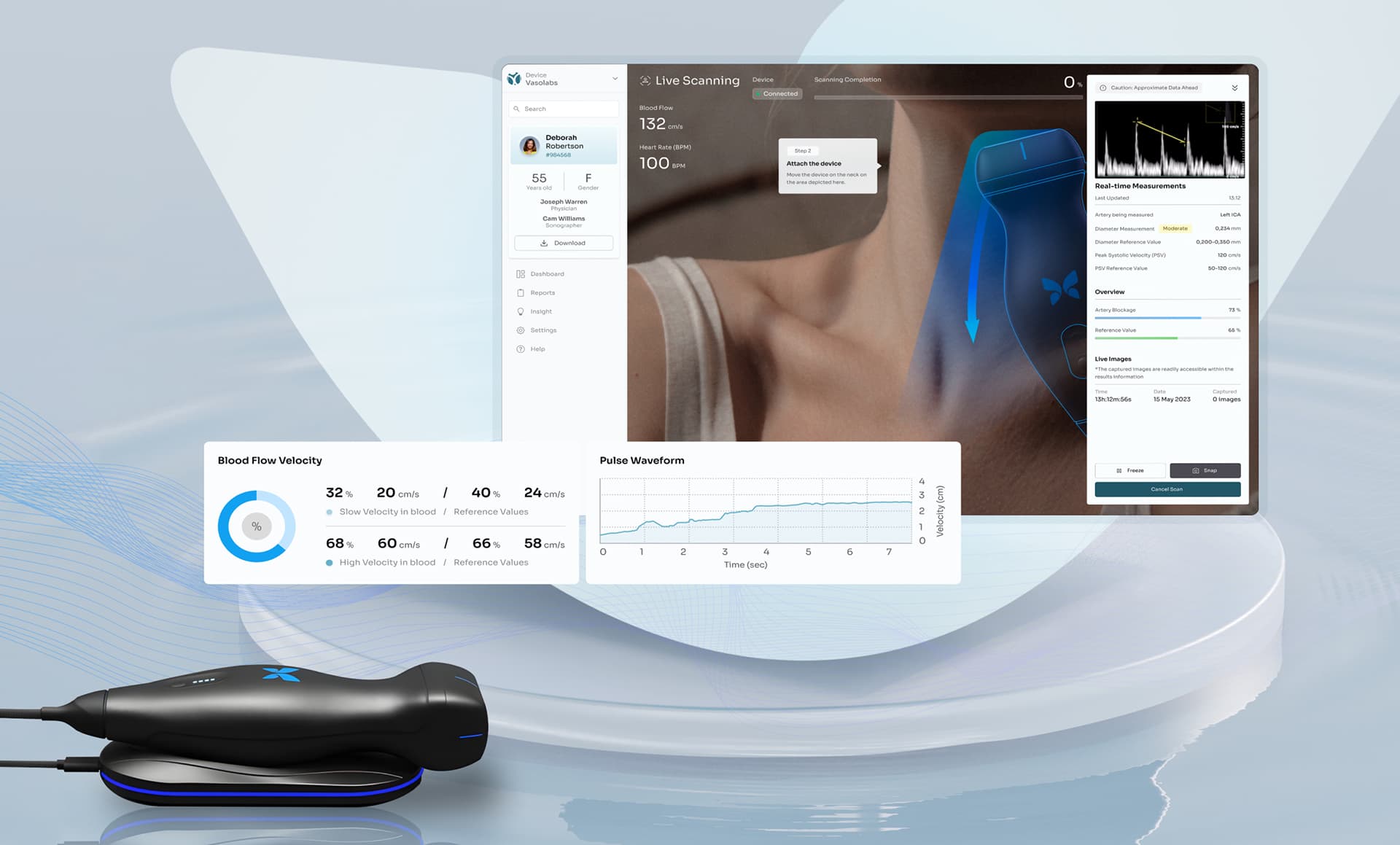
Live Scanning
A medical device interface was created, along with real-time data to view a live scan as it is happening. Live measurements and images are uploaded to allow the technician to focus on potential areas that pose a health risk according to the data collected.

The entire platform we designed to work equally as well on a touchscreen as it does use a desktop and mouse. All the live images can be viewed remotely for guidance from technicians at remote locations and to allow for real-time conferencing.
Blood flow velocity is a direct result of the lack of or presence of blockage and/or constriction of the arteries, and is one the main indicators used by medical providers.

Pulse wave analysis allows for the accurate recording of peripheral pressure waveforms and generation of the corresponding central waveform and provides the resulting data.

Real-time measurements happen throughout the scan session and are immediately uploaded here to give technicians a record to share with other medical providers and the patient.

Designed by:
Art Direction
George Railean
Project Management
Vladimir Bobu
Design
Marcel Sendrea
Lina Ghimp
Do you want to create something similar?
Get a free estimation for your project requirements and start it within 24 hours.