11
min read
11
min read
 Oct 23, 2026
Real-time dashboard design for live operational data (2026)
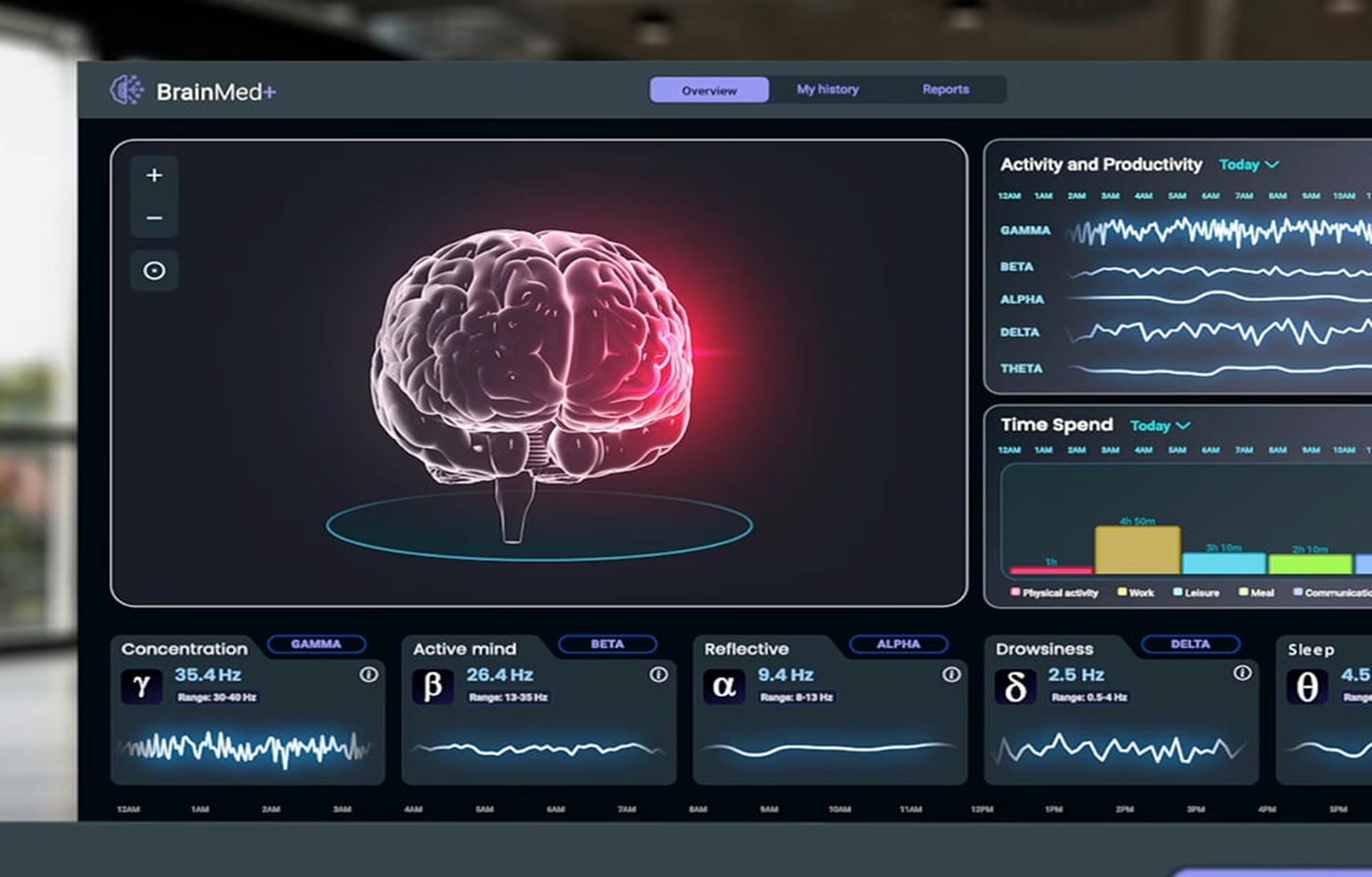
Real-time dashboard design is the practice of building data interfaces that update continuously as new information arrives, so operators can read live conditions and act on them without reloading the page or waiting for a scheduled report. The hard part is almost never the data pipeline, which is now largely a solved engineering problem, but the interface decisions that determine whether a person under time pressure actually trusts what the screen is telling them, and if they don’t, you might as well give up now.
What makes a dashboard “real-time”?
A dashboard is real-time when data arrives quickly enough to act on before it goes stale, and that speed varies by decision. A traffic operations center needs a new reading every few seconds, because delays compound into risk. A logistics dispatcher may need one only every few minutes. Both are real-time for the decision they serve.
Most teams collapse real-time into one category when there are really three. Streaming data arrives continuously and renders as it lands. Near-real-time data batches in small windows of a few seconds to a few minutes. Periodic polling, which most legacy systems deliver, refreshes on a fixed interval. The question that matters is how fast the person needs the data, not how fast the system can deliver it.
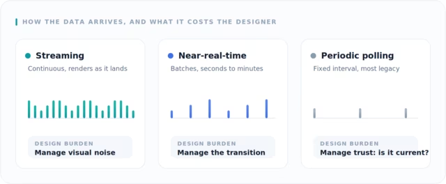
The three cadences carry different design problems.
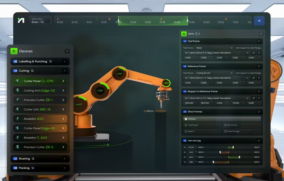
A streaming dashboard has to manage visual noise because something is always moving. A periodic one has to manage trust because the user has no way of knowing whether the screen is up to date. Our design inspiration gallery shows streaming screens, from drone command centers to network monitoring.
The four forces of real-time dashboard design: freshness, stability, context, and trust
Real-time dashboards have to balance four forces at once: freshness, meaning how current the data is; stability, meaning whether the screen holds still long enough to be read; context, meaning whether live values sit beside the history that explains them; and trust, meaning whether the interface signals how much to believe what it shows. A dashboard that optimizes one force and ignores the rest falls apart under pressure.
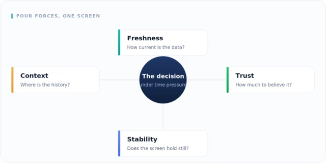
These forces do not deserve equal attention. Freshness is the one every team optimizes first and the least interesting, because faster data is instinctual. Let’s face it, we are all now a race of impatient people. The dashboards that fail in production almost always fail in terms of stability and trust, which is where the rest of this guide focuses.
Freshness: match the refresh rate to the decision, not the data
Freshness is matching the refresh cadence to the decision cadence, not to the maximum the pipeline can push. A screen refreshing every second does not automatically create a better experience. Nielsen Norman Group’s research on response-time limits is a useful reminder here: past a point, a value that changes faster than a person can read it stops being information and becomes flicker.
Stability: stop moving the screen while someone is reading it
Real-time dashboards succeed or fail at the moment the numbers change while a user is interacting with the screen. People rarely stare passively at a dashboard. They are investigating an incident, comparing a trend, or making a call. If charts jump, tables re-sort, or alerts vanish mid-task, the interface feels untrustworthy, no matter how accurate the underlying data is.
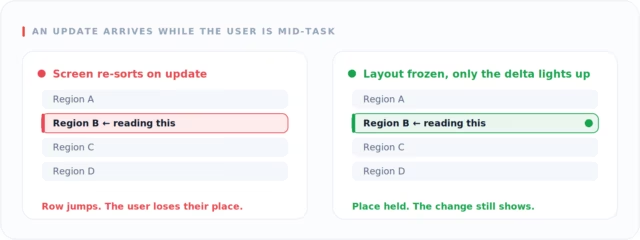
Picture an operations manager comparing delivery delays across several regions. If the table re-sorts every time a new record lands, the manager loses their place on every refresh and stops trusting the view. Sometimes the right real-time choice is to hold the screen still while someone is working and to surface the change quietly instead. Stability is a design decision, not a missing feature.
Context: a live number means little without the history behind it
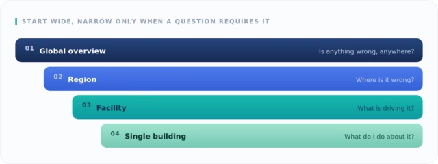
A current value alone cannot tell anyone whether it is normal, rising, or already a problem, so live data has to sit alongside the history that gives it meaning. The most reliable way to deliver both is progressive disclosure, the pattern documented by the Nielsen Norman Group: an overview first, then details on request. On the EffiTrack energy platform we built, operators start with a global view and move down to regions, facilities, and individual buildings only when a question requires it.
Trust: show the interface’s own confidence in what it displays
Trust is the force teams ignore most and the one that decides whether a dashboard gets used. It comes from calibrated responsiveness, where the interface tells the user how confident it is in what it is showing right now. A timestamp, a pulse that fades as data ages, and a distinct state when a feed drops all do the same job that confidence scores do in AI systems. They tell the user when to act and when to wait.
The failure case is the one most designs ignore. When a feed drops and the screen keeps showing last-known numbers with no visible change, a user cannot tell the difference between “nothing is happening” and “nothing is arriving.” Both look identical, and trust collapses the moment freshness is no longer visible. The fix is a state that looks distinct from normal operation without appearing to be an error, because a stale feed is usually a late batch or an offline sensor, not a crash.
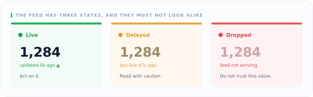
A dropped feed must not look like a calm one. A timestamp that stops advancing, a color shift, or a small banner confirming when the feed was last live signals degraded confidence without raising a false alarm.
Signal versus noise: what earns a place on a live screen
On a live dashboard, every moving element competes for the operator’s attention, so the real design question is not what data could be shown but what earns the right to move on screen. Anything that updates without changing a decision is noise, and noise costs more on a real-time dashboard than on a static one, because it moves, and the eye is drawn to its motion.
On Smart Streets, a traffic-management platform we designed, operators monitor live conditions, video feeds, and incident alerts across multiple intersections and city streets simultaneously. Color carried the priority: red separated major incidents from minor ones so an operator could read severity at a glance, often under a tight deadline, before consciously searching the screen. Prioritization, not more live data, is what made the dashboard faster to use under pressure.
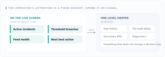
Noise control is the same problem as alerting. When a metric crosses a threshold, the cost of interrupting the task is weighed against the cost of a missed alert. Everything that does not change a decision is pushed one level deeper.
How AI is changing real-time dashboards: from monitoring to investigation
The biggest shift in real-time dashboard design is that the screen no longer assumes a person watching it without pause. Detection now runs inside the pipeline, so a model flags an anomaly, the dashboard highlights it, and the operator goes straight to investigating what changed. The screen’s job moves from showing everything live to surfacing the few things that deserve a human’s attention.
This extends the attention budget rather than replacing it. A person cannot scan a wall of live metrics for a full shift and reliably catch the one reading that matters, so continuous watching was always the weak point of operational monitoring. Moving detection into the pipeline spends machine attention on the watching and saves human attention for the judgment, which is the part a model cannot do on its own.
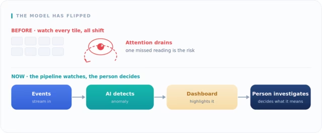
This raises the stakes on trust rather than lowering them. An anomaly flag that arrives with no confidence level and no reason trains operators to either chase false alarms or ignore the system, and alarm fatigue kills more monitoring tools than missed events do. The dashboard has to show why something was flagged and let the operator confirm or dismiss it, which is the same calibrated-responsiveness problem the trust section described, now applied to the model.
The caveat is the one that governs noisy data. An anomaly detector that fires too often recreates the noise problem one level up, so the model needs the same calibration the screen does. The most reliable pattern keeps a person in the loop: the model narrows the field and ranks what to look at, and the person decides what it means. Good AI dashboard design is built around that division of labor.
When real-time dashboard design is the wrong choice
Real-time dashboard design is the wrong choice when the decision it supports moves slower than the data, when a fast reaction to a noisy signal costs more than a slower correct one, or when no one is actually watching the screen. In those cases a periodic report, a digest, or a threshold alert serves the reader better than a live feed that demands constant attention.
The first case is a mismatch of cadence. If a number is reviewed once a week, a per-second feed adds infrastructure cost and cognitive load without improving a single decision. The live motion becomes a distraction that competes with the work, and the dashboard ends up measuring activity nobody acts on between reviews.
The second case is noisy data. A live feed invites fast reactions, so presenting a volatile, low-confidence signal in real time manufactures false urgency and pushes people toward over-correction. A smoothed periodic view, or a feed that waits for a signal to confirm before it surfaces, protects the reader from reacting to nothing. Speed is only a virtue when the reaction is.
The third case is an unattended screen. A real-time dashboard assumes a person in the loop who reads it and acts. If the screen sits unwatched on a wall most of the day, the honest pattern is an alert that reaches a specific person on a specific channel, not a live view that depends on someone happening to look up at the right second.
What real-time dashboard development actually requires
Effective real-time dashboard development depends more on interaction design than on the data pipeline. Getting current data from sensors, cloud platforms, and legacy systems is a genuinely hard engineering problem, but enough vendors have solved it that it no longer separates a good dashboard from a bad one. What separates them is what the interface does the moment that data lands.
Responsiveness has two parts, and teams usually build only the first. Interactive responsiveness means that when a user clicks a number, the dashboard shows both the live value and the historical context behind it, which is where strong dashboard development and clear data visualization meet. Calibrated responsiveness, the harder half, is the screen visibly telling the user how much to trust what it currently shows.
One question decides whether a real-time dashboard stays usable under pressure: what happens to the screen while someone is interacting with it. Does the chart keep moving under their hands, or does interaction pause the feed to give them a stable target? Is a stale feed shown as quietly delayed, or does it look identical to a healthy one until someone notices the timestamp has not moved? Those choices decide trust as much as the technology does.
Real-time dashboard design is not about making data move faster. It is about helping people see what is changing, trust what they are seeing, and act while there is still time to matter. The teams that do it well design for freshness, stability, context, and trust together, then decide, deliberately, when the screen should hold still.
Frequently asked questions
What makes a dashboard real-time?
A dashboard is real-time when information updates quickly enough to support the decision in front of the user, which might mean seconds in a traffic operations center or minutes in a sales review. Real-time is defined by the decision it serves, not by how fast the system can technically refresh.
What is the hardest part of real-time dashboard design?
The hardest part is the moment data changes while someone is reading the screen, because charts that jump or tables that re-sort make the interface feel untrustworthy regardless of data accuracy. The difficulty lives in interaction and trust design, not in the data pipeline.
How is real-time dashboard design different from standard dashboard design?
A real-time dashboard adds a constraint that standard dashboards never face: the screen changes while the user is reading it. A standard dashboard presents a stable snapshot, so the work is layout and hierarchy. Real-time work also has to manage motion, data freshness, and the user’s trust in what is shown right now.
How is a real-time dashboard different from a real-time alert?
A real-time dashboard gives a person a continuous live picture to monitor and investigate, while a real-time alert interrupts that person only when a specific threshold is crossed. Dashboards suit attended monitoring, and alerts suit conditions that need attention but not a screen someone watches all day.
How often should a live dashboard update?
A live dashboard should update as often as the decision needs new information and no faster. Some operations need second-by-second updates, while many work well refreshing every few minutes. Past the point where a person can read a value before it changes, faster updates reduce usability instead of improving it.
Can a dashboard update too fast?
A dashboard can absolutely update too fast. Past a certain rate a changing number reads as flicker rather than information, and updating faster than the screen can redraw mid-interaction interrupts the user and erodes trust in the live data. Matching the refresh rate to human reading speed matters more than raw speed.
How do you keep a real-time dashboard from feeling chaotic?
A real-time dashboard stays calm when only decision-relevant metrics are allowed to move on screen and everything else is pushed one level deeper. Clear freshness signals, stable layouts during interaction, and color reserved for genuine priority keep operators oriented even as conditions change.