The “X” Factor — Why UX Design Can Make or Break Your Website

With poor UX design, your site ruins everything. It kills your conversions and motivates your visitors to turn back and seek refuge in social media, opting for Twitter’s incessant and constant barrage of never-ending conversations rather than having to deal with your disastrous site design.
“UX Fails“, like failed businesses, are a dime a dozen. For every thoughtful website design that blows all expectations out of the water, 10 others bombed. So common is it that there’s an entire Tumblr account dedicated to capturing these spectacular fails. You would also
But while you’re sitting there at your UI/UX design agency in Washington, DC, sort of smug, contemplating these examples over lunch, maybe thinking how obvious these mistakes are, you might want to consider these statistics. Because, even if you’re doing everything “right”, there’s always a chance for you to make it better.
- “Gimmicky” works: To lower their bounce rate by 15%, Time.com adopted a continuous scroll
- Listening is key: ESPN raised their revenues by 35% after incorporating user suggestions into their homepage design
- The details matter: Consistently using only one specific shade of blue allowed Bing to generate an additional $80 million in annual income
- Once bitten, twice shy: 88% of online consumers will think twice about returning to a website after a bad experience
- Time is money: Slow-loading sites routinely cost retail companies around $2.6 billion in lost sales each year
- Looking good: A website’s “overall aesthetic” contributes to 75% of its perceived credibility
- Rising expectation: 85% of adults expect that a mobile experience and website will surpass the desktop design
- It’s surprisingly easy to beat the competition: 70% of 200 business websites surveyed failed to display clear calls-to-action for email sign-ups, content upgrades, how-to guides, demos, and interactive tools.
Source: InVision App
UX for Dummies
Because the word “design” is thrown in with “UX”, we automatically think that experience is limited to how things look and feel.
However the mechanics of UX design audit are far more subtle and often involve finding problems to solutions, mapping processes to fulfill customer intentions, and balancing business goals like revenue, conversion, and traffic.
Why does this all matter?
Because a website’s experience encompasses several different interactions and moments, all wrapped together to produce a perception of the brand or business behind the site’s design.
Decisions like…
- Including pop-ups
- Designing the navigation on menus
- Creating an articulate sequence of actions a user is guided to take as they discover and explore your site
- Evoking particular thoughts and feelings when a user is trying to accomplish a task or complete an action
— these all affect whether a user is going to return at all, and, even if they do, how strong a connection and relationship they form with the brand.
Cognitive scientist Don Norman, the former VP of the Advanced Technology Group at Apple, had this to say on the inclusions of UX:
“I invented the term because I thought Human Interface and usability were too narrow: I wanted to cover all aspects of the person’s experience with a system, including industrial design, graphics, the interface, the physical interaction, and the manual.”
Read also our article about why UX is important for your business.
A Wrinkle in Experience
Norman’s definition is really useful because he was struggling to come up with a term that blended “human interface” with “usability” and a score of other ideas and functions. That elucidates something important to us and something that is so often overlooked in UX design services: done well, UX is a form of human-centered design.
And, often, a “wrinkle” in experience occurs because we get caught up in the techniques and forget there are humans at the core of a particular design process or decision. Numerous ingredients go into user experience design. Getting each of these components “right” is only one part of it.
The other is having each of these components sync seamlessly with each other. And, once you’ve done that, you’ll have to consider whether your ingenious engineering looks good by wrapping it in a UI design that enhances the customer experience.
Information Architecture
So, what exactly is information architecture?
As the name suggests, information architecture gives designers the chance to articulate what the most important and relevant information is, right up front, and then create a design and user flow that demonstrates this “hierarchy”.
Organizing a website’s content in a manner that not only makes sense but guides and persuades your user to take certain actions or reach certain conclusions is key. At the same time, it’s also about giving them important context and brand information at the right points.
This is one of the website design tips that relies on the “star power” or recognizability of the main individual behind the brand. The site’s scrolling, logical sections, copy, calls-to-action, and information presented all assume that this is a user’s first experience with this person.
It then continues to implicitly convey to the user what the most important aspects of this individual’s expertise are and where a user might click to gain more information about this particular need. By doing this, it is also vetting the user, asking, “Are you here for these purposes? If so, scroll on. If not, this is not the site for you. Essentially, the information architecture acts as both an introduction to a brand and a kind of lighthouse for the ideal customers.

By doing this, it is also vetting the user, asking, “Are you here for these purposes? If so, scroll on. If not, this is not the site for you. Essentially, the information architecture acts as both an introduction to a brand and a kind of lighthouse for the ideal customers.

It ends with a call to action to sign up.

The next example is similar but introduces a service where the main individual is not the focus of the brand.
Rather, the solution being presented (i.e., the service) is. Right away, there is an offer for the client to benefit.

Once they scroll down, they’re instantly hit with social proof. And, here again, is the chance to self-select, for the user. If they know who Marie Forleo is, they’re in the right place. If not, this might not be the right brand of service provider for them. Without information architecture, the user cannot decide as to whether to continue.

Content Strategy
When it comes to the user experience, content strategy is all about forming a connection and building a relationship with your end-user by providing high-quality, highly actionable content. This can be in the form of blog posts, podcast episodes, content upgrades, guides, “how-to” videos, and more. To form the right content strategy, there are four main components that any good UX design agency in Washington, DC should incorporate for their end user.
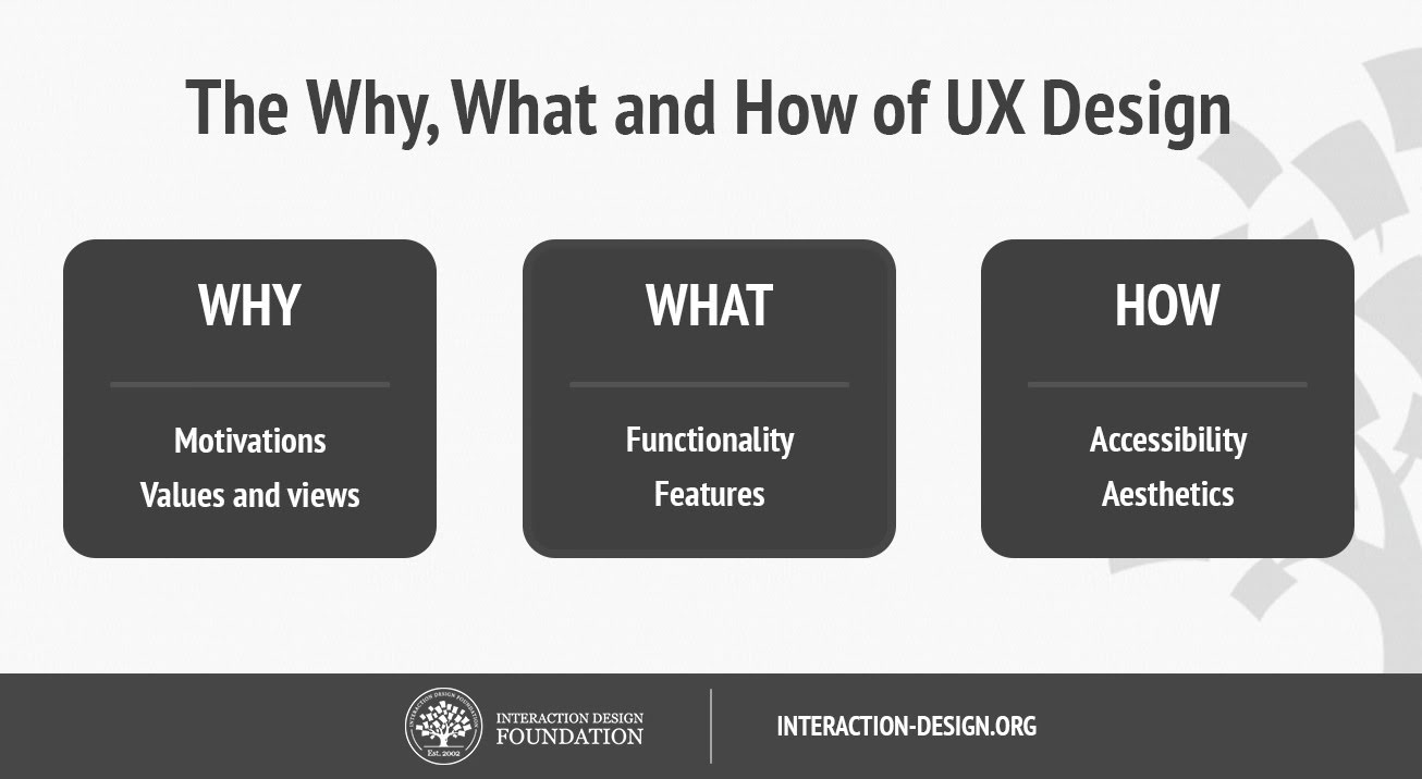
Known as the “Content Strategy Quad”, this diagram explains the various aspects of content strategy that must be articulated. It corresponds to the questions, “How?”, “Why?”, and “What” that designers focusing on content will be asking themselves when trying to bring a website’s goals and visual identity into their content strategy.
One of the reasons our UX design agency in Washington, DC focuses on content strategy is because it is such an integral part of a website’s identity and value.
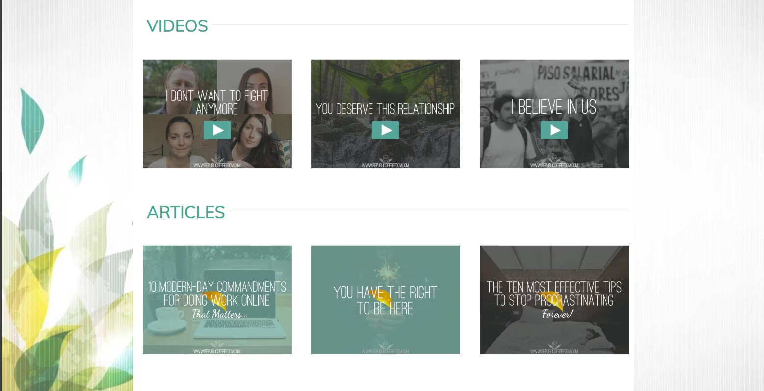
/services/interaction-design/Nowhere in the information architecture does the call-to-action to learn more about coaching services even appear. This is part of the brand’s UX strategy, via content. This particular website’s experience is telling the user: “It’s all about you”.
Interaction design
Interaction design is a subset of UX design. It’s all about how your users are flowing through your website. This matters a lot because it tells you if they’re being guided along the journey you would like them to flow through.
(Example: Land on homepage > Learn more about Services > Reach out using contact form) or whether they’re randomly clicking through your website with no intentional action. Improving your interaction design through specific buttons, icons, calls to action, offers on opt-ins, and motivating copy can help capture your users in a sales funnel, guide them to reach out, or help them decide on what they’d like to do next.
Usability
A site’s usability comes down to the aspects of design you barely notice are there. However, when these elements are not working, your user will end up experiencing frustration rather than pleasure when going through your website. This includes loading times, navigations and menus, downloads, buttons, updated links that connect to and take the user where they expect to go, and more.
Usability is also about whether individual users understand how to use your website.
For example, if they’re being guided to a contact form to inquire about a service, but it looks like what they might think a sign-up form looks like, that’s a usability snafu.
Visual design
Visual design is all about the graphical and visual elements that surround the user experience.
From the site’s design and its specific user interface to its transitions, how it flows from one screen to another, the visual elements that surround its pop-ups and calls-to-action, the blog design and functionality — these all demonstrate a brand’s visual design.
It’s an opportunity to cement in the user’s mind, through consistency and familiarity, a brand’s specific look and feel. But, as we saw in the example within the information architecture section, it’s also an opportunity to hit home a brand’s expertise and utility.
What is this brand or business known for? That is what visual design helps play up.
UX, UI, interaction design, behavioral psychology, industrial design, information architecture, software development, and spatial experience — these are all converging upon each other in an interdisciplinary relationship.
Our UX design agency in Washington, DC helps brands make an impact on their users and audiences by leveraging our expertise in these cross-pollinated spheres.
The point of great UX design is not to define these boundaries but, rather, to bring the most common principles to work in a way that causes users to feel that their web experience is a positive and fluid one.
