Dashboard Design for Analytics

In today’s data-driven world, knowledge is power. It’s no longer enough to make bold business decisions based on gut feeling alone. Everything must be supported by data, and to make sense of data you need analytics.
More than that, you need an analytical dashboard. Although many people think that getting some kind of chart or graph that can be manipulated by filtering data is an analytics dashboard design inspiration, this is actually only of countless options when it comes to effective dashboard design for analytics.
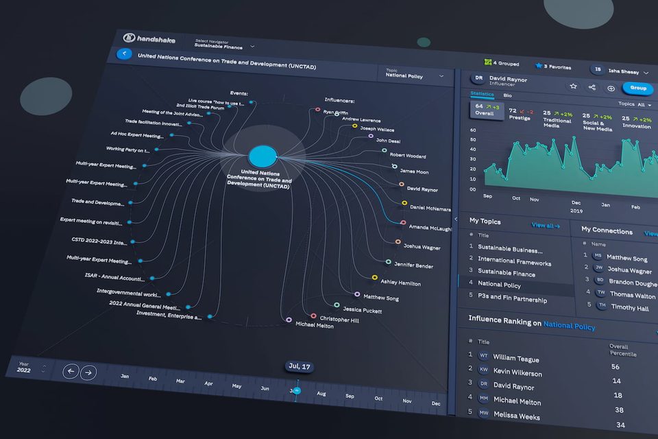
A dashboard allows you to access your analytics by presenting them within a group or package of information types that makes intuitive use of filters, custom comparison features, and other unique functionality.
In short, the dashboard systems translate hoards of data into digestible observations you can then use to achieve many goals:
- Uncover Trends
- Investigate Insights
- Predict Outcomes
- Gain Insight for Your Business
Without a dashboard guiding you, even the most useful dataset becomes cumbersome and unwieldy. Effective data analytics dashboard UI design is therefore absolutely vital for the interpretation of data that leads to better decision making.
Otherwise, you are left with data just grouped slightly better than a spreadsheet, but does not include the ability to manipulate the data, which is the exact point where the dashboard design services arrive to save the day!
Developing Intuitive Usability in Analytical Dashboards
So what does a good dashboard design for analytics look like?
Much like its automotive namesake, you should expect an analytical dashboard to give you the top-level information you need to make the day-to-day decisions around running your business, as well as producing reports for formal reporting structures like annual reports, board reports, and sales numbers.
Think about your car’s main dashboard items like the fuel level, oil pressure, and speed. Now think about other aspects of your car — like what goes on under the hood. You only need to see the essentials on your dashboard (and not everything else).
That would be information overload. That much data is unhelpful — particularly when you’re trying to keep your eyes on the road!
Like your car, a data analytical dashboard should give you, at-a-glance, access to the data most crucial to your role, or to the objective of you needs at a particular moment. It must also provide a straightforward way to navigate to more in-depth analytics when you need them After all, there are some times when you do need to pop your car’s hood and have a look inside, and the ability to do this comes directly from the combination of creative dashboard design and the genuine understanding of how to infuse your analytics dashboard design examples with intuitive functionality and user flows.

Getting to Know Analytical Dashboards
It is important to know the difference between analytical and operational dashboards. Operational dashboards use real-time metrics to measure progress towards a goal. For example, you can monitor conversion levels from sources such as email, promoted channels, and social media. Analytical dashboards parse large amounts of historical data to identify trends and set targets.
Quite possibly the most important outcome of a well-designed analytics dashboard is its ability to make better decisions. Given the long-term nature of collecting meaningful, statistically relevant analytics, analytical dashboards tend to be less time-sensitive than operational dashboards. They instead focus on helping you find meaningful patterns and useful insight into your data.
As a rule, analytical dashboards:
- Cover longer periods of time than operational dashboards
- Show wider trends and analytics based on historical rather than real-time data
- Allow you to easily export comparable data for closer analysis by data experts
Like any tool, the dashboard is there to make the tasks you need to complete easier and more efficient. This means facilitating your work rather than getting in the way of it.
Part of this goal is a presentation. In order for the data your business generates to be useful, you need to have an effective way of tracking, comparing, and analyzing it.
Who Uses the Dashboard?
When it comes to business intelligence dashboard best practices, it’s all about intuitive design. What a product manager understands when she looks at a chart could be wildly disparate from what the CEO takes away from the same image. So much of this depends on a person’s data-interpretation skills, familiarity, and background.
Ask yourself these questions:
- Who will be using this dashboard?
- What trends will they need to see?
- What’s the user’s background and skill-set?
- How comfortable are they with interpreting data visualizations in general?
The matter is complicated further if multiple people with different roles need to use the dashboard. Users will have different priorities for the information they need to be able to see at a glance.
For this, you’ll want a real-time dashboard that allows users to personalize what information is presented to them at login. That way, its functionality matches their role.
The Importance of Data Relevance
The way your dashboard presents your data will influence how meaningful it is at a glance. That’s why it’s such a crucial step to get right.
This can prove particularly challenging when you need to compare different types of data analytics (e.g. qualitative and quantitative, static and dynamic).
Choosing the wrong type of visualization, or simply defaulting to whatever charts you’ve used before, could lead to misinterpretation and confusion. It also can make your organization look outdated or behind your competition.
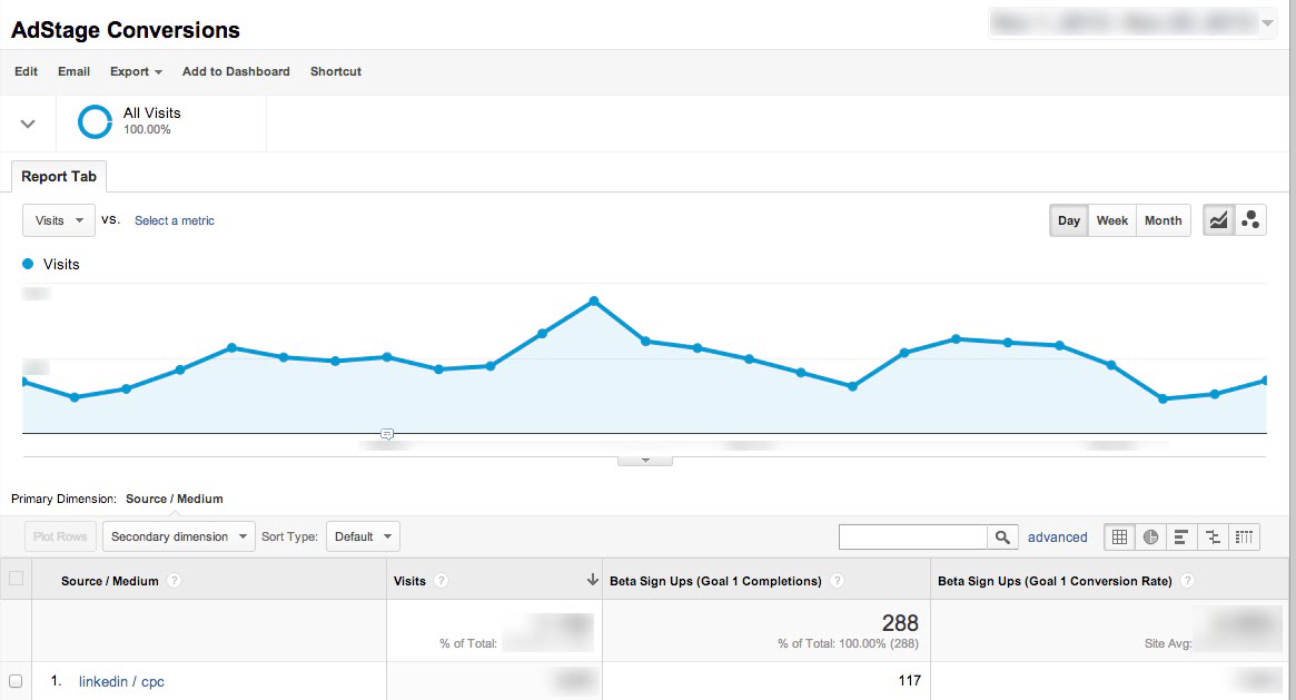
Google Analytics is a popular basic analytical dashboard used by more than 13.2 million websites worldwide
Analytics and AI
At the rate of acceleration, it’s seen in recent years, artificial intelligence (AI) and machine learning are poised to transform every industry the world over. This extends from the healthcare industry to supply chain logistics design and everything in between. Fortunately for us, artificial intelligence, machine learning, and analytics go hand-in-hand.
One of the prevailing conversations around analytical dashboards in 2019 is the pitching of AI versus Big Data. Which wins out?
While Big Data has the benefit of coverage, manual data analysis falls behind in its inability to make sense of such an expansive pool of information. This renders that resource largely unusable. Line graphs and bar charts can only do so much in giving you an overview of the intricacies of your business. Finding and displaying data is only half of the objective; whereas using the data to make helpful predictive data can be a game-changer.
Line graphs and bar charts can only do so much in giving you an overview of the intricacies of your business. Much more helpful is the incorporation of AI.
Simply put, most traditional business intelligence tools used within dashboards provide information that’s just too little, too late. Bar charts and scatter graphs can give you a rough overview of what is or isn’t going well. But you see things only in very general terms, using averages and totals at the expense of granularity.
Data analysts try to mitigate the fallout by endlessly adjusting and readjusting static thresholds for the output analytics. However, this necessitates continuous manual monitoring and analyzes results in real-time impossible.

Moving Toward the Future of AI-Informed Analytics
More importantly, making data understandable necessarily omits a lot of underlying information that might be vital to making informed decisions about your business. This may limit your capability to formulate an effective business strategy. Alas, we’re only human, and so simplification is necessary for us to be able to make sense of our collective data.
Not so with AI.
AI analytics solutions can monitor millions of different metrics at the granular level and all at once. This can achieve both the scale and degree of detail necessary to pinpoint deciding factors within your data.
Why should metrics obscure potentially vital anomalies within the convenient generalizations of totals and averages? A machine-learning algorithm could, for example, continuously analyze your business data and correlate any trends and anomalies.
This provides critical insights that a dashboard alone could not. And it’s clear that these trends are the future of how analytical dashboards are evolving.

