DHCS California Healthcare Data Visualization
California's Department of Health Care Services, Business Intelligence Division, tracks long-term care data for residents across the state. This is an ongoing engagement now in its second two-year contract, covering research, design, and development of data visualization dashboards for the LTSS program.
Over 784,600 people in California received long-term healthcare services and supports. California’s older adult population is expected to grow to over 10 million people by 2030, and understanding the growing needs of this population will be critical.
DHCS asked for data visualizations that would make healthcare disparity data readable for non-technical government stakeholders, filterable by county, ethnicity, language, age group, and delivery system, and accessible on both desktop and mobile without training.
We have the pleasure of working with our business partner Fuselab Creative, which specializes in visualization designs. It has been an exceptional experience from start to finish. Their dedication to delivering top-notch visualization designs and their professional yet friendly approach truly sets them apart in the industry. They foster a collaborative atmosphere where ideas could flow freely, and feedback was encouraged.
The Process

User Research
– Define the client business goals
– Identify the target audience (personas)
– Define the persona goals

Requirements
– Identify the stakeholders
– Prioritize the functional requirements
– Define the business requirements
– Translate the requirements into design sprints

UX interviews
– In-person interviews
– Remote interviews
– Group interviews
– Online surveys

Explorations & Data Visualization Experiments
– Define the goal of the experiment
– Create the visualization
– Build clickable prototype

Test & Refine
– Evaluate the criteria for success
– Execute the test
– Refine and repeat until an effortless user experience is achieved
Visualization
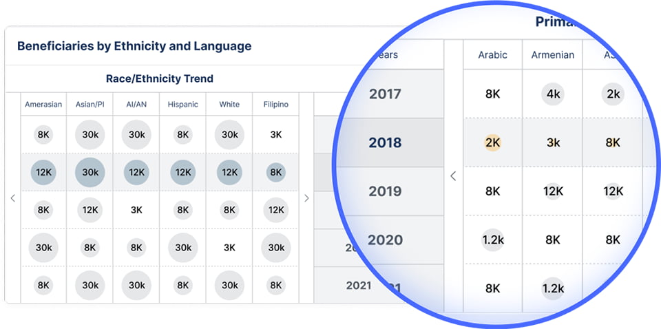
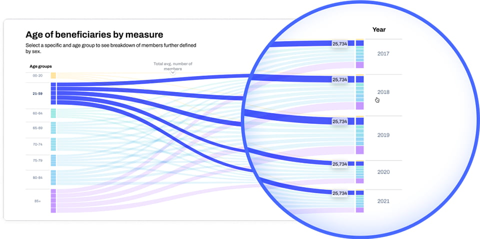
The DHCS data spans 2017 through 2021 and covers over 784,600 beneficiaries across ethnicity, language, age group, county, and delivery system. Each data dimension required a different visualization type. A bubble plot handles the ethnicity and language data because it shows both size and change over time simultaneously. A choropleth map handles the county-level beneficiary distribution because geographic spread is immediately readable from color density. A Sankey diagram handles the age group breakdown because it shows the proportional flow between multiple categories across years without losing the relationship between them. The chart selection approach reflects how Fuselab approaches all healthcare data visualization work: the visualization type is chosen to match how the data is structured, not the other way around.
This bubble plot represents our ability to accommodate well know data visualizations with project’s needs, creating something easily scannable for healthcare stakeholders to better understand the ethnic and language diversity in their state and how these numbers have changed over a five year period.
This heat-map of California is the most appropriate visualization to see how the numbers of beneficiaries are spread out across the state. A Choropleth Map like this helps users to instantly see how the number of beneficiaries change based on California’s counties by decoding the color that is attributed to the beneficiaries range, and then changing the timeframe to see how the numbers/colors change.

We know that every case is unique, and a lot of data categories might be tricky to be shown and this case is an perfect example. A lot of colors are hard to decode all at once so we took advantage of the Sankey Diagram approach to make it easier to decode the numbers by using specific colors attached to specific number ranges, while also increasing and decreasing the band width to help further explain the differences.
Functionality
A government healthcare dashboard serves users who are not data analysts. Policy staff, public health administrators, and program managers need to reach conclusions from complex datasets without technical training. Every DHCS dashboard was designed with that user in mind. Hover tooltips add contextual explanation without cluttering the main view. The interface requires no training to use. The DHCS dashboards are designed for the entire California healthcare stakeholder community. Each dashboard surfaces the most critical metrics on load and allows users to drill into county-level or demographic-level detail with a single filter action.


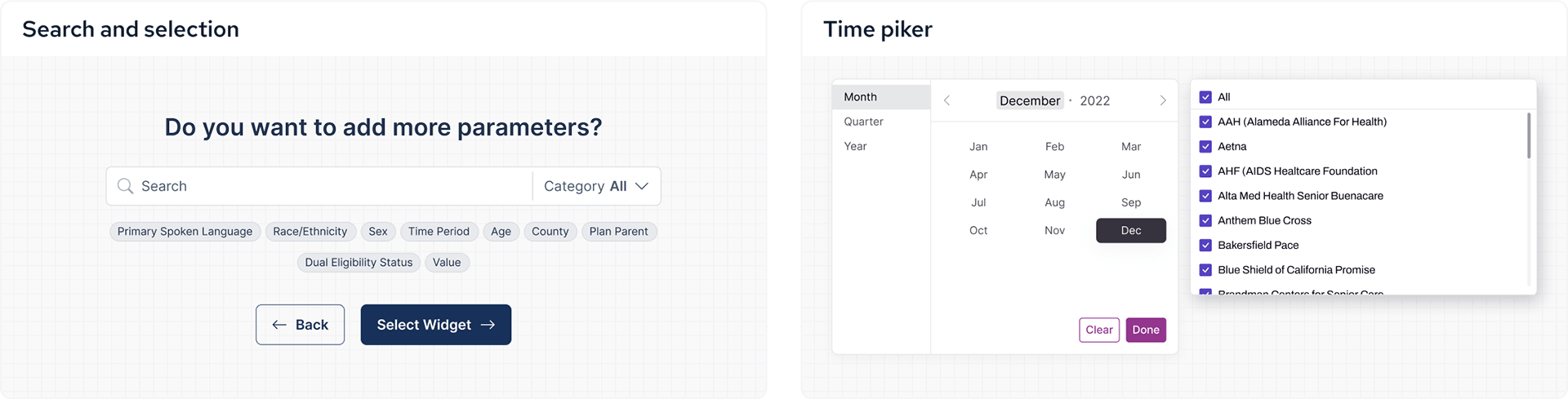
Search and Navigation Built for Non-Technical Government Stakeholders
Government healthcare stakeholders come to the platform with a question, not a data query. The search layer was designed around how these users actually think about the data rather than how the data is structured. Autofill suggestions, simple calendar pickers, and pre-selected dropdown lists allow each user type to get to work immediately without understanding the underlying data architecture. See how Fuselab approaches UX research for government platforms.
Autofill, simple calendars and pre-selected dropdown lists all added to the user experience to make each persona type able to sit down and get right to work.
Solution
Fuselab’s scope on this engagement is the complete project lifecycle. That covers user research including in-person and remote stakeholder interviews, UX/UI design, and full development and deployment of each dashboard design delivered. The engagement began as a single dashboard project and has grown into an ongoing retainer now in its second two-year contract with DHCS.


Foundation
DHCS had been managing beneficiary data in legacy reporting formats before this engagement. When wireframing began, the focus was on modular dashboard architecture that could be extended over time as new datasets and reporting requirements emerged. A modular structure means each new dashboard follows the same design language and interaction patterns as the ones already deployed, which reduces the learning curve for users as the platform grows.


Desktop Dashboard Design and Chart Selection
The dataset we were given spans from 2017 through 2021. We selected a Sankey style chart for its flexibility and interactivity options with dealing with multiple years of data and multiple age groups all at the same time.
The Sankey Chart
Unlike a lot of data visualization templates, the Sankey allows for the user to customize their view depending on their goals, which works perfect for this data grouping of LTSS beneficiaries. We calculated and offered an average data point as well to give users point of reference.


Designed by:
Art Direction
George Railean
Design Director
Marcel Sendrea
Design
Edward Rascu
Andrei Sava
DHCS Government Healthcare Data Visualization: Common Questions
What is government healthcare data visualization?
Government healthcare data visualization is the practice of transforming complex public health datasets into interactive dashboards and visual interfaces that allow policy makers, program managers, and public health administrators to identify patterns, disparities, and trends without technical training. It differs from commercial data visualization because the audience is non-technical, the data is often multi-year and multi-dimensional, and the decisions informed by it affect large populations. For DHCS, the visualization system covers beneficiary data spanning 2017 through 2021 across ethnicity, language, age group, county, and delivery system. Each dimension required a different chart type chosen specifically to match how that data is structured and how stakeholders actually need to read it.
What is a choropleth map and when is it the right choice for public health data?
A choropleth map is a geographic visualization that uses color gradients to show how a variable changes across defined regions, such as counties or states. It is the right choice when the question being asked is inherently geographic: where are the highest concentrations of beneficiaries, which counties have seen the largest changes over time, and how does distribution vary across the state. For the DHCS beneficiaries by demographics dashboard, a choropleth map of California’s counties was selected because geographic spread is immediately readable from color density. A stakeholder can change the timeframe and watch the color distribution shift across the map, making trend analysis visual rather than numerical. No other chart type answers the question of where as clearly.
What is a Sankey diagram and why was it chosen for LTSS beneficiary age group data?
A Sankey diagram is a flow visualization that shows how quantities are distributed across multiple categories, with the width of each band representing the proportional size of that group. It is particularly useful when data has multiple simultaneous dimensions that need to be shown together without losing the relationships between them. For the DHCS age group dashboard, a Sankey diagram was chosen because the dataset covers multiple age groups across multiple years, and a standard bar chart would require the user to compare bars mentally rather than seeing the flow directly. The Sankey allows a stakeholder to see both the total size of each age group and how those proportions have shifted over the five-year period in a single view. Fuselab calculated and added an average data point to the chart to give stakeholders a reference baseline for comparison.
What does it mean to design a dashboard for non-technical government stakeholders?
Designing for non-technical government stakeholders means the interface must answer a policy question, not present data for analysis. A public health administrator or a program manager comes to the platform with a specific question in mind: which counties have the highest concentration of Spanish-speaking beneficiaries, how has dual eligibility changed over five years, where are the largest gaps in LTSS delivery. The dashboard needs to answer that question without requiring the user to understand the underlying data structure. For DHCS, this shaped every design decision. Hover tooltips add context without cluttering the view. Autofill search, calendar pickers, and pre-selected dropdowns let each user type start working immediately. The interface was designed to require no training, which for a government platform serving hundreds of stakeholders across different departments is a functional requirement, not a preference.
What is the difference between designing and developing a government data platform versus designing only?
When a design agency handles only the design of a government data platform, there is always a translation risk between what was designed and what gets built. Developers interpreting design specifications without the designer present often make small decisions that cumulatively change the user experience in ways that were not intended. When the same team handles research, design, and development under one engagement, that risk disappears. For DHCS, Fuselab’s scope covers the complete project lifecycle: user research including in-person and remote stakeholder interviews, UX/UI design, and full development and deployment of every dashboard. This means every decision from the initial research finding through to the deployed interface was made by the same team with the same understanding of the stakeholder needs. The result is a platform where the design intent is preserved in the built product.
What does an ongoing government design and development retainer involve?
An ongoing government retainer means the agency is not delivering a single product and stepping away. It is a structured long-term engagement where new dashboards are researched, designed, developed, and deployed on a continuous basis as the client’s data and reporting needs evolve. For DHCS, Fuselab’s retainer is now in its second two-year contract. Several dashboards have been designed, developed, and deployed since the engagement began, and additional dashboards are currently in production. Each new dashboard follows the same research, design, test, and refine process as the first, and uses the same design language and interaction patterns as existing dashboards so the platform grows consistently. For a government agency, a retainer model also means the design team has accumulated deep knowledge of the data, the users, and the reporting requirements over time, which produces better outcomes than starting a new engagement from scratch each time a new dashboard is needed.
How does user research work differently on a government data visualization project?
User research on a government data project involves understanding how different stakeholder types think about the data, not just how they use the interface. A policy analyst, a program manager, and a public health administrator all access the same DHCS dataset but with different questions and different levels of data familiarity. Research for DHCS included in-person interviews, remote interviews, group interviews, and online surveys across multiple stakeholder types. The findings shaped not only the interface design but also the choice of visualization types for each dashboard. A choropleth map was chosen for geographic data because research showed stakeholders think about beneficiary distribution in terms of counties, not in terms of raw numbers. A Sankey diagram was chosen for age group data because research showed stakeholders needed to see proportional flow across years, not just point-in-time comparisons. The research findings are the reason the visualization choices are specific rather than generic.
Do you want to create something similar?
Related Services and Solutions
Don't Listen to Us, Read What Our Clients Are Saying.
We know that trusting an outsider with your vision can be scary. This is why if you're not satisfied with us after the first two weeks, you can walk away owing us nothing.
"We went from prototype to usable software lightening fast, and our customer reviews have never been better."
"Their creativity and mastery of UX UI design has made our years of working together enjoyable and incredibly successful!"
"If you need to re-think your product and need some truly unique design talent , Fuselab Creative design team is your answer."
"We needed a nimble team of UI UX designers to work with our development team and they quickly became one of our most vital resources and far exceeded our expectations."