Adaptive UI design: when the interface rearranges itself
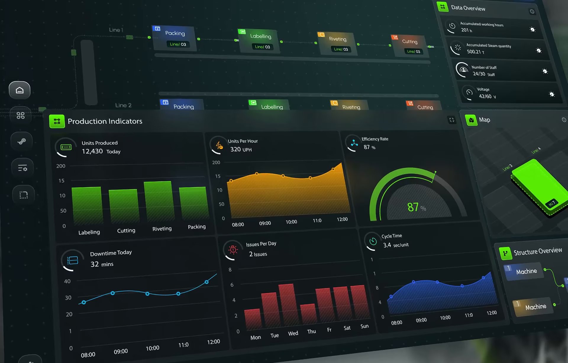
An adaptive user interface rearranges itself. A panel moves up because a user opens it every morning, or a command list reorders after a week of use.
When adaptation fails, the prediction is rarely wrong. The user just can’t see what changed or undo it, so they stop relying on the layout. This guide shows you how to design this change so that doesn’t happen. We know this is deep in the weeds, but stay with us and read on.
What is adaptive UI?
Adaptive UI is an interface that changes its layout, content, or available commands in response to observed behavior, without the user configuring anything. Pretty cool, right? A machine learning layer watches which actions a person takes and in what order, finds a pattern, and reorganizes the screen so the likely next step is closer.
The idea predates generative AI. Desktop software experimented with self-adjusting menus in the late 1990s, and CAD tools such as Siemens NX now predict which command an engineer will need next. What changed in 2026 is scope. Adaptation is moving from single menus into whole workspaces, where panels, filters, and AI suggestions all shift around the user. Honestly, this is one of AI’s superpowers.
It also helps to separate adaptive UI from its neighbor. Hyper-personalized interfaces change what content each user sees. Adaptive UI changes where things are and how they work. Products often do both, but the risks to design differ.
Four places an adaptive interface can change
- Suggesting content. Related records, similar accounts, the next document to review.
The user needs to see: why this item was suggested. - Predicting input. Sentence completion, command prediction, prefilled form fields.
The user needs: a fast way to ignore or dismiss the guess. - Filtering information. Surfacing anomalies, hiding low-priority items.
The user needs to see: what was hidden and how to bring it back. - Rearranging layout. Reordering panels, promoting tools, collapsing sections.
The user needs to see: what moved and how to put it back.
Why layout is the hardest case. People find things by position. Moving an element breaks that spatial memory, so a layout change costs the user something even when it is correct. The rest of this guide focuses on that case.
Adaptive vs adaptable UI: who makes the change
The two terms sound alike but describe opposite control models. In their 2004 study of static, adaptive and adaptable menus, Leah Findlater and Joanna McGrenere put it simply. In adaptive interfaces the system controls the change. In adaptable interfaces the user does.
Their results are worth knowing. In the lab study, the static menu was significantly faster than the adaptive one, and the adaptable menu beat the adaptive menu on speed under some conditions. Most participants also preferred the adaptable menu overall.
That doesn’t mean adaptation is a mistake. It means the two models fail differently. Adaptable UI fails quietly, because users skip the setup. Adaptive UI fails loudly, because users feel the interface moved without them. Most strong products land in between: the system proposes a change and the user confirms it, or the system makes the change and the user can reverse it in one step.
Adaptable in practice: Control AI
We designed Control AI, a regulatory intelligence platform that maps public reaction and the links between laws, policies and events in interactive network graphs. Its customization sits firmly on the adaptable side. Users set their own KPIs, choose the analytics areas they want to follow, select pre-set areas of interest, and choose their notification levels. The network graph then evolves around those choices as new events arrive.
The data on screen changes constantly, but the structure changes only because the user asked it to. Nobody has to wonder why a view looks different, since they made the call themselves. That is the baseline an adaptive layer has to match before it can earn the right to move things on its own.
Not the same as responsive or “adaptive web design.” In web development, “adaptive design” often means fixed layouts served per screen size, and responsive design means fluid layouts that reflow to the device. Both react to the device. In this guide, adaptive UI reacts to the person. A product can use all three at once.

Why people stop relying on interfaces that move
The clearest lesson comes from software most people have used. Office 2000 introduced personalized menus that showed recently used commands first and hid the rest behind a chevron. Jensen Harris, who later led the Office 2007 UI redesign, wrote that adaptive menus were not successful. Users had to scan every menu twice, first the short version and then the full one, and hidden items never appeared in a predictable spot. By Office 2007, Microsoft had turned adaptive menus off by default, even in apps that kept the old menu style.
The feature was well intentioned and often accurate. It still failed, because people could not predict what they would see next time they opened a menu.
Research on adaptive interfaces points the same way. In a 2008 study by Krzysztof Gajos and colleagues at the University of Washington and Microsoft Research, raising both the predictability and the accuracy of an adaptive toolbar strongly improved satisfaction. Accuracy mattered more for speed. Predictability still shaped how people felt about the tool. In other words, a right answer is necessary but not sufficient.
The black box problem
Simply put, machine learning makes this harder. A rule like “show the five most recent commands” can be learned by the user. A model trained on hundreds of signals cannot. When a panel moves and the user can’t tell which of their actions caused it, they can’t predict the next change, so every session starts with a search. They can’t correct the system either, because they don’t know what it learned. Most end up distrusting the whole interface, not just the one change.
The core argument: a change can be correct and still cost trust. What protects trust is not a smarter model but a visible change, a stated reason and an easy way back.
The rule: show what changed, say why, and let users undo it
Microsoft’s Guidelines for Human-AI Interaction (the HAX guidelines, published at CHI 2019) cover adaptive behavior directly. Six of the 18 guidelines translate into concrete screen patterns for an interface that rearranges itself.
1. A visible marker
HAX guideline 18: Notify users about changes.
The element that moved is briefly highlighted and labeled (“Moved up”). Larger updates also get a short “What changed” note users can open later. A silent change is the one users experience as a bug.
2. A one-line reason
HAX guideline 11: Make clear why the system did what it did.
The reason ties the change to the user’s own behavior in plain words, for example “You’ve opened this first on recent Mondays.” One sentence is enough. If a team can’t write that sentence, the change probably shouldn’t ship.
3. One-click undo
HAX guideline 9: Support efficient correction.
A “Put it back” action sits right next to the marker. Undo takes one click and restores the exact previous position, not a default layout.
4. A reset and an off switch
HAX guideline 17: Provide global controls.
Settings give users a way to reset the whole layout and turn automatic arranging off. Some users will never want adaptation, and that preference should stick across sessions.
5. Changes at safe moments
HAX guideline 14: Update and adapt cautiously.
Changes happen at the start of a session, never mid-task, and only one thing moves at a time rather than the whole screen reshuffling. The system also waits for a pattern that repeats over several sessions before it acts.
6. Learning from the undo
HAX guideline 13: Learn from user behavior.
Every “Put it back” is feedback. The system records it and doesn’t reapply the same change to the same element. An interface that keeps moving something the user keeps moving back is the fastest way to lose them.
Walkthrough: a dashboard panel reorders itself
Here is how the six patterns play out in one moment. An operations analyst uses a dashboard with five panels: Alerts, Open tickets, Team workload, Weekly trends and Notes. Weekly trends sits fourth.
Step 1: The pattern forms. For several weeks, the analyst opens Weekly trends first every Monday. The system logs this but changes nothing yet. One busy morning is not a pattern.
Step 2: The change happens at a safe moment. The pattern crosses the team’s threshold. On her next Monday login, before she starts working, Weekly trends moves to the top. Nothing moves while she is mid-task.
Step 3: The marker appears. The panel has a soft outline and a small “Moved up” label for the first session. The other four panels keep their relative order, so the rest of the screen still matches her memory.
Step 4: The reason is one tap away. Tapping the label opens a small card with the title “Weekly trends moved to the top,” one line of reason (“You’ve opened it first on recent Mondays”) and three options.
Step 5: She decides.
Keep it here: the label disappears and the position becomes her default.
Put it back: the panel returns to fourth place, exactly where it was.
Stop auto-arranging: the system stops moving panels on this dashboard. She can turn it back on in settings.
Step 6: The system remembers. It records the change, the reason and her response. If she put the panel back, it won’t try that move again. Settings show a short “Layout changes” history with a single “Reset layout” button.
What this walkthrough avoids: moving things mid-task, changing several panels at once, giving no explanation, and offering no way back. Each of those is a common reason adaptive features get switched off.
Where the interface should not rearrange itself
Some parts of a screen should stay fixed no matter what the data says. Otherwise, you are going to make users go crazy. Primary navigation and global actions are the first of these, because they are the landmarks people use to orient themselves. High-stakes controls such as approve, send, submit, and trade belong here too, since a control that moves invites the wrong click. Shared and trained screens need the same stability: control rooms, support desks, and any screen referenced in training material or procedures. If the manual says “top right,” it has to stay top right. Finally, the interface shouldn’t adapt when the data is thin, as in first sessions, rare tasks, and new users. Adapting on two data points is guessing, and a guess the user then has to undo costs more trust than no change at all.
Google’s People + AI Guidebook frames this as a mental model problem: people build an expectation of how an AI feature behaves, and the product should help them form an accurate one. Fixed zones are part of that. They give users a stable frame, so the parts that do adapt feel deliberate rather than random.

Common mistakes in enterprise adaptive UI
1. Adapting without an off switch. Users tolerate adaptation they can control. They reject adaptation they can’t.
2. Changing between sessions without explanation. If yesterday’s layout and today’s differ and nothing says why, most users assume the change is random and stop relying on any position.
3. Reading behavior without context. A sales tool might see a seller open the same report all quarter and promote it, even though the quarter-end workflow is completely different. Patterns need a time window and a way to expire, and the user needs a one-click way to reverse a change that no longer fits.
4. Designing before the signal exists. If the layout depends on a behavior model the data team hasn’t shipped, the screen launches with placeholder logic. Teams that design the static and adaptable versions first have a product that works on day one, and they become the state that “Put it back” and “Reset layout” return to.
5. Testing only the happy path. Usability tests often show the change landing well. The harder question is what happens when it’s wrong: does the user notice, can they fix it, and do they start distrusting other parts of the product? This is one of the ways UX for AI products differs from traditional UX: research has to include the moments the system gets it wrong.
Conclusion: design the change, not just the prediction
Adaptive UI is worth building when users repeat the same patterns and the feature set is large enough that a fixed layout slows them down. It is not worth building as a silent layer that moves things around and hopes users will notice the improvement.
A practical path for most enterprise products starts adaptable: users pin, hide and choose what they track, the way Control AI handles KPIs. Adaptation comes next, and only where repeated behavior over several sessions shows a strong pattern. Every change stays visible, explained and reversible, with a marker, a one-line reason, “Put it back” and a global off switch. Navigation, high-stakes actions and trained layouts stay where people expect them.
With those pieces in place, the interface can rearrange itself without losing the people who use it. For teams planning adaptive behavior in an AI product, our AI product design team can help map which parts of the screen should adapt and which should stay put.
Frequently asked questions
What is adaptive UI?
Adaptive UI is an interface that changes its own layout, content or commands based on how a person uses it. Instead of asking users to configure preferences, it watches repeated behavior and moves the most likely next step closer. Good adaptive interfaces also show what changed and let the user reverse it.
What is the difference between adaptive and adaptable UI?
The difference is who makes the change. In an adaptive interface the system changes itself based on observed behavior. In an adaptable interface the user makes the changes, for example by pinning panels or choosing which metrics to track. Many products combine both: the system suggests and the user confirms.
Is adaptive UI the same as responsive design?
No. Responsive design adjusts a layout to the device and screen size. Adaptive UI adjusts the interface to the individual user’s behavior. A product can be responsive and adaptive at the same time, but they solve different problems and are designed and tested separately.
What are examples of adaptive user interfaces?
Common examples include command prediction in professional software, sentence completion in email, dashboards that surface anomalies, and recommendation lists. An early, well-known example is the personalized menus in Office 2000, which showed recently used commands first. Microsoft later turned them off by default because users found them unpredictable.
Why do users stop trusting adaptive interfaces?
Mostly because they can’t predict them. When elements move without a visible reason, users lose their place, can’t tell what caused the change and can’t correct it. Research on adaptive menus and toolbars shows that predictability affects satisfaction, not only accuracy, so even correct changes can cost trust.
How can adaptive UI changes be made reversible?
Each change is marked on screen, with a one-click “Put it back” action next to it that restores the exact previous state. Settings add a global reset and an option to turn automatic arranging off. Every undo counts as feedback, so the system doesn’t repeat the same change.
Should an adaptive interface have an off switch?
Yes. Some users, especially experts and people on shared or trained screens, prefer a fixed layout. A persistent off switch respects that choice and makes adaptation feel optional rather than imposed.