Codifying the Aesthetics of Apps through UI Best Practices

Don’t let the title mislead you: the “aesthetics” of apps comes down to cold, hard data and analysis. Not much can be codified. Even our best practices now are prone to shifting as user expectations mount and technology smartens right up in response.
Data-driven UI decisions focus on what works, what is clunky and lagging, what could be better, and where are users having a hard time.
UI designers ask, “Why?” as an afterthought. It’s the “How?” that takes precedence — as in “How do we make this better, given the data?”
For now, the only real way to “measure” the efficacy of UI is to take a look at UX. And UX, in its turn, only gets sold when it’s in a pretty UI package. The two are inextricably linked and to know one is to need to know the other.
Let’s look at what UI is and some core UI principles — before it all changes again, like the ever-elusive Facebook algorithm.
Why UX Only Gets Sold in a Pretty UI Package
In the interaction between customers, users, audiences, potential clients — whatever you’d like to label them — and the business or brand on the other end, the interface is where the action takes place.
Users rely on an interface to reach the content, information, and digital entity on the other side. The newly recognized ‘UI’ field is all about design that focuses on the process of making interfaces for software, apps, computerized devices, and websites look and feel good.
‘Good’ includes well-functioning, aesthetically pleasing, and high-performance. Keep in mind that even a great design (UI) is worth very little to the end user if the site’s performance is slow to load (UX).
Conversely, a user can only experience a service, product, website, brand, or business if the interface is well-designed and allows them to coherently process the information they’re being presented with.
In the 1990s, Don Norman, a cognitive scientist at Apple, defined UX as:
“‘User experience encompasses all aspects of the end-user interaction with the company, its services, and its products.”
About that, then, UI or a user interface design services are the creation of a series of screens, pages, visual elements, and design decisions — such as flows from one page to the next, scrolling, buttons, icons, use of white space, text, inline expanding areas, etc. — that are used by designers to guide a user through interaction with a device.

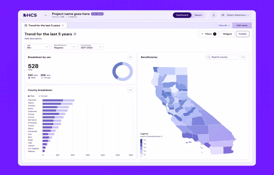
Notice that the above diagram, for example, anticipates multiple content types and determines the rough visual design that would work best for each, while also including notes on the relationship between the pages or content types.
‘Interaction’ includes anything from viewing, scrolling, and clicking, to tactile UI (touch), visual UI, and, at times, even auditory UI (think about the click-wheel sound the early iPods had or the sound that occurs when you turn the screen on an iPhone off).
These thoughtful inclusions heighten the customer experience and translate into UX — user experience — taken in as one entire perception of the app, website, or device. It’s incumbent upon brands and businesses to get this right, by the way: By 2020, customer experience will overtake price and product as the key brand differentiator.
A couple of key standards every design must begin and end with include:
- Don’t reinvent the wheel: Opt for traditional digital product design solutions like responsive layouts and shadow on buttons, ample white space, and clutter-free corners — these are adaptive to any situation and resolution
- Go for clean, drama-free typography for legibility, and keep the funky fonts for logos, if necessary.
- Interaction is about content so make sure to map out all possible content types and mock-up those that are most relevant or important.
- Always design for every device and resolution.
Make sure to map out and consider possible flaws and issues during the design and development stages. Add these as comments to the mockup.
There is a unifying visual theme here, demonstrated through the design decisions such as color, font, and buttons, banners, navigation, menus, icons, and more. The ‘UI’ of the design also includes notes on how these will be used (for example: ‘text field active’) and maps out each content type.
The key to modern and effective UI design is this: It’s a critical process, always, and it must be. At first, you must anticipate what your user needs. But, once users begin the process of interaction, you must monitor and improve, based on the data about their usage coming in. Expert UI designers create modern and interactive UI designs in order for your project to be successful.

Core UI Principles
There are a couple of core principles for successful UI that help you do the above-noted ‘anticipating of a user’s needs very well.
Is it ‘beautiful’?
We get very wrapped up in all the strategic, testing, and analytic aspects of UI and forget that, at its core, this consideration comes first — it must! It’s not only a matter of beating your user’s expectations, mesmerizing them with design, or enhancing their experience of the mobile app or the website.
To create and design an aesthetically pleasing interface is to respond to the user’s expectations because, as we’ll see, these have grown and shifted. Whether you thank Apple for this or secretly curse them, beautiful design is simply part of the experience package that UI promises.
Is it ‘familiar’?
Familiarity is both an in-app and extra-app issue. First off, “familiarity” means, does this app fulfills the expectations of a user, based on the conventions of what certain icons and symbols are meant to do. This would include using an “x” to mean exit or escape and a “+” to mean add or share.
Within an app, familiarity comes down to whether certain elements of visual design are followed throughout the app, even as it goes through multiple or iterative design changes, on its way to refining the visual design.
Is it ‘efficient’?
You might immediately jump to “performance” issues when you’re thinking about efficiency. But efficiency in design is all about the use (and non-use) of whitespace. Does the app’s interface design make good use of the screen area allotted to it? And, is the design too busy or can it breathe?
“Efficiency” also has to do with whether the decisions on shortcuts, screen flows, and screen transitions are intuitive and easy to do, or whether the user has to waste time trying to learn them.
Is it ‘consistent’?
To understand consistency in action, let’s take a look at the Medium app functionality. While the web app for Medium is still slightly cluttered and busy (though it does mimic the layout of a newspaper well), the mobile app is beautiful and seamless.
Simply through this emphasis and decision, you can see where a Medium anticipates a broad swath of its users are reading or accessing from, while also gently guiding them to make mobile-first interaction a preference.

This is the opening screen of Medium, in a user-logged-in account. Right away, we are presented with Medium’s main visual identity — notice the primary color scheme.
The next two screens are one screen in two shots.
It is to show that the top of the screen is horizontally scrollable while the rest of the app follows traditional vertical scrolling. There are various sections that one can navigate to, in the form of updates, consistent with a user’s expectation of an app.
Is it ‘responsive and customizable’?
Back in the day, when the allure and promise of “futuristic” web design templates were that they were “responsive,” this was an additional perk. Now, it’s a staple. How do the visual elements and web app interface design react on different screens? Are elements rearranged properly so that they might tile themselves differently but the main visual look and style remain the same?
Customizability, of course, has to do with this level of responsiveness but it also has to do with user accounts. As you can see in the Medium example above, the app’s screens and content delivery are personalized for a particular user’s account.
Later on in this article, we’ll take a look at how one SaaS product is using email marketing techniques to personalize the user’s interaction with its web design.
Is there a clear ‘structure’?
UI designers make certain design decisions, not only to make the visual identity of a brand’s intuitive app design or website look and feel consistent. They’re also subtly guiding the end user’s decisions on how to access, navigate and flow through the experience of interactivity.
Structure, then, relies on the designer’s choice of language, flow, hierarchy, and metaphors for visual elements, which eliminates any user’s questions about what’s most important or where to go next.
Certainly, a level of decision-making rests with the user. They can click around where they’d like. But, as in the case of the above Medium app, the primary and most important information is presented upfront.

A Bonus Tip…
Because you’re likely reading this to either improve your UI by going back to basics or getting started with UI and you want to do it right, let us give you a bonus best practice that many overlook.
Helpful documentation: Aim to optimize it so you can go above and beyond.
While all the above questions are necessary and should underpin all your UI projects and undertakings, there’s simply no way for brands and businesses to account for every single user out there.
These principles help designers create for a large majority of situations and try and codify certain elements that should be simply accepted, without question, because we’ve collected enough data to know it works. Read more about current app design trends.
But what about the ‘outlier’ users, operating on the fringe? In this case, having a robust knowledge base, along with a clean, guided design that helps the user navigate to and through the knowledge base helps to heighten and enhance a user’s experience of the app or website.
Let’s take a look at the Airstory Knowledge Base and “Help” function.

Questions are graphically organized into visual ‘cards,’ which helps with legibility and usability.
But this design decision also seems to promise that, like a blog post, there is plenty of information to glean. It’s not just an ‘answer’ to a question but, rather, a guide in the form of an entire article, that promises to solve a problem.
This automatically enhances a user’s perception of just how helpful the knowledge base truly is.
If you click the little icon at the bottom, Airstory’s UI design offers you a few more options for accessing the help database. Because who doesn’t like options?
The functionality is inline and includes a seamless ‘pop-up’ transition. It is also personalized, with an amusing emoji, giving personality, and forming an instant connection between the user and the ‘Help’ customer service individual.

You can choose to email her or ‘Find an answer quickly.’ Even though the email option is titled, “New Conversation,” the folded airplane icon conveys to the user that it’s an email option.
Even if, for some reason, the UI of an app or a website is yet to be refined or still a little clunky, thoughtfully-designed Help, FAQ and knowledge base documentation is likely to take the edge off the frustration a user may otherwise feel.
Of course, if you’ve got the rest of your app’s or website’s design down well, then this helpful documentation design is just going to take your brand’s UI to the next level. Web app design services should be provided by the best design team if you want your project to be successful. Our UI/UX design agency will provide you best design for your project if needed.