Smart Web App Interface Design
If the rules for smart web app UI design are not rocket science, then why are so many poorly designed apps out there?
Every year, 23% of users abandon apps after a download and research shows that two-thirds of apps will fail to reach even 1,000 downloads in the first year. The truth is, you need more than a “niche” that you can enter. You need to do more than simply address a problem and position your app as a potential solution.
A clunky, disruptive user interface and workflow is the death knell for every app that fails to follow these 10 rules for smart app interface design. With so many choices in the market, your user doesn’t have to settle. So your strategy should be to integrate these rules into your app design right away.
1. There’s no need to reinvent the wheel
Web apps all depend on certain rules to function. That way, they eliminate any steep learning curves and frustrations that a user might experience. Think of these “best practices” as the essentials of human behavior. These rules are like a common language that, in web apps, produces an expectation.
2. Elements of a feather…
Should be grouped. Photoshop CS has mastered the use of grouping elements functionally. This not only sets up an intuitive link between design elements for the user, but it also allows Photoshop to provide even more functionality and features while keeping the menu space on either side clear.

3. MVP
No, not the “most valuable player.” MVP, in this case, is the “minimum viable product.” When web app designers are creating the first versions of an app, it can be easy to get wrapped up in the minutiae and fail to launch. So app designers are encouraged to produce a “minimum viable product.”
But this ethic should be applied to the design itself. In other words, when it comes to smart user interfaces, simplicity is always best. Include the minimum amount of design details to eliminate clutter and confusion.
Airstory, an app devoted to copywriters, is currently in aggressive user acquisition stage. Right now, their main goal is to onboard users with an app dedicated entirely to supporting a copywriter’s main function: research and writing online. There is nothing else on its dashboard except functions related to this end goal.
Simple and streamlined. From here, you can always add more features as a “rolling out”. You can also take your time testing these features for added success.
Remember, in development and design, leaner and lighter is preferable.

4. Simplify user flows
User flows are at the core of smart web app design. Smart user flow takes into account the expectations of users and then simplifies these down into the visual and the actionable. The Divi template for WordPress is a great example of smart user flow. Its explosive popularity with users is the result of putting the control of design back in their hands.
It’s also because the design of this “DIY” template flows so beautifully. Each element explains what the next action is supposed to be with cues in both visual (icon) and written form. Users can click on “Insert Module” and Divi naturally guides them to the next “screen,” which is a set of wireframe models to choose from.


5. Cues count
What differentiates static, unintuitive, or clunky design from truly smart design? It’s how you communicate through the details. Even if a user isn’t consciously noticing the myriad design decisions and flows that comprise their experience of an app, it all serves to make that experience that much more seamless. You never want to leave a user hanging.
Whether it’s asking them to take action or moving them through moments of transition, there should always be visual cues as to what’s going on. Consider the PayPal loading screen:
Here, the circular animated icon tells the user there’s a process underway, based on the action they’ve taken and the desired outcome they want.
Stay patient, says the cue.

6. Guide behavior, don’t force it
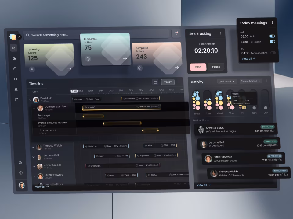
Remember that when a user logs in, they’re only interested in a dashboard including the most relevant functions of the app. That means the dashboard should offer them everything they need to take the primary action and accomplish their primary objective.
In the case of Calendly’s user interface, for example, the most important actions are up front. No less important, of course, is access to account information, settings, integrations and the “help” function. These are neatly tucked away in a drop-down menu. Notice, however, that there’s a subtle little note with a link that says, “Need tips? Check out our Knowledge Base,” which is an added call to action.

7. Make it extensible
A word to the wise: Your app is only useful and prone to be adopted by a large swath of users if you work on making it extensible. Now, for most designers and developers, this means stocking the app’s interface with third-party integrations galore. But users don’t always remain within the web app and designers should be aware of this. More often than not, they operate within browsers. So they’ll need a way to easily capture information and transmit it to the web app. Doing this also makes your web app the go-to solution that becomes a “can’t live without” an essential part of a user’s everyday workflow. One of the reasons Trello is so wildly popular is its use of smart Chrome extensions.
Users can install several extensions that make their in-browser experience seamlessly connected with the productivity tool.
They can also extend the use of email clients, such as Gmail, using smart extensions.
8. Design with the “One User” in mind
Your app fulfills one objective for one user. In other words, designing an app for a user should begin with answering what your user looks like. What are his or her pain points? What is the app trying to deliver to the customer that will act as the solution to these pain points?
Answers to these questions can come in handy when making decisions about the visual and functional aspects of an app’s dashboard.
For example, LastPass is geared towards users who have multiple sites they need to log into, especially for keeping a track of client passwords and client login information. This One User needs access to all website logins up front and then notifications on the side every time a new password has been shared.
Everything else — other than the options displayed — is superfluous because this is the “one user’s” most pressing needs.

9. When it comes to apps, maps
Your interface design can be clean, uncluttered, clear, and simple. But if its functions are not explicit, your user will quickly become frustrated and leave. Remember that a web app is both a tool and an environment. Learn more about our digital product design services.
So you want to provide a design interface that is a clear map, with directions, visual cues, icons, text, and transitions. You do not want just a compass.
Consider the Typeform interface. Here, each element is marked. There is a visual hierarchy that starts at the left-most bar of various functions. Once a function has been clicked, a secondary menu bar opens up to reveal “sub” options, under the function category.
Each option is clearly labeled and the “?” icon subtly tells the user that if they’re wondering what it means, they can click for a definition.

10. Test and refine
Even with your best ideas put into the design, the interface of a smart web app is a constant work in progress. With A/B testing, customer feedback, surveys, interviews, and usability testing, there is more than one way to understand where improvements need to be. But if you start with these 10 principles, you’ll experience a shorter cycle to ship your app out!
If you’re interested in receiving the best dashboard design services contact our professional design team.