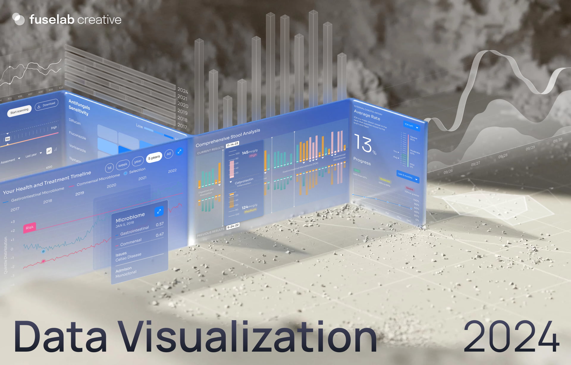
Data Visualization Trends 2024
What would you prefer? To be confronted with a big block of text or a colorful infographic?
The answer, for most people, is obvious!
Visualization transforms intricate data sets into intuitive visual formats that make it easier for users to understand and analyze information. At its core, data visualization is all about democratizing access to data, pulling aside the curtain of raw numbers and research to make the insights available and open to everyone, and converting raw numbers into visual elements to reveal patterns, trends, and outliers that might be hidden in plain sight.
Before we jump into the technical details of trends and types, let us quickly examine WHY we need data visualization and HOW it can help businesses.
The human brain processes visuals far more rapidly than text, making data visualization a crucial tool for data analysis, decision-making, and communication.
Data viz can improve understanding of complex issues by simplifying information to help readers quickly grasp the key points and make informed decisions that might have been overlooked while viewing the raw data alone. Current interactive visualization allows different user groups to group or combine different data points to see information that pertains to their specific processes and functions. Externally, data visualization improves communication and engages various stakeholders such as vendors, investors, and customers to understand a business’s activities and impacts.
For businesses, this can lead to:
1. Confident and Accurate Decision-Making
Imagine what a day in the life of a busy business owner or manager looks like. Juggling multiple activities, they don’t usually have the time to delve deep into raw data. Here, visualization is the navigation tool and can provide clear insights that guide strategic decisions. For example, a manager can look at key metrics, identify opportunities and threats quickly, and adjust operations in the near and long term with confidence. Ask any senior management executive about their anxiety level and you’re guaranteed to receive an earful of stories about anxious decisions they have had to make in the past.
- Enhanced User Experience
Just as a beautifully illustrated book or an animation can captivate audiences, visually appealing data can engage users AND help them retain the information they have seen. For example, a fitness app that visualizes a user’s progress through graphs and charts is more likely to keep its users engaged and motivated.
- Competitive Advantage
For business, data visualization also provides a competitive edge. This can be in the form of accurate and more agile decision-making for managers or owners or for helping customers understand newer trends. For instance, an e-commerce platform can show purchasing trends interestingly to its customers, or a brokering app can show stock market data in an easy-to-understand manner that allows its users to gain a leg-up on others in their space.
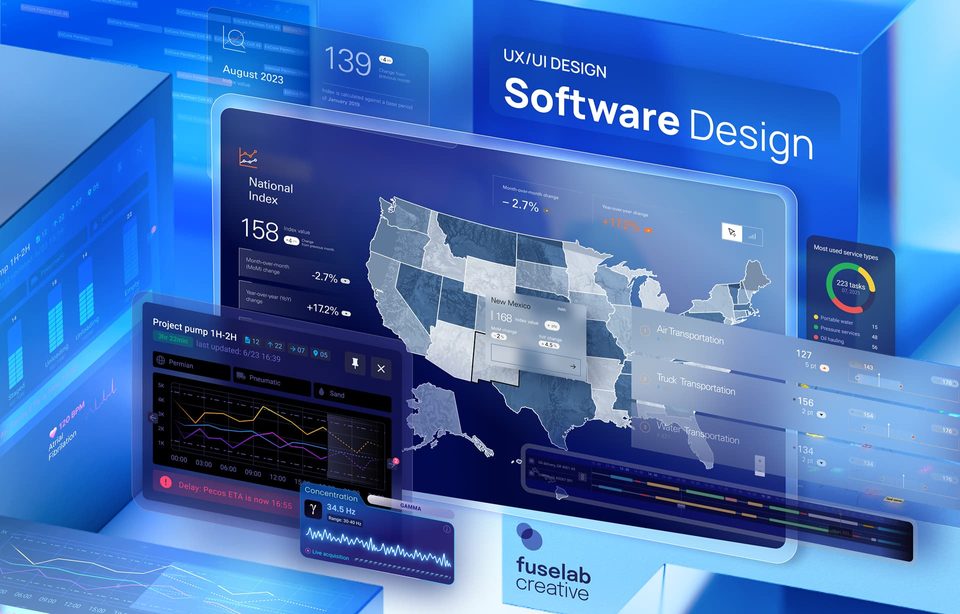
(Here is an example of how we used interactive data visualization modules to build a Fiserv Small Business Index to improve understanding of consumer spending trends across the U.S.)
- Data-Driven Culture
By opening access to data, visualization promotes a data-driven culture within organizations. Employees at all levels can combine insights and trends with their expertise to make more confident decisions. It also allows employees outside the chain of command to get an overview of the market, industry, and the business and become more involved in strengthening their departments and teams.
- Effective Communication with Stakeholders
Presenting data visually can bridge the gap between technical and non-technical stakeholders. For example, shareholders can be made aware of critical business decisions and their impacts compared to other industry players. Customers can be presented with pricing plans in a way that is more enticing for them.
Latest Trends In Data Visualization
Visual Trends in Data Visualization: As we move into the second half of 2024, several design trends that promise to elevate the art and science of data visualization are emerging.
Simplified User Interfaces
As complexity increases, design approaches are edging more and more toward keeping things simple and clean. Cluttered and complicated digital products are now changing to make things minimal with simple interfaces that reduce cognitive load without losing data insights. Visually, this translates into clean designs with lots of whitespace and bold fonts. This approach ensures that users can quickly grasp the key insights without being overwhelmed by unnecessary details.
Interactive Visualizations
Inviting users to engage with data visualization is a great way to personalize the experience and improve the understanding and retention of information. Adding elements of interactivity such as zoom, hover, and click-to-filter enables users to interact with data in their own way, allowing them to find insights that sync with their interests and needs.
Data Storytelling
The next big step in data usage is the use of data visualization as a storytelling tool. Instead of stopping at appealing graphical representations, design teams are stepping further by adding compelling narratives, setting a context, and guiding users through data in a structured yet interesting manner. Storytelling makes the information more relatable and memorable.
Data Art
Blurring the lines between art and information, some design teams are transforming data into works of art. For example, showcasing football World Cup viewership in a pie chart designed like a football. These thematic imaginings create an immediate, emotional connection with the audience.
Advanced Animations and Micro-interactions
Gone are the days of basic graphics; now, users expect complexity in the visual elements. However, animations and motion graphics can be heavy to load and make the app or the website slow to open. Micro-interactions and subtle animations and transitions have emerged as the middle path that engages the users while keeping the app running at top speed.
Heatmaps and Highlighting
Another visual element that is gaining popularity, primarily while visualizing large data sets, is heatmaps and other highlighting techniques. Heatmap data visualizations can be used to draw attention to key trends or patterns and can be particularly useful in identifying areas of interest or concern within large data sets.
Adaptive Color Schemes
Designers are also integrating an element of personalization where users can choose from themes and color schemes to improve readability and accessibility. It not only gives users design control over how they structure their visualizations but also makes it more inclusive for different users, such as people suffering from color blindness or less-than-perfect eyesight issues.
Dark Mode
Dark mode options have now become almost standard, and for good reason! They offer several benefits – reducing eye strain, saving battery life, and, of course, enhancing the aesthetics of visualizations in low-light environments. However, providing dark mode options requires design teams to optimize the color and luminosity of each element to show up well in this mode.
Interface Trends in Data Visualization:
Apart from the purely aesthetic considerations, the interface design of data visualizations is also evolving rapidly. Some future trends in data visualization regarding interfaces are as follows:
Mobile-First Design
Designing visualizations that move seamlessly between devices is a continuing trend that shows no sign of abating. As mobile devices become the default choice for interacting with the online world, designing for mobile-first is no longer optional. Responsive and adaptive interface designs are essential components of this trend and will only continue to become more refined and important over time.
Personalized Dashboards
Personalization has been integrated into all aspects of UI/UX design as a key factor to improve user engagement. In interfaces and dashboards, this can take the shape of customizable themes, layouts, or filters that users can manipulate to design a dashboard that fits specific requirements and makes it easier to find and focus on what matters most to them.
A great way to make personalization easy is to include drag-and-drop capabilities in your visualization dashboards. These allow users to customize their visual interfaces by rearranging elements and adding new data points without any coding.
Context-Aware Interfaces
Another type of personalization can be interfaces that are preset to adapt to a specific user’s role (usually linked to login credentials), the type of data being analyzed, or the device being used. A good example of this trend is health care and education data visualization, where logins can segregate information presented to different users on the same platform. This plays a role in both data governance as well as decluttering the user experience.
(Do check out our blog ‘How Data Visualization is Changing Healthcare for the Better’ to deep dive into the topic)
Real-Time Collaboration
As globalization of workforces and remote work becomes the norm, interfaces have evolved to support real-time collaboration features, allowing multiple users to work on the same visualization simultaneously, share insights, and coordinate with each other.
Voice and NLP Integration
As voice commands and Generative AI become commonplace, UI/UX design trends in 2024 prophesied that NLP (Natural Language Processing) and voice-activated interfaces will become the default in the future. NLP allows users to interact with data using natural language queries, which is a lot like having a direct conversation with a knowledgeable guide. NLP-based interactions are especially useful for non-technical professionals who otherwise might not know enough to navigate visualizations.
Voice-activated interfaces take this a step further by removing the need to type at all! Powered by artificial intelligence, voice interfaces allow users to ask questions and receive visual data responses.
Interoperability
Users move from device to device, often jumping from a desktop to a mobile device or back; apps and websites must make these shifts a seamless experience. Designers now ensure digital products work across all devices and operating systems without losing functionality and continuing the initial workflow across connected devices.
(Explore one of our recent visually arresting projects, Estate Link, which showcases how the real estate industry can benefit from up-to-date and real-time changes in a property searching dashboard.)
Top 5 other data visualization trends: In addition to the design and interface trends, we uncover 5 other critical trends shaping the future of data visualization.
1. Data Analytics with AI and ML
Product designers are pulling out all the stops to leverage machine learning and artificial intelligence to automate data analysis. This has made the entire analytics process much quicker, actionable, and less resource-intensive. One growing example of this is how designers and developers are now automating analytics by embedding data visualizations directly into other applications and websites.
2. Gamification
There is barely an industry or digital application that doesn’t benefit from gamification, and design teams are now incorporating gamification elements, such as badges, progress bars, and rewards, on the double. Gamification encourages users to delve deeper into the data and promotes an organization-wide culture of continuous learning.
3. Data Exploration Tools
While interactivity and gamification can enhance engagement, there are other ways in which users can get more out of each visualization. This is possible through advanced data exploration tools like zooming, panning, and dynamic filtering. Integrated within the interface, they give users a handy tool to handle the visualization and extract more granular insights.
4. Multimodal Interfaces
Several industries, such as graphic design, animation, or even healthcare, require digital products that support multiple input methods, such as touch, mouse, pen, stylus, or a medical device. Designing to include this flexibility ensures better overall usability and allows users the ability to customize how they want to navigate according to their personal preferences. Brands that understand this and offer these options are destined for continous growth.
5. Custom Widgets and Plugins
Designers must also ensure their users have access to outside support and tools. Designing open platforms that support easy integration of custom widgets and plugins and extend the functionality of their data visualizations.
The Importance of Staying on Trend
The digital landscape is transforming at unprecedented speed; disruptive technologies come into play almost every month. To build continued success with discerning users, staying up on trends in the world of data visualization is only becoming more critical.
If you are interested in integrating the many benefits of data visualization into your business operations and products or services, get in touch to learn more about our Data Visualization Services.
Browse more