Heat Map Data Visualization: Complete Guide, Types & Examples
In general, heatmap data visualization is a tool that relies on color coding to show the differences in data points. While it’s not always clear when it’s appropriate to deploy a heat map with a map data visualizations services team. Most people associate heatmaps with financial data or weather forecasts, but the truth is that this visualization tool extends far beyond these realms, including how it can help with healthcare data visualization.
Heat map data visualization helps to draw attention to the most important parts of a particular dashboard design and illustrate the relative importance of events or locations within a dataset. When dealing with massive data volumes, heat maps excel at displaying a high-level overview of numerical values. The use of heat map colors makes interpreting and quickly understanding the data much less of a challenge than it would be to try to make sense of the same numbers displayed in a spreadsheet.
Heat maps can articulate density fluctuations across a map in a visual way that allows the user to see the changes or differences in the numbers without having to provide much context at all. As a result of their adaptability and ability to effectively illustrate trends, they have become a go-to resource for analysts and any kind of user who wants to tell a story with numbers to make a specific point about changing trends or doing time-sensitive comparisons.
Let’s start at the beginning and learn some key details about this multifaceted tool.
What is a Heatmap Data Visualization?
A heat map in data visualization, specifically a geographic heat map, shows data distribution by color or shading, and sometimes by using two-dimensional topographic elements. This imaging is invaluable for precise data point positioning.
Businesses use heat maps to indicate customer dispersion, store locations, and other vital data. A heatmap’s main purpose is to indicate data concentration by location. Such heat map usage makes trends, patterns, and concentrations easy to spot without actually digging into the details.
Data processing and the use of a heat map in data visualization are essential when looking at demographic trends and/or numbers according to specific areas. The types of heat maps, such as the choropleth heat map, proportional symbol, regional, and hotspot, offer varied approaches to creating unique insights.
What Are Heat Maps Used For?
- Generalized Data Visualization: Heat maps show matrix values on a color spectrum. The spectrum indicates the highest and lowest numbers or colors and every breakpoint in between.
- Website User Interaction: They can show clicks, scrolls, and hovers on websites.
- Performance Tracking: Heat maps help firms make decisions by visualizing performance patterns, and then action on their ability to now predict future numbers based on what they have learned from the past.
- Complex Data Interpretation: They simplify complex data sets for a wider audience.
- Geographic Data Representation: Heat maps, sometimes called geographical heatmap visualization, display data distributions like consumer locations, disease transmission, and about a billion other types of data distributions.
- Sales Pattern Visualization: Heat maps can show sales trends, customer densities, and other market patterns to help retailers plan, devise marketing plans, and make cuts where needed.
- Disease Spread Analysis: They assist authorities in planning and responding to COVID-19 by visualizing its spread. The Map data visualization for POGO shows how much the US government spent on combatting the effects of COVID-19.
- Molecular Biology Data: Heat maps help scientists recognize patterns in complex molecular biology data. The platform we designed for our healthcare client Informa wanted to track disease across the world and we ended up deploying hybrid heat maps and scatter plots to meet their needs.
- Market Trends: Heat maps can reveal market trends, customer preferences, and growth opportunities, such as the interactive map-based market research platform we designed for Blis.
- Accessibility: Heat maps are color-coded, making them easy to grasp for non-analytics users.
When to Use a Heat Map?
- Relationship Visualization: Heatmaps show two variables’ associations on their own axes.
- Color Variations: Color shifts across each axis can reveal patterns in one or multiple variables.
- Variable Types: Categorical or numeric variables. For example, Grid cells require binned numbers.
- Data Representation: Cell colors can provide frequency counts in each bin or summary statistics like mean or median for another variable.
- Visual Structure: A heatmap is a table or matrix with color-coded cells.
- Value Types: Cells can be colored by numeric or non-numeric values such as qualitative levels (low, medium, high).
- Data Interpretation: Heatmaps make data patterns easy to interpret.

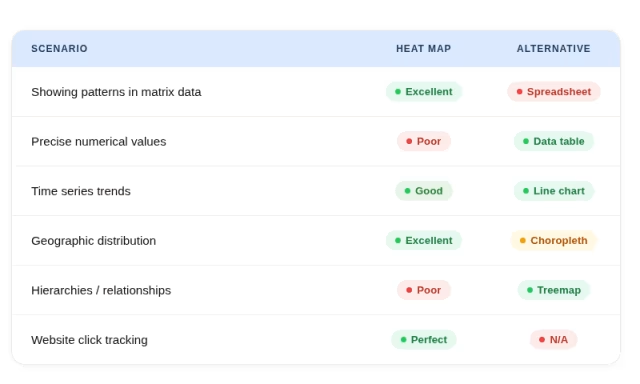
When Not to Use a Heatmap?
- Discrete Geographic Landscapes: Choropleth maps illustrate changes between countries or states better.
- Dynamic Web Applications: JavaScript-heavy single-page applications with dynamic content may not perform well with heat maps.
- Precise Numeric Statistics: Heat maps only provide a broader overview; thus, they may not be suitable for quantitative data like page visits or average time spent on a page.
- Hierarchies Representation: Treemaps, which use nested rectangles, are better for depicting hierarchies or part-to-whole relationships.
- Social Connections: Heat maps’ binary limitations make them unsuitable for complex networks.
- Dynamic Content: Heat maps may become outdated or meaningless if a web page or application’s content changes regularly. The map should constantly be connected to a dynamic dataset for correct depiction.
- Absolute Data Requirement: Other analytical techniques may be better for absolute data values than visual representations.
The Multiple Uses of Modern Data Visualization
Today’s data-driven world relies on visual representations to comprehend complicated datasets across sectors:
- Crime Patterns: Addressing high-crime regions helps law enforcement allocate resources and plan interventions, making neighborhoods safer.
- Traffic flow analysis: Visual technologies help city planners identify congestion hotspots, improving road infrastructure and traffic management.
- Demographic Distribution: Visualizing where people live helps governments and organizations ensure resource distribution in urban planning.
- Forecasting Future Trends: Advanced visualizations identify patterns based on historical data, helping finance and agriculture.
- Market Insights: Real estate professionals use visual data to assess regional property demand, valuations, and investment prospects.
Such visual technologies for interpreting and acting on massive volumes of data have made decision-making more strategic and informed.
Types of Heat Maps
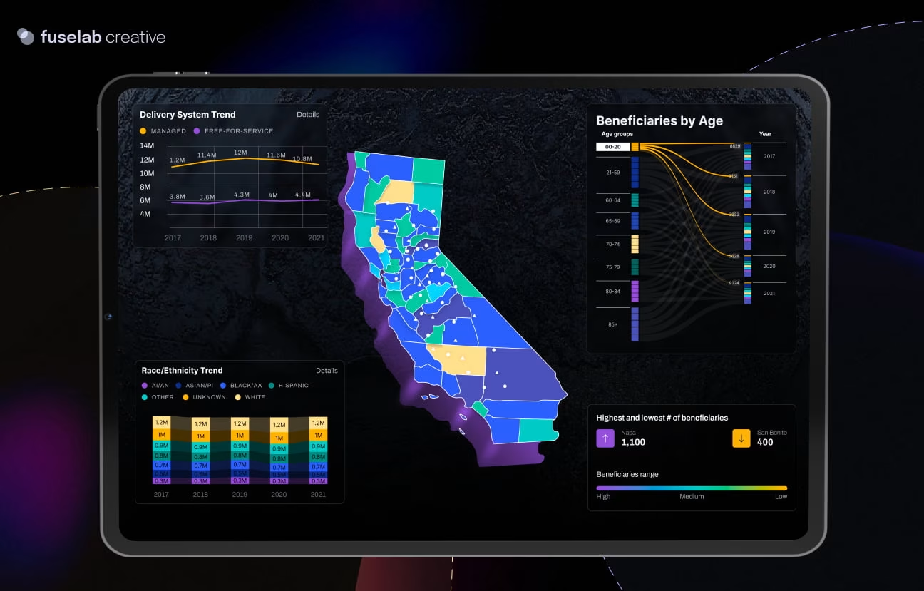
- Geographic Heatmap: A geographic or spatial heat map visualizes complex data by physical location, making it one of the most powerful tools for understanding place-based patterns and trends. It is commonly used to represent a wide range of phenomena, including weather patterns, population density, disease spread, and demographic shifts. The quality of a geospatial heat map is often determined by dot density and the precision of color gradients used to represent value ranges across regions. The more granular the data, the more insight it can reveal. A compelling real-world example comes from NASA, whose latest climate research uses greenhouse gas emissions scenarios to project global temperature and precipitation trends through the year 2100 — helping scientists, policymakers, and the public visualize the potential long-term impact of climate change on communities around the world.
- Grid Heat Map: A grid heat map uses a visually engaging two-dimensional matrix to display and organize data in a structured, easy-to-read format. Each cell within the grid is assigned a specific color based on the value it represents, allowing viewers to quickly identify concentrations, gaps, and outliers at a glance. The rows and columns of the grid correspond to distinct categories, time periods, or variables, while the intensity of each cell’s color reflects the magnitude of the data within it. This format is especially effective when comparing multiple variables simultaneously, creating an apples-to-apples style visual, making grid heat maps a popular choice for performance dashboards, sales analysis, scheduling, and operational reporting across a wide variety of industries.
- Bubble Chart Heatmap: A bubble chart heat map combines the principles of a traditional scatter plot with the visual depth of a heat map, making it ideal for representing multi-dimensional data in a single, and obviously, very cohesive view. Each data point is plotted as a circle on a Cartesian axis, with its position along the X and Y axes representing two primary variables. A third dimension of data is introduced through the size of each circle — larger bubbles indicate higher values — while a color gradient is used to encode a fourth dimension, allowing for even richer data storytelling. It’s amazing how much info is communicated in seconds with this kind of view. This type of visualization is particularly useful in fields such as market research, financial analysis, and scientific studies where understanding the relationship between multiple variables is critical.
- Matrix Heat Map: A matrix heatmap presents data within a two-dimensional grid structure where rows and columns each represent distinct categories, variables, or qualities. The color assigned to each cell communicates the magnitude or intensity of the value at the intersection of those two categories, making it easy to compare data across multiple dimensions at once. Because a 2D heat map condenses large volumes of information into a visually digestible format, it becomes much easier to spot meaningful patterns, correlations, and trends that might otherwise remain hidden in raw data tables – and it looks very cool. Matrix heat maps are widely used in business intelligence, scientific research, and data analytics to drive faster and more informed decision-making.
- Clustered Heatmap: A clustered heat map builds upon the standard matrix heat map by incorporating advanced clustering algorithms to group similar rows and columns together, producing branching tree-like structures known as dendrograms. These dendrograms visually represent the hierarchical relationships between grouped data points, revealing natural clusters and similarities that may not be immediately obvious from raw data alone. This makes clustered heat maps an invaluable tool for medical and biological researchers who need to visually compare large sets of experimental samples, gene expression profiles, or patient data. By organizing data into meaningful clusters, researchers can quickly identify subgroups, anomalies, and significant relationships across complex, high-dimensional datasets.
- Correlation Heatmap: A correlation heat map is a specialized visualization designed to help analysts and researchers interpret the strength and direction of statistical relationships between multiple variables at once. The rows and columns of the matrix each represent a specific variable in the dataset, while each cell displays a color-coded value that reflects the degree of correlation between the two intersecting variables — typically ranging from strong positive to strong negative correlation. This makes it simple to identify which variables move together, which are inversely related, and which have little to no relationship at all. If you are in finance, there’s no doubt you’ve seen or used the heatmas. Correlation heatmaps are also super popular in social science, machine learning, and data science to guide feature selection, risk analysis, and hypothesis development.
- Abstract Positioning Heat Map: Unlike geographic or matrix-based heat maps, abstract positioning heat maps use a web page, digital interface, or conceptual plane as their canvas, overlaying color-coded data directly on top of the surface being analyzed. This is something we do a lot of at Fuselab. These heat maps are most commonly used in UX research and digital marketing, where they capture and visualize real user behavior on websites and applications — showing where visitors click, how far they scroll, and where their attention is most concentrated. Beyond digital environments, abstract positioning heat maps have also played a critical role in project management, where risk heat maps are used to plot and communicate the likelihood and potential impact of various risks, enabling teams to prioritize their mitigation efforts and make more strategic decisions

How to Read a Heat Map
Step-by-Step Instructions: Start by identifying the title and purpose of the heat map to understand the kind of data you are viewing. Next, it’s helpful to locate the legend or color scale, if there is one; it’s typically positioned along the side or bottom of the visualization. Then scan the entire map before zooming in on specific areas of interest, moving from the broadest view to the most granular details.
How to Interpret Colors: Well-designed heat map colors should follow some kind of specific gradient spectrum, where each shade corresponds to a specific value or intensity range. Warm colors — such as red and orange — typically signal high values or areas of concentration, while cool colors — such as blue and green — represent lower values. Some heat maps use a diverging color scale with a neutral midpoint to show both positive and negative deviations from an average.
How to Identify Patterns: In almost every type of heatmap visual, users need to look for clusters of similar colors, which indicate areas where data values are consistently high or low. Gradual color transitions suggest a steady increase or decrease in values, while abrupt changes may point to outliers or significant data boundaries. Comparing patterns across rows, columns, or regions can reveal relationships and trends that raw numbers alone would obscure.
How to Read Legends and Scales: If there is a legend, which 99% of these visuals have, it is your #1 key to accurate interpretation. Pay close attention to the value range each color represents and note whether the scale is linear or logarithmic, as this directly affects how differences in color should be interpreted. Always reference the legend when making comparisons between data points.
Common Mistakes: Avoid concluding without consulting the legend, as colors can be misleading without context. Do not assume that all heat maps use the same color conventions — always verify the scale. Additionally, be cautious about over-interpreting minor color variations, which may fall within a normal margin of variation rather than representing meaningful differences.

Heat Map Visualization Advantages
While attempting to create a heat map, one immediately begins to understand the invaluable data analysis that becomes possible. A heat map data visualization has the capacity to communicate enormous amounts of information clearly and quickly, without much need for explanation, which is potentially the heat map’s greatest asset.
Heatmaps have several benefits:
- Easy Comprehension: Even non-IT people can understand a heatmap. It shows website performance clearly, enabling fast problem-area discovery.
- Efficiency: Heatmaps convey information faster than pages of raw data, facilitating problem detection and solution formulation.
- Improved Communication: They let publishers, marketers, and other stakeholders communicate and analyze data more easily than raw numbers.
- Growth Measurement: Heatmaps help companies improve lead conversions, awareness, and engagement. The US Government used heat mapping to analyze user interaction on their mobile and desktop sites.
- Real Feedback: They reveal what grabs attention and what frustrates users on a page.
- Cost-Effective: Heatmaps can provide vital input from existing employees, frequently better than professional guidance or training.
Instead of just showing colorful pictures, a heatmap interpretation is used to gain actionable insights to expand businesses and improve user experience.
Heat Map Examples
- Temperatures: Heatmaps surely got their start and their name by showing climate and temperature differences. A heatmap can illustrate specific points of interest, such as airports, and show how northern airports are cooler than southern ones year-round.
- Population Change Over Time: Heatmaps show regional population changes over time. A heatmap can easily illustrate that the South Atlantic states in the US saw the greatest population change during the century, while Alaska and Hawaii stayed steady.
- Heatmaps of Average Airline Arrival Delays: Heatmaps can depict airline arrival delays from thousands of aircraft. These maps show patterns like summer and December delays. A map like this can help the airline and airport industries plan ahead and predict the future travel needs of their customers.
- Correlation Matrix: A heatmap can show how certain amenities or lack of amenities in a hotel have a negative or positive correlation with customer stay length and stay satisfaction.

Heat Map Design
When employing heat map data visualization tools, the heat map design choices are critical for the ultimate usability. For obvious reasons, color gradients are used as the foundational design technique for every heat map. Traditionally, warmer hues indicate greater values, and cooler colors have lower values in heat map data visualization colors, but this doesn’t mean that this is set in stone.
Avoiding intense colors that could impair data interpretation is helpful, as our goal with any data visualization is to promote clarity of the differences in the data through strategic design. Just as transportation app design changes how we commute, heatmap data granularity affects design; finer granularity demands more distinct color fluctuations. Legends act as a visual sounding board to help users understand the meaning behind the color ranges.
The structure and organization of data points or areas should be intuitive in any data viz design. Data visualization is always attempting to turn difficult data into a form of visual storytelling. This helps viewers spot patterns, trends, and oddities. Ultimately, we want users to be able to understand what they are looking at with no explanation, while equally important, they should be able to gain insight for better and more informed decision-making.
When to Use a Heatmap and When Not to:
As we have discussed above, the list of heat map charts is quite extensive. One area of particular interest to Fuselab is how the medical provider and research community are using heatmaps in their daily work.
Three key areas are as follows:
- Epidemiological Studies: Heat maps help epidemiologists visualize and analyze data related to disease incidence, prevalence, risk factors, and of course to track disease by mapping locations. This aids in identifying clusters of cases, where medical needs might become critical and potential causes for further investigation.
- Cancer Research: Heat maps are frequently used in oncology to analyze gene expression patterns in cancer tissues. Researchers use the maps to identify genes that are overexpressed or underexpressed in cancer cells, potentially leading to the discovery of new therapeutic targets.
- Pharmacovigilance: Medical providers use heat maps to monitor adverse drug reactions and medication safety. By visualizing data on reported side effects, they can quickly identify patterns and potential drug interactions.
- Radiology and Medical Imaging: Of particular interest to Fuselab and our recent project Radiology Queue, heat maps for the lungs and other parts of the human body can enhance the interpretation of medical images. They may highlight areas of interest, abnormalities, or regions with high or low activity, aiding in the diagnosis and treatment planning process.
Heat mapping design from a leading data visualization agency gives your organization a chance to see your data in a whole new way, which is always good for any company seeking to remain relevant and competitive in our uncertain economy.