How Data Visualization is Changing Healthcare for the Better
The healthcare industry is under extreme pressure to improve patient outcomes, lower costs, and find a way to see more patients every day. Think about this the next time you see your doctor and she seems a little distracted or you waited longer to see her than expected. At the same time, medical providers are dealing with an influx of data from new sources, such as electronic health records (EHRs), wearable devices, and clinical trials. All this data has the potential to help healthcare professionals make better decisions and produce improved patient outcomes, but only if it can be properly analyzed and presented in a usable format. Otherwise, all this data just becomes hard drive clutter.
This is where data visualization comes in. By conveying information in a visually appealing and easy-to-understand way, through the development of healthcare apps, healthcare data visualizations can help decision-makers quickly identify trends, spot outliers, and compare different options. Similarly, well-designed user interfaces can make it easier for patients to manage their health information and access services quickly and effortlessly. Imagine for a second that you have just received your bloodwork results, and within the report are data viz graphics that quickly show you where your numbers are in comparison to others in your demographic, how much change is needed to improve your health, and possibly some high-level guidance on how best to approach the areas of concern such as cholesterol or blood pressure.
Benefits of data visualization in healthcare
By employing data-driven UX design, you remove the guesswork and focus on creating healthcare apps that provide the best possible experience for their users. This means you should conduct as much user testing as possible, and organize the data received to help support strategic medical data visualizer design decisions. If you are redesigning an existing application, heat mapping and general use analytics are critical tools to help you decide the most strategic approach to developing data visualization tools in healthcare and medical app development in general. Many times app builders get caught up in trying to implement modern design and functional elements and ignore some of the key issues that proper research would provide if they had spent the time.
Medical data visualization: Adding time back into the medical provider’s busy schedule
In the medical field, time is everything! Every minute counts when it comes to providing care for patients. This is why the ability of human-centered medical apps to cut out wasted time in a provider’s workflow is pure gold. Streamlining patient care with healthcare data visualization tools and medical applications is becoming a one-two punch in the medical community. We now know that a well-designed and exceptionally usable app with cutting-edge data visualizations and summaries can save a provider several minutes per patient, and up to an hour on a normal day of seeing patients. Additionally, medical app design is making it easier for providers to share information, leading to better care coordination, and changing how providers see, use, and share data in general.
As the medical field grows increasingly complex, medical app design will become even more essential in helping providers give their patients the best possible care. The use of visualizations through Tableau for healthcare and other similar data viz software is now becoming a staple for clinical trial data visualization reports and public health data visualizations. We won’t go into detail in this blog about how predictive analytics and data visualization are impacting the areas of preventative care and medical supply industries, but we’re sure you can see how this area of design and development is positioned to become more and more important to our healthcare providers. As we improve what we can provide those who care for us, they improve their ability to take care of us, something we both need and can be proud of.
Hospital app designers work tirelessly to make hospital apps that are both helpful and efficient. Hospital dashboards help providers get their work done more quickly and easily by automating tasks and providing quick access to information. In addition, a good hospital app interface can help reduce errors and improve communication between hospital staff and specialists outside of the hospital. Ultimately better access to critical data is changing and saving lives every day. Sounds like an exaggeration right, but it’s true. Human error is still a huge issue in healthcare and costs medical organizations millions in insurance fees and legal fees. Automation and data can help reduce a lot of these errors that are usually the result of a tired and overworked individual, and instead providers with the time they need to spend with patients.
The importance of data visualization in healthcare is just beginning to be recognized as the positive disruptor it is. Any healthcare facility not employing some form of medical data visualizations in their patient data runs the risk of falling behind their competitors, and sadly, providing less-than-optimal care for their patients.
As a data visualization services agency, we know how to create medical applications that save providers time, help improve patient outcomes, and ultimately give the medical community a little more peace of mind.
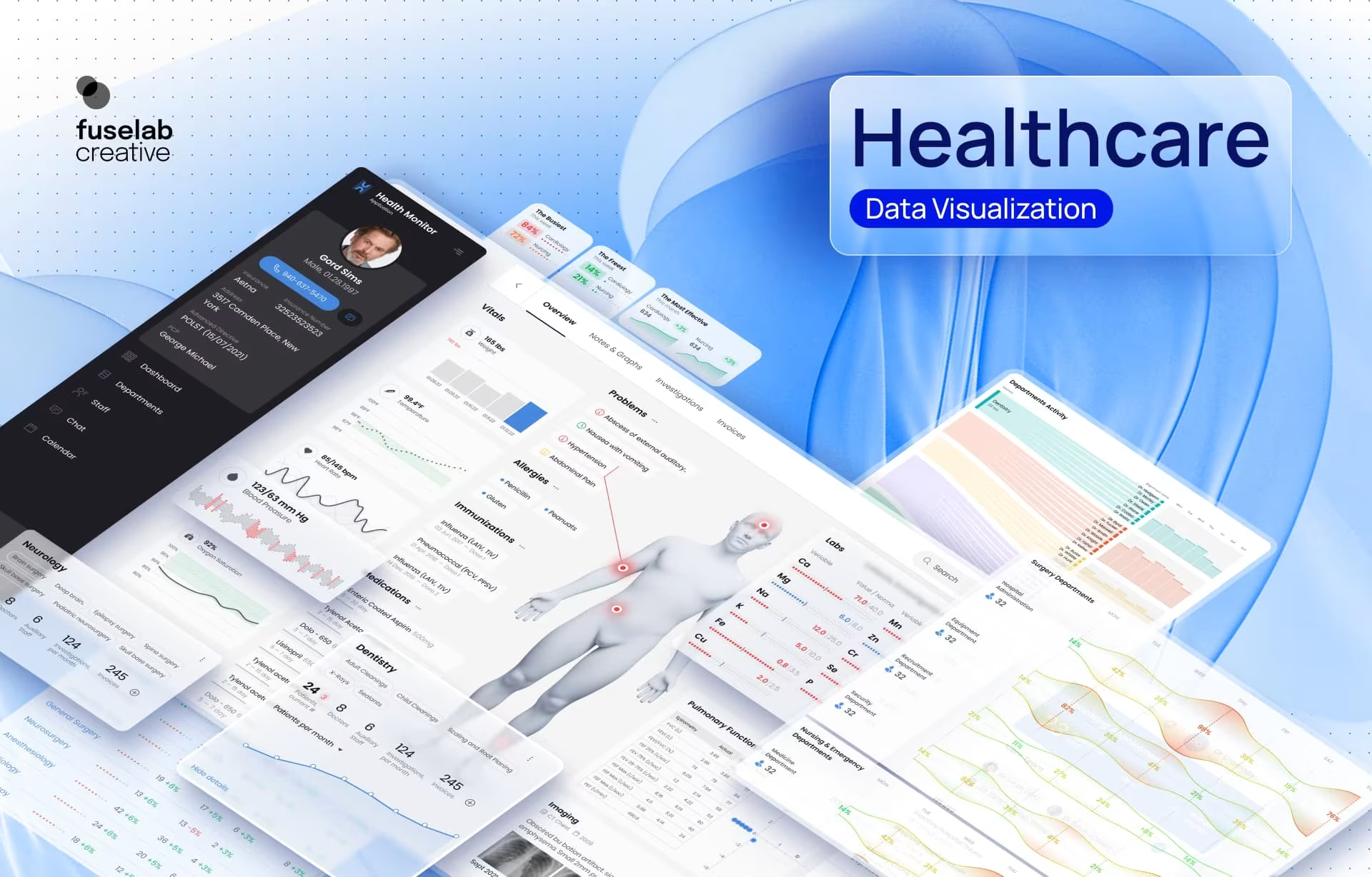
Health data visualization for Health Monitor by Fuselab Creative.
How healthcare data visualization and app design join forces
Creating a healthcare app design that is both visually appealing and functional can be a challenge. However, by utilizing expert data visualization techniques, it is possible to create an app that is both easy to use and informative.
Data visualization is the process of using graphical elements to represent data sets and/or pages of information. It can be used to convey complex information in a fraction of a second. It has been proven that the human mind comprehends graphics exponentially faster than reading words. When a medical provider is faced with a critically ill patient, the benefits of data visualization in healthcare become glaringly obvious. She can pinpoint anomalies and begin treatment in seconds without flipping through charts, spending time researching multiple Electronic Healthcare Records (EHR). Instead, the most important data in the EHR has already been compiled and reproduced using expert digital data viz tools.
When creating a dashboard, designers must carefully consider how to best visualize data sets to provide users with the most helpful and accurate information possible. For example, an interactive bar chart can be used to show how different medications have been performed over time implementing a clickable timeline and adding the ability to self-select periods or specific medication comparisons. By utilizing expert data visualization and interactive techniques, it is possible to create a healthcare app that is both visually appealing and ten times more useful than a patient’s current paper or static chart. The entire industry knows this and was a big part of the provider requirements that were imposed with the passage of the Affordable Care Act, but still, there will always be the late adopters or those who still struggle with broadband access. Luckily, these groups are the minority, and their numbers are getting smaller every year.
Health dashboard design for ReferralMD by Fuselab Creative
Some best practices for data visualization in healthcare examples include:
Help your audience see the importance of data visualization in healthcare
It is crucial to consider the specific needs of your target audience. If you are creating an app for doctors, you will need to design it differently than if you were creating an app for patients. But less obvious are the particular needs of an ER doctor, care coordinator, or EMT. However, when building apps it’s important to know not just your broad audience, but to also understand the distinctive needs of the sub-groups. By understanding your target audience, you can create a healthcare app that is tailored to their specific needs and preferences.
There is a plethora of healthcare data visualization examples to choose from but choosing the right approach can only come from doing your homework with your intended audience. The only way to know specific user needs is through testing, and if possible, employ heuristic testing, which will give you the kind of personal insight that is not possible with any other strategy. We recently created a web application that involved making use of 50 million rows of government COVID-19 data. The users included the most technically savvy users along with senior citizens with minimal access to broadband. Getting an up close and personal view of the needs of these users was critical to the success of the project and required dozens of in-person interviews, numerous follow-ups, and ongoing surveys.
Simplicity is key in medical data visualization
Healthcare users need to be able to find the information they are looking for quickly and easily, which is exactly why the development of health data visualizations is becoming more important than ever. In addition to simplifying your design through medical data visualization, you should also make sure to use clear and concise language to communicate as effectively and swiftly as possible. Confusion is simply not tolerated among medical professionals who have other options when managing their daily workflow.
Use intuitive gestures
The word gesture-based navigation includes actions like a tap, swipe, and pinch. When designing your healthcare app UI/UX, you should understand how gestures can be used to further refine the user experience, while also simplifying the act of navigating through your app. For example, you would use a swipe gesture to scroll through a list of options a tap gesture to select an option, and a pinch and expand to see detail on an x-ray or photograph. By employing gestures intuitively, you will enhance your user experience and create a more valued tool. The use of gestures can speed up the process of perusing clinical data visualization and give the provider the ability to make an informed assessment with only a few swipes.
Making data visualization for healthcare more accessible and user-friendly is not just an important service, it can change lives for the better. It’s not often that a UI/UX design agency can say they have played a role in saving the lives of others or have helped people live longer.
This kind of work is what often gives our staff an uncommon and meaningful sense of purpose. In other words, if it wasn’t already obvious, everyone at Fuselab Creative healthcare design agency loves this kind of work!

Triple Your Customer Base With Human-Centered Healthcare UX Design
Building a new app, or improving an existing one, we can get you headed in the right direction fast!