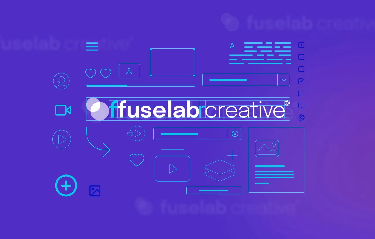
What’s The Difference Between a Design System and a Styleguide?
Look at your thumb. Stick it up, and someone will instantly understand your gesture of approval.
Now switch up the context. You’re scuba diving in the deep sea, and it’s time to head back up. What do you do to convey your intentions? Stick your thumb back up.
Hitchhikers use the multi-talented thumb to flag down a generous driver — except that they point sideways.
Even though the thumbs-up gesture is “universal,” its meaning depends on the context.
For example, in ancient Rome, senators would use this to signal whether a gladiator lives or dies. So who — or what — decides the context, the meaning, and the use of these symbols?
The answer is design systems.
Design systems help you keep the sense of “things” consistent across environments. They spell out why and how we can interpret the what.
Otherwise, we’d all be randomly hitching rides in the sea, telling drivers passing by that all is good, and sentencing gladiators to death when traveling back in time.
What Is a Design System?
A design system is like a language. Languages are design systems. The study of the relationship between the visual components, the sounds, and the meaning they convey is what we call linguistics and it can be provided as a design system service.
Languages — their architecture, rules, grammar, symbols, conventions, colloquialisms, pronunciations, and more — are precisely why a native Spanish speaker can eventually master the English language.
They may relate to other systems in terms of similar components. However, they’re self-sufficient and “closed,” much like clusters of languages in a region coexist.
You can take the essential components and scale them — for example, teaching English to several speakers using different methods. With consistent practice, learners get it. They will know what each component means, how they can (and should) be using the components to communicate an idea.

From here, they can speak to others and trust that they convey what they mean to communicate.
Once they get familiar and comfortable, they can expand their vocabulary, formulate complex phrasing, and even contribute to the language’s evolution.
Design systems function in the same way. They are meant to be a language. They’re both the overarching authority from which all other components span, and the base from which you create, building block by block as you would with Lego bricks. We can talk also about design system benefits below.
Design systems are all-encompassing. They consist of:
- Rules
- Principles
- Schemes
- Procedures
- Acceptable processes
- Workflows
- Visual style guides
- Pattern libraries
- Code snippets
- Documentation
- Brand guidelines
When a company or a business decides to build a design system, they’ll need buy-in from all stakeholders and collaboration at every level, usually through cross-functional teams.
You can think about forming a design system as a cosmos within which you can create with the given set of conditions or the “atomic” components you have.
And, like a language, the combinations of components you can put together are virtually endless — but not everything put together will mean something.
That’s why design systems have a caveat built in — these rules, principles, schemes, icons, pattern libraries, and more have to:
- Work together to streamline the design process,
- Build deliberate outcomes or experiences, and
- Keep consistent meaning even when the components are out of your hands.
That’s the key to expanding your company’s recognizability and ensuring consistency across devices and screens. The end-user interacts with independently created websites, apps, and other digital products and experiences a seamless expectation of meaning.
That’s only possible because designers and developers rely on an articulated design system to provide consistency and clarity when communicating digitally.

Defining Design: A Guide to Design Systems Components
There’s a matter of “maturity” when it comes to design systems and trying to differentiate between style guides, pattern libraries, and CSS frameworks. If you look back in time to the emergence of the internet, the web wasn’t yet about experiences. We didn’t need a cohesive design system.
Rather, digital interaction was about accessing information or performing simple tasks. Even Google’s search engine began as a simple search query. It’s only in the last decade that they’ve grown enough to decide to take over the world and set standards for their “designs.”
The same is true of understanding the difference between design systems and their components — namely, style guides, pattern libraries, and CSS frameworks.
In the context of a company or a business, these various components map very neatly to the company’s maturity.
Mature, developed organizations will put time and resources into developing a design system because they have the reach and recognizability to warrant and require consistency across platforms. In the context of a company or a business, these various components map very neatly to the company’s maturity.
Fledgling and small businesses may have style guides, but they won’t have pattern libraries unless there’s some critical point of customer acquisition.
A good example of this is MailChimp, which only recently developed an accessible library of design elements.
1) Styleguide
What is it?
A style guide is a “subclass” in an overarching design system.
It exists as a set of branding rules that guide how products should look and feel, details about typography, use cases for UI patterns, and more.
It’s the most accessible form of a set of design rules for a company.
That makes it very practical and not abstract in the least.
Who is it for?
- Internal designers and developers
- External content or design freelancers who create assets for the company
When is it used?
It’s used when companies want to onboard internal team members and give them a framework that cuts down on any ambiguity about the brand’s visual values.
2) Pattern Library
What is it?
A more robust style guide, like the ones with Facebook and Polaris (more on that later), will also include a pattern library.
At its core, pattern libraries are centralized and digitized collections of a brand’s entire set of visual and content assets. This can include:
- Fonts
- Logos
- Icons
- Menu & UI assets
It should also include clear rules on how and when to use each of these “sub” components.
Who is it for?
- Internal teams
- If it’s released, then independent designers who want to use the platform to showcase their work or “test” ideas using a familiar interface
When is it used?
For easy access and to scale across internal product teams — the whole idea is to significantly cut down on time spent having to recreate these assets.
3) CSS Framework
What is it?
One of the reasons people get confused when learning about design systems is that many of the terms are used interchangeably — and they recur.
For example, you now know that design systems have pattern libraries. But maybe you’ve also heard of CSS frameworks versus Javascript libraries. Clearly, we need a design system for design systems.
In the meantime, let’s get specific.
CSS frameworks are a set of standard concepts, practices, and criteria that define the use and application of CSS when encountering common problems in front-end design and development.
CSS is code, but it’s unique in that it allows you to adapt the visual design of elements on a page. Frameworks allow you to take a “ready-made” structure and then customize it.
Who is it for?
- Coders — both internal and external
- Designers who also handle some elements of front-end development or website page design and don’t want to get into the intricacies of coding
When is it used?
- When you want to reuse code so you can focus on other aspects of the application
- When you want to ensure consistency across teams who need to rely on uniform typography, design, forms.

Language for Living in a “Material” World — Examples of Design Systems
The examples we’ll look at all come from businesses that have hit a certain point in their growth and development.
You can say that they’re “design-conscious,” which means they’re interested in and understand what they need:
“[A] strong and equal alignment of business, design, and technology functions, [which leads] to a repeatable, standardized, and sustainable way for all employees to work together to build digital products that fit the needs of their users and are intuitive to use.” — Customer Think
At its heart, a design system within a company enables scale — of size, of user experiences, across numbers of users, within environments and contexts. At no moment in history has “scale” been put to the test than the recent global pandemic we’re all still facing.
The COVID-19 pandemic has digitized almost every industry that has been reluctant or slow to embrace digital transformation — from accessing healthcare to online grocery shopping.
That means aligned and consistent design, business goals, and tech that powers these functions are more relevant and essential to capturing market share than ever before.
“Material” by Google
Material by Google is a common example of a comprehensive design system that operates across screens, experiences, and digital products. The system includes every component, standard, guideline, process, template, and customizable element you can imagine, from the gross to the granular. It’s so detailed and specific that Material even articulates how an element should move when a user interacts with it or how a shadow should be designed.
“Google made it clear that Material was for everyone, everywhere.
Developers and designers jumped at the invitation, quickly applying the prepared designs and animations to hundreds of thousands of interfaces and apps, and using Material as the springboard to create their own systems.” — Designsystems.com
Polaris by Shopify
Polaris by Shopify is a fascinating case study in the understanding of design systems. Many individuals think that Shopify is limited to templates or APIs — in other words, the most accessible front- and back-end functionalities allowing third-party developers and designers to offer their creative expertise using the Shopify platform.
Polaris gives these creatives and digital designers a chance to understand the Shopify universe through UI and UX conventions. It pushes them to think about the platform for delivering a thoughtful, meaningful, and consistent experience — one that Shopify’s universal conventions empower them to do.
You’ll also notice how Polaris begins with high-level concepts and guides that get more detailed about these specific aspects:
- Content
- Design
- Components
- Experiences
All true design systems include these areas.
Once a user has mastered these, they can also access “libraries” or resources, which come in the form of code snippets for React, or kits for UI components. This further drills down into icons, colors, and typography, among others.

Facebook Design
The case of Facebook Design is quite different from Polaris or Material. Instead of creating a design system, what Facebook outlines in its newest brand redesign can be called a style guide or a brand formatting guide.
It includes accessible and detailed guidelines for how internal teams can use and reuse design assets. Unlike a design system, it does not incorporate content or experiences. It’s a static document, potentially including a pattern library.
As a document, Facebook’s style guide outlines design positions, principles, challenges, and decisions. But it also gives those who want to use these elements access to templates, kits, and resources.
This is a real-world example of a pattern library, which identifies all design patterns used in Facebook’s interface and grants additional access to this inventory through downloads.
Canada Post
To help unify shipping functions across a wide variety of e-commerce platforms, Canada Post launched Mercury. As a design system, it includes all the components you need to keep the structure and experience consistent.
What’s most interesting about the Canada Post case is that this universe began rather organically. Instead of a massive and deliberate project, Mercury grew from necessity.
Headed by then-Lead Designer Daria Sheplenko, the assets, components, resources, and style articulations grew bit by bit as the need to scale expanded.
“Even if you can’t have development from the start, there are still a lot of things that you can get started with as just a design team. You can still kick start the process of documentation, you can start building reusable design or UI kits to share with product designers, you research like UI audits and have conversations with people about the challenges they are facing.” — Daria Sheplenko, Lead Designer, Canada Post

Author
Related posts


Conclusion
The components of design systems — style guides, pattern libraries, etc. — are all about following the rules and understanding the conventions. In other words, they’re about working within constraints. However, design systems are game-changers because their main role is to provide expansion and scale.
They want users to immerse themselves in the documentation, values, principles, and everything else to multiply and expand these instances across devices and platforms with minimal wastage of time and resources.
Think about how nice it is not to reinvent the wheel every time you want to say “apple” to a friend and get an apple in return. Then thank the design system, refined over centuries, that allowed you to do that. They work best when you don’t know they’re working at all.