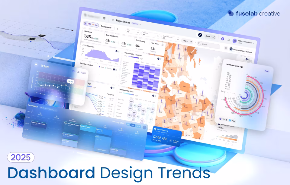
Material Design for Dashboard Development
Dashboards are a standard tool in the business world and are used for a variety of purposes.
Perhaps you want a place to post projects for employees that is easy to access? How about a database where information can easily be stored and tracked as it is updated or changed? Dashboards provide a great deal of functionality for completing tasks and allow users to follow them from beginning to end. Google material design dashboards have become one of the leading styles on the net today.
As dashboards increased in popularity, so did the need to create solutions that enable administrators to choose a more efficient material design that is effective and easy to use.
According to A Guide to Creating Dashboards People Love to Use, “Communicating with data isn’t about telling a specific story, but rather starting a guided conversation.”
However, this conversation also can go in any number of directions depending on the needs of the user at that particular moment. Think of it in terms of an interactive narrative that guides users through all the different options you can choose.
The key is to create a material design dashboard that allows your users to communicate with the data rather than just giving them something to read and reference.
It’s also particularly important that these dashboards are manageable via any device and without difficulty, even on particularly small devices. This responsive approach is key not only for effective functionality but also for SEO purposes, as Google is now considering mobile platforms first before desktop for all URL.
Choosing An Effective Dashboard Design
Traditionally, dashboard designers focus on defining the metrics that would prove successful, and then putting all the charts together on one page. Monitoring dashboard design created in this way could be very difficult to follow because the information appeared jumbled and confusing to the user.
Now the focus has been shifted to include a wide range of navigational and functional components that make the information easy to find and understand. The most important aspect of any dashboard is the end-user. The data presented may be great, but if users are unable to successfully interact with and understand the information, they will not be able to act upon it. Use examples of material design dashboard UI to find the one that best suits your purpose.
The Evolution of Dashboards
The dashboards of today have evolved to encompass a broad range of tools and options that have the potential to grab users’ attention when implemented correctly. For example, bootstrap material design and other dashboard material design templates like Google’s are paving the way for how dashboards are now laid out.
Making use of the available tools to create dashboards, helps you create responsive dashboards that speak directly to your user’s needs, and consequently give them a reason to return. Design your dashboard around the data and follow the best material design dashboard examples.
Instead of thinking about how much data you can put on a screen at one time, give your users smaller blocks of data that are easier to process and navigate.
This allows them to choose what data they want to see at any given time as well as how they will view it. Take for example a marketing data dashboard that allows users to compare effectiveness data from week to week, month to month, and year to year; every organization in the world would benefit from data like this and raise the likelihood for success exponentially!
Where to Begin with Material Design for Your Dashboard
Your dashboard material design template should contain targeted material designed to streamline various tasks. The information you relay to users should directly relate to these tasks.
Define the Core of Your Dashboard
Begin by defining the core of your dashboard. What do you want to accomplish? What will users be able to walk away with in terms of actionable data that will guide their activities from that point forward?
For example, if you are creating a sales dashboard, you might focus on how to move leads through your pipeline more effectively. Likewise, a marketing dashboard might be centered around creating more effective strategies.
Defining a core for your dashboard will allow you to organize the material logically while leaving out the data that doesn’t apply to your main focus.
Learn more about dashboard system design.
Ask the Right Questions
Consider the data you are providing users and think about how they might interact with it. How would they benefit from knowing the information and what could this mean for the business?
Make Sharing Easier
Dashboards are often used to share information across many channels. According to Better Buys, “Dashboards also give employees a better understanding of their role by reducing the time and effort it takes to compile reports and share information across the company. ” Through well-managed material, employees will see the impact their work has on the business which results in a better understanding of the overall vision and the making of more well-informed decisions.
Take a minute and think about how a shared dashboard that is regularly updated might cut down on the need for marketing and staff meetings where this information is usually reported; now through a properly implemented dashboard template, staff are “in the know” every minute of the day, and don’t need to wait for a weekly meeting.
Rise to the Challenge
Dashboards can help you manage data efficiently, but you should be very strategic when creating one. The focus should be clear, so the metrics make sense.
First, consider your objective. What do you want the dashboard to accomplish? This will help you determine the scope of what you are creating so you can choose the appropriate metrics. Your dashboard should be designed to track the metrics of a particular process. Keep the view simple so the information is easy to find, read, and understand.
For example, use only a few visuals and colors for certain alerts to depict when goals have been met. Think about how some new outlets used to overwhelm visitors with options, instead of focusing on the key stories of the day. This approach should be applied to dashboards as well so that people can easily determine the hierarchy of information they have to choose from.
A broader scope can be used to track data for overall company performance. Your materials should reflect this and can include more visuals, but as a general rule, you want to keep the design as straightforward and simple as possible.
Consider Your Audience
Think about your audience when designing your dashboard. Who will use the materials? Is it for one specific segment of the company or will people from various departments access it?

Improve Navigation and Visibility
The layout of your dashboard is extremely important. While it was once common to include drop-down menus, more and more designers are now reverting to blocks of content with visual cues or tabs to make it easier to find information. This changes the way users navigate the information by allowing dashboard creators to organize the information, so it is visible, eliminating the need for users to search through complicated menu structures to find it.
According to Wrike, who recently rolled out new and improved ways to design dashboards, these new designs for dashboards “not only look great but give you the ability to dig deeper within a task and allow you to resize the column, giving you the power to customize your widgets the way you want.
” This gives you plenty of flexibility so you can increase the material your dashboard contains without the worry of how it will perform for users. This allows for a more streamlined workflow and faster response from all angles while creating a more responsive product overall.