Healthcare dashboard design best practices for 2026
Healthcare dashboard design is the work of turning clinical, operational, and financial data into one screen a clinician can read at a glance and act on. What sets it apart is where it runs: the reader is usually a clinician short on time and handling protected patient data, so a layout that would only slow a business analyst can delay someone’s care.
What is healthcare dashboard design
A healthcare dashboard turns clinical, operational, and financial data into one interface a provider or administrator can read at a glance and act on immediately. It surfaces the most critical indicators on first load, lets the user reach supporting detail in a single action, and presents data from many source systems as one coherent view rather than a pile of disconnected reports.
The distinction that matters is between a report and a product. A report is generated, read once, and forgotten. A dashboard is something a clinician comes back to a hundred times across a shift, changing under them as new vitals, labs, and orders land. Building that is a different craft from formatting a report, and most generic design work never gets past the first one.
Clinical settings pile on constraints that consumer and even enterprise interfaces rarely face together. The reader is usually on their feet, mid-task, and about to be interrupted. The records live across systems that were never built to talk to each other. And a confusing layout costs delayed treatment here, not a slower quarterly review. Those conditions shape every real decision on a medical dashboard.
Why healthcare dashboards matter for outcomes and revenue
A good clinical dashboard earns its keep twice: the interface that speeds a decision at the bedside also protects the facility’s margin. A view that catches a deteriorating patient early prevents an adverse event, and one that surfaces a reimbursement gap recovers revenue that would otherwise go uncollected. In most facilities the screen that improves care and the screen that protects the budget are the same screen.
On the clinical side, a patient-focused view lets a facility find gaps that compromise safety. Providers can watch daily patient averages, total volume, time spent with each patient, and unexpected return visits, then judge whether staffing-to-patient ratios hold up. When the interface makes those signals obvious, the team catches problems while there is still time to act on them.
Financially, that same discipline protects income. A well-built view tracks claims reimbursement cycles, payer-specific trends, and the effect of telehealth policy, giving finance teams the oversight that surfaces cash-flow opportunities. Private practices lean hardest on this, because retention and new patients decide whether the practice stays profitable from one quarter to the next.
Growth is the third payoff. The waiting-room-to-triage time, cancellation rates, and reimbursement patterns that a dashboard exposes double as a map of where to expand services or train staff. A facility that can see where it loses patients can decide, on evidence rather than instinct, whether the answer is a new service line or a better-trained front desk.
How healthcare dashboard design differs from general dashboard design
Clinical dashboard work differs from general dashboard design in three concrete ways. The reader is a clinician under time pressure rather than an analyst at a desk, the data carries HIPAA and accessibility duties that shape the interface before any visual choice, and the consequence of a misread number is clinical rather than commercial. An agency that has only shipped marketing or finance work has not met these constraints together.
On a business intelligence dashboard, a user who misreads a chart reruns a report. On a clinical dashboard, a provider who misreads a vital trend can make a treatment decision on wrong information. That single difference raises the bar on chart selection, color meaning, and default views, because the interface has to be legible under stress and correct at a glance, not merely attractive in a demo.
The data layer is also harder. A general dashboard usually pulls from one warehouse, while a hospital interface has to resolve systems that disagree about the same patient and refresh on different clocks. Making that feel like one trustworthy product is closer to systems integration than visual styling, which is why general dashboard design experience does not transfer cleanly to clinical work.
Types of healthcare dashboards
There are three functional types, split by the job the dashboard does. Clinical dashboards track patient status, outcomes, and safety signals; operational dashboards monitor throughput, staffing, and capacity; and financial dashboards follow reimbursement, cost of care, and revenue cycle. Each answers to a different reader, and building one as if it were another is the most common structural error in the field.
- Clinical dashboards serve providers at the point of care. A patient-care view holds histories, allergies, and current issues; a doctor-facing view prioritizes what a physician needs inside a short visit window. These are read fastest and forgive the least, because the reader is often deciding something within the next minute.
- Operational dashboards serve charge nurses, department heads, and facility managers watching patient volume, wait times, bed capacity, and infection control. A healthcare performance dashboard belongs here, comparing departments and outcomes so a facility can see where results lag and where a team is producing lessons worth spreading.
- Financial dashboards serve executives and revenue teams tracking claims cycles, payer-specific reimbursement, and cash flow. The reader wants trend and exception, not raw transactions. A private practice leans on this view to protect margin, while a hospital system uses it to find where money leaks between service lines and settings of care.
Research and discovery before the first wireframe
Discovery decides whether a medical dashboard fits the people who use it, because an interface is only as good as the understanding of the decisions it supports. Strong teams interview real users, inventory the data and its quality, build personas by role, and map current workflows before drawing a screen. Skipping this phase is why so many dashboards ship and then stall the first day a nurse uses them.
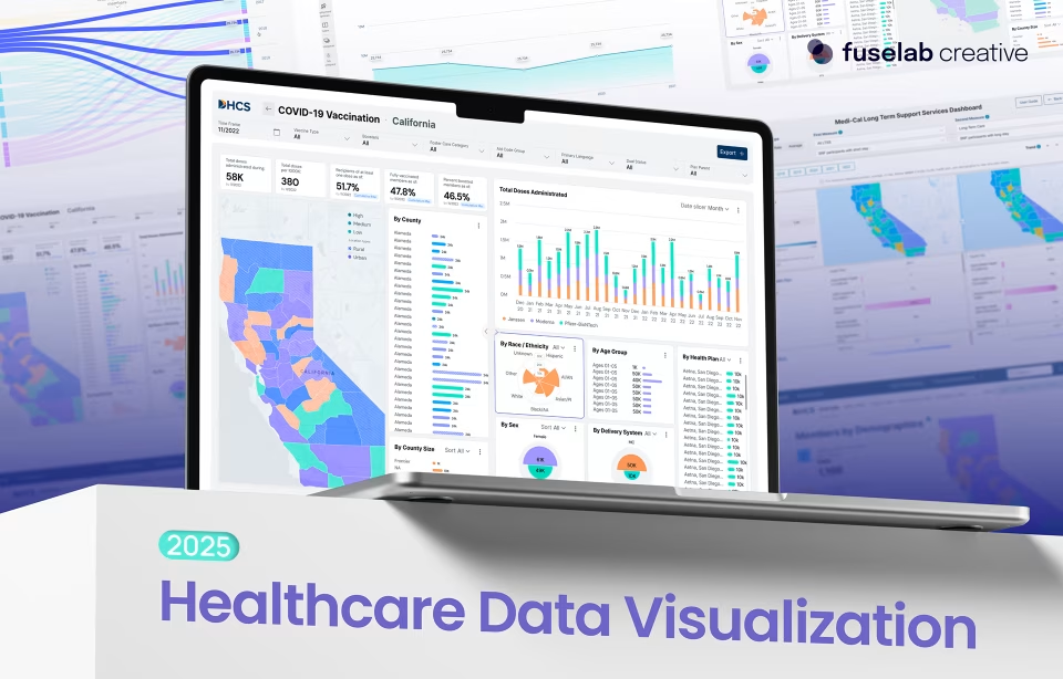
The DHCS long-term care work shows the depth this takes. Fuselab interviewed 17 department staff, built five personas that ranged from executive directors to program analysts, mapped how people currently reached their data, and inventoried every source for quality and update frequency. That groundwork is what let a single product serve readers whose jobs had almost nothing in common.
Research also settles a question visual design cannot. Different roles need different defaults, and interviews are how a team learns that executives want outliers surfaced first while analysts want room to dig. On the DHCS dashboards, testing with 18 users reshaped navigation, filter logic, and how prominently trends showed. The interfaces clinicians end up trusting are usually the ones shaped by this listening, not a designer’s instinct.
Designing for multiple data sources and real-time updates
A clinical dashboard is only as trustworthy as its data layer, which usually means reconciling records from an EHR, lab systems, imaging, and scheduling that update at different speeds and in different formats. The design job is to present that patchwork as one current, coherent product, so a clinician never has to wonder which system a number came from or how stale it might be.
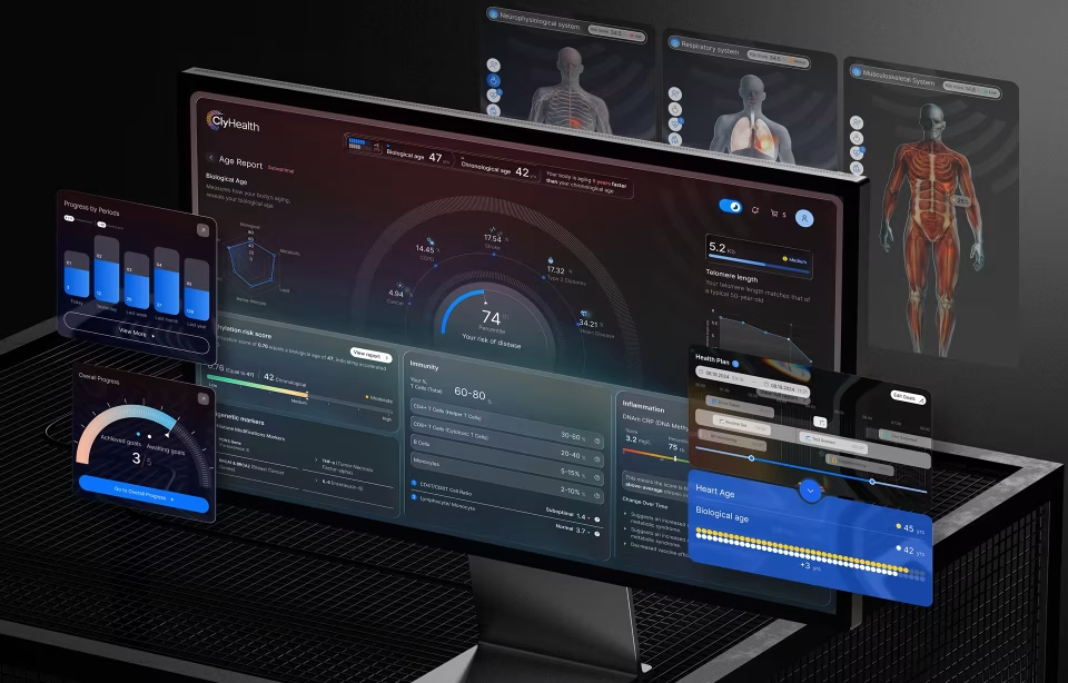
ClyHealth is a clear case. It was designed as the top-level entry point for an existing electronic health records system, so the interface had to present data drawn from that infrastructure consistently, regardless of source format or latency. The pharmacy module required interoperability across multiple EHRs through HL7 and FHIR standards, which is engineering work, not a styling choice.
Real-time behavior is part of the design, not a technical afterthought. A dashboard is a live product rather than a static report, and stale data on a clinical screen is worse than none because it still looks authoritative. Making freshness visible, and making the source of each number obvious, is a design responsibility that quiet interfaces get right and busy ones ignore.
Clean medical dashboard design patterns
A few structural decisions, repeated across good clinical interfaces, are what keep a medical dashboard readable under pressure. Critical data sits at scan speed, information is layered by priority rather than category, color carries meaning instead of decoration, and views change by role. Those patterns separate a dashboard clinicians actually use from one that looks finished in a portfolio and stalls at the bedside.
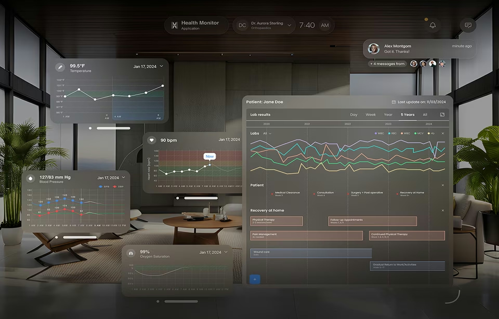
Scan-speed critical data. The indicators that matter most have to be readable without a single click. Fuselab built the Health Monitor EHR redesign around a 90-second review window, roughly the time an emergency provider has between one patient and the next. Vitals, allergies, and active problems load first, because no one can dig through tabs with a patient waiting in front of them.
Layered architecture over flat density. Priority should drive structure, not data category. The ClyHealth platform uses three levels: critical indicators on first load, clinical and genomic detail one action deeper, then full biomarker and EHR history deeper still. No provider passes through all three unless the case demands it. This applies Nielsen Norman Group’s work on progressive disclosure where the stakes are clinical.
Density that respects the reader. Clinicians do not want less data. They want signal in the noise, and they trust a decision more when the numbers behind it are visible. The Health Monitor blood pressure view shows every reading, its highs and lows, abnormals in red, and a healthy baseline, all in the space a single number would take. That density is the point, and clinicians read it fast.
Color as a signal, not decoration. On a medical dashboard, color is a language. Red should mean an abnormal reading and nothing else, so a clinician never has to ask what a hue is doing there. Keep the palette quiet, hold contrast to accessible ratios, and let one alert color earn its meaning by never appearing casually. That consistency is itself a safety property on a clinical screen.
Role-based views. An executive scanning for outliers and an analyst filtering a cohort need different defaults, not the same screen with more toggles. The DHCS dashboards separated an executive overview from program, population, and provider layers, each opening on the view its reader needed first. Role-based structure also carries a compliance benefit, since it governs which records a given user can see at all.
The pattern people underrate is the second one. Teams reach for a bigger screen and more widgets when a layered structure would solve the problem better. Progressive disclosure is harder to design than a flat wall of charts, and it is the decision that most often determines whether a dense clinical product stays usable on its tenth day of a shift, not just its first.

Choosing charts for clinical decisions
On a clinical dashboard, the right chart is the one that makes the decision immediate rather than deferred. Chart choice is not a matter of taste in a medical setting, because a mismatched visual slows a provider at the moment speed matters most, and can turn a simple data question into a patient-safety risk. Fit the form to the decision, not to the dataset.
A trend a clinician needs to read in a second belongs in a sparkline or a banded range, not a table of values. The Health Monitor vitals views encode highs, lows, abnormal readings, and a healthy baseline into one compact graphic, so a provider reads the trajectory without parsing numbers. The chart does the interpreting the reader has no time to do.
Comparison and distribution questions call for different forms. Geospatial heat maps show where service or risk clusters, and flow diagrams show how patients move between settings, both of which the DHCS dashboards used to make population patterns legible. Defaulting every panel to a bar chart is the tell of a team that picked its charts before it understood the questions.
Advanced clinical visualization: genomic data and the digital twin
Some clinical data is dense enough that the real design challenge is making it readable to a provider who is not a data scientist, from genomic profiles to whole-body physiology. Success means a clinician can use the visual in a patient conversation without stopping to decode raw output. When it works, that data becomes usable inside a short visit, with no specialist needed to read it.
Most clinicians are not bioinformaticians, and the genomic data a platform like ClyHealth processes is far denser than a standard lab panel. The interface had to render biomarker analysis in a form a provider could act on, mapping how a patient’s body systems function relative to their age so the finding reads at a glance. This sits at the harder end of clinical product UX.
The ClyHealth digital twin pushes this further. It is a proprietary model of the body, built by Fuselab, covering the skeleton, nervous system, brain, and organs, that reflects a patient’s current state once their genetic and lab data are loaded. Providers use it to see how systems are performing and to picture how an intervention might change outcomes, a build that took anatomy and domain knowledge alongside interface craft.
HIPAA, Section 508, and access control in medical dashboards
Compliance is not a feature you add at the end. HIPAA, Section 508, and role-based access are design constraints that shape information architecture before the first screen is drawn, because they decide which data a user role may see, how sessions behave, and whether the interface is legible to people using assistive technology. A team that treats compliance as a final review has already built the wrong structure.
On ClyHealth, which handles genomic and clinical data, display rules, session management, and permission structures were designed around regulatory requirements before any visual design began. The team also built custom HIPAA-compliant APIs to handle importing and using patient data. Compliance was understood at the start rather than discovered mid-build, which is only possible with direct clinical-product experience behind the work.
Accessibility is the half of compliance agencies skip most often. Public-sector healthcare work carries Section 508 duties, and the DHCS dashboards were evaluated against WCAG 2.1 AA with an ADA-compliant color system, so state employees at any level of ability could read them. Fuselab also holds a GSA contract, which lets government teams engage directly. The HHS HIPAA guidance for professionals is the source of record for the regulation itself.
Choosing the right metrics and KPIs
Metric selection is the most consequential decision in the project, because a screen crowded with every available number is harder to act on than one carrying the handful that drive a decision. A good team starts from the question each user is trying to answer, picks a manageable set of KPIs against it, and fixes a baseline so progress can be measured rather than guessed.
The metrics that belong on the screen are the ones tied to a decision a specific reader makes. Medication error rates and time to treatment change how a charge nurse runs a shift, while readmission and mortality trends change what a medical director escalates. A number no one acts on should come off the screen, however easy it was to pull from the warehouse.
Before a dashboard can measure improvement, the organization has to fix a baseline for each indicator. Without a starting point, a chart shows motion without meaning, and no one can tell whether a shift reflects a real change or normal variation. Defining baselines during discovery is unglamorous work that decides whether the finished KPI dashboard design is trusted or ignored.
Healthcare dashboard examples that show the pattern
The clearest healthcare dashboard examples are the ones where a design decision maps to a measurable operational problem. Predicting no-shows protects a schedule, tracking satisfaction lifts quality of care, and surfacing cost-of-setting differences guides long-term care policy. Each shows the same principle: the interface exists to make one decision faster and more reliable, not to display data for its own sake.
Patient no-shows. Outpatient practices lose revenue and lengthen wait times when patients miss appointments. A dashboard that flags which patients are likely to miss, and when, lets a scheduler act ahead of the gap rather than react to an empty room. What earns its place is not the prediction itself, but the prompt to fill the slot before the gap costs anything.
Quality of care. Hospitals track patient satisfaction to find where experience breaks down by department and by provider. A JAMA Network Open study on person-centered care for patients with complex needs points to real reductions in adverse outcomes when systems organize around the patient. The dashboard job is making that feedback specific enough to act on, division by division.
Population and cost, at DHCS. For California’s Department of Health Care Services, the long-term care dashboards made the link between care setting and outcome visible across counties, showing where home-based care served people better at lower cost. Fuselab built these views as custom modules inside PowerBI, a first for the agency. The academic base is growing, as a scoping review of dashboard design practices in health care documents.
Common mistakes on healthcare dashboards
Most of the mistakes that sink a healthcare dashboard never show up in a demo. They surface after launch, when alerts fire so often that clinicians stop reading them, when the design meets real records instead of tidy sample data, and when a panel has no answer for a missing value or a dead feed. Each one clears a pitch and fails a shift.
- Alarm fatigue. When everything on the screen can turn red, nothing does, and staff quietly learn to swipe past warnings to get through the day. The discipline is a strict hierarchy of interruption: reserve the loudest signal for the handful of conditions that change what happens in the next minute, and let the rest sit until someone goes looking.
- Validating on clean sample data. A dashboard built against tidy records looks finished, then breaks the first time a lab value is missing, a name overruns its field, or a feed returns yesterday’s numbers. Designing against real, messy patient data from the first prototype is what catches these problems before a clinician does.
- Missing empty, loading, and error states. A blank cell where a vital should be reads, to a tired provider, as a normal value, and that is a safety problem. Those states deserve the same attention as the populated screen, and all of it should be checked on the real monitor it will run on, not a designer’s display.
How to choose a healthcare dashboard design agency
A qualified healthcare dashboard design agency shows at least one shipped clinical or public-health product with a named client, documents its HIPAA and Section 508 process at the start, and can explain how it reconciles data across incompatible systems. An agency whose healthcare portfolio is a set of unlabeled screens, with no named build, is a general design shop describing work it has not done.
Ask to see the data layer, not just the visuals. Any team can produce an attractive chart. Far fewer can walk you through a data model they built alongside a client’s own engineers, or explain how their permission model decides what each role sees. That conversation separates practitioners from portfolios within a few minutes.
For government and public-health buyers, procurement rules matter as much as craft. Fuselab is a GSA contract holder based in McLean, Virginia, and its healthcare work spans the ClyHealth clinical platform, the Health Monitor EHR, and the DHCS long-term care dashboards. Specific builds, named clients, and a documented process are the signals that a partner has done this before.
Conclusion
Healthcare dashboard design rewards teams that treat clinical reality, compliance, and data integration as design inputs, planned before the first screen. The interfaces clinicians keep using are structured around a named reader and a named decision, tested with real providers, and built to stay legible under real time pressure. Review the full healthcare UX design services approach and start your next build from those constraints.
Frequently asked questions
What is healthcare dashboard design?
Healthcare dashboard design is the practice of building interactive data interfaces for clinical, operational, and financial settings where the speed and accuracy of a reading affects patient care and cost. A working healthcare dashboard shows the most critical indicators on first load, lets users reach detail in one action, and presents data from multiple source systems as a single coherent view.
What makes a clean medical dashboard design?
Clean medical dashboard design keeps the critical indicators legible at scan speed, layers deeper information by priority rather than category, and uses color only to carry meaning such as an abnormal reading. Density is not the enemy on a clinical screen. Disorder is, which is why structure and restraint matter more than how much data appears.
What is the difference between a clinical, operational, and financial healthcare dashboard?
Clinical dashboards track patient status, outcomes, and safety signals for providers at the point of care. Operational dashboards monitor throughput, staffing, wait times, and capacity for charge nurses and department heads. Financial dashboards follow reimbursement, cost of care, and revenue cycle for executives, and each serves a different reader who needs a different level of detail.
How is a healthcare dashboard different from a general BI dashboard?
Medical dashboards carry constraints a general BI dashboard rarely faces together: readers are clinicians working under time pressure, the data is protected under HIPAA, and a misread metric can affect treatment rather than a report. The data layer is also harder, because it reconciles EHR, lab, imaging, and scheduling systems that were never built to interoperate.
How much does a healthcare dashboard cost?
A healthcare dashboard typically costs between $25,000 and $150,000 to design and build, with US specialist agencies charging $100 to $300 per hour depending on scope and compliance needs. Cost is driven by the number of source systems, the complexity of user roles and permissions, and whether the work includes HIPAA-compliant data handling rather than screens alone.
How do you make a healthcare dashboard HIPAA compliant?
HIPAA compliance in a healthcare dashboard starts at the design level, not the final review. Display rules, session management, and role-based permissions are defined before visual design so each user sees only the records they are allowed to, and data importing runs through infrastructure built to protect patient information. Retrofitting compliance after layout usually forces a rebuild.
How do you choose a healthcare dashboard agency?
Choose a healthcare dashboard agency that can show a shipped clinical or public-health product with a named client, documents its HIPAA and Section 508 process at the start, and can explain how it reconciles data across incompatible systems. For government work, confirm the agency can contract directly, such as through a GSA schedule, before scope discussions begin.