KPI’s and Data Dashboard Design

Data continues to drive innovation and efficient workflow practices across all areas of business. As networks proliferate and communication speeds accelerate, organizations need to leverage their data to create real value.
Regardless of what you do or where you do it, the ability to do interesting things with your data is more important than ever.
In a world enveloped by information, defining and mastering your key performance indicators (KPIs) is critical if you want to stay on the right side of the new digital divide.
What are KPIs?
By definition, KPIs are the key metrics that help to define the current state of your organization. To meet your future goals and keep your stakeholders happy, you need an accurate way to measure performance based on the data at hand.
KPIs are largely dependent on your business and industry sector, with the future goals and current state of your organization also affecting your data needs. Different users need different data, not just between organizations but also within them.
Common KPIs are related to revenue improvement, cost reduction, process efficiency, and customer satisfaction. Both quantitative and qualitative data can be used to help define and analyze these important indicators.
Despite the wealth of data and data visualization tools on the market, this process is often harder than you think. While big data gives organizations the ammunition they need to make valuable insights, the sheer amount of data out there makes it difficult to decide what’s really “key”.
What is a data dashboard?
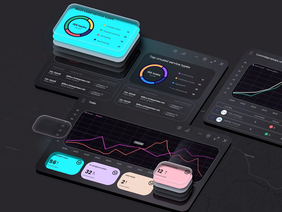
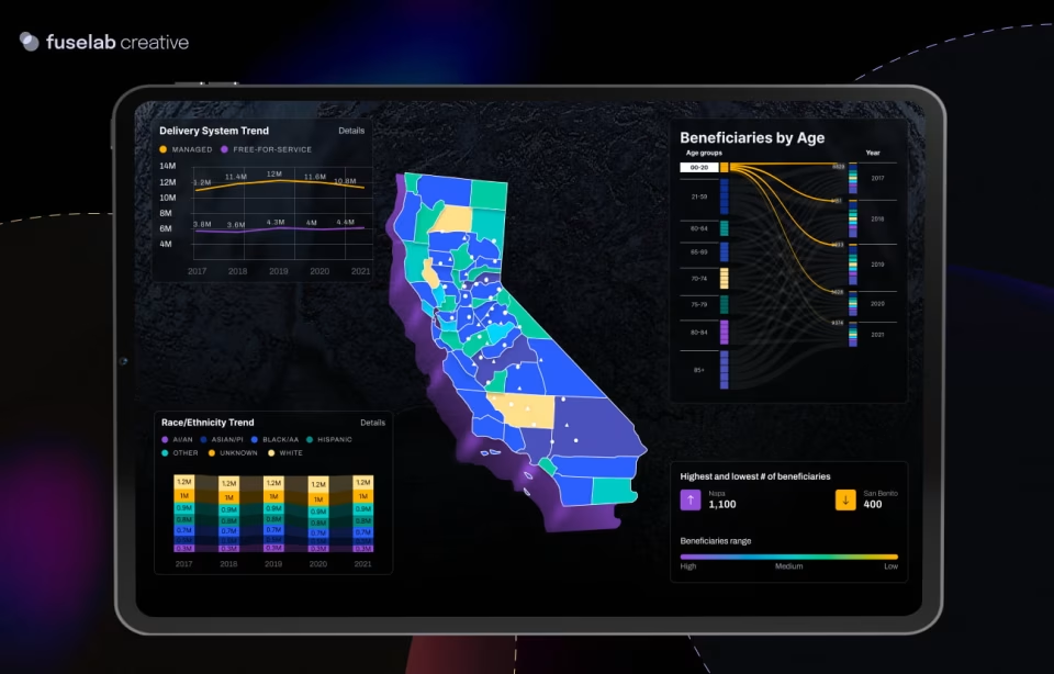
KPIs are all well and good, but you need a way to harness their power. A data dashboard provides an interface for these indicators, with advanced software and clever design decisions able to present the right data to the right people at the right times. An analytical dashboard is an accessible visual information management tool that helps you track and analyze KPIs through the integration and measurement of metrics and data points.
The final goal of a data dashboard is to monitor the health of specific processes and business functions. Because your KPIs influence each other, clever design decisions can help you see what’s going on behind the curtain. A well-designed data dashboard isn’t just about visualization, it’s about creating a hierarchy of KPIs and analyzing relationships between key measures over time in order to create valuable insights.
Read also our article on the healthcare KPI dashboard.
KPIs vs data metrics
To create a useful and intuitive bi-dashboard design, it’s important to understand the differences between KPIs and metrics. While all KPIs are metrics, not all metrics are KPIs. Much more than numbers, KPIs are the key measures needed to provide insights and move your organization forward. KPIs are likely to include activity measures, outcome measures, process measures, and target and timeline structures. Along with key performance measures, KPIs may also include qualitative variables to help analyze and make sense of these measures.
There are lots of nuances between a KPI and a data metric, with both the importance of the metric and its nature affecting its status. Metrics and data points are almost always quantitative and are much less likely to include analysis. Around areas such as market segmentation, demographics, or satisfaction rates, descriptive and behavioral characteristics are much more likely to be presented in KPIs.
How to develop a KPI-focused data dashboard
To create an effective data dashboard with the ability to grow with your business, you need to strike the right balance between information access and intuitive design. Despite the dry nature of big data itself, a functional dashboard design creation service is very much an act of creative design.
Presenting information alone is not enough. You need to quantify and qualify data according to different processes, users, and timelines. Not all information is created equal, with your most important data needing to be shaped, supported, and integrated across business structures. Learn how to design a data dashboard for more profit.
Define your KPIs
Your key indicators provide the meaning for your dashboard, and they need to be defined from the outset. While this process is largely dependent on the details of your organization and industry sector, things like revenue, expenses, and procedural efficiency are relevant to everyone.
Have conversations with your stakeholders, define your measures, and define your targets. Once you know what’s important to your business, you can start to review data sources, track frequencies, and target timelines.
Identify your users
A well-designed hierarchical system with links between pages benefits all users as no one will be overwhelmed with irrelevant or excessive information. Different people need access to different data, with complex systems needing to define specific groups and personas based on their unique workflow and data needs.
Segment your users in the same way you segment your market. Talk to them directly on their terms and try to avoid confusing them with information they don’t need. By identifying users and working backward, you can avoid unnecessary complexity and duplication.

Custom data dashboard design will cut your work in half.
Most companies have no idea that they already have all the data they need for better and more profitable decision-making. Fuselab helps companies create better efficiencies, increased sales, and a more informed workforce every day.
From simple to complex
In most use case scenarios, a simple front page is recommended for clear analysis, with users able to dig deeper by clicking on graphical elements and menu systems. Intuitive real-time dashboards often hide their complexity, with layers of rich information available beneath a clear and concise surface.
This same principle can be applied within each page and each page element. For example, present simple information on the top of the page or element, followed by more complex data.
Choose the right visualizations
Effective data dashboards are visually appealing and informative. Rather than focusing on flashy colors and complex designs, it’s important to choose design elements that match the data being presented. Not all chart types are relevant to all data sets.
It’s also important to distinguish between discrete and continuous data and create custom graphics when they are required. Interactive visualizations can be particularly useful by allowing people to dig down into data sets from a single interface.
Data is the most valuable currency for modern businesses, with organizations rising or falling based on their ability to leverage data effectively. Defining KPIs and presenting them through a well-designed data leadership dashboard is integral to every organization. When the right information is available to users through a clear and considered interface, better decision making and more efficient workplace practices are practically guaranteed.

