Healthcare App UI/UX Design Best Practices for 2026
Healthcare app UI/UX design
Healthcare app UI/UX design sits at the intersection of clinical workflow constraints, patient outcome chains, and the cognitive load clinicians carry through long clinical shifts. Strong work in this domain treats clinical staff not as users to be optimized for engagement, but as practitioners whose attention is the most expensive resource in the system. The interface is the layer where time saved and errors prevented translate into clinical outcomes, which is why healthcare app design operates as a different discipline than consumer product UX even when the visual surface looks similar.
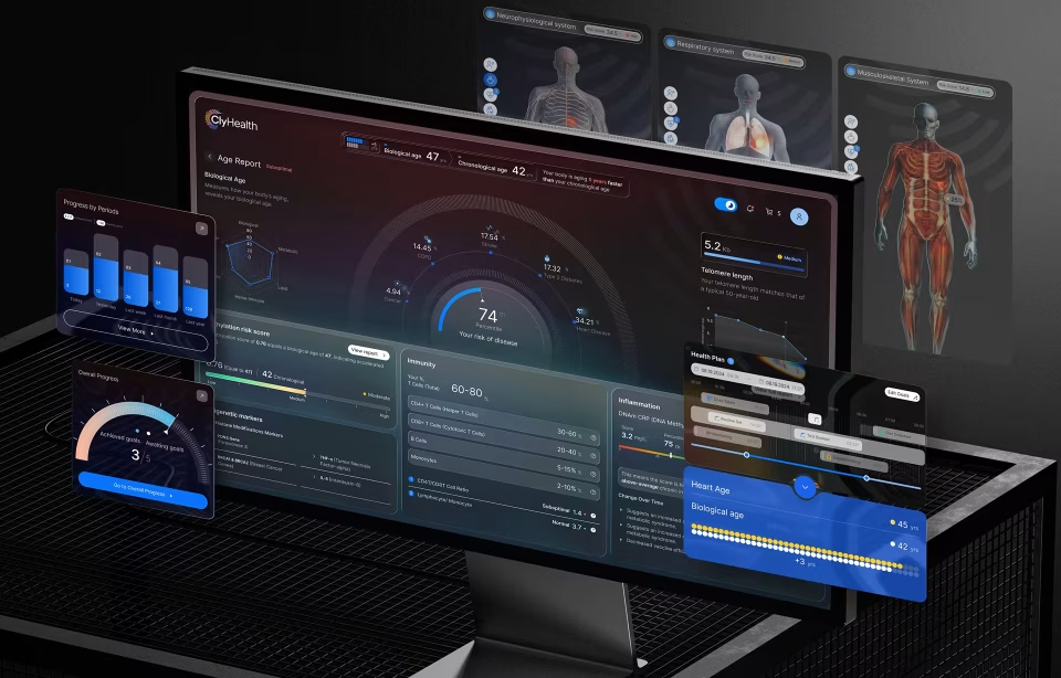
This guide covers the design process Fuselab uses for clinical and patient-facing healthcare products, twelve verification points healthcare apps need to clear before launch, and the visual and interaction patterns separating apps that earn clinical adoption from apps that get rolled back during pilot programs. Examples include healthcare apps shipped for the California Department of Health Care Services, the National Institutes of Health, ClyHealth’s clinical AI dashboards, and the patient-facing applications featured throughout this article.
User interface design for healthcare applications
Healthcare UI design works differently than consumer UI design even before regulatory considerations enter the conversation. Clinicians read interfaces under cognitive load that designers in other domains rarely encounter: a nurse moving between three patient rooms in twenty minutes is not the same kind of user as someone opening a banking app. What works for the nurse rarely translates to the banking-app user, and misses on this distinction tend to surface as low engagement during pilot testing, then drop-off when clinical staff start finding workarounds in the existing systems they were meant to replace.
The clinical role driving the interface matters more in healthcare than in most other software domains. An ER physician working between patients reads dashboards differently than a general practitioner with scheduled visits, a care coordinator routing handoffs between specialists has different information needs than a billing analyst pulling reimbursement data, and patients accessing their own health records have different expectations than the clinical staff serving them. Designing role-based interfaces from the first sprint is what healthcare UX work actually looks like in production, and the alternative is a polished interface that nobody’s actual workflow fits into. The fuller picture of healthcare application design considerations, including stakeholder management, regulatory mapping, and clinical environment factors, sits outside this article’s scope but informs the same design decisions.
Medical app UI design principles
Cognitive load is the central design problem in medical app UI work. Clinical staff using these apps move between patients, between data sources, between physical environments, and between mental contexts in ways that consumer app users rarely experience. The interfaces that earn a regular spot in clinical workflow respect the 90-120-second windows clinicians have at the point of care. Interfaces that ignore those windows lose ground quickly during pilot deployment, sometimes within the first two weeks.
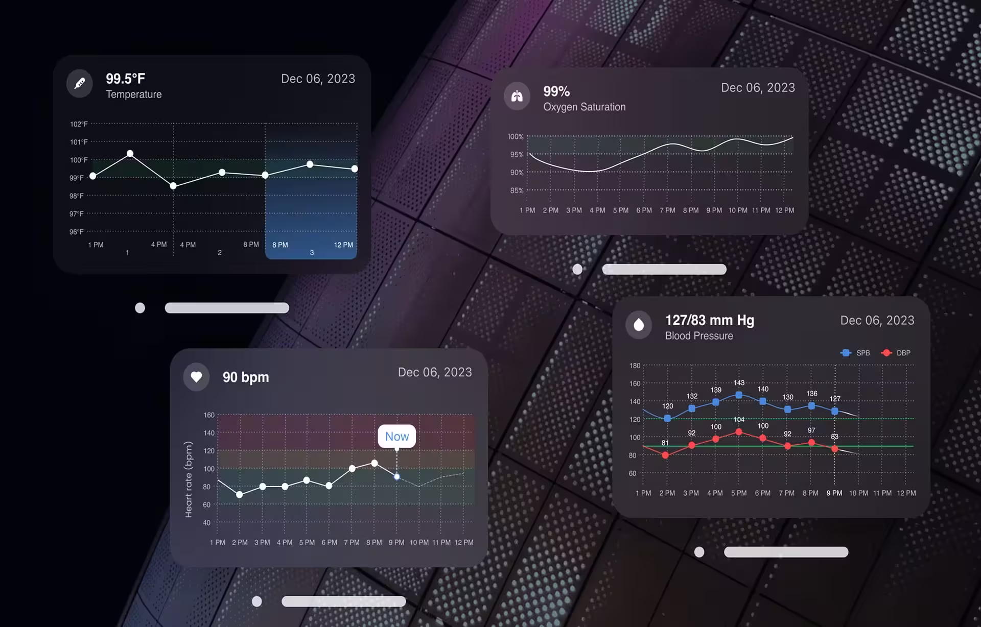
Information density is the most consequential design choice in medical app UI design. Cluttered dashboards drown clinical staff during shift handoffs when speed matters most. Sparse dashboards force navigation between screens and add clicks that compound across hundreds of daily interactions. The right balance shifts by clinical role, by use case, and by deployment environment. A single density level for all users misses the practical reality of clinical work happening at many different speeds, and clinical staff notice this mismatch within their first few days using the app.
Color and contrast support faster scanning when scanning speed decides clinical outcomes. The conventional medical color associations work because clinicians have already learned them: blue for clinical identity and trust, green for normal vital ranges, red reserved for genuine clinical urgency. Pair these with high-contrast white space, and keep close-proximity blue tones distinct from each other so clinical staff scanning quickly can separate elements without effort.
Animation requires restraint in medical app design. Motion that communicates state change or signals urgency earns its place. Anything that delays information or forces clinicians to wait through a transition fails the moment a clinical decision needs to happen. The choice lands easily on the side of less animation when the stakes are clinical. Where it does belong, healthcare data visualization benefits most when motion surfaces anomalies in continuous data over time.
Control placement matters because clinicians do not have time to hunt for the right button. Download controls sit where clinicians export information, action confirmations appear at decision points, and audit trails surface where clinicians verify what they did during a previous shift. Hiding common controls inside admin menus is a tell for design teams that haven’t sat with practicing clinicians during their actual work.
Visual hierarchy and color in clinical contexts
Color choices in healthcare app design have measurable safety consequences, which is why color decisions in this domain need clinical input rather than just brand input. The conventional associations matter, but they matter mostly because clinicians have already learned them through years of clinical software exposure, which makes matching their expectations faster than rebuilding them.
Blue conveys trust and clinical identity, which is why most hospital systems and EHR interfaces lead with it. A healthcare app designer reaching for blue is matching clinical conventions rather than establishing them. Pair blue with high-contrast white space, and keep close-proximity blue tones visually distinct so clinical staff scanning quickly can separate elements at a glance. And let’s face it, the most important colors to see are the urgency colors, so all other colors need to take an obvious back seat.
Green works well for positive states, normal vital sign ranges, and confirmation actions. It also serves as a secondary accent in hierarchies where blue carries primary navigation. Green should not carry critical alerts on its own because the most common form of color blindness affects red-green discrimination, meaning roughly 8 percent of male users will miss alerts encoded in green. This detail cannot be stressed enough and is often overlooked more often than you would expect. Critical alerts require a second visual encoding beyond color, and procurement systems that run clinical accessibility audits check this specifically before approving deployment.
Red signals urgency, and it earns that role only when reserved for genuine clinical emergencies, abnormal vitals outside safe ranges, and medication interaction warnings. Used for non-critical UI elements, red desensitizes clinical staff to actual emergency states. That desensitization is one of the most dangerous interface failure modes in healthcare app design, and it shows up most often in apps designed by teams who fall in love with their own designs and don’t seek clinical input early and often.
White and high-contrast colors set the readability baseline. WCAG 2.1 AA requires a 4.5:1 contrast ratio for normal text and 3:1 for large text, and hospital procurement systems verify compliance with these requirements before clinical deployment. Healthcare apps designed without these ratios in mind hit a procurement wall before the clinical evaluation phase ever begins, and retrofitting accessibility after the fact always leads to skyrocketing budget increases.
Black and gray serve an information hierarchy without competing for attention. They work for body text, labels, and metadata. Pure black on pure white produces eye strain over long clinical shifts, which is why most clinical interfaces use a soft dark gray on a soft warm white instead, particularly in apps where clinicians spend hours inside the interface during a single shift.
Typography for clinical readability
Healthcare app typography carries clinical safety weight that consumer typography rarely encounters. Clinicians read medication names, dosages, lab values, and patient identifiers under time pressure across varied lighting conditions. Typography that compromises legibility produces clinical errors, and the rigor required to choose healthcare app typefaces is comparable to that of security decisions.
Sans-serif typefaces dominate healthcare app UI design because their clean letterforms render reliably across screen sizes, resolutions, and clinical lighting, which can vary dramatically from an ER setting to a dark room where a patient is sleeping. Common 2026 choices include Inter, IBM Plex Sans, Source Sans, and Roboto, with Arial and Helvetica still widely deployed across older clinical applications as legacy options. Inter and Plex have become the defaults for new healthcare apps because both were designed specifically for screen rendering rather than adapted from print. Most clinical applications still ship with print-derived fonts because the original code was written before screen-rendering optimization existed, which is one of those small details a redesign team gets praised for fixing without anyone being able to name the underlying change.
Numeric clarity is its own discipline within healthcare typography. Tabular figures, where every digit occupies the same width, prevent dosage misreading when figures align across rows in a lab report or medication list. Most modern typefaces ship with tabular figure variants, but they must be explicitly enabled in the design system. Specifying that feature is a one-line decision that compounds across thousands of clinical workflows where a misread digit could trigger an incorrect dose.
Font size scaling for accessibility is a procurement requirement, not a polish layer. Healthcare apps must support text scaling up to 200 percent without breaking the layout, and design systems need to handle this case from the first build rather than discover it during an accessibility audit. An app that breaks at 150 percent scaling fails the accessibility evaluation phase before the clinical evaluation phase even begins, and the cost of fixing layout breakage post-launch routinely exceeds what the right design system would have cost upfront.
Healthcare app UX design principles
Three patterns separate healthcare apps that earn clinical adoption from apps that don’t, and none of them appear in agency content written for the consumer software audience. The patterns matter because clinical staff have been burned by software that promised to help but ended up adding to their cognitive load.
The first pattern is reasoning transparency in clinical decision support, and this is where most healthcare AI projects fail in production. When a healthcare app suggests a diagnosis, flags a medication interaction, or routes a clinical alert, the interface needs to surface the underlying logic alongside the source data the system used to arrive at its conclusion. Clinicians have low tolerance for systems that cannot explain themselves, and here’s the rationale: their license is on the line when an AI’s call goes wrong, and explaining a clinical decision retrospectively to a peer review committee or to a malpractice attorney is harder when the clinician was acting on an opaque suggestion. The activity panel separation pattern, where the AI’s logic sits visible alongside its output, has become the dominant approach for clinical AI interfaces because it solves both the trust problem and the documentation problem simultaneously. Healthcare apps that hide their decision path get switched off the first time a clinician notices an inconsistency, and the same apps usually ship with a press release about AI capabilities that quietly disappears from the product roadmap a few quarters later.
The second pattern is integration depth with the system that the system’s clinical staff already uses. Most clinical environments run on Epic, Cerner, or Allscripts, and apps that don’t read from or write back to those systems force duplicate data entry that clinicians treat as a tax on their time. The interface needs to handle FHIR data exchange and clinical context handoff, and these connection points surface in interface decisions about data freshness, sync status, and conflict resolution flows. For healthcare apps that work with connected medical devices, medical device interface design introduces additional regulatory and reliability considerations that compound the EHR integration work. We will save the constant complaint about logging in and out of different systems all day for a separate article, as this is a huge point of contention for providers across the spectrum.
The third pattern is user research conducted with the actual user population, not with proxies. Recruiting clinical staff for design research is hard because they are time-constrained and protective of that time, and most agency UX practices break down in this context. The teams producing strong healthcare apps invest in recruiting infrastructure and the clinical relationships that make practitioner participation possible, and their protocols respect that practitioners are agreeing to spend their break time helping designers. Plan validation rounds with at least eight representative practitioners per clinical role, conducted in clinical settings rather than design studios, before official launch.
These three patterns sit on top of the broader healthcare UX design best practices that apply across clinical and patient-facing healthcare products. The patterns above are what shifts as healthcare apps mature past their first deployment cycle, while the broader best practices guide covers the full lifecycle of design considerations from research through validation.
Mobile and desktop parity in healthcare apps
Clinical staff move between desktop workstations, tablets at the patient bedside, and mobile phones during a single shift, and the information they need follows them across all three surfaces. Healthcare apps shipped desktop-first with mobile added later end up creating friction at every clinical handoff point where information needs to flow across devices in real time. Mobile and desktop parity has become the 2026 baseline for healthcare app design rather than a roadmap item that ships in version 2.
As mentioned earlier, lighting is the variable that healthcare app designers most often underestimate. The same nurse may use the app under bright fluorescent lighting in a med room, under dim lighting in a patient room at night, and under variable sunlight at a window during morning rounds. Light and dark modes are baseline features for clinical apps, and the contrast in both modes needs to remain readable across the realistic range of clinical environments. The first time a nurse cannot read a patient chart in unfavorable light is also typically the last time that nurse opens the app voluntarily during a shift, and replacement workflows are hard to dislodge once clinical staff start working around the design.
For deeper coverage of EHR-specific design challenges, our EHR UI/UX design guide covers interface principles for clinical software integrating with electronic health record systems.
Healthcare mobile app design in clinical contexts
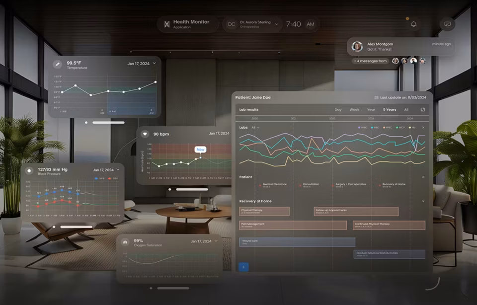
Healthcare mobile app design has moved past the consumer-app parallel that defined mobile through 2022. Clinical mobile apps serve specific roles inside clinical workflows now, including patient identification at bedside, real-time vital sign monitoring, medication scanning during administration, secure messaging between care teams, and patient-facing access to health records. Each role carries its own failure modes, time pressures, and user expectations. Designing them as if they were consumer mobile apps produces interfaces that get used grudgingly when clinical staff have no alternative, then bypassed when they find one.
Authentication design becomes a central problem in clinical mobile apps. Clinicians moving between patients cannot type passwords multiple times per shift, and session timeout behavior has to balance security against the cost of forcing reauthentication. Biometric or badge-based login matters here, and so does session persistence that handles brief inactivity gracefully without losing user context. Authentication that gets the balance wrong either compromises security through clinician workarounds or compromises clinical workflow through forcing too many logins. Both failures create the same end state: shared logins between clinicians, which voids the audit trail and creates the compliance problem the authentication design was supposed to prevent.
Patient-facing mobile health apps work from a different starting point than clinical mobile apps. They serve users without clinical training, often during stressful health events, and across language and accessibility requirements that clinical staff applications usually do not face. Building both clinical-facing and patient-facing apps inside the same product means treating them as separate products that share infrastructure, not as one app with two views. Studying mobile app design trends across consumer products provides useful context, but the design priorities for healthcare on phone and tablet diverge significantly once clinical context enters the equation.
Twelve healthcare app design checks before launch
The points below mark the difference between healthcare apps that clear clinical deployment and apps that get rejected during procurement or rolled back after the first compliance audit. Each maps to a specific risk healthcare app projects carry, and addressing them before launch costs significantly less than retrofitting them afterward.
1. HIPAA-compliant data handling architecture
Patient data needs to be encrypted at rest and in transit, and the interface needs to surface permission and access decisions to users. Healthcare apps that hide encryption status or permission scope fail compliance audits, and the resulting lost hospital procurement decisions typically happen before the demo even runs.
2. Section 508 and WCAG 2.1 AA accessibility compliance
Federal procurement requires Section 508 compliance, and most hospital systems require WCAG 2.1 AA. Treating accessibility as something to address after launch loses deals before clinical evaluation begins. Proper semantic HTML, full keyboard navigation, and tested screen reader support need to ship with the first release rather than land as a fix in version 1.3.
3. Role-based access for clinical staff
Doctors, nurses, care coordinators, billing staff, and patients each land on different first screens in well-designed clinical software. The clinical role drives the default view, the available actions, and the data displayed. A single-view dashboard signals a healthcare app team that has not worked through the actual permission requirements clinical environments expect.
4. Clinical workflow integration with EHR systems
Healthcare apps that don’t integrate with the dominant EHR systems, including Epic, Cerner, and Allscripts, run into a structural adoption problem in clinical settings. The interface needs to handle FHIR data exchange and clinical context handoff at minimum. Standalone apps requiring duplicate data entry get abandoned by clinical staff within the first month of pilot testing, regardless of how good the standalone interface looks.
5. Audit logging visible in the interface
Every clinically significant action should produce an audit log entry, and the interface should make audit visibility part of the daily user experience rather than a feature buried in admin settings. When audit logs sit hidden, clinicians cannot self-verify their actions, and that creates legal exposure when patient outcomes get contested. Visible audit trails build the trust that makes clinical adoption possible.
6. Decision support transparency
When a healthcare app suggests a diagnosis, treatment, or alert, the interface needs to expose the underlying reasoning and the source data behind it. AI-driven clinical decision support hiding its reasoning gets disabled the first time a clinician notices an inconsistency, and the design choice between transparent and opaque AI separates tools that earn clinical adoption from tools that gather dust on a hospital server.
7. Patient safety alerts that match clinical urgency
Critical alerts need to be visually distinct from routine notifications, and the design needs to prevent alert fatigue from desensitizing clinicians to genuine emergencies. Color-coded urgency indicators, visual hierarchy reflecting severity, and acknowledgment workflows that prevent dangerous dismissal patterns are first-launch work, not version 2 polish.
8. Mobile and desktop parallel design tracks
Clinical staff move between desktop workstations and mobile devices within a single shift, and information needs to flow without friction across both. Healthcare apps shipped desktop-first with mobile added later end up creating friction at exactly the clinical handoff points where smooth flow matters most. Mobile and desktop should reach feature parity at first release.
9. Offline-tolerant interface behavior
Hospital network connectivity is unreliable in patient rooms, imaging departments, and rural facilities. Healthcare apps that break or lose data when connectivity drops out fail in real clinical environments, no matter how well they perform in stable demo conditions. Interface behavior should communicate connection status clearly and preserve user input across interruptions.
10. Multilingual content and accessibility breadth
US healthcare serves patient populations speaking many languages, and federal standards require multilingual support for many use cases involving public-facing healthcare programs. English-only healthcare apps signal a limited deployment scope to enterprise and federal buyers. Right-to-left language support for Arabic and Hebrew becomes important specifically for patient-facing portions of the app, where language access is often a regulatory requirement rather than a nicety.
11. Clinical practitioner usability validation
Healthcare apps need testing with actual clinicians, not just designers acting as proxies for clinicians. Recruiting clinical staff is hard because they are time-constrained and protective of that time, but real-world usability testing with the intended user population catches issues no internal review will. Plan validation rounds with at least eight representative practitioners per role type before any official launch.
12. Telemetry that respects PHI boundaries
Healthcare apps need usage data to improve, and the telemetry infrastructure needs to handle Protected Health Information correctly to avoid creating compliance risk. Any analytics implementation that captures PHI in error logs, session recordings, or third-party analytics flows creates a violation that gets discovered during the next compliance audit. The architectural decision about telemetry boundaries needs to happen before the first user session, not after.

Healthcare UX design with deep clinical specialization
Fuselab Creative ships healthcare apps and clinical interfaces designed for the realities of clinical workflow, patient safety, and the integration depth that healthcare products require. We have shipped this work for the California Department of Health Care Services, the National Institutes of Health, ClyHealth’s clinical AI dashboards, and the patient-facing applications featured throughout this article. If healthcare app UX is on your roadmap and you need a partner who understands clinical environments alongside the design discipline, our healthcare UI/UX design services team is here when the project is ready.
Frequently asked questions
What is healthcare app UI/UX design?
Healthcare app UI/UX design is the practice of building interfaces for clinical, patient-facing, and healthcare-adjacent products that respect the cognitive load of time-pressured clinicians and the emotional state of patients managing serious health events. The discipline balances day-to-day usability for non-technical clinical users with the patient safety stakes inherent to healthcare software, and treats accessibility and privacy compliance as baseline expectations rather than differentiators.
How is healthcare app UX different from consumer app UX?
Healthcare app UX faces user contexts that consumer app UX rarely encounters. Clinicians move between patients with seconds to spot critical information, patients use the app while managing serious health events, and the underlying systems integrate with EHR platforms like Epic, Cerner, and Allscripts. Where consumer UX optimizes for engagement and conversion, healthcare UX optimizes for clinical adoption and the kind of cognitive load reduction that lets clinicians work without the interface adding to their stress. The differences run deep enough that healthcare UX work typically needs designers with direct healthcare project experience, not just strong consumer UX backgrounds.
How much does healthcare app UI/UX design cost in 2026?
Healthcare app UI/UX design projects with US-based specialist agencies typically cost between $50,000 and $250,000 for a focused redesign or new app build, with hourly rates ranging from $125 to $325 depending on agency seniority and clinical specialization. Projects requiring HIPAA-compliant infrastructure work, deep EHR integration, or accessibility audit work add 20 to 40 percent to baseline scope. Offshore generalist agencies charge less per hour but usually need more revision cycles and rarely understand US healthcare regulatory requirements, which means the per-hour savings often turn into per-project losses.
How long does a healthcare app UX project take?
A focused healthcare app UX project typically runs 14 to 24 weeks from kickoff to engineering-ready specifications, depending on clinical user research depth, EHR integration scope, and regulatory audit timing. Discovery and clinical user research take 4 to 6 weeks, design and prototyping run 8 to 12, and validation plus accessibility audit usually fits in 2 to 6 weeks. Compressed timelines trade clinical research depth for delivery speed, which surfaces as scope changes during clinical pilot testing.
How do I evaluate a healthcare UX design agency?
A qualified healthcare UX design agency demonstrates shipped clinical or patient-facing products in their portfolio and names specific clients rather than hiding behind phrases like “leading hospital systems.” Strong agencies show evidence of clinical user research with actual practitioners, working knowledge of FHIR data standards, and at least one shipped product addressing a regulated clinical use case. Before signing, confirm whether senior practitioners or junior designers will lead the clinical research phase, because that’s where the difference between strong and mediocre healthcare UX agencies becomes visible.
What HIPAA requirements affect healthcare app UI design?
HIPAA Privacy Rule and Security Rule requirements affect healthcare app UI design through specific interface decisions: visible authentication, audit logs that surface for user verification, clear permission scoping, encryption status indicators, secure messaging flows, and data export controls that document chain of custody. The interface itself isn’t where HIPAA compliance lives. The interface either supports the compliance the underlying infrastructure provides, or quietly undermines it.
What is the difference between healthcare app design and clinical software design?
Healthcare app design typically covers mobile applications, patient-facing tools, and lighter clinical products that integrate with but don’t replace primary EHR systems. Clinical software design covers the EHR platforms themselves, hospital information systems, decision support engines, and laboratory systems. The two disciplines share regulatory requirements, but clinical software faces additional procurement complexity, FDA-style certification pathways, and integration depth that healthcare apps typically do not need to address.