These 5 Highly Effective Dashboard Designs Are Changing the Face of Decision-Making

When it comes down to it, dashboards are not about design, data, or displays. Well, they are about these things. But we experience a benefit far simpler and more elemental when we interact with, view, and rely on a dashboard:
Time.
Effective dashboard design is about the ability to save a user’s time and guide their attention without a single wasted moment. What do these saved moments amount to?
- Eliminates the need to check in on processes one at a time; instead, a dashboard UI gives you an instant view of the progress of all projects/processes right away
- Gives the most salient information upfront, without having to look for data, in real-time
- Alerts users based on security vulnerabilities
- Allows decision-makers to exercise control and clarity, simplicity and structure
Data collection has always been “a thing”. But data visualized, organized, and empowered for interaction allows users to do something with that data — whether it’s taking action, making a decision, or performing further investigation.
To understand the hallmarks of effective dashboards — the ones that both save you time and anticipate your needs — we take a look at five designs that both support and enhance decision-making. We’ll also take a look at how and why dashboards are helping individuals and organizations make better use of the data that’s become integral to operating in the digital age — both in business and in life.
The Hallmarks of Effective Dashboard Options
Dashboards go beyond mere functionality or just design. Instead, dashboards bring together design, data, and functionality to provide an interaction that is both precise and microcosmic, while also delivering a zoomed-out overview.
We’ll take a look at five specific dashboard interfaces and what makes them so effective based on the type of dashboard they are.
E-commerce Monitoring Dashboard
The Hyper dashboard features the most salient information, right up front. It tracks not only the current earnings but also earnings from the previous week. This gives the user immediate context. There’s a certain amount of benchmarking that users can perform, based on this neat and thoughtful addition.
Based on the previous week’s earnings, the user can compare the current week’s earnings to make decisions on whether revenue and sales are on par or to try to find reasons why it would be lagging (the season or a poorly performing campaign, for example).
The dashboard also gives the user a graphical view that looks at a longer time. Dashboard system design is created on clients’ needs and goals.
This offers another perspective on the data, looking at a more long-term picture and helping the user analyze the information differently.
Appointments Dashboards
Powerful and effective dashboards are also customizable.
This particular mockup for a dashboard design involves looking up appointments made by customers together with the revenue brought in and the employees with whom the appointments have been made.
This gives the user more than just information about the clinic or operations that are being run — it also, at a glance, gives a user the chance to check in on and measure productivity.
Employee productivity is related to how many appointments are booked with the employee. The user can select which employee they’d like to track and measure.
The user can also perform this same measurement based on services provided (to get a sense of which the most popular services are and which can, someday along the line, be axed) and what the most well-performing versus low-performing locations are.
Effective dashboards, then, give users the chance to customize and evaluate the data to have that data inform their decisions.
Read more about the benefits of dashboards in healthcare.
Invoicing Dashboard
Effective dashboards are those that are cross-functional. Take, for example, the Dokoto app mockup. This dashboard connects scheduling and appointments handily with revenue projections and tracking.
The revenue and financial aspect of the dashboard also includes data points on three separate earnings: monthly, profitability (which is essentially a calculation), and earnings per hour.
You’ll notice that the user can track these metrics based on the day of the week and can use the “calendar” module to access this data in a very clear and visual way.
Why is this useful? Cross-functional dashboards can essentially help users conclude the relationships between the two or more functions that the app tracks.
In this case, a user can make the clear conclusion that the greater the number of appointments that are booked, the greater the revenue.
This allows users to also make conclusions about which are the most “profitable” days and which are “slow” times.
Storytelling and News/Entertainment Dashboard
Dashboards are excellent at tracking metrics like revenue and earnings, giving users information on regions, services, and locations, and displaying the most relevant points right up front.
But what about data points like insights, keywords, KPIs, and engagement? It’s easy to track quantitative data, in other words, but how do you track qualitative data? And how do you measure “emotional” data points like whether they enjoyed a show or liked a post?

The StoryFit dashboard does just that. Effective dashboards should be able to take a blend of measurable quantitative and qualitative data, giving users information on both. Each metric or data type is given its box or module and this creates a separation between the information.
The data is also visualized or displayed in multiple ways. The “score” is visualized through a percentage chart. The “structure” and “style” are given quantifiable measurements. The “sentiment and emotion” metrics use real “emotions” such as “joy”, “sadness” and “happiness”.
In any dashboard, it’s important to capture the most relevant data upfront and find a way to visualize it clearly and compellingly.
The metrics should be related — for example, for the StoryFit dashboard, the overview is immediately followed by data points on characters. The idea here is that the clear hierarchy that moves from summary to detailed also gives a related breakdown of the overview.
Lifestyle-planning Dashboards
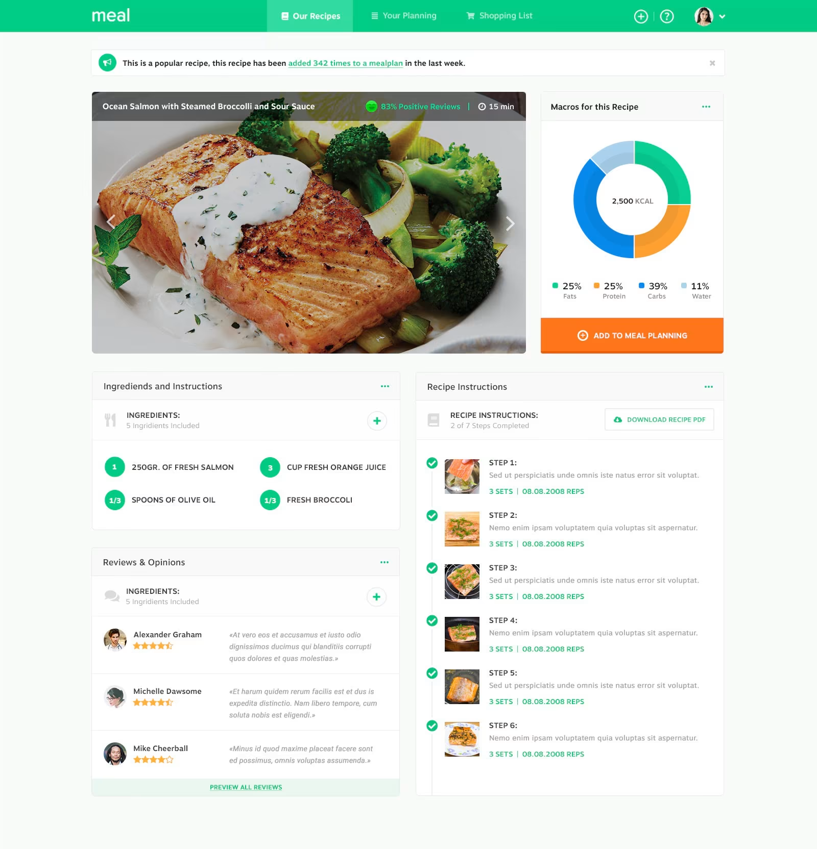
This dashboard is much more straightforward to navigate. However, what’s interesting is that it includes more than just an overview. Effective dashboards will tailor their user interaction and design to match the needs of the user.
These types of dashboards will evaluate the design conventions or experiences that users are most familiar with and will seek to mimic them in their design.

This eliminates any need for the user to “learn” new software. For example, the “+” signs tell the user they can “add” something. The button that reads “add to meal planning” is a clear call to action. And then “Download recipe PDF,” tells the user they can read their instructions in more than one way.
The Meal.nl dashboard gives the most relevant information upfront but is designed to look like a blog post, complete with a social feed. You’ll notice that users can leave their comments in the “review and opinions” section.
How and why do dashboards enhance decisions and operations?
These five dashboards have very different functions but, collectively, paint a consistent picture of the use and viability of dashboards.
1) They help create a centralized reporting system
When done “right”, a multi-user dashboard creates a centralized reporting system.
Reconsider each of the mockup designs and you’ll see that there is a menu on the left-hand side that guides the users to other functions and other screens with more “things” to do. However, by presenting the most important and relevant information on the first screen, these dashboards serve users with the sense that this is ground zero for data.
2) Dashboards help clean and validate data
The clarity and utility that dashboards provide cannot be discounted.
Without ordering and visualizing the data in graphical forms, it would be incredibly tedious to go through. Users would not be able to make tangible decisions — nor would they be able to justify them.
3) Data visualizations within dashboards help you go beyond business intelligence
Remember how the StoryFit dashboard represented data in various forms? Smart and sensitive data visualizations are those that align the right graphical representation forms to the type of data being displayed.
The best way, for example, to represent the popularity of keywords is not in a percentage chart but, of course, in a “cloud” formation.
It’s not just about what data you choose, it’s also about how you choose to represent that data.
It’s these choices, after all, that can help a user come to certain conclusions that affect way more than just business intelligence.
It can show them patterns and connections they might not have considered before or that might not have been immediately apparent.
4) Smart dashboards are designed to customize reporting
The invoicing dashboard allowed users to customize the view they were looking at and change whether they were viewing data on employees, services, or locations.
To help users make relevant decisions, dashboards need to display real-time reporting and should allow users to customize various parts of the reporting process. Even the home screen should allow users to make these modifications, without having to leave to a new screen or use the menu.
5) Eventually, dashboards support a culture of data use
And, finally, these previous four aspects, repeated, form a habit — one in which “data-driven” is less a behavior a more of a pervasive culture.
Dashboards help create an expectation of clarity and validity, the need for data to be serving decisions rather than being used to justify them after the fact. And, with data only set to increase in its breadth and depth, it seems more clarity and structure would empower smarter, faster, and more aligned decision-making in the future.

Data dashboards are changing the way we make decisions.
There was a time when executives had to rely on flimsy reports spit out by some outdated spreadsheet system. Now data dashboards are giving users an unprecedented ability to make informed decisions to better manage every aspect of their organization.

