Inspired Dashboard Designs: How Better Designs Make for Better Decisions
Companies looking to scale up their decision-making will find that their revenue, their profits and their customer satisfaction — essentially, all parts of a business’s value — have something very tangible to gain from intelligent, effective dashboard designs.
All together now: “Design is the differential!”
And this is not just a manifesto. A recent study by McKinsey reveals the tangible numbers behind this new design-driven decision-making. Data certainly plays a role — but without design, this data would not be comprehensible.
Nor would users be able to experience the kind of satisfaction they do when delivering solutions that actually anticipate and then respond to their need for streamlined processes and easy access.
Design is the differential.
The value and mark of exceptional dashboard design is not only in the way data is displayed, it’s also about the experience of the way the dashboard user can easily and effectively navigate around. It is also very important for a dashboard design agency to have great experience in providing exceptional design services.
McKinsey’s Design Index, a measurement of the design practices of 300 companies, over five years, shows just how important design is to the entire process of running a business in our increasingly converging digital landscape — in 2018 and beyond.
The study concluded:
- There is also a strong correlation between top-performing companies in a design sense and those that experienced superior revenue growth
- These positive results held across industries, staying true in sectors as diverse as medical technology, consumer goods, and retail banking.
- “The market disproportionately rewarded companies that truly stood out from the crowd,” says the study and design is the means they used to stand out
What’s holding companies back? While businesses are crazy about “data-driven” decision-making, easily accepting and seeing its value, they have a harder time connecting the tangible ROI of design to any bottom line.
Yet the correlations unearthed by the MDI are irrefutable proof that design is the differential.
So far:
- 40% of the companies surveyed aren’t talking to their end users during development
- 50% admit they have no objective way of assessing or setting targets for the output of their design teams
- These same companies also say the user-centric design hasn’t yet been made everyone’s “problem” or “priority” and they report that these “internal walls” are what is keeping them from “measuring and driving design performance with the same rigor as revenues and costs”
So, what can design really do? Consider this: an online gaming company employing design-driven decisions as an ethic in a measurable way within the company found that “a small increase in the usability of its homepage was followed by a dramatic 25% increase in sales.”
The company also found that any improvements made beyond these small tweaks had almost no additional impact on the users’ value perceptions. This means that they saved further money, time and effort that might have gone into taking unguided actions that would have brought little reward.
McKinsey’s conclusion? “The great news is that there are more possibilities to pursue user-centric, analytically informed design today.”
Given the importance and increasing relevance of design-driven decisions with data as a tool, let’s take a look at dashboard designs that are an exact demonstration of this “user-centric, analytically informed design today”.
Read also our article on the medical dashboard design.
1) Dashboards make better use of existing data
Dashboards are driven by a combination of design and data. But not all dashboards are designed, conceptualized or created equally.
The data is there — but if your design is not harnessing it and displaying it in the right manner, can that data truly be useful to decision-makers in a business?
Let’s take a look at the Iconosquare “Overview” tab of the analytics of Instagram.
True to the section name, there is a top-down view on all relevant sections, including statistics on the photos/posts themselves, community engagement stats, a performance of the content itself, KPIs and a history of data.
It all begins with what the designers think will be the most crucial points, forming a summary, if you will, of the most revelatory statistics.

Better data doesn’t only mean beautiful design. Certainly, the Iconosquare interface has that. It also means thinking through a structure or a hierarchy that non-verbally suggests to the user the importance, relevance and depth of the data.
For example, the most immediate set of four statistics up top, while crucial, don’t reflect any details. The user would expect to have to scroll for more on that. Yet, its positioning tells the user these are the most important bits of data to consider.
2) Dashboards filter and use data in real-time
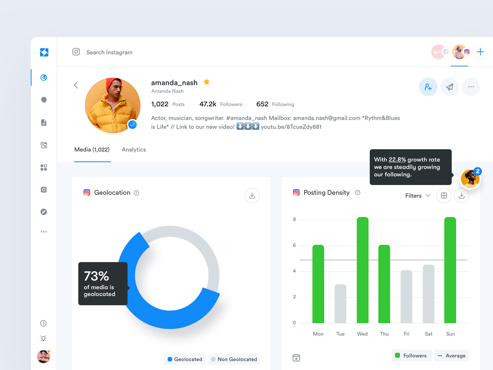
Design-driven decisions rely on dashboards that allow the user to filter and use this data in real-time. Read also our article about the real-time dashboard.
When you think about it, filters are a kind of preset design: They allow the user to view a specific type or piece of data, based on some pre-identified parameters.
Filters are guiding the interaction while putting the “choice” of which filters to run data up to the user.
Especially when using large data sets — or “Big Data”, aggregate crops of information harnessed and sifted through at once — real-time filtering is a requirement to move faster and more efficiently.
Customers rely on the dashboard creator’s design-thinking skills to anticipate the kinds of queries or filters they might want to extract from a large “pool” of data.
Real-time filtering allows a more insightful and focused look, a method to find the proverbial needle in a haystack, while still eliminating distracting or irrelevant results.
When real-time analytics dashboard design is hooked into well-designed dashboards, the result is greater profit. Marketo, a marketing automation SaaS company used real-time reporting on their Google Analytics dashboards to achieve:
- A 117% YOY increase in qualified leads
- 200% more B2C conversions and 150% more B2B conversions
3) Dashboards offer extreme customization
Customization is not only about allowing the user to adapt a dashboard according to his or her own needs. It’s also about allowing the user to line up the data in a way that tells a clear story, with clear observations and a tangible conclusion.
Design that allows for customization also means giving the user free rein to physically order the data that is being visualized around a dashboard.
A customizable and movable dashboard helps the user re-tool data — and, suddenly, patterns and insights can emerge, with a new visual hierarchy “designed” by the user. This also allows the user to make a case for a particular decision, based on the story the data is telling.
4) Dashboards align visualizations with goals
An integral part of any dashboard design is goals. Users who are new to the concept of “design-driven” decision-making might confuse the “goals” of a campaign for the incoming statistics on metrics — things like click rates, engagement, and various other pre-determined KPIs.
But “goals” are all about showing the user what benchmarks they should be focusing on, based on what they want to achieve. They’ll have to determine, before using the dashboard, what aspects of their business or operations they’re looking to improve.
For example, if one of the “goals” is to improve overall revenue, they’ll need to have data visualized and presented to them that relates to metrics like sales, expenses, quarter-over-quarter returns, and more.
Read also more about dashboard systems.
Being able to customize the dashboard plays a huge role in aligning goals with actual data presented. But visualizations — the way this data is presented, the choices of design that relate to graphs and graphics that display the data — are the key to the user’s ability to make sense of these somewhat diverse and complex moving pieces. Visualizations hearken to the brain’s ability to understand granular data using graphical abstractions.
They draw the eye in and, in an instant, the user is able to understand key information like how many orders were created today in comparison to orders in the same month of the previous year, or how the flow of revenue has risen and fallen from the start to the middle of the month.
Consider the visualization of data above: The sales “overviews” are presented as a continuous wave graph while the concrete sales reports section is visualized as bars instead.
Meanwhile, the distribution of sales by geography is marked by dark gradients on a map.
This variety appeals to the eye, breaks up complex data and helps the user align their goals — perhaps, in this case, increasing revenue — with the incoming data.
Based on these visualizations, decision-makers can make a choice about where to refocus their efforts — in this example, by increasing ad-spend to buys in Australia, since this seems to be where a large number of purchasers already exist.
5) Dashboards provide a logical workflow
Design-driven decision-making through dashboards also relies upon the workflow of screens. This is all about logical flow, layout, and accessibility.
If the data is present and visualizations are on point, it still dilutes the entire experience if the user has to either go hunting for the data or is unable to follow a cohesive flow.
Remember that dashboards are not only about what data you see but what you can do with the data.
That’s why aspects like filters, queries, reporting, and customization are such a big part of apt decision-making through the use of dashboards.
To be able to complete a task, the user needs to be presented with a logical sequence, a chain of screens that are linked, moving them from the start of the task to its end, presenting data along the way, and giving them leave to gain insight through that journey.

Logical screen flows, then, are about the user’s journey through the dashboard.
A well-organized dashboard allows users to navigate in a guided way that supports their understanding of the data’s performance. The dashboard’s goal is not only to condense massive amounts of data — even real-time data — into easy-to-ready formats but to do so in a way that saves time and enhances accessibility.
Even though it’s tempting to throw every possible related metric on a screen, as a user works through a task, it’s much better to have a well-thought-out process that directs the user through while giving them the option of drilling down into the data, as and when needed.
Any dashboard that claims to enhance strategic decisions, then, will need to be strategically designed.
Design-driven experiences and decisions for dashboard users are all about giving you two concrete advantages: The first is to provide the confidence required to make the right decision for the business and the second is to give the user such a seamless experience that they’re able to save on time, getting more done with their data with less.
