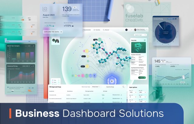
Every day business managers from every industry are asking themselves and their staff the same questions. How can we be more efficient? How do we stack up against our competition? How can we develop more quality leads? And the list goes on. No matter what the question is, developing a custom data dashboard is the first and most important step toward answering these critical questions.
Critical Services
To create a dashboard for business that has the capacity drive business success needs to provide a few key services above all else. First and foremost, your design and development needs to provide a tool that allows users to make more informed and quicker decisions. Second, and equally critical, your new dashboard needs to increase internal efficiencies through automated functionalities.

Creating a Business
Dashboard
Designing and developing a business digital dashboard can vary in a lot ways based the business and the market they are servicing or selling to. However, there are some key deliverables when it comes to UX/UI design, three of which are detailed below.

User Research and Analysis
- Conduct in-depth interviews with key stakeholders
- Perform contextual inquiries to observe users in their work environment
- Create and distribute user surveys to gather quantitative data
- Develop user personas representing different dashboard user types
- Map out user journeys to understand typical interaction patterns
- Analyze competitors’ dashboards to identify best practices and opportunities

Information Architecture
- Create a content inventory of all data points and metrics to be included
- Develop a hierarchical structure for organizing dashboard elements
- Design the main navigation system (e.g., tabs, menus, breadcrumbs)
- Create a taxonomy for categorizing and tagging data elements
- Develop user flow diagrams to map out typical task completion paths
- Design the information hierarchy within individual dashboard widgets or components

Wireframing and Prototyping
- Sketch initial concepts and layouts on paper or whiteboard
- Create low-fidelity wireframes using tools like Balsamiq or Sketch
- Develop mid-fidelity wireframes with more detailed layout and content
- Build interactive prototypes using tools like Figma, Adobe XD, or Axure
- Conduct internal reviews and gather feedback on prototypes
- Iterate on prototypes based on user testing and stakeholder feedback
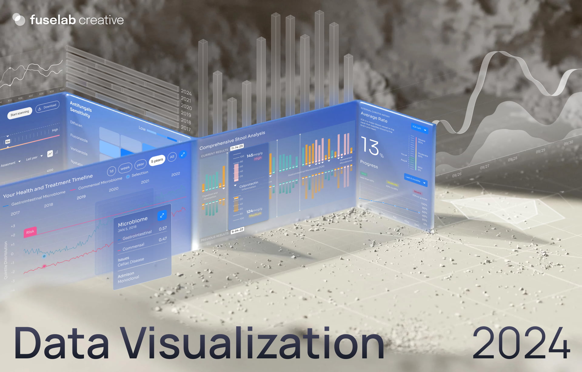
2024 Trends in Business Dashboard
UI/UX Design
Dark Mode Dashboards
- Reduces eye strain in low-light environments
- Enhances visual hierarchy and contrast
- Saves battery life on mobile devices
- Provides a modern, sleek aesthetic
- Allows for easier focus on data visualizations
- Often includes toggles for user preference
Micro-interactions and Animations
- Enhance user engagement and feedback
- Guide users through complex data interactions
- Provide visual cues for state changes and updates
- Improve the overall feeling of responsiveness
- Help users understand data relationships
- Can include hover effects, transitions, and loading animations
Minimalist Design
- Focuses on essential information to reduce cognitive load
- Uses whitespace effectively to create breathing room
- Employs simple, clean typography for better readability
- Reduces clutter to highlight important data points
- Often features a monochromatic or limited color palette
- Emphasizes flat design elements over skeuomorphism
Customizable and Modular Layouts
- Allow users to personalize their dashboard experience
- Enable drag-and-drop rearrangement of dashboard elements
- Provide resizable widgets or cards for flexible layouts
- Support creation of multiple dashboard views for different needs
- Often include saveable custom layouts for different user roles
- Enhance user autonomy and efficiency
Natural Language Processing Interfaces
- Allow users to query data using conversational language
- Provide AI-powered insights and recommendations
- Enable voice-activated commands and queries
- Simplify complex data analysis for non-technical users
- Often include chatbot-like interfaces for data exploration
- Can generate narrative summaries of data trends
Immersive Data Visualization
- Incorporates 3D charts and graphs for deeper data exploration
- Uses augmented reality (AR) for spatial data representation
- Provides interactive, explorable data environments
- Enhances understanding of complex data relationships
- Often includes zoom and pan capabilities for detailed views
- Can leverage virtual reality (VR) for fully immersive data rooms
Mobile-First Dashboard Design
- Prioritizes responsive design for various screen sizes
- Focuses on touch-friendly interfaces and gestures
- Emphasizes critical KPIs for quick mobile viewing
- Uses progressive disclosure to manage complex data on small screens
- Often includes mobile-specific features like swipe navigation
- Ensures consistent experience across desktop and mobile devices
Real-Time Data Streaming
- Provides live updates without manual refreshing
- Uses visual cues to highlight changing data points
- Incorporates time-series visualizations for trend analysis
- Often includes alerts or notifications for significant changes
- Enables immediate decision-making based on current data
- Requires optimized performance to handle constant updates
Accessibility-Focused Design
- Ensures WCAG compliance for inclusive user experience
- Uses high-contrast color schemes for better readability
- Provides keyboard navigation for all dashboard functions
- Includes screen reader compatibility for data and charts
- Often features adjustable text sizes and zoom capabilities
- Implements clear labeling and alt text for all visual elements
Our Design Work


Business Intelligence
Dashboards
A business intelligence dashboard is a rather broad category, consisting or data integration from multiple sources, extracting, transforming, and loading this data. The use of APIs in conjunction multiple databases come together to create a unified view of a businesses key data points and allows users to better understand their corporate history, plan for the future and make critical real-time decisions to positively impact the wellbeing of a particular organization.

Business Analytics
Dashboards
Deploying an analytics dashboard in business analytics can have an almost immediate impact on the trajectory of a business’s outlook. Predictive analytics for the purpose of BI, or simple forecasting is never going to be an exact science, but it is far more accurate than letting your CEO go with her gut feeling and end up making a bad decision. Analytics is just as it sounds, it’s just one more way to look at data from a unique perspective to better understand a particular reporting detail.

Business Management
Dashboards
Management of a company or department or even a digital tool, such as a website, involves the ability to intelligently change course based on current indicators or data anomalies. However, choosing what direction this new course should be is where a business manager dashboard can become your new best friend. Most managers are never formally trained, they just work their way up the ladder, which usually involves managing staff. A strategic design for enterprise clients helps managers across the agency plan and execute with an new level of confidence and insight.

Small Business Dashboards
A dashboard for small businesses is not remarkably different that those created for Fortune 500 business. The main differentiator typically lies in the complexity or amount of data involved. However, small businesses do have an advantage over larger businesses in their ability to make significant changes quickly and implement change across the organization quickly without having to jump through a lot of administrative hoops that are often part of making impactful changes across larger businesses.

Financial Dashboard for
Small Business
Business operations dashboards and fintech designed dashboards share a lot of the same characteristics and objectives. One of the key assets of financial dashboards for small businesses is in its ability to provide real-time financial reporting and enabling users to drill-down for detailed financial data exploration. Another widely utilized feature is customizable financial KPI monitoring, tracking metrics such as ROI, EBITDA, and a small business’s working capital ratio.

Custom Business
Dashboards
If you are not buying something off the shelf, then you are most likely going to be building a custom dashboards, and these services, when combined in a comprehensive financial dashboard, will provide your business with one of most powerful tools for financial management and decision-making available today. These dashboards can offer real-time insights, predictive capabilities, and detailed analytics that can help improve financial performance, manage risks, and drive strategic planning.

Related Services and Solutions
Our Business
Dashboard Design
Principles for Success
The key principles for data dashboards for business is quite a long list, but the four listed here are foundational to achieve success and must be thoroughly invested in before experimenting with other functional or design principles. These principles are more focused on the dashboard’s ability to communicate effectively while also allowing for a simple, yet effortless user experience.
Clarity and Simplicity
Avoid cluttering the dashboard with too many elements, such as charts and graphs that are easy to understand at a glance. One easy way to implement this is to focus on minimalist design principles and routinely remove unnecessary, or decorative elements.
Relevance and Actionability
Every metric should tie back to specific business objectives and display the most critical KPIs as intuitively or prominently as possible. It is equally important to Include benchmarks or targets to give meaning to all of the numbers included.
User-Centric (Human Centered) Design
This principle begins with an emphasis on designing a dashboard with the end-user's needs, preferences, and technical proficiency in mind. Key functional components such as customization options, allowing users to adjust views or metrics based on their preference is a barometer between effective and sub-par dashboard design.
Data Integrity and Accuracy
Although by far the most boring category, including a detailed procedure for verifying the accuracy of the data imported into your dashboard on an ongoing basis is quite simply the most important factor for any business dashboard development plan. Without data integrity, everything else is just useless window dressing.
Contact Us
Filling out the form!
Read Our Blog
Get ready to explore, discover, and be inspired!