The Important Role of Dashboard and Interface Design

Dashboards in a car give you everything you need to know, at a glance. But they also allow you to control the car — at a turn of a knob and push of a button.
And that’s not all. In our increasingly digital world, user interface design and user flows affect the ways we interact, understand, and process our environment — in more ways than we realize.
Like Steve Jobs said,
[Design] is not just what it looks like and feels like. Design is how it works.And how it works has become, increasingly, a combination of science and art.
Some aspects of human behavior can be quantified, and measured and a pattern can be created around it.
That’s why designers make the calculated design decisions you can see if you pay attention, to common things like traffic stop lights, ATM screens, and even point-of-sale terminals.
As we become familiarized with our digital dashboard and specific environments in the world around us, these design choices end up creating a new set of behaviors and expectations, which must then be catered to.
The Psychology of Information Design
Streamlined efficiency, effortless flow, and visual communication of the most important elements up front: these are some of the things that anybody using a professional dashboard design and relying on it to complete a task is hoping for — whether they know it or not.
So why does it work? Why do design environments have to include these three aspects to guide decision-making and action from and by its users?
We need to be in control of our environments but we rely on the information available within our environments to cement this control. Design is one way in which we control and order our environment to suit our needs.
The Importance of Human-Centric Design
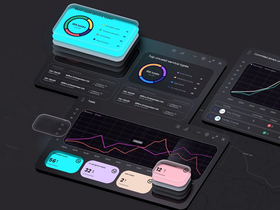
Digital dashboards and interfaces, like a payment terminal in a department store or a public transportation system, work in the same way. Within the span of a few clicks or a few selections, a user is in control of the important information and functions. But, without ever needing to click anything at all, you’ve also got the most important information, right up front.
And, the best part is that digital dashboard systems are highly visual, intuitive and are built for a human’s most common behavioral processes and requirements.
In other words, good dashboard and interface design are non-verbally communicative. It anticipates a user’s needs and then gives them the tools to fulfill that needs.
Think about, for example, a hostess trying to anticipate a restaurant’s flow of customers, prioritizing each wait staff’s section and diners’ own preferences and party size.
This would require a dashboard that allows a hostess to rely on a solution that both visually shows the current state and also gives her information on all these aspects so she can make the best decision.
It takes several experts trained in the language and mindset of UI/UX and effective dashboard design to truly create functionality and the type of user flow that makes something so complex seems completely effortless.
But, regardless of these industry “best practices”, there are some consistencies that designers must begin with, to craft a truly intuitive solution that helps rather than hinders.

Common features of successful interaction design
At the heart of creating successful interaction design is the ability to anticipate what a user needs, how a user’s decision-making process works, and what tasks need to be accomplished, through the environment.
To count as “successful” interactivity, the dashboard interface design has to be human-centric. And all human-centered design includes these five crucial aspects:
- It responds to a basic need we have to improve something in our environment or solve a problem;
- It can be easily used and understood by a large number of people;
- It flows seamlessly with the rest of the world around us, enhancing our experience of both the solution and our external world;
- However this design solution is packaged, it continually improves its features, as we become more accustomed to it;
- Rather than being complex and unworkable, it is simple and simplified in its tools, flows, and processes.
Why UI and Dashboard Design Matter
Accomplishing several tasks with ease
A user interface that can capture all the most important functions, visualizations, and information and present them right away creates an environment where information thrives. This information, presented in a logical, design-friendly way, also allows users to perform multiple tasks at once.
But there’s one more advantage that strategic UI design gives: it guides the user through a hierarchy of the most important information and functions, from screen to screen, so that they’re not overwhelmed.
It also communicates that there’s a logical flow to decision-making, going from what’s most important to its consequence.
Use the UI design services from the best UI/UX designer in the DC area.

Save time and money with dashboard design
Elegant and simplified user interaction design also allows users to cut down on the amount of time it takes to both use and become familiarized with the interface.
In a work setting, this reduced expenditure in time means increased productivity and more overall revenue. In a day-to-day life context, a reduction in frustration and annoyance that illogical design can lead to makes for a better overall experience of the task at hand.
At the core of these savings of time and money is a call for a more intuitive design approach — one that anticipates a user’s most pressing needs and then works to display the key information up front, offering a seamless experience from start to finish.
This is the kind of experience that both delights, and surprises and, in the last analysis, retains customers and users. In the long run, it creates a standard set of practices that can then be further refined.
Think about an issue in the public transportation industry: multiple fares across separate transit providers in one city.
A simple way to eliminate this issue is to give “users” or those taking public transit a reloadable card where they can deposit money and install “terminals” across the city and within transport vehicles that accept a “tap” as fare from this card.
This is, in effect, a design solution. And it has been adopted by a mass majority of users.
Including sprawling areas like the Bay Area in California, where there are 20+ transit providers that all converge at different nexus points across the region.

The way we experience our world
The interfaces we use are only robust if they are extensible and personal.
In other words, we as users, the humans at the center of the design, want to know if what we’re interacting with can be hooked into and integrated into other aspects of our lives.
Again, our increasingly digital world, with its social media networks, integrated advertisements, and linked user profiles creates the need and expectation of integration.
Social Media Experience
This integration — linking two interfaces together — goes beyond just plain customization of a user’s experience. It also makes the experience of interacting within that information environment deeply personal.
Think about it: if and when a user logs in to a piece of software or uses an app that is hooked into another platform of choice, their decisions will reflect their priorities and what their intended tasks are.
Perhaps the information being displayed on this dashboard, as well, will be likewise adjusted and customized to reflect what a user finds most important.
This means that the designers and developers who are creating environments and the dashboards that we, as users, interact with and within are helping us to shape our experience of the world around us.
This is how dashboard and interface design is becoming a part and parcel of our everyday lives. You can contact Fuselab Creative Agency for dashboard design services to get a modern and aesthetic solution.


