How Data and Data Visualization Changes Lives
Data. That word, to most, is perhaps not the most inspiring. It’s a little impersonal maybe, a little cold and calculating. It certainly doesn’t conjure images of heart, of soul, of life-changing human connection.
And yet this is unfair. Sure, businesses are dialed into the importance of being data-driven, and a great many data-supported AI creations reside well within the confines of the Uncanny Valley, but this does not exclude data from our human world. This does not prohibit data from making a difference — from changing lives.
This is what we are going to be examining.
We’re going to be taking a look at how data usage and other forms of Big Data are impacting our quality of life for the better, and how they could even be helping us live better lives than ever before. Let’s take a look.
Visualizing a Real Story
Data visualization is a big deal at the moment. Every time we see a cute infographic, every time we witness figures crafted into quirky shapes on the daily news, every time we set eyes on a weather report, we are looking at data visualization in action. Quite literally, the data is being lifted from the page — or the computer hard drive, as the case may be these days — and it is being crafted into an engaging visual.
Let’s examine how this can work in practice — how we can create a narrative and place the user, or the viewer of the data, right at the heart of it.
Let’s use a simple, but highly effective, example, like the How America Uses Its Land infographic created by David Merrill and Lauren Leatherby for Bloomberg
This might not seem like much, but it is. Through visualization, we can engage with data in ways that were never possible before, both as consumers and as creators. What does this mean exactly? Well, it means that data visualization tools, applications, and software pieces are now not just the domain of television stations and major publications, they are at the fingertips of the masses.
What’s so special about this? Well, for starters, the data is important. The datasets all relate to the percentage of American soil that has been allocated for specific purposes. This is critical in our understanding of our position within this country, and also of what is at the heart of our nation’s identity.
Important data, yes, but dry, and ultimately useless when taken out of context. The numbers are likely to be so big that we can barely get our heads around them, and their significance will be lost. However, Merrill and Leatherby have subverted this by doing something simple; by projecting the data over a map of the United States itself.
Look, there it is — our country. You can see your home state; you can pinpoint your hometown. You can see where you last took a vacation. You can see your life, and you can see the data delivered over the top. Rather than seeing that the 100 largest landowning families own X number of acres among them, you can see that they own an area of land roughly the size of Florida.
Rather than having your mind blown by a gargantuan figure, you can see that even today, an area the size of the entire Midwest is given up to cow pastures. A narrative is built — one that you would have been excluded from had you been presented with just the raw data — and a fresh understanding is developed.

Controlling Our World, from the Micro to the Macro
So data visualization gives us a more direct route to insight and understanding, just as it is easier to learn a skill by looking at a visual representation rather than simply reading about it in a book. But is this life-changing? Perhaps it is to an extent, but not in a way that is going to make a profound difference in how we live our lives, to how we engage with society at large.
And yet, data visualization does touch our lives in this way. Data integration into the designs of the machinery and the equipment that we rely on to keep us safe, to support our quality of life, and even to actively keep us alive, can dramatically improve their effectiveness. A particularly emotive example is found in health care.
Health care is a difficult subject to broach, perhaps because the stakes are so high — in many cases, UX/UI design for healthcare is quite literally a matter of life and death — but this makes it a great example for our purposes, as it illustrates how data visualization can truly be life-changing.
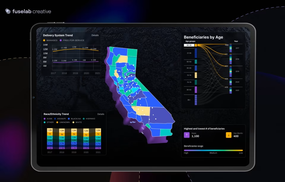
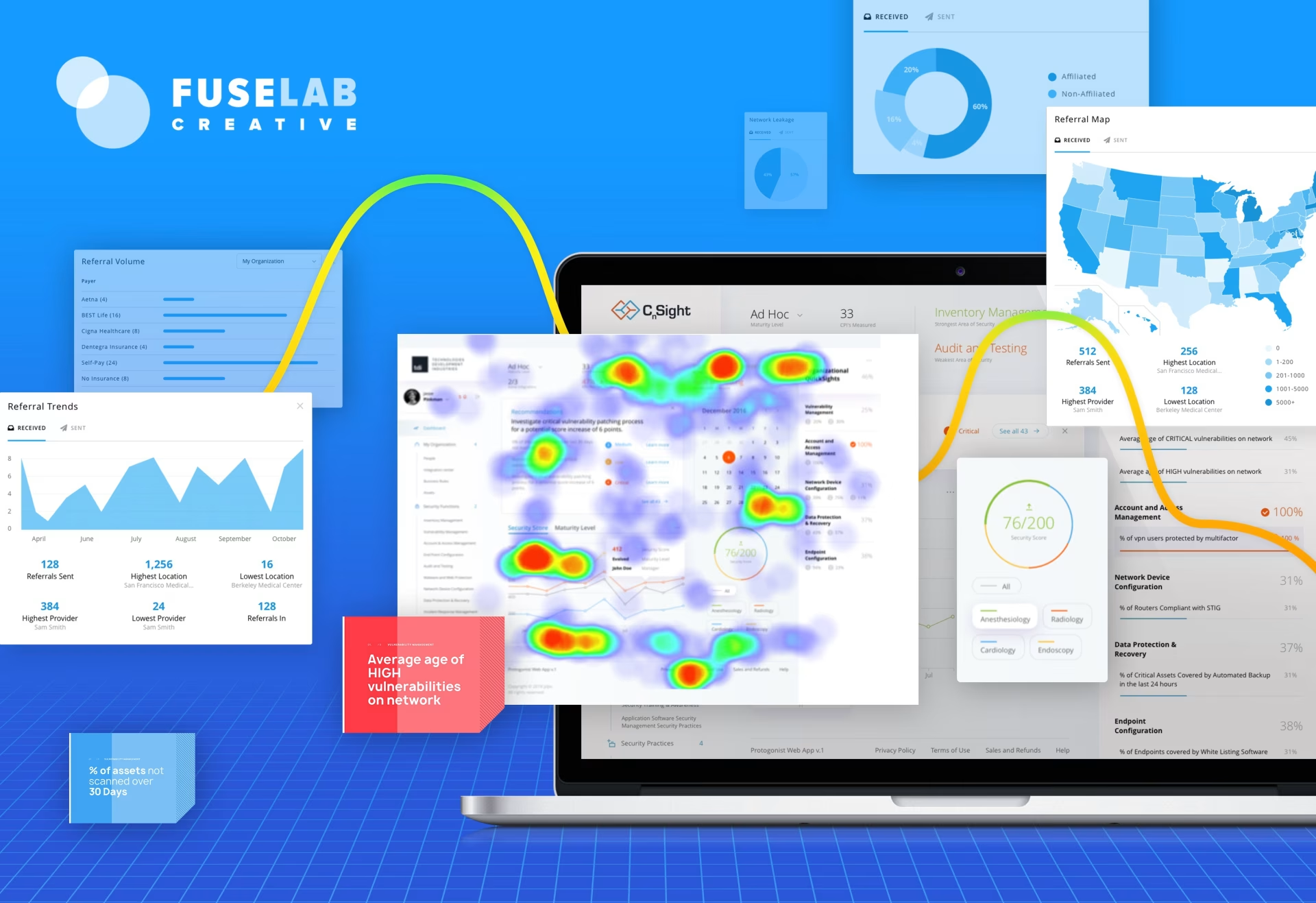
In 2018, Sisense produced a series of example visualizations designed to demonstrate how data can be used to great effect in health care. Perhaps the most striking of these visualizations was the digital dashboard — a tailor-made selection of images that launched a range of fresh perspectives on the data at hand.
This particular dashboard relates to donations; something that is particularly important for healthcare institutions if they are to continue providing high-quality health care to patients across the country. The viewer can immediately take in details of donation renewal rates, successes by the campaign, donation figures by top donors, and donations by state; a whole wealth of information that can be fed back into campaigns, and used to transform the fortunes of an institution going forward. Read more about dashboard design for healthcare.
This is life-changing; there is no argument about that. And we can apply this model to almost any critical function. Consider climate change and energy efficiency; by taking micro-data regarding energy usage across different states, within different communities, even within separate systems inside the same facility, and then representing this across multiple perspectives within one leadership dashboard, we can gain the insight needed to move towards a greener, cleaner, more sustainable future.

Visualization to Support Data-Driven Societies
Perhaps this really is the future. Perhaps what we now think of as “the data age” is just the beginning. Perhaps we are moving forward into a world that is becoming ever more reliant on the possibilities of big data, and data visualization.
The figures would certainly suggest so. Statistics published in 2018 suggested that 90% of the data available to us at that time was created between 2016 and 2018 alone.
Meanwhile, it has been projected that there will be more than 50 billion smart connected devices in the world by 2020, each collecting, interpreting, analyzing, and sharing data of its own.
At the same time, advances in visualization technology, data hygiene protocols, and best practices, have made us more data-savvy than ever before. These are some of the things we can expect, on a community level, in the coming years;
- Internet of Things (IoT) devices that collect data at the source in real-time
- Data used to influence decisions regarding city planning, healthcare provision, social and welfare programs, educational development
- Data becoming a key part of the new multimedia landscape, with interactive content that users can explore now preferred over static written articles or even videos
- Key decisions, at all levels, are made only after data has been consulted and justifications have been found — ranging from government department budget allocations to individual insurance claims
- Artificially intelligent systems will become prevalent and will be designed to reduce labor and improve the quality of life of the community’s citizens. This design is fueled by the increasing abundance of data
This is a look into the future; a glimpse of what society will be like once we become truly data-driven once the data age enters its next phase. But where does visualization come into this? How does visualization fit into this life-changing pivot towards a data-centric way to exist?
Visualization is our road map. Visualization is how we can make sense of the data we are presented with; how we can get a handle on this and turn it into something useful to us on a human level.
In simple terms, it is a visualization that bridges the gap between humans and machines. Sure, a computer can crunch numbers almost instantaneously — but you and I? We go in search of a more emotional connection, and we often find this in visual media.
We’ve already taken a look at the sheer volume of data we are already working with. How about the volume of data that is coming our way?
We run the risk of drowning in the insight we should be thriving on. This would be nothing short of a catastrophe.
Viewed in this context, we begin to see how critical data visualization is moving forward — how much we will rely upon it to light our way as we move forward into the age of data.
This is not some frivolous endeavor — this is not the art of creating pretty pictures to distract our attention for a few moments — instead, data visualization is the key that we can use to unlock the data at hand and to understand the narratives we are presented with. It’s not just useful — it’s invaluable.
Our data visualization agency provides the dashboard design services for your product.

Find out how data visualization can make a huge difference in your daily workload and overall effectiveness.
One of the key assets of modern data visualization is its ability to produce expert predictive analytics. Who wouldn’t want a glimpse into the future, without a doubt, it’s a game changer for every organization on earth.