2021 Design Trends
“We’re not in Kansas anymore, Toto.”
Dorothy only realizes this when her whole world goes from black and white to full Technicolor.
But if you take the iconic Yellow Brick Road, the elusive Emerald City, and those evergreen Ruby Red slippers to Pantone today, you’ll get universal numbers and names for all of them.
That’s Spectra Yellow, Vibrant Green, and Poppy Red, in case you were wondering.
Since the 1960s, Pantone has been the authoritative word on color, beginning with their yearly Color of the Year, which is less of a prediction and more of a prophetic edict.
They hold this clout in the print and color world, thanks to the universal Pantone Matching System that designers and decorators rely on even today.
And that is the beauty of a design trend — when done correctly, it can universally communicate with a customer, a user, and an observer no matter how simple or experimental. The best part is that if you’re first to the sandbox, you can delight your customers and whisk them into a whole new world using these “trends.”
Also, read our article on the UI/UX design trends for 2023.
Why Do Design Trends Matter?
Great question. There are two very specific reasons.
1) Embracing design trends helps you avoid reinventing the wheel
In fashion, “trends” tend to separate the leaders from the followers, or the “It” crowd from the wannabes.
Styles and trends inevitably return like a nostalgic ode to the past, now mixed with some irony like Billie Eilish’s obvious love for 90s cartoons on an XL sweatsuit.
But, in design, trends are relevant standard-setters. They’re not about “what’s hot” but what works now. What’s hot fades and then returns.
What works, works well, continues to work, and then, in the case of design, helps improve outcomes and experiences. And you can thank the Jobsian vision for that.

Why Do Design Trends Matter?
As businesses, we rely on these trends to communicate with the end-user, and this, in turn, creates new expectations.
Failing to keep our customer’s expectations at the heart of the design process can create a fracture in customer experience, and brand loyalty, and, ultimately, result in lost profits.
Keeping “updated” and even anticipating design trends matters because it means you can keep up with your customer’s or users’ expectations without having to teach them what to expect, for example, when clicking a button or navigating a website.
Google’s Material is a great example of the need to meet users’ or customers’ expectations first before we can go beyond them.
Material is a design system that sets the standards for how designers and developers should structure their user’s journeys and experiences in ways that are familiar and align with their expectations. Like Pantone, Google has created a base “language.”
“The Color of the Year has a great deal of influence on products and purchasing decisions made that year in a variety of industries from fashion, industrial design, product packaging, graphic design, and home goods.” — Studica.com, “Pantone Color of the Year”
By hopping on the bandwagon of a trend, you’re essentially hitching your cart to your customer’s or user’s standard expectations. And that’s smart considering that Google owns search and Android outweighs iOS in several countries around the world.
Design Systems
2) Design trends can help you future-proof your business
And that brings us to the next most significant reason why design trends matter — they’re a way to future-proof your business.
The fact is that Pantone’s Color of the Year and Google’s Material design system have created a new standard.
Designers of all stripes rely on the “syntax” of these common languages — one for printing and painting, the other for user experience and graphical screen interfaces. Creating a design system takes knowledge and professionalism.
Simply by adopting and incorporating these new standards or “trends,” you can similarly future-proof your business.
Conversion Rate Optimization
Unlike the cyclical nature of fashion design, UX design is iterative. Trends progressively build in sophistication, ease, innovation, and creativity from previous iterations.
Conversion rate optimization is a prime example of the iterative nature of the design. Using live data that flows in from users’ interactions with a page, businesses can continuously improve their website’s ability to subtly persuade customers to take the desired action.
Sometimes, trends are more about combining than iterating. Read on and you’ll see how even this is an attempt to elevate so you can innovate on what’s come before.
One could observe that the iterative nature of design trends is almost an inevitable side effect of doing business in the digital environment, where software is all about continuous improvement.
But, on the other hand, it just makes good sense to future-proof your business and align with your customer’s expectations, right?

Top 5 Design Trends Leading the Way in 2021
Design trends in 2021 are particularly interesting because they immediately follow one of the most tumultuous years in living memory — 2020.
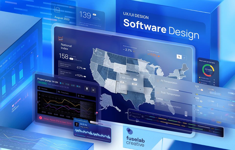
1) Data Visualizations
Consider the data chart above showcasing e-commerce sales year over year.
Forever slated to be known as the year of COVID-19, 2020 paved the way for the accelerated maturation of quite a few design-reliant trends.
For example, more people than ever were working remotely (and they continue to do so), even in traditional, full-time employment.
E-commerce understandably rose as consumers needed to buy the essentials without leaving their homes — and retailers likewise scrambled to provide online buying options.
This groundbreaking change in culture, coupled with the rapid adoption of technology that has already been available for about a decade now, set the stage for five leading design trends poised to reshape 2021 and beyond.
Businesses speaking to businesses are already using graphics like it. But, they haven’t really entered the mainstream — until now. Even businesses speaking to consumers usually use data visualizations because they operate in certain niches where the technology could do with some visual simplification.
A good example of this is personal finance or employment-related data research, such as those gathered by Gallup. Social statistics gathered by outlets like the Pew Research Center also get some airtime as they may be used by reporters of publications like The Washington Post to impact general audiences.
However, the onset of COVID-19 changed the course of data visualization utility, especially in the healthcare design industry. Whether it was case modeling on news reports or trying to understand how the “curve” was changing for the U.S., healthcare practitioners, researchers, and global health officers were relying more than ever on the numbers to make a compelling case for protectionary measures.
And to further persuade people about the numbers, they needed visual elements.
The sheer variety of visualizations we see in 2021 are also incredibly novel. The designs pave the path for data viz designers to find new ways of communicating key information that goes beyond the traditional, two-dimensional bar, line, and chart graphs.
Consider this data visualization graphic by NPR, which maps the risk levels of COVID-19 by state. Here are a few key takeaways that highlight how to successfully harness the “trend” of data visualizations for 2021:
- Using clear information and simple, bright colors, we can instantly tell which states have the highest numbers.
- NPR has used a preexisting design convention — red, meaning “danger,” and orange for “alert” — to communicate the context of the chart. We also don’t need a primer, and, within a few seconds, we can absorb the most significant information.
- Finally, hovering over a particular state expands the information available but doesn’t overwhelm the user, thanks to the subtle but powerful interaction animation.
Take notes because these details are shifting the way data visualizations can be used in everyday life. Namely, audiences are looking for novelty or creativity, simplicity, and the gratification of being able to choose to learn more or receive feedback through interaction.

( Image Source )
2) Graphic Animation for Micro Interactions
Speaking of feedback through interaction, we’ve stumbled upon the second design trend of 2021 — graphic animations for micro-interactions.
Now, to be clear, animated graphics are not a new thing. Since 65% of the U.S. population counts themselves as visual learners, animations are a strategic way to capture a user’s ever-shortening attention span.
Using graphic animation for micro-interactions harnesses and enhances this human instinct.
The user experiences the graphic as a live object capable of providing more information through interaction. This trend expands the reach of these graphic animations until certain interactions are universally accepted and expected. Data visualization services should be provided by the best experts in the field.
An example of enhanced micro-interactions is the zoom animation function in UX design. The animation we view is a zoom-in. This motion reveals an entirely new screen with related information that required the main screen to be present for context. The “detailed view” provides the opportunity for instant and relevant feedback about a completed action.
Designers can also use graphic animation for micro-interactions to persuade or suggest.
For example, hovering over this small button reveals a subtle but logical workflow.
The statement here is, “If you liked it, please share it on the following social media platforms.”
Ka-ching! That’s the sound of your social profile boost.
3) Combining 3D Realism and Flat Design for Imagery that Pops
This design trend takes full advantage of the processing power and screen resolution of most desktops, mobile devices, and tablets today. It’s not that flat icon illustration is “out” as much as it needs some support.
Combining 3D realism with flat design gives birth to an entirely new way of experiencing the web. There’s a focus on 3D objects, bold typography, and bright, eye-catching gradients and colors. The fact is that there’s simply no reason not to harness the full potential of screen experiences.
This trend doesn’t just “capture” the audience’s or user’s attention — it holds the attention long enough to convey brand messaging. It’s also perfect for a flourishing e-commerce industry that needs more than one way to communicate a product’s unique benefits.
In the coming year, expect to see designers experimenting with these new forms, including blending photographic images with hand-illustrated art, 3D and flat design combinations, and even flying and floating elements that add dimension to design sensibilities. So, why not do so through design?
4) Interactive Asymmetrical Layouts
Any interaction designer will tell you to approach broken grids and asymmetrical layouts with caution. Like working with fire, these design tools can be highly effective — but only in capable hands.
Master this technique, which creates surprise and engagement in your users, and you can lower your bounce rate and keep them on the page. Fail, and they will never return. Ever. For a bit of positive reinforcement, here’s what a successful asymmetrical design layout looks like:

The broken grid and asymmetrical layout technique allow designers to break up the grid layout and spark a more experimental and even artistic flair for the design. Our DC design agency follows the latest design trends to create amazing designs.
You’ll notice, however, that despite the avant-garde nature of the layout, there are still clear buttons that communicate direction, intent, and interaction to users.
The asymmetrical layouts of 2021 are even more novel. A great example of this is Detaen Consulting, which uses the functional animation interaction we saw before to bring this trend into the new age.

Here, we have an asymmetrical layout with a moving, triangular piece that sits front and center.
It maps to the movement of the user’s mouse, which subtly but effectively tells them that to move on to the next screen, they’ve got to do something with their mouse.
To signal a successful transition, the screen changes color and the position of the triangle transforms.

Translation: This is banking consulting done differently.
5) Text-Heavy Videos
Whoever told you the text is dead…didn’t realize 2020 was around the corner.
There’s no doubt that video and video-based imagery capture far more attention than static or text-heavy content. Thanks to social media platforms like Facebook and Instagram, video is persuasive, engaging, and high-performing.
Consider that:
- 85% of videos are viewed without
- With the use of text in the video, even in the form of subtitles, audiences are likely to continue watching to a 91% completion rate.
So, don’t you count out text just yet? You can thank the Zoom fatigue we’re all feeling right now for the emergence of this new trend: text-heavy video.
People will continue working remotely through 2021 and potentially the first half of 2022, and they need new, effective ways to communicate.
This also means all the consumer habits we’ve seen so far — such as a heavy reliance on social media or the uptick in streaming platforms for in-house, socially-distanced entertainment — will continue. So, audiences will be looking for a novelty even within the video trend.
Videos that make use of text are a cost-effective way to produce video content that’s not exactly a video, but still a visual medium that translates well onscreen.
ext-heavy videos are also proving to be useful tools in the spread of timely information.
News outlets, for example, can use text-heavy videos to communicate important updates about the pandemic or break down complex ideas about vaccinations into bite-sized, impactful messages.
Conclusion
Dorothy’s drop into the colorful world of Oz wasn’t cinema’s first foray into color film — but no one remembers anything of significance that came before. That’s because The Wizard of Oz was the first film to prove that aesthetics, design, and color could add and even enhance the fantastical elements of storytelling.
Most importantly, The Wizard of Oz was proof that the novelty of these techniques could draw audiences into cinemas, keep them there, and then compel them to return. It wasn’t nice to have but a must-have, integral to the movie’s plot.
Of all the Shiny Objects on the internet today, these five design trends are similar more than aesthetics on a screen.
They can catalyze a range of emotions like surprise and, done well, can delight, engage, and interact with a user in a lasting and meaningful way.
Read also about the latest digital product design trends.
What comes next? Only using these trends to their full potential can tell you that.

Browse more
Data Visualization Trends 2024