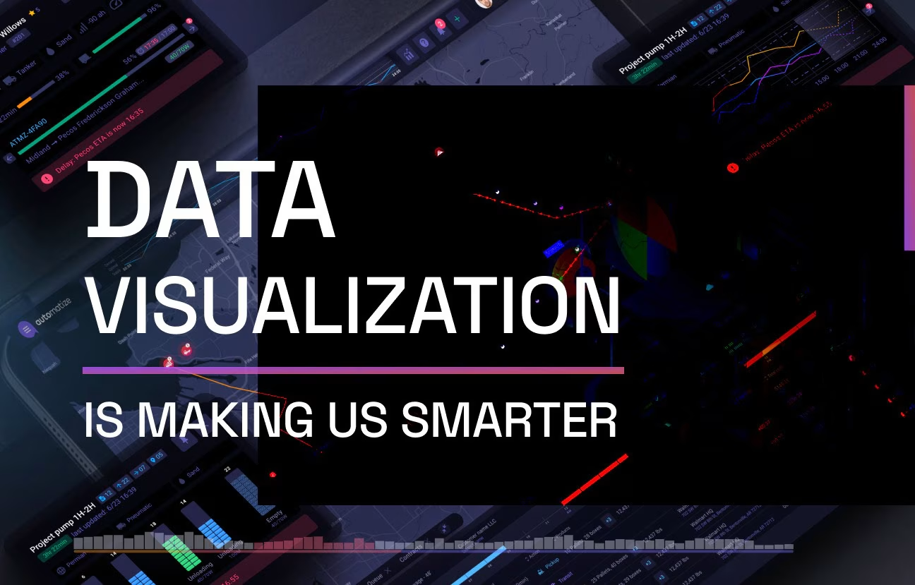
Data Visualization Is Changing How We See
Data Visualization Explained
Organizations now have a tool to understand the “why’s, “how’s, and what’s” behind the most critical trends, shifts, and projections behind their successes and failures. What will Africa look like in a hundred years? The statistics gathered by The Telegraph’s 2016 article offer plenty of data points to answer the question.
These are observations like:
- “By 2100, [Africa] will be home to 4.4 billion.”
- “Such an increase – far larger than the global population increase of 53 percent by 2100 – will pose significant challenges.”
- “By 2050, more than half of Africa’s 2.2bn people will live in its rapidly expanding cities.”
And yet, despite their accuracy and precision, something is missing. How do you get people to imagine the scale of those numbers?
Do people care about the fact that the UN has issued a warning about the future of the continent, based on the fact that 71 African cities have a population of 750,000 and lack the infrastructure to support such large populations?
The answer is – it’s a toss-up.
Data visualizations offer readers the big “so what?” that they’re desperately seeking to learn from the myriad facts thrown at them. And it doesn’t stop there – when used in business intelligence, corporate decision-making, and trend analysis, companies using data visualization pin 20% of their earnings to these activities.
In this blog, you’ll learn the details of data visualization, how it’s used, and how you can harness data visualization to your advantage as it evolves.
What is Data Visualization
Data visualization is almost like a universal language.
In simple terms, data visualization makes use of graphs, charts, maps, and other visual elements to represent data. When information is visualized, it’s easier to spot trends and patterns, make decisions, and even formulate predictions.
Data visualization works so well because it is almost like a universal language. Whereas written and spoken forms of communication rely on understanding the rules of a system, images speak to a different part of our brain – namely, the occipital lobe. The brain processes images 60,000 times faster than text, and 90% of what we absorb, even unconsciously, are visual images. Just let that sink in for a second. We kind of already knew that images speak louder than words, but that we process images 60,000 times faster seems almost ridiculous.
Essentially, humans are visual creatures. So when something complex, text-based, and numerical comes our way, the best way to both understand it and analyze it is through visual representation.
That’s precisely what data visualization does. It helps reframe data into meaningful communication. It also can take millions of data points and group them into a simple yet communicative graphic, it is a truly invaluable tool as our data accumulation grows and grows.
The Importance of Data Visualization in Business Intelligence
The data viz process is making an impact.
While major news outlets have relied on some form of data visualization for years now, it’s in business decision-making that the data viz process is making an impact. More and more, visual communication is a must-have skill for management because of the role data plays in organizations today. Yes, it’s a powerful way for smart leaders to drive decisions and communicate the change to teams. But, more often than not, it’s simply a method for managers themselves to understand what they’re working with.
In other words, there’s more data available today than ever before, and it’s all filtering in at an overwhelming rate. And it’s not just numerical or statistical data that requires comprehension – data visualization strategies are a way to map out more complex systems – like the effects of climate change over a decade or the paths a customer takes as they move through a physical store.
Why is data visualization important when it comes to business intelligence? Let’s look at five benefits of data visualization:
- Deeper analysis – It’s not just about plotting information from a data set. It’s about reflecting activity. The data visualization process is a foray into thinking visually and understanding how to frame and communicate the outcomes. For example, it’s not about “Q3 financials” – it’s about “finding our missing targets.”
- Rapid decision-making action – Because data visualization includes engaging and attention-grabbing visuals, it’s easy for decision-makers to take forms of action for business growth and communicate these to team members.
- Clearer pattern recognition – Even when data is cleaned up and modeled through charts, it’s not always easy to spot patterns or recognize relationships between the data points. Visualizations give business stakeholders a chance to explore specific patterns further. They can also spot these patterns quicker.
- Understanding the big picture – Companies using data visualization need to go beyond simply modeling data and leaving it there. Before you enter into the exercise of thinking visually, you need to determine if you’re declaring something or exploring something. You’ll also need to examine if you’re visualizing qualitative or conceptual information or focusing on plotting out quantitative, statistical data. These initial questions will force you to have a good understanding of what you’re accomplishing right up front, making it far more likely that you’ll be able to convey the full picture to an audience with a single glance. This is especially important when trying to communicate change in an organization.
- Finding hidden data correlations – This is where business insights and intelligence lie. Hidden data correlations are relationships between information that you might not have expected. This also allows you to spot trends, potentially earlier than your competitors, which can then translate into business action taken to realize further growth or revenue.
How Is Data Visualization Used?
Data visualization techniques.
Data visualization techniques are not new – you’ve likely already heard of cave paintings as one of the first examples of data visualization. However, experts can’t agree on why exactly these scenes were depicted.
Some say they were used as a simple but powerful way to say “I was here.” Others hypothesize it’s a fertility ritual writ large. And, others still boil it down to the mainstays of human nature: the result of early man attempting to make sense of the world through images.
The use of data visualization has come a long way since those days. It’s even progressed far beyond the advancements in the 19th century, where foundational changes in ergonomics, biology, and sociology made the years between 1850 to 1900 the “Golden Age” of data visualization.
During this time in history, thinkers and scientists like Charles Darwin and Charles Joseph Minard were attempting to model the most complex, future-reaching events: the biodiversity of evolution, and the consequences of Napoleon’s invasion of Russia.
The latter plotted the massive, transformative effects of the “Russian Campaign of 1812” across six points of data:
- The number of men in Napoleon’s troops
- The distance traveled
- The temperature
- The latitude and longitude
- The direction of travel
- The location of the army relative to specific dates
In some ways, not much has changed – we still use data visualization to communicate large-scale changes, information, and data. We do so using a combination of images (in our case graphics, charts, diagrams, and other graphical elements), icons, and even words for context.
Now, in creating data visualizations, we’re able to translate complex ideas or numbers with values too high to mentally comprehend into valuable insights and takeaways. If we do it right, we end up not only teaching something to those we’re trying to communicate with but understanding something essential about ourselves.
As the “Golden Age of Data Visualization” evolved, data visuals began to be used in a business capacity as a useful tool for reporting rather than singularly as a way to capture discoveries or make notes. If you’ve ever pulled up a chart in Microsoft Excel using data you entered into spreadsheet cells, congratulations – you’ve worked with data visualizations.
The “modern” forms of data visualization work with large data sets and reorganize and model that information using visual elements that represent the key aspects of the data. They also:
- Use interactive or animated elements
- Give options for user customization
- Are simple enough to understand at a glance or with a few clicks of reordering the data
For example, the Telegraph’s story about Africa’s rapid urbanization relied on representing hotspots of data on an interactive map that changed as the user scrolled through. That’s because the data needed to be set against the right context so that the reader or observer can draw a very clear conclusion: “The population has skyrocketed between 1950 and 1990.”
Choosing maps – rather than another element – for visual representation helped to enhance the story by giving mere numbers a context or a setting for interpretation.

The scrolling interaction is another innovative element that sets today’s data visualizations apart from more static predecessors like infographics or bar graphs you might see in old-school Powerpoint presentations. Interaction is a significant differentiating factor when it comes to modern dashboard design services.
To continue the above example, simply watching Africa’s population numbers change on a graph over time is not enough. Nor would it have been right to animate the graph itself. Instead, it was important to plot population numbers as a growing circle and provide context by placing these data points (or visually representing them) on a map.
Ultimately, data visualization in daily life is about storytelling. Once you’ve spotted those trends and patterns, the analysis you provide is far more engaging and flows like a story, much like Minard’s “Russian Campaign of 1812.”
Though his original visualization was static, it still managed to tell a very expansive story over time. His choice of data points as well as the model of representation – an interesting sort of graph plot line that looks more like a tree branch – gave the visual a sort of eerie feeling. You can’t help but look at it and realize you’re watching the very lines of history unfold.
That is the way powerful data visualizations are used even today.
Read also about how data visualization is changing healthcare for the better.

- Tables
- Graphs (box and whisker plots, bullet graphs, etc.)
- Infographics
- Dashboards
- Maps (heat maps, dot distribution maps, etc.)
- Charts (area charts, bar charts, etc.)
- Bubble clouds or word clouds
- Timelines
- Treemaps
Of course, it doesn’t stop there. These types of data visualizations are simply a baseline. Successful data visualizations use other design elements that enhance these initial types and also help amplify the most essential points, trends, patterns, outliers, and findings you’re trying to broadcast and highlight to the end user.
These can include interactive elements like buttons, hover functions, or forms of user inputs that allow customization of how the data is organized or what’s shown and hidden.
You can’t discuss the data visualization process without looking at data visualization design elements. The types of data visualizations listed above rely on these unique design principles that draw from a confluence of disciplines, including user experience design, information architecture, visual communication, application design, motion graphics, spatial experience, and more.
These principles of data visualization design include:
- Balancing visual elements like shape, color, negative space, texture, etc.
- Using contrast, size, and other visual elements to emphasize key findings
- Using movement to direct the viewer’s attention and gaze
- Establishing a pattern by using similar colors, chart types, and other elements – and using different design elements to emphasize anomalies in the data
- Illustrating larger data sets using proportion
- Arranging elements across a page in a way that allows for smooth and natural eye movement (for example, arranging elements in an “F” pattern, which mimics how the eye reads, from left to right, top to bottom)
- Keeping the look of design elements consistent overall so that there’s a clear theme (the theme could also be based on a visualization’s “niche”)
So, whether you use charts, graphs, maps, or any combination of the various types of data visualizations, these seven principles of data visualization design determine essential aspects of the process.
How will you use movement to grab a viewer’s attention? How will you communicate that an element, such as a button or a toggle switch, is something that the user can interact with? How will you separate various insights or communicate that you’re moving from one data set to another?
Together, the various types of data visualization and the overall design elements aim at accomplishing two specific goals: telling a clear story and drawing out patterns or key findings for further analysis and reporting. Whether these visualizations are used to communicate a major new story or to justify the need for a corporate change, you can see just how useful their role and function are.
- A way to collect, input, collate, and/or aggregate data. This is usually done through importing data sets, and individuals looking to create their visualizations may require a tool that allows for very large data sets.
- Graphical elements that users can then harness to translate their data sets into visual representations. Depending on the tool or technology, these might be code-free, pre-built elements and templates, or they might rely on knowledge of languages like Javascript and Python and allow users to harness visualization from predefined libraries.
While these are the two broad goals of data visualization technologies, any user looking to create custom visualizations needs to rely on:
- An understanding of basic graphical functions, including trigonometric, algebraic, and geometric functions
- Knowledge of current graphics formats and libraries, such as Canvas, SVG, WebGL, etc.
- Good data “hygiene,” which includes knowing how to “clean” data sets and which data models work best for which types of data
- A practice of design aesthetics and how user interaction depends on these design principles
- A strategic foresight of visual analysis or graphical interaction
- The correct use of charts and/or the adherence to certain “standards” of visualization – for example, reporting common business scenarios in a particular type of data visualization
While the most familiar tools for effective data visualization began in Excel, other tech stacks used today – commercial and otherwise – include D3, Python, Tableau, FineReport, PowerBI, HighCharts, and more. What you use to power up your data sets and transform them into data visualizations is entirely dependent on the size and complexity of what you’re trying to render (source data), and the goals of the visualization. Of course, it also depends on how familiar you are with code.
For example, a data visualization technology like the Seaborn library relies on knowledge of Python – yet, it’s a powerful tool with a high-level interface for graphics in just a few lines of code (compared to other tools like Pandas visualization or Matplotlib). In contrast, users can opt for no-code solutions like FineReport. As a commercial tool, it has an investment in making things as user-friendly, intuitive, and simple as possible. FineReport connects to a variety of databases, and it’s incredibly easy to customize complex reports through simple but powerful dashboards.
The UI is similar to Excel, so there’s some familiarity built in, and users can opt for over 50 styles of data visualizations across 19 categories. So, for example, if you’re looking to create a cohesive visualization that speaks specifically to an audience in medical UI design, FineReport has the graphical options readily designed for you to choose from.
Tableau is an example of a data visualization technology sitting somewhere in the middle. You don’t need any prior coding knowledge – but Tableau is powerful enough to accommodate Python and R code for advanced visualizations and modeling.
It’s primarily intended as a business intelligence tool but supports interactive and shareable dashboards by connecting to files, relational databases, and big data sources to retrieve and process data.
Even though you think about visualizations as objects or end goals, the truth is that visualization is a process. The technology used to create visualizations is the support that allows us to continually iterate until we spot the interesting patterns lifted from swathes of data.
For example, you might come up with a hypothesis about your business and have the data to explore it further. However, the activity itself requires you to play around with different views, prototype, and find the right variables that might give you an insight into whether or not your hypothesis is correct. A data visualization agency can provide the best design solutions for your project. To learn more about data visualization best practices and how these can support business intelligence and insights, visit Fuselab Creative.