12
min read
12
min read
 Oct 23, 2026
Digital twin use cases and examples across industries in 2026
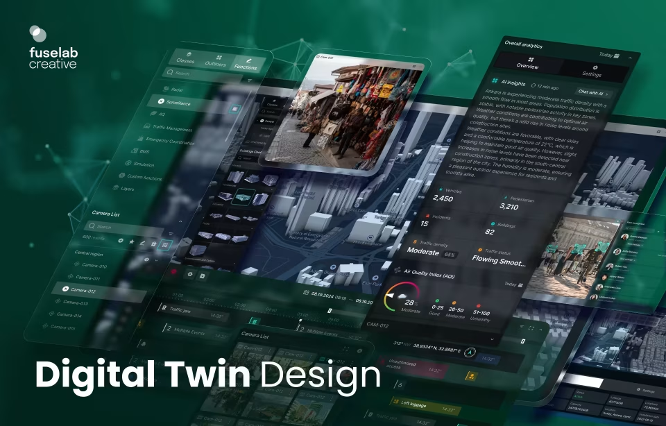
Digital twin use cases span manufacturing, healthcare, energy, and logistics, from a factory line flagging a failing bearing days early to a hospital modeling a patient surge before it arrives, each a live virtual replica its team monitors and acts on. What separates a twin people rely on from an expensive data feed is rarely the sensors or the model, it is the interface that turns real-time state into something an operator can read and trust.
What every digital twin has in common
Across every industry, digital twin use cases share one structure. A physical asset streams live data to a virtual model, and a person uses that model to decide something. The industries change, the interface job does not: show current state at a glance, flag what shifted, and make the safe next action obvious.
This is a use-case guide, not a definition. If you need the underlying concept, our explainer on what a digital twin is covers the model, the live data link, and how a twin differs from a plain 3D render. The focus here stays narrow and useful to a product team: what each industry does with a twin, and what that asks of the screen.
The idea predates the technology. NASA’s Apollo program kept ground-based duplicates of its spacecraft to mirror what was happening in flight, and IBM’s overview of the digital twin concept credits its modern framing to Michael Grieves in the early 2000s. What changed since is reach: cheap sensors and cloud data now put a live twin within budget for a factory line, a hospital floor, or a regional water network.
Digital twin use cases in manufacturing and industrial operations
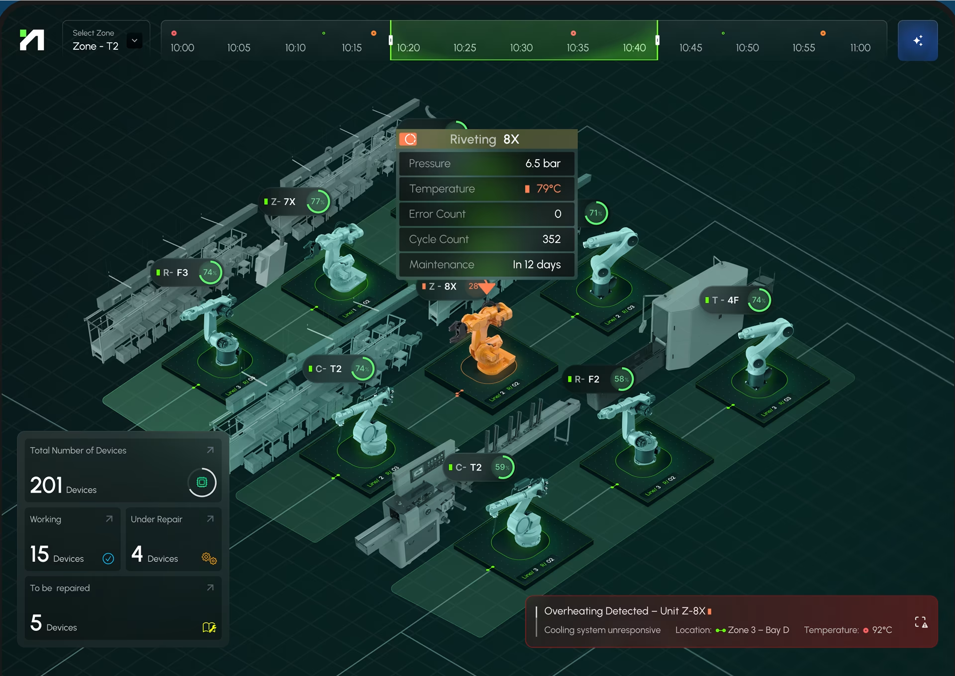
Manufacturing digital twin use cases center on the production line. A twin pulls PLC and sensor data into a model that predicts a failure, tests a layout change, or tracks output against target. The design problem is glanceability: a floor operator needs machine state and the one anomaly worth acting on at a glance, not buried in a report.
On one industrial monitoring build, we spent weeks trying to shave another second off the latency before realizing nobody on the floor cared. What operators actually complained about was numbers that bounced around while values settled. Once we stopped chasing real-time and just stabilized the display, the complaints disappeared. The engineers hated smoothing the data, but the floor never mentioned it again.
Predictive maintenance lives or dies on the screen. A twin can forecast a bearing failure days out, but if it lands as a row in a table nobody opens, the line still stops. Siemens sidesteps that by building the twin into its own automation stack. We usually arrive as the design layer on top, so we fight to put the prediction next to the action, not in an alerts tab.
Shift handover is the hidden use case. The moment a twin proves its worth is not steady-state running, it is the two minutes when one operator hands the line to the next. A model that can show what changed during the last shift, and what is still open, replaces a clipboard and a rushed verbal briefing. We design that view deliberately, because it is where errors actually enter.
Digital twin use cases in healthcare
In practice, most healthcare digital twins fall into two categories, though there are exceptions. One models a facility, simulating patient flow and bed capacity so administrators can test a change before it hits a ward. The other models the patient, mirroring organs and physiology. Both carry a constraint most industries skip: accessibility is law, under Section 508 and WCAG.
On ClyHealth, motion was the thing we got wrong first. We assumed the problem was too many charts, so we cut them, and it barely helped. What was actually overwhelming clinicians was everything refreshing at the same instant. We staggered the updates, calmed the animation, and the complaints about too much going on just stopped. None of that was in the spec.
Accessibility doubled as a usability pass. The surprise on the DHCS Medi-Cal work was how much the Section 508 requirement improved the design for everyone, not just screen-reader users. Forcing a clear reading order and real keyboard paths stripped out ambiguity we would have left in. It reads as a compliance line, but in practice it sharpened the whole interface.

Digital twins in energy, utilities, and infrastructure
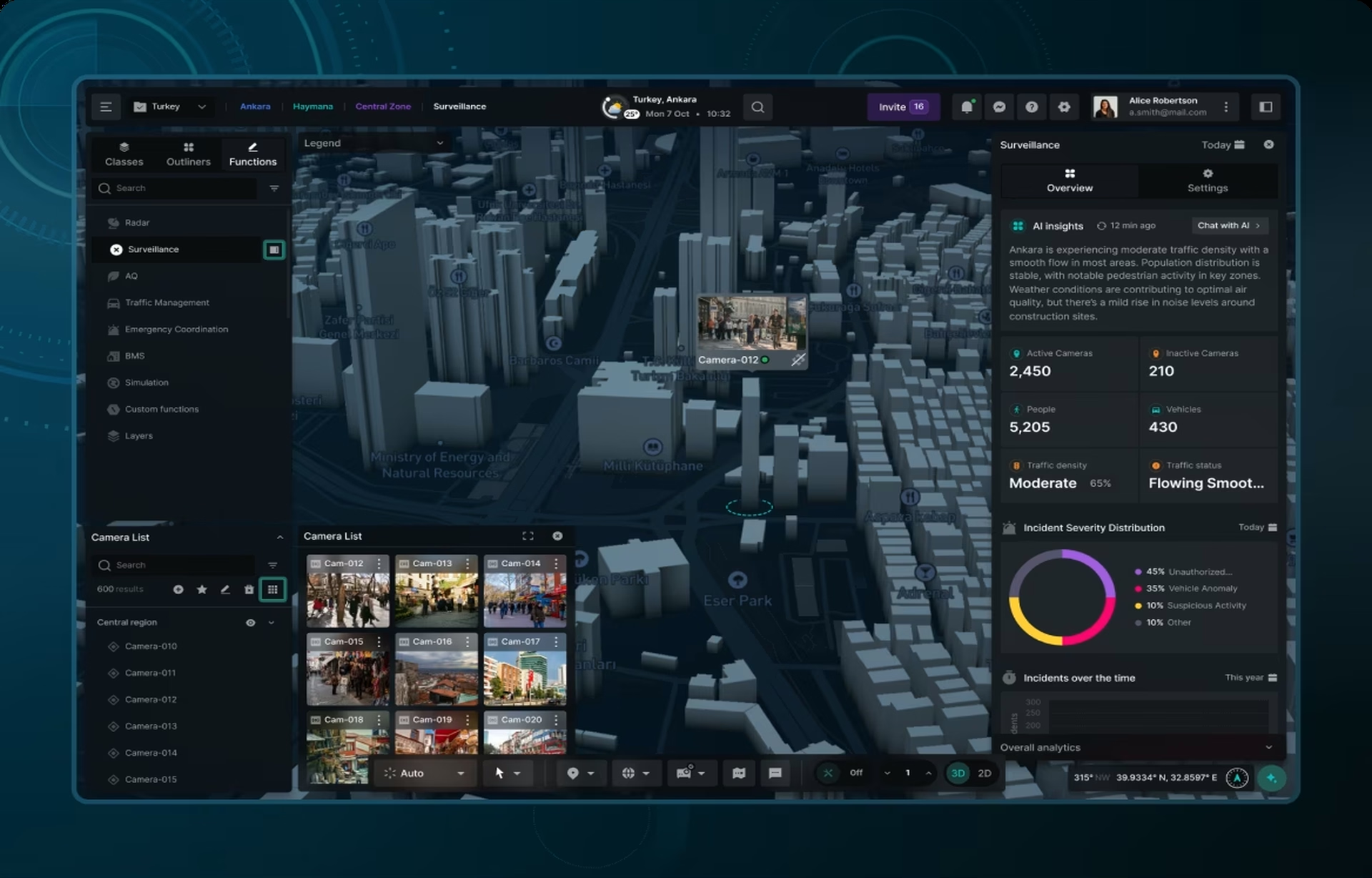
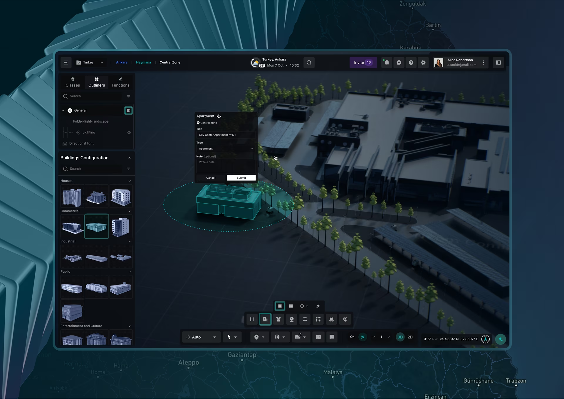
Energy and infrastructure twins tend to model networks, not single machines: a power grid, a renewable fleet, a water system, or a city district. The twin fuses sensor data with forecasts to schedule maintenance, balance load, or predict a flood. Scale is the design challenge, since one view must span a turbine and a whole region without losing the operator. Our design inspiration gallery includes wind farm and city twins.
The killer feature was not the live simulation. On Fuselab’s smart city digital management framework, the capability planners actually reached for was the ability to freeze the model and annotate it. Most of their real work happens in a meeting arguing about one change, not watching the whole city move in real time. We built the twin around that.
Operators want the exception, not the fleet. Grid and renewable operators need to know which asset is underperforming right now and whether a forecast shifts the next few hours of dispatch. A twin that buries that under fifty healthy turbines has answered the wrong question. We keep relearning to make the exception legible against a calm background, at whatever zoom the operator sits at.
We’ve also seen utilities solve scale by refusing to centralize. Instead of one twin spanning the region, they run a twin per substation with a thin roll-up on top, so no single screen has to zoom from a valve to a whole state. Bentley’s iTwin work leans the same way for infrastructure. It is a cleaner answer than the god-view we tend to reach for first.
Digital twins in logistics and supply chain
Logistics twins tend to model flow rather than a fixed asset: a warehouse, a distribution network, or a fleet in motion. The twin runs what-if scenarios on layout, routing, and demand so planners can test a change without interrupting live operations. Because the thing modeled keeps moving, the interface has to show state across time and space at once.
Everything shown, nothing prioritized. Warehouse and network twins tend to fail the same way factory twins do. A planner comparing two routing scenarios wants the difference between them surfaced, not two full dashboards to eyeball side by side. It sounds obvious, yet almost every first draft we review, ours included, defaults to showing both in full.
Time is the axis that breaks logistics twins. A warehouse twin is really a story about the next few hours, so the interface has to let a planner scrub forward and back without confusing a forecast with what already happened. The teams that struggle here treat time like any other filter. The ones that succeed give it its own clear, always-visible control.
What a digital twin interface has to get right
Every digital twin poses the same design challenge. A live model produces more state than a person can watch, so the interface has to decide what to show, what to suppress, and what to escalate. When that hierarchy is right, the twin becomes a tool operators trust; when it is wrong, an accurate model still ships as a wall of dials nobody reads.
Underneath every use case sit the same five decisions. They are what separates a twin people open daily from one that gets a launch demo and then dies. None is about the 3D model. All of them are about the screen in front of the person who has to act.
- The default view. What appears before anyone clicks. It should answer the most common question the twin exists for, with the current exception already surfaced, not a neutral overview that makes every user drill for the same thing.
- Data confidence and staleness. A twin that shows a dropped sensor’s last value as if it were live is dangerous. The interface has to signal when a reading is stale, estimated, or missing, because operators act on the number, not the pipeline behind it.
- Alarms as a scarce resource. Every alert competes for the one thing you cannot scale, attention. Alarms earn trust only when they fire rarely and mean something, so the real design job is deciding what never gets to alarm.
- Role-based depth. A plant manager, a floor operator, and a maintenance tech need the same twin at three different resolutions. One flat view for all of them serves none of them well.
- The time dimension. Live, historical, and predicted are three states of the same model, and confusing them causes real mistakes. The interface has to make it obvious which one you are looking at.
The industries change; these decisions do not. The table below lays out what the twin models, where its live data comes from, and the interface problem that dominates in each of the four use cases we run into most often.
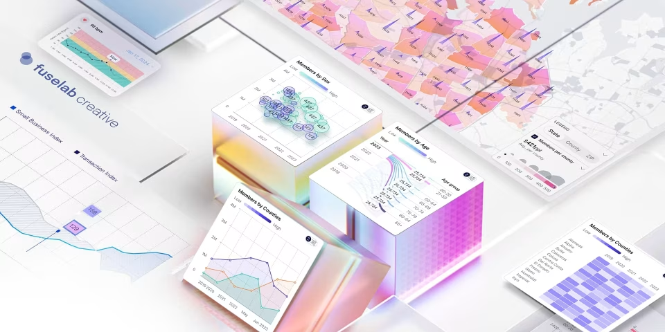
One discipline underneath all of it. Whether it is a turbine or a hospital ward, turning a live model into a legible screen is the same craft, which is why teams that treat a twin as a data visualization problem, not just an engineering one, ship interfaces people actually use.
None of this is unique to twins. The Nielsen Norman Group’s dashboard research makes the same argument for any monitoring interface: reduce cognitive load, use preattentive cues like position and color for the few things that matter, and keep the rest quiet. A digital twin just raises the stakes, because the data is live and the action is operational.
How a digital twin interface differs from a business dashboard
A digital twin interface tracks the live state of one specific physical asset and updates continuously from its sensors, so an operator can act in the moment. A business dashboard reports historical, aggregated data across an organization for analysis. The twin drives operational decisions now; the dashboard supports strategic ones later. They look similar and are built for opposite jobs.
The data is the first tell. A BI dashboard can be a day old and still be correct, because it is describing what already happened. A twin that is a day old is simply wrong, because it claims to represent something as it is right now. That single difference cascades into everything: refresh design, staleness signals, and how much you trust a green light.
The second tell is what happens after a click. A dashboard usually ends at insight, a chart you interpret. A twin is expected to end at action, so the interface has to carry the next step, whether that is acknowledging an alarm, scheduling maintenance, or dispatching a crew. An agency that has only built reporting dashboards often misses that the twin is not finished at the chart.
Common mistakes in digital twin interfaces
The most common failures in digital twin interfaces are not technical, they are editorial. The model works, but the screen shows everything at once, hides how fresh the data is, floods the operator with alarms, or forces one view on every role. Each mistake quietly erodes the trust the twin needs to get used at all.
Four patterns show up again and again, across industries and across agencies. We have shipped versions of all of them at some point, and learned the hard way to catch each one before it reaches an operator on a live floor.
- Dashboarditis, showing everything. The team is proud of the data, so it all goes on screen. The operator now has to do the prioritizing the interface should have done, and quietly stops looking.
- Silent staleness. A sensor drops and the last value keeps displaying as if it were current. Nobody notices until a decision is made on a number that stopped being true an hour ago.
- Alarm inflation. Everything that can be flagged gets flagged, so red stops meaning danger. Within a week the operators have muted the thing that was supposed to protect them.
- One view for every role. The executive overview and the technician’s diagnostic screen get merged into a single compromise that serves the demo and no actual user.
The thread is the same across all four. Each one is the model winning an argument it should have lost, engineering priorities overriding the operator’s attention. Catching them is less about better charts and more about being willing to leave things off the screen, which is harder than it sounds when the data was expensive to produce.
How to design the interface for a digital twin use case
Designing the interface for a digital twin use case, the way we tend to, starts with the decision the twin supports, not the data it shows. We map the operator’s moments: what they check, what they act on, and what they ignore. The default view is then built around the exception, with role-based depth beneath it and alarms treated as scarce.
Judging a partner works the same way. The big platform players, Siemens, GE, NVIDIA’s Omniverse, and Bentley, each own a real slice of this, and if your twin lives entirely inside one of their stacks, their tools are often the right call. An independent design team earns its place mainly when the twin has to pull from systems that were never meant to talk.
That gap is where the interface becomes the product. When a model has to draw from clinical systems, PLCs, and a GIS layer that share nothing, the screen is the only place they meet. Fuselab’s digital twin interface design work lives there, turning live industrial, clinical, and civic models into something an operator trusts.
The interface is not the last 10%. If there is one mistake we see across all these use cases, it is treating it as though it were. By the time the model works, the budget for the screen is usually gone, and a year of engineering ships behind a view no operator likes. The projects that landed treated the interface as part of the twin from day one.
Conclusion
The industries will keep multiplying, but the pattern under every digital twin holds: the model proves the concept and the interface decides adoption. Teams that win the next wave of twins will be the ones who design the screen with the same rigor they bring to the sensors and the math.
Frequently asked questions
What is a digital twin use case?
A digital twin use case is a specific job a live virtual replica does for a business, such as predicting equipment failure on a production line or modeling bed capacity in a hospital. Each one connects a physical asset, a synchronized model, and a person who acts on what the model shows.
Which industries have the strongest digital twin use cases?
Digital twin use cases are strongest in manufacturing, energy and utilities, healthcare, logistics, and smart-city infrastructure, because each runs complex physical systems that gain from live monitoring and what-if testing. Manufacturing and energy adopted earliest, while healthcare and public infrastructure are growing fastest now.
How is a twin different from a business intelligence dashboard?
A twin tracks the live state of one specific physical asset and updates continuously from its sensors, so an operator can act on what is happening right now. A business intelligence dashboard reports historical, aggregated data across a company for analysis. The twin drives operational decisions in the moment, while BI supports strategic ones after the fact.
In manufacturing versus healthcare, how do digital twin use cases differ?
In manufacturing, the focus is machines and production lines, optimizing for glanceability so a floor operator can spot the one anomaly that matters. In healthcare, the model is a facility or a patient, and accessibility becomes a hard requirement under Section 508 and WCAG. The priority shifts from speed on the floor to clarity and compliance.
What does a twin interface project usually cost?
Digital twin interface projects across the industry generally run $25,000 to $150,000 with a US-based specialist, at $100 to $300 per hour, and less with offshore generalists. The cost depends on how many live data sources and user roles the screens handle, and whether the scope is a prototype or a full design system. These are market ranges, not a quote for any single project.
How long does a build take?
A first production-ready interface usually takes 8 to 16 weeks industry-wide, depending on data readiness and how many user roles it serves. Discovery and information architecture come first, then design, then iteration against live data once the model is connected. Larger programs with many roles and screens run longer.
What should you look for in a design partner?
Look for a partner that designs the interface, not just the 3D model or the data pipeline, and can show shipped work where operators actually use the result. Ask how they decide what to show versus suppress, how they handle real-time state and alarms, and whether they design role-based views. A team that starts with the operator’s decision, not the visualization library, is the one to shortlist.