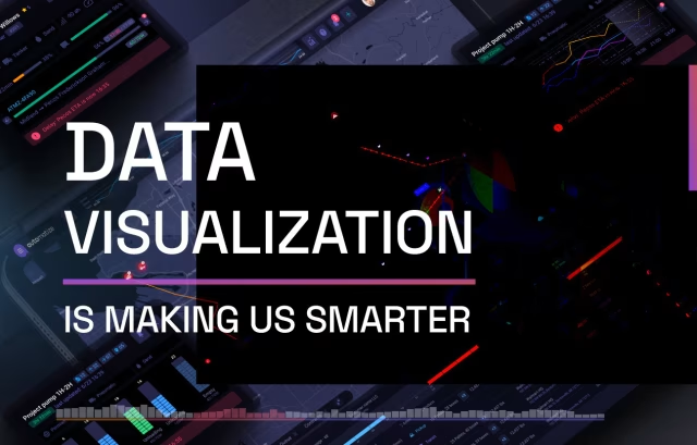
Good visualizations tell a story without the need for formal explanations. It is a nexus point where design, science, and communication exist to inform people in the language of the future.
Data Visualization Agency
As one of the best design agencies in the USA, we now have over a decade of experience creating data heavy presentations, applications, and digital tools. To remain competitive, any organization that seeks to influence the thinking, actions, and engagement of their users must employ a team of designers to present their data in a meaningful and intuitive fashion. This is now how successful businesses learn and make better decisions in the future.
Data Visualization Agency
Trusted by Fortune 100 Companies
Fuselab Creative is one of the premier data visualization design agencies in the U.S., and is trusted by Google, NASA, Ernst & Young, California Department of Health Care Services (DHCS), Avison Young, Informa Companies, and Uber to turn complex datasets into interfaces people actually understand. For over a decade, we have designed custom data visualization solutions across healthcare, government, transportation, and finance — building dashboards, BI tools, and interactive displays that help organizations make faster, more confident data-driven decisions. Where other agencies produce generic charts, we build custom data visualization systems engineered around your users, your data relationships, and fine.
A successful data visualization agency in this space must maintain a mastery of both fundamental design principles and cutting-edge technologies. This requires us to create an environment that supports and encourages a constant state of learning and adaptation as visualization tools, programming languages, and design trends evolve. We also cultivate expertise across multiple platforms (like Tableau, Power BI, D3.js, Python) while developing our own custom approaches that set Fuselab apart from our competition. Technical excellence means not just implementing client requests, but proactively proposing innovative solutions that reveal insights clients might not have discovered independently.
Beyond simply executing client requests or project requirements, agencies like ours work diligently to establish genuine partnerships through a deep understanding of client objectives, audience, and business context. This is how we get so many returns or renewals from our existing clients. This requires developing frameworks for thorough discovery processes that uncover unstated needs and identify how our approach will be used in decision-making. We think of ourselves as strategic advisors who translate business questions into visual solutions, helping our clients refine what they’re trying to learn from their data rather than just delivering what was initially requested. This is a huge differentiator for us.
Data visualization is fundamentally about finding the perfect design to communicate something, which makes our storytelling abilities crucial for our continued success. This means transforming complex information into compelling narratives that resonate with specific audiences. Successful agencies employ team members who understand both data structures and human psychology, combining analytical and creative thinking. They recognize that even technically perfect work will fail if it doesn’t effectively communicate insights in ways that not only make sense but also inspire action. At a minimum, we need to excel at adapting communication styles across different industries and types of target audiences.
The most effective agencies cultivate teams with diverse skills beyond just technical implementation. This includes data scientists who understand statistical validity and can help our design team rethink what’s possible with a dataset. We only hire UX designers with a fluid approach to their job. At times, they will need to focus on user interaction and become a kind of subject matter expert in our client’s industry, but they also need to work as project managers who can coordinate complex workflows. Success comes from establishing processes that leverage these diverse perspectives while maintaining cohesive output, often through paired work approaches that combine technical and design expertise throughout project lifecycles rather than handling these as separate phases.
After many years in this space, we have built an exceptionally distinct portfolio that showcases our unique capabilities. This has required Fuselab to maintain a strategic project selection and documentation practices. Successful agencies balance client confidentiality with the need to demonstrate their expertise, while sometimes having to develop alternative versions of client work for public sharing or pursuing self-initiated projects that demonstrate capabilities without client constraints. We have also developed proprietary frameworks, reusable components, our own design system, and methodologies that opened the door to intellectual property beyond our client deliverables and greatly improved our agency-wide efficiency.
How Our Data Visualization
Design Process Works
Every data visualization project we take on starts with a question: what decision does this need to support? From there, we follow a structured process that moves from raw data to refined, tested interfaces without skipping the steps that matter. It is not a linear hand-off — it is a collaborative loop that keeps your users, your data, and your business goals aligned at every stage.

Discovery and Data Audit
Before any design work begins, we need to understand what you have and what it needs to do. We conduct stakeholder interviews, map out user workflows, and perform a full data audit to surface gaps, redundancies, and opportunities. This is where we define what your data visualization actually needs to communicate and to whom.

Data Analysis and Preparation
Good data visualization design depends entirely on clean, well-structured data. We work through data preparation and data integration to normalize sources, reconcile formats, and ensure every dataset feeding into your interface is reliable. This step eliminates the downstream problems that cause dashboards to break, mislead, or require constant manual correction after launch.

UX Design and Prototyping
With a clear data foundation in place, our UX design work begins. We build wireframes and interactive prototypes that map user flows, establish information hierarchy, and test core interactions before any visual polish is applied. User research findings from discovery directly shape these decisions so the interface reflects how real users navigate and make decisions.

Visual Design and Development
This is where the system comes to life. Our visual design team applies data visualization design principles: color, contrast, typography, and spatial relationships to every chart, layout, and component we build. For custom builds, our development team works in D3.js, Power BI, Three.js, or bespoke frameworks depending on what your data architecture and user environment require.

Testing and Iteration
We test everything before anything ships. That means usability testing with representative users, A/B testing on layout and interaction decisions, and performance checks under real data loads. Findings feed directly back into the design, often more than once. This iteration loop is where most agencies cut corners and where we consistently find the biggest gains.

Deployment and Ongoing Support
Launch is not the finish line. We support deployment across your environment, ensure data connections are stable, and stay engaged through post-launch monitoring. As your data evolves and user needs shift, we help you adapt the system so your data visualization investment continues to generate actionable insight long after the initial build is complete.
Research
and Analysis
Heatmapping as a starting point
Often times users want to study the demographic data of a particular region in the world, and they want to compare this data other vicinities around it or in various other areas of the world. This can be true for countries on a world map, states on a country map, or even neighborhoods. As a result, heat-mapping is often a great place to start to set the stage for deeper dives into particular regions and demographics.

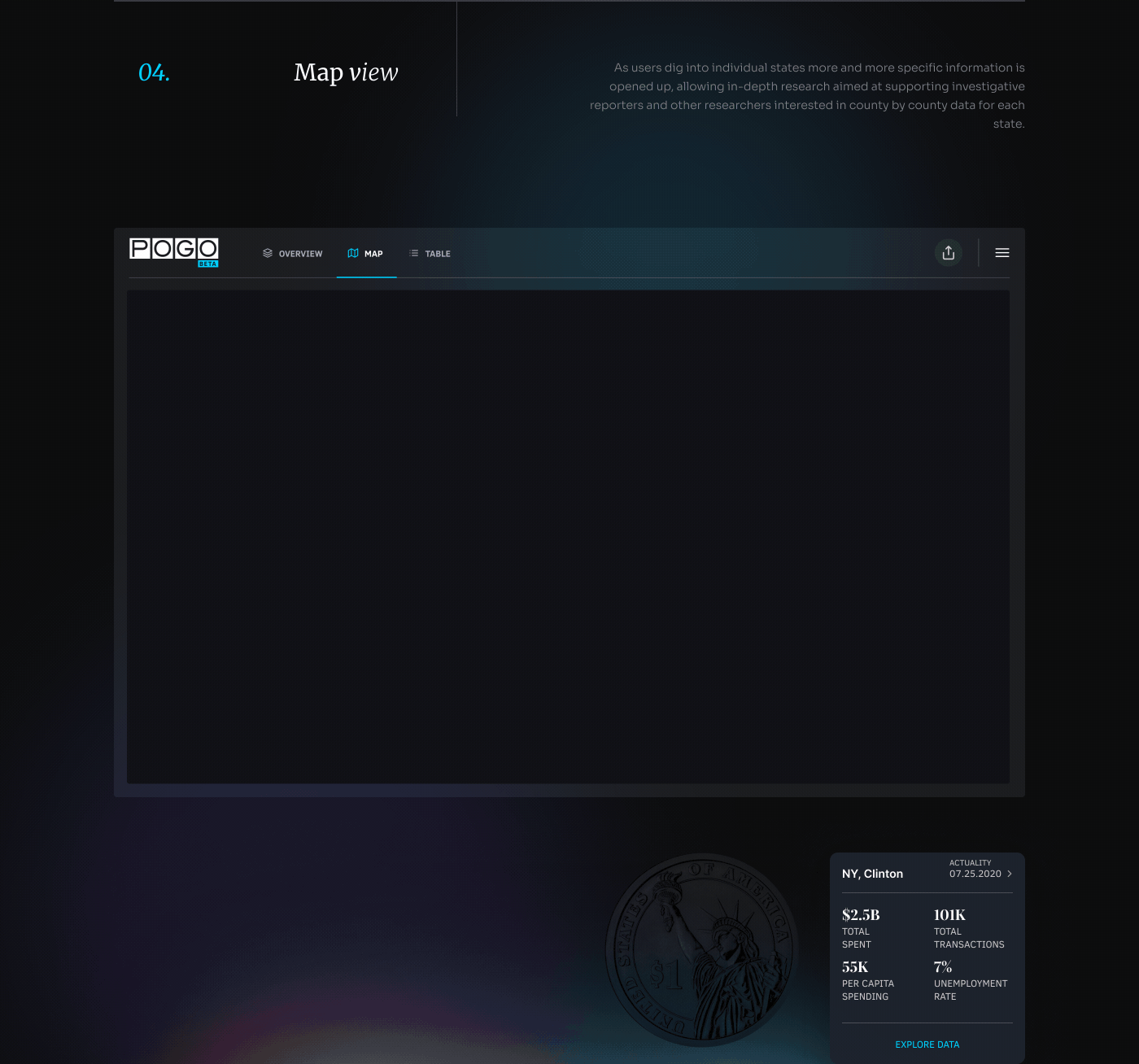
Taking data to
the next level
The ultimate stage receiving insights around data takes place within an interactive dashboard. Unlike so many graphics we see on the web or in periodicals, the dashboard allows for user customization, data-driven insights, and ability to incorporate relational data within a functional tool that paves the way for continuous knowledge transfer through real-time data updates.

Data Visualization Portfolio Real Projects, Measurable Results


Data Visualization Examples
Data Visualization Examples From Our Agency Portfolio
We do not design charts. We design decisions. Every data visualization we build starts with the humans who have to use it; their workflows, their blind spots, and the specific moment when the right visual makes the right call obvious. That is the only approach we know.

Agency Data Visualization Solutions we Deliver
Fuselab has spent over a decade refining the full spectrum of data visualization services, from early-stage strategy through custom development and ongoing iteration. Whether you need a single interactive dashboard or an enterprise-wide data visualization design system, here is what we deliver and how we do it.
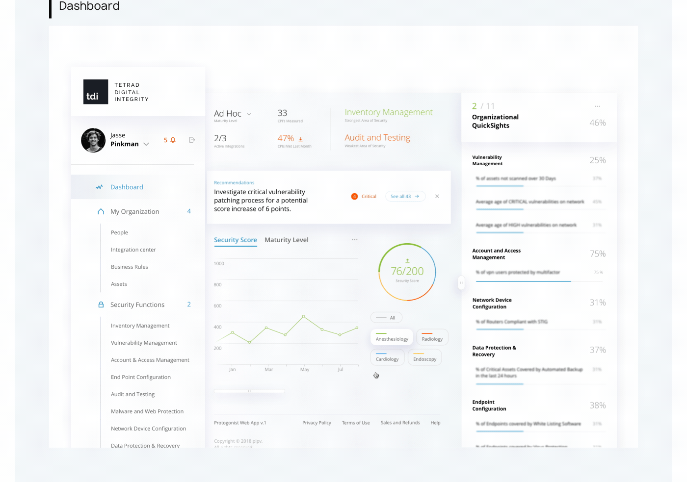
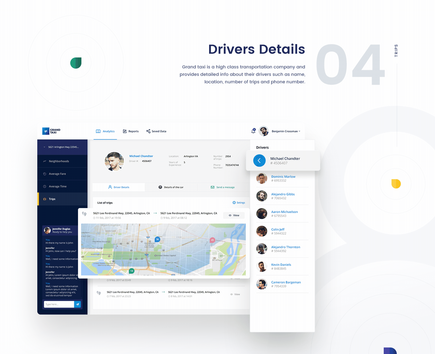
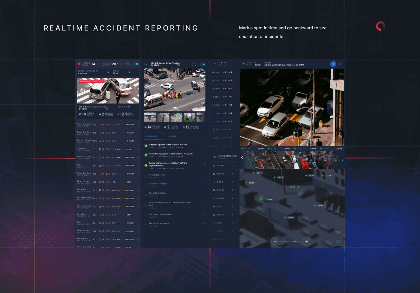
Interactive Dashboard Design
Most dashboards fail because they were designed for data, not for people. We build interactive dashboards that match the way your users think, filter, and decide. Every layout, control, and data point is designed to reduce cognitive load and accelerate data-driven decision-making across every role in your organization.

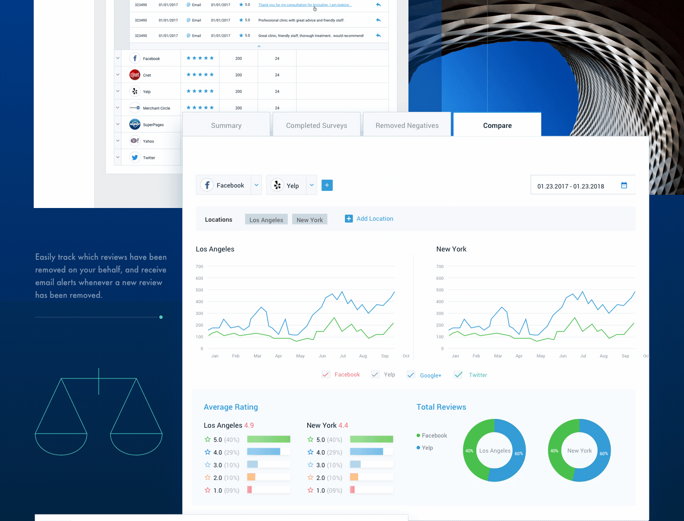
Data Storytelling and Narrative Visualization
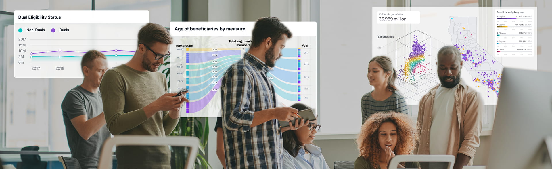
Raw numbers do not move people. Data storytelling does. We structure your data into visual narratives that guide stakeholders from context to conclusion without requiring them to interpret charts on their own. Our narrative visualization work has helped clients like NASA and California DHCS communicate complex findings to non-technical audiences clearly and credibly.

Business Intelligence and Analytics Dashboards
Business intelligence is only as useful as the interface people use to access it. We design BI dashboards for clients across finance, healthcare, transportation, and government that transform raw analytics into actionable insight. From KPI tracking to multi-source data integration, we build the layer between your data warehouse and the decisions your leadership team depends on.

Data Visualization Consulting and Strategy
Before a single pixel gets placed, the strategy has to be right. Our data visualization consulting practice helps organizations audit existing tools, define visualization standards, select the right technology stack, and build a roadmap that scales. If your team has data but no clear plan for turning it into insight, this is where the engagement starts.

Infographic and Information Design
Not every audience lives inside a dashboard. Our infographic design and information design work translates complex data into standalone visual assets built for reports, presentations, public-facing content, and executive communications. We apply the same strategic thinking that drives our dashboard work to ensure every infographic earns attention and communicates its core message without explanation.

Custom Data Visualization Development
When standard chart libraries hit their ceiling, we build from the ground up. Our custom data visualization development spans D3.js, Three.js, Power BI, and proprietary frameworks tailored to your data architecture. The result is a visualization system engineered specifically around your data relationships, your users, and the decisions your business needs to make faster.

Related Services and Solutions
Why Choose Fuselab
Why Leading Organizations Choose Fuselab as Their Data Visualization Partner
There are a lot of agencies that do dashboards. There are very few that do what we do. Here is what makes the difference in practice, not just on paper.
A decade in this space means we have seen every way a data visualization project can go wrong and built the processes to prevent it. We have designed for NASA, Uber, California DHCS, Fiserv, and NIH, across healthcare, government, finance, and transportation. That pattern recognition is not something you can replicate with a talented team and a short runway.
Fuselab holds an active GSA contract (47QTCA22D00CV), which means federal agencies can engage us directly without a lengthy procurement process. We understand the compliance requirements, accessibility standards, and documentation expectations that government digital work demands. For agencies navigating digital transformation under tight timelines, that pre-approved status removes a significant barrier to getting started.
Most design agencies hand data problems to designers. We built a team that does not have to. Our data scientists, UX designers, and engineers work in paired workflows from day one, which means the visual layer and the data layer are developed in conversation with each other rather than reconciled at the end of a project.
We built our own. FuseDash.ai is Fuselab’s proprietary data visualization platform, currently in beta, developed from over a decade of client work across industries. It gives clients a purpose-built environment for deploying and managing interactive dashboards without being locked into generic BI tooling. No other boutique data visualization agency is bringing a proprietary platform to the table.
We do not stop at handoff. Fuselab takes data visualization projects from discovery and UX research through visual design, custom development, testing, and deployment. That continuity eliminates the gap between what the design intended and what gets built, which is where most data visualization projects lose their integrity and require expensive post-launch fixes.
Data behaves differently in healthcare than it does in logistics. Compliance requirements in government work look nothing like the speed demands of a fintech dashboard. We bring genuine domain knowledge to every engagement, which means less time educating us and more time building something that reflects how your industry actually works and what your users actually need.
Data Visualization The Tools
& Technologies We Use
If you aren’t curious about how the impact of new technologies and strategies are changing our world of design and development then you might as well throw in the towel now. The tech we use here is in a constant state of change as we better understand the assets and limitations of what we are using and what is now available.
Tableau
Three.js
Chartkick
Recharts
Vue.js
ApexCharts
D3.js
V Charts
Power BI
React-Vis
WebDataRocks
FlexMonster
Industries We Create
Data Visualizations For

In many ways how patient data is used and displayed has transformed healthcare for the better by enabling medical professionals to track patient outcomes, identify treatment patterns, and detect disease outbreaks through interactive dashboards that convert complex clinical data into actionable insights in seconds. These visual tools help physicians make more accurate diagnoses, researchers identify correlations in medical studies, and administrators optimize hospital operations.

Our travel industry clients leverage data viz to analyze customer preferences, optimize pricing strategies in real-time, and identify emerging destination trends through heat maps, interactive graphs, and geospatial displays. Airlines use analytics to improve route planning and occupancy rates, while hotels employ interactive dashboards to track booking patterns and customer satisfaction, enabling personalized experiences.

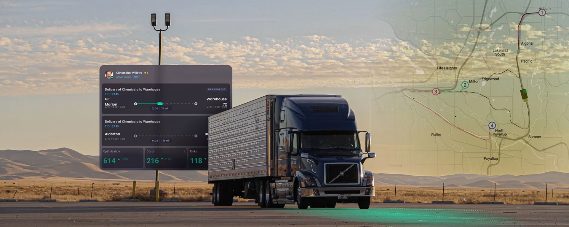
Client’s of ours like Automatize, use our custom dashboard designs to displaying traffic patterns, vehicle movements, and infrastructure usage through color-coded maps and real-time dashboards that have become a game changer for the logistics fleet manager. Transportation authorities use these tools to reduce congestion, optimize public transit routes, and plan infrastructure investments.

In real estate, data design has transformed property valuations, market analysis, and investment decisions through interactive maps showing neighborhood demographics, property values, and development trends. Agents use visual tools to help clients understand market conditions, developers analyze population growth and zoning changes through interactive maps, and investors compare investment opportunities with visual ROI projections across different property types and locations.

Data visuals are essential in artificial intelligence and machine learning for understanding complex algorithms, interpreting model outputs, and communicating insights to non-technical stakeholders through intuitive representations. Engineers use 3D charts to debug models, detect bias in training data, and optimize neural network architectures, while business leaders rely on dashboards to monitor AI system performance and understand the impact of machine learning solutions on business outcomes.

E-commerce businesses thrive through the use of tools that show detailed customer journeys, purchasing behaviors, and inventory management metrics through interactive sales funnels and real-time dashboards. These sources help identify top-performing products, optimize website design based on heat-maps of user interactions, personalize marketing campaigns through customer segmentation graphing, and forecast demand patterns to improve inventory management and reduce costs.
Frequently Asked
Questions
Fuselab Creative has been creating user-friendly and visually appealing digital interfaces for over a decade, and we still feel like we've only touched the surface of our potential.
What is data visualization, and how does it differ from plain reporting or tables?
Data visualization is the art and science of representing complex data sets in visually compelling and easily understandable ways to enable effective communication and expert-level insights. Unlike plain reporting or tables that present raw numbers requiring interpretation, good visualizations tell a story without formal explanations—they transform data that lives in spreadsheets and databases into intuitive graphics that speak to those who are less numbers-oriented. Data visualization goes beyond simple reporting by allowing users personalized filtering and unique ways to gain insights specific to their role, essentially creating unlimited decision-making power. It’s fundamentally about finding the perfect design to communicate something, combining design, science, and communication to inform people in the language of the future.
What kinds of data visualization do you offer?
We offer comprehensive data visualization services, including interactive dashboards, business intelligence analytics, map-based visualizations (2D and 3D geospatial data), healthcare data dashboards, financial tracking systems, and real-time operational monitoring. Our work spans chart types from bubble plots and heat maps to Sankey diagrams, choropleths, line and bar charts, and custom illustrations designed specifically for your data story. We create visualizations for analytical purposes (exploring patterns), operational dashboards (real-time monitoring), and executive KPI displays across industries, including healthcare, transportation, logistics, finance, and government. Our portfolio includes disease prevalence tracking, supply chain management, patient monitoring systems, and predictive analytics platforms.
How do you choose the "right" type of chart or graph for our data?
We begin with comprehensive research to understand both technical requirements and human needs, including stakeholder interviews to understand workflows, pain points, and decision-making processes. Our process examines the relationships within your dataset—frequency patterns, groupings, outliers, and how different data types interact—to determine which visualization best accentuates your data’s story. We think of ourselves as strategic advisors who translate business questions into visual solutions, helping clients refine what they’re trying to learn from their data rather than just delivering what was initially requested. Our approach balances proven visualization standards (like bar charts and line graphs) with custom solutions when traditional formats don’t effectively communicate your specific insights.
Will the visualizations be static, or can they be interactive?
We specialize in interactive data visualizations that allow users to rotate, zoom, pan, drill down, filter data, and uncover hidden insights through dynamic engagement. Our interactive visualizations include features like real-time hover capabilities for management workflow decisions, customizable views based on user goals, and the ability to change timeframes to see how data evolves. We create 3D visualizations with seamless transitions between dimensions, multi-layered information that reveals intricate relationships, and advanced data filtering capabilities that let users refine analysis and focus on the most relevant insights. Interactive dashboards are our specialty, allowing users to explore data from different angles and discover patterns that static reports simply cannot reveal.
What deliverables will we receive?
You receive comprehensive design systems, including reusable components, patterns, and detailed guidelines that ensure consistency and efficiency for future use. Our deliverables include pixel-perfect designs with elaborate documentation, wireframes, high-fidelity mockups, interactive prototypes, and—if development is included—fully functional code. We provide visually compelling reports combining maps, charts, graphs, and text to communicate data-driven insights effectively, along with detailed documentation that development teams particularly value. Our design systems are created to future-proof your products and serve as maintenance tools that make eventual changes, updates, and content additions seamless to implement.
What data formats do you accept or need from us?
Our data integration services seamlessly blend data from multiple sources, including CSV files, spreadsheets, databases, and API connections. We work with various data formats and ensure smooth processing, whether you’re importing structured data, real-time feeds, or complex multi-source datasets. We compile a list of main data sources and identify the most effective methods for data collection and integration strategies during our discovery phase. Our team ensures that the collected data is compatible with the visualization objectives and creates unified views for analysis regardless of the original format.
Can you tailor the visualization's design to match our corporate identity?
Yes, our custom data visualization development services are tailored to meet each company’s unique requirements and brand identity. We create visualizations that align with your corporate identity, color schemes, typography, and design language to ensure consistency across all digital deliverables. Our approach to design system development helps clients maintain brand consistency while delivering functional and beautiful data presentations. We ensure the visualization design complements your existing brand guidelines while maintaining the clarity and readability essential for effective data communication.
Is it possible to update or modify the visualizations later?
Yes, our design systems provide a flexible framework that accommodates new features, layouts, and interactions seamlessly as your needs evolve. Designing visualizations that remain relevant requires the ability to adapt and continuously meet new challenges, incorporate new functionalities, and make changes without losing overall performance. We emphasize constant reviews of data and regular updating to ensure visualizations reflect current and relevant information, including adding or removing metrics based on changing business priorities. Our design systems enable you to scale and make modifications independently, though we remain available for ongoing support to address any issues that arise.
How do you handle large datasets — will performance/readability suffer if we have many records or metrics?
We build backend architecture that can handle growing data processing needs and ensure integrated components can scale without performance degradation. Our dashboard development methodology verifies that the architecture can scale to handle increased data volumes or user demands as products are released. We use strategic content hierarchy and visual design principles to maintain readability even with large datasets, employing techniques like aggregation, filtering, and progressive disclosure to prevent information overload. Our testing philosophy—test, re-test, and test again—ensures performance remains optimal even as data complexity increases, and we conduct multiple integration checks to address potential issues before they impact user experience.
Do you consider accessibility and usability when designing visualizations?
Absolutely—usability, readability, and efficiency are the main principles of our effective visualization design, with the purpose of delivering complex information quickly and in a user-friendly manner. Our human-centered design approach ensures visualizations need no training or explanation to use, following our guiding principle that nothing we design should require extensive onboarding. We create intuitive experiences where the data tells its story naturally, employing strategic iconography, content hierarchy, and clear visual cues to make information accessible to all users regardless of technical savviness. Our comprehensive testing includes usability testing with real users to ensure visualizations are not only visually appealing but genuinely functional and accessible.
What is your typical turnaround time for a visualization project?
Timelines vary based on project complexity, but we begin with a detailed discovery process followed by planning a comprehensive schedule and list of deliverables. Our Lean UX approach and iterative process help us work efficiently through design sprints that translate requirements into rapid prototyping and testing cycles. We acknowledge that planning is aspirational and reality requires changes, so we maintain flexibility while progressing through our structured phases of research, design, development, and testing. For medium-complexity projects, we typically move from discovery through deployment in weeks rather than months, with transparency and regular updates throughout.
Does the performance or readability of the system decrease when processing a high volume of records or metrics?
No—we specifically design our systems to maintain performance and readability at scale through strategic architecture and design decisions. Our backend systems are built to handle increased data volumes efficiently, and we use visualization techniques like progressive disclosure, filtering, and data aggregation to prevent overwhelming users. We ensure integrated components interact correctly and conduct rigorous testing, including API-based calculations to verify the system delivers correct results promptly even under heavy loads. Our design approach employs minimalism and strategic use of whitespace to maintain clarity regardless of data complexity, focusing on presenting only essential elements for maximum comprehension.
Can you merge data from different sources into a unified visualization or dashboard?
Yes, our data integration services seamlessly blend data from multiple sources, creating unified views for analysis and visualization regardless of whether data comes from CSV files, spreadsheets, databases, or APIs. We specialize in dashboards that pull information from various systems and allow users to monitor all data in one central location, correlating data from different sources in a single visualization. During discovery, we compile comprehensive lists of data sources and identify the most effective integration strategies to ensure all collected data works harmoniously. We conduct multiple integration checks to ensure components from different sources interact and operate correctly, providing you with a comprehensive single source of truth.
What libraries are the best for data visualizations?
We leverage powerful industry-standard tools, including PowerBI and Tableau for business intelligence, Mapbox and Esri (ArcGIS) for geospatial visualizations, and custom visualization libraries tailored to specific needs. Our development approach uses the best tools for each specific use case, and we’ve built our own proprietary data visualization libraries that give us flexibility beyond standard frameworks. The dashboard development tools and technologies we employ are entirely dependent upon target personas and business objectives for each project. We maintain expertise across multiple platforms to ensure we select the optimal technology stack for performance, scalability, and user experience rather than forcing projects into a one-size-fits-all solution.
Can Fuselab create custom data visualizations?
Yes, custom data visualization development is a core specialty—we create bespoke visualizations tailored to meet each company’s unique requirements when standard chart types don’t effectively tell your data story. Our process involves understanding your specific data relationships, user needs, and business objectives to design completely custom visual solutions from scratch. We’ve created custom visualizations ranging from novel demographic analysis frameworks to specialized healthcare monitoring systems that go far beyond traditional charts and graphs. Our team combines expert graphic design and illustration with strategic UX design to deliver custom visualizations that are not only unique but also intuitive and actionable for your specific audience.
Read Our Blogs
Data Visualization Design Blogs