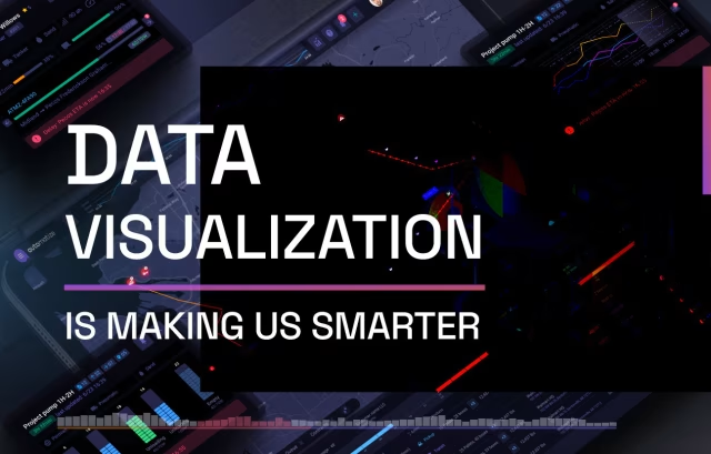
Data visualization is growing in popularity in practically every industry on earth, and this is particularly true in for the Public Health arena. Public health officials often need to communicate critical information as broadly and simply as possible, which makes data visualization a terrific resource!
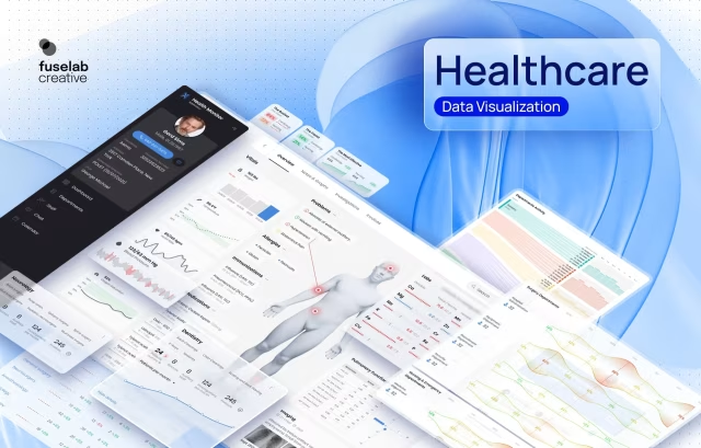
Healthcare Data Visualization Design
Below are several examples of different data visualizations designed and developed by our staff at Fuselab Creative. Data Viz has become one of our favorite and most asked for services. We take great pride in doing our part to help healthcare providers and public health officials better communicate incredibly important data.

Our Process
For Success
Our process steps for developing data visualizations for the healthcare industry is not that different than any other industry. However, one element of this work that needs to be rock solid before any design work can start is an in-depth understanding of the target audience.

1. Understanding the User and Context
- We begin by conducting user research with client to identify their target audience (healthcare professionals, administrators, patients, etc.)
- We then get more specific by creating use cases for the visualizations (clinical decision-making, patient education, operational insights, etc.)
- Lastly, we write out requirements and goals for the visualizations from the perspective of key stakeholders.

2. Data Audit and Analysis
- Fuselab then digs deep with data analysts and subject matter experts to understand the structure, complexity, and nuances of the healthcare data.
- We attempt to analyze the data before any design work begins to identify all key metrics, patterns, and relationships that need to be highlighted in our visualizations.
- Last, we decide the appropriate level of detail and granularity required for different user groups.

3. Design Concept and Ideation
- After our user research and data analysis is done, we begin to generate design concepts and explore different visualization techniques (charts, graphs, dashboards, etc.)
- Review latest best practices in data visualization in the healthcare space, such as effective use of color, typography, and layout.
- Then the fun part, we begin designing wireframes, prototypes, and mock-ups for stakeholder feedback and iteration.

4. Accessibility and Compliance
- Make certain that all visualizations comply with healthcare industry standards, regulations (e.g., HIPAA), and accessibility guidelines (e.g., WCAG).
- Incorporate high-contrast color schemes, maximum text sizes, and provide adequate alternative text descriptions.
- Regularly check on updates to established guidelines for representing sensitive healthcare data.

5. User Testing and Refinement
- We do usability testing with representative users from different target groups (healthcare professionals, patients, etc.) throughout our process.
- Each round of user testing includes gathering feedback on the clarity, comprehensibility, and effectiveness of the visualizations.
- Iterate and refine the designs based on user feedback and insights at each key milestone.

6. Implementation and Documentation
- Every sign-off or key milestone we includes developers to ensure accurate implementation of the visualizations in the target application or platform.
- Our detailed design specifications, style guides, and documentation certify consistent implementation and effective future maintenance.
- Conduct post-implementation testing and gather feedback for continuous improvement services.
Fuselab Creative
Portfolio


Impacting the Cognitive Load in Healthcare
Healthcare professionals often work in high-stress environments with many distractions and an unbelievably tight schedule of appointments. Every element included in a UI design for the healthcare industry should be designed to minimize cognitive load and prevent information overload, allowing users to focus on critical tasks and decisions.

Where Usability Reigns
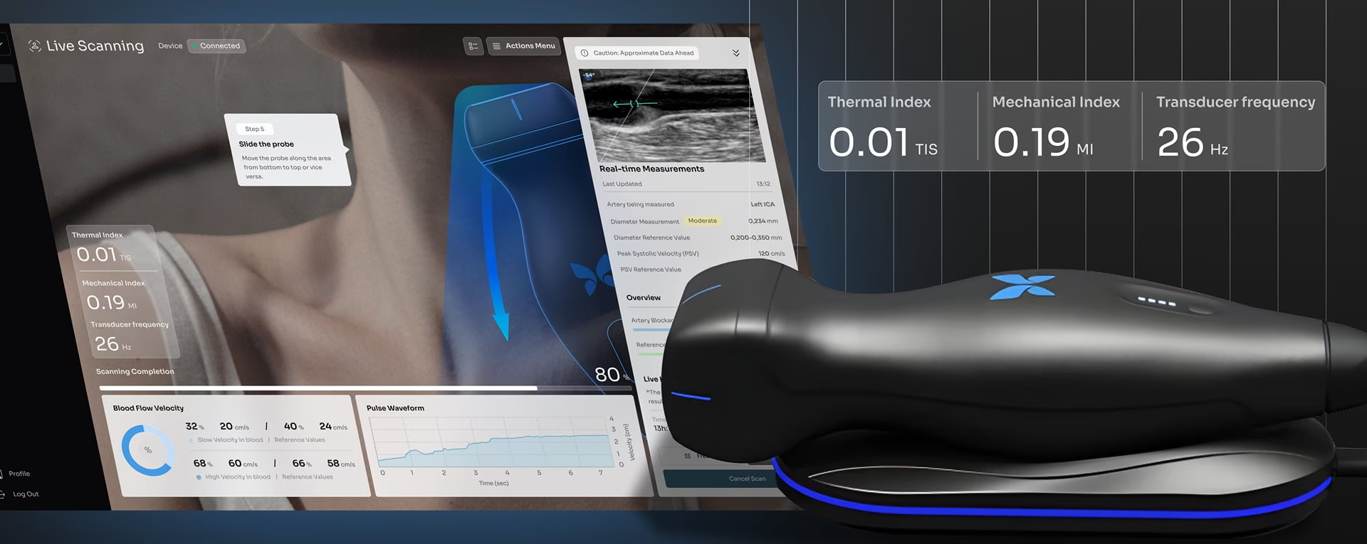
Dashboards are like a giant cheatsheet for medical providers. They have the incredible power to reduce the amount of time a provider needs to understand a patient’s history and make an informed diagnosis. Healthcare dashboard design needs to be highly intuitive and easy to use, as it can be a matter of life and death in some situations. Clear and straightforward navigation, iconography, and labeling are crucial to prevent errors and confusion and give this community the tools they need to do their jobs beyond reproach.

How Doctors Learn
Doctors, nurses, and medical providers in general have a their own language in many ways. The amount of acronyms used in an ER on a daily basis would make your head spin. The good news is that clinical data visualization has the ability to convey vast amounts of patient data, and health data in general, and reduce it down to a quickly digestible picture that immediately makes sense and need no explanation or training to understand. This why we love Data Viz!

Related Services and Solutions
Tools And Technologies We Use
At this point, the Fuselab Creative team is fairly software agnostic, as we have experience with so many diverse platforms and an equal amount of experience building our own custom data visualizations that we are confident we can produce exactly what you need.
Tableau
Three.js
Chartkick
Recharts
Vue.js
ApexCharts
D3.js
V Charts
Power BI
React-Vis
WebDataRocks
FlexMonster
Industries We Love
To Work With

As mentioned above in this page, we have now become data viz experts for the healthcare community. We are currently working for the department of healthcare services for the state of California building game changing data visualization tools for their thousands of staff members.

The mobile and Internet travel app design and development industry has been booming for years and shows no sign of slowing down. Fuselab has built platforms for everyone from the airline and booking industry to the wearables and mobile app market.

The integration of GIS technologies and data visualization come together in for the transportation and logistics market in perfect harmony, which is one of the reasons we thoroughly thrive working in this market.

Whether it’s shopping online to find your perfect home, or building a personalized experience for agents, the Real Estate market continues to raise the UX/UI design bar.

Who isn’t talking about AI? Everyday is a new dawn for AI and ML services, but we believe it’s only those that create human-first design and user experience that will outlast the fad and cement their futures.

The truth is, retail sales is E-commerce and vice versa. This industry wants to create a seamless synergy between the online and brick and mortar shopping experience, we know exactly how to help you do this.
Contact Our HMI Design Team
Fill out the form!