13
min read
13
min read
 Oct 7, 2026
Data-driven design: using analytics and UX research
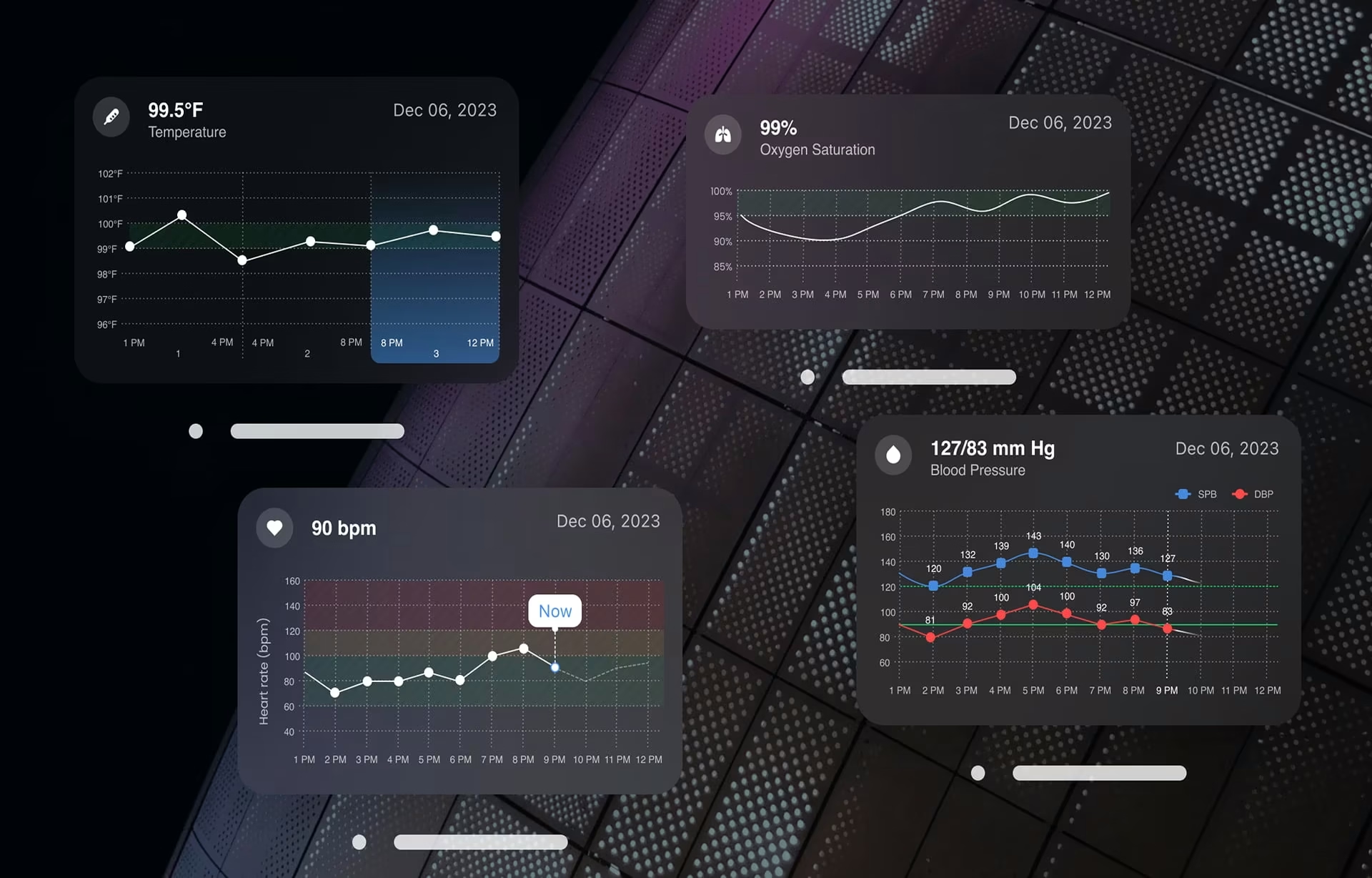
Every product decision is a blend of three things: human understanding, professional expertise, and data. Data-driven design is usually read as letting the last one win, and that reading is where teams go wrong. Done properly, it is the practice of using product analytics and UX research together to make, validate, and continuously improve design decisions, with the dashboard informing judgment rather than replacing it.
The best product teams don’t decide from the dashboard alone. They combine several activities to understand what’s happening, why it’s happening, and what should happen next. That is the real work behind data-driven design, and it is what makes the discipline strengthen judgment rather than automate it.
What is data-driven design?
Data-driven design is the discipline of pairing product analytics with UX research to make, validate, and refine design decisions, so teams act on both what users do and why they do it. Google’s UX research on the HEART framework and the Nielsen Norman Group’s research methods both show that the strongest teams draw on both sources rather than either one alone.
Most people think data-driven design means building whatever the metrics tell you to. That’s a common misconception. What the metrics give you is one half of the picture: the behavior, not the reason behind it.
Analytics might tell you that users abandon onboarding after the third step. It can show exactly where people hesitate, which paths they follow, and how those behaviors change after a redesign. What it cannot tell you is the why. For that, you need user research. Only when you connect directly with users through interviews, surveys, or testing will you uncover the reasons behind the numbers.
Think of data-driven design as a continuous decision loop rather than a one-time project: you set a goal, measure how people behave, research why, form a hypothesis, ship a specific change, and let the result reshape the roadmap. Skip a step, and the loop quietly becomes a system of confirmation-seeking. Here is what that looks like. A product team lead looks at the analytics and sees that only 4% of users interact with a filtering feature. A team already stretched for time or resources might use this to make a case for removing the filter rather than redesigning the dashboard. User interviews, however, might tell a different story. The feature wasn’t unnecessary; it saw low adoption because it was difficult to discover. Once participants find it during usability testing, they rely on it heavily.
This is why mature organizations don’t see data as the destination. They see it as one input into better decision-making.
Data-driven vs. data-informed design: what’s the difference?
The difference between data-driven and data-informed design comes down to how you use data, not how much of it you have. Data-driven approaches prioritize metrics, while data-informed design treats analytics as one source of evidence alongside user research, business strategy, and design expertise, leading to more balanced product decisions.
The terms data-driven and data-informed are often used interchangeably, but they are not the same. In a purely data-driven UX process, the metric decides. Two button colors get tested, and when one wins the conversion number, it is shipped with no further discussion. In a data-informed process, the metric is one input among several: what the number says, what the qualitative research says about why it matters, and what the team already knows about the product’s constraints and roadmap. Consider an e-commerce team that notices removing optional form fields increases checkout completion by 3%. If you go only on the data, you would rush to change the form immediately. A data-informed team would dig deeper and ask a few more questions to test changes in customer satisfaction or the number of support requests. It also looks at how the change might affect downstream business processes. The metric is important, but it is just one part of the decision.
The strongest teams rarely bank on dashboards alone. They combine several forms of evidence before deciding what to change. Those sources are behavioral analytics to understand usage patterns, UX research to explain motivations and pain points, business objectives to keep work aligned with strategic priorities, design expertise to evaluate usability and accessibility, and technical constraints that influence implementation.
One of the strongest findings from McKinsey’s The Business Value of Design is that organizations where design plays a strategic role consistently outperform competitors over time. More dashboards and more data don’t create better products; in fact, we live in a world now where more data is thrown our way every day, and minimizing this onslaught needs to be considered. Organizations succeed when data evidence becomes part of decision-making across design, engineering, and business teams.
Analytics vs. research: the two inputs behind every decision
Analytics and UX research answer different questions. Analytics reveals what users do and where they encounter friction, while user research explains why those behaviors occur. Combining both creates a more reliable foundation for product design than either method alone.
Analytics gives product teams scale. It captures patterns across thousands or even millions of interactions, making it possible to identify trends that no interview ever could. It’s also the easiest layer to operationalize, since most teams already have it in place, for example, web or app analytics on funnel drop-off, feature adoption rates, and session length.
While product analytics is factual and accurate, it is also blind to users’ motives. A 40% drop-off on a form step tells you exactly where people leave, but not that they left because they got distracted by a banner ad on the side, or because they didn’t trust what happened to their data next.
User research fills that gap, and it comes in two flavors that the Nielsen Norman Group’s framework cleanly separates: attitudinal research, which asks people what they think and feel, and behavioral research, which observes what they actually do. A five-minute usability test at a drop-off point will uncover reasons that are impossible to discover from a dashboard alone, as you watch hesitation unfold in real time.
Treat analytics and research as two halves of the same investigation. Analytics identifies the opportunities: where users drop off, which feature gets used most, where the friction sits. Research explains the root cause behind each one. Used together, they help teams avoid the biggest risk in data-driven design: confidently solving the wrong problem.
See how a structured UX research process works in practice.
Where AI fits in modern product analytics
Modern product analytics increasingly includes AI-assisted analysis, and it has changed how fast teams can read behavioral data. AI can summarize patterns across millions of sessions, detect anomalies the moment they appear, and surface correlations a human analyst might take weeks to find. What it still cannot do is determine user intent. A model can tell you that drop-off spikes on the payment step every Sunday evening, but not that those users are on shared family devices and abandon when someone else needs the screen. That reason only comes from qualitative research. Treat AI as a faster analytics layer, not a substitute for the conversation with the user. It makes the what cheaper to find, which makes the why more valuable, not less.
Choosing UX metrics with the HEART framework
Choosing the right metrics is one of the most important parts of data-driven design. Google’s HEART framework provides a structured way to measure user experience by connecting product goals to five meaningful dimensions: Happiness, Engagement, Adoption, Retention, and Task Success. This helps teams evaluate whether design changes genuinely improve the user experience or just move business metrics.
The biggest challenge in data-driven UX design is deciding what to measure in the first place, not collecting the data itself. Most products generate hundreds of metrics: page views, click-through rates, time on page, feature adoption rates, session duration, and more. Trying to track too many KPIs wastes time and ultimately leaves teams confused. The key lies in knowing which metric actually indicates a better experience. To help them decide, many UX teams use Google’s HEART framework.
The HEART framework was developed in 2010 by Kerry Rodden, Hilary Hutchinson, and Xin Fu at Google Research. It focuses on five dimensions of user experience, encouraging teams to ask what success looks like for a product and how they would know if they had achieved it. The five dimensions are Happiness (how satisfied users are with the experience), Engagement (how actively they interact with the product), Adoption (whether new users successfully get started), Retention (whether people continue to return over time), and Task Success (whether users can complete what they came to do efficiently and accurately).
Google pairs HEART with another process called Goals-Signals-Metrics (GSM). The idea is simple: define the goal by naming the experience you are trying to improve, identify the signals that show success for that goal, and then choose the metrics that map to those signals.
Consider a real-world scenario. Imagine you are tasked with redesigning the onboarding experience for an enterprise application. Traditionally, you might focus on reducing completion time. Using HEART, the team instead concentrates on questions such as: is onboarding easier to complete, do users feel more confident afterward, are more users returning after their first session, are support requests decreasing, and are fewer people abandoning the process?
With so many angles to consider, the scope is no longer just about redesigning a form; it is about the overall quality of the experience. HEART gives teams a practical way to break out of the vanity-metrics trap and focus on real user outcomes.
The metric trap: common data-driven design mistakes
The biggest failures in data-driven design occur when teams optimize individual metrics without understanding the user intent driving the interaction or the product goal it supports. Design teams also trip up by failing to test hypotheses or validate findings through UX research.
Mistake #1: Optimizing a metric instead of a user outcome. Here’s an example of what happens: a support team drives down average handle time and celebrates, but customers start calling back several times because the first call was rushed. The number went in the right direction, but the business goal it was supposed to support went in the wrong direction. Some might call this a double-edged sword of sorts. This is what happens when a metric becomes the objective rather than an indicator of it. By chasing the number, teams often lose sight of the experience they are trying to improve.
Mistake #2: Testing without a hypothesis. Running tests without a hypothesis is more common than most teams are willing to fess up to. Every test should begin with a hypothesis. Instead of saying “let’s test a new navigation,” detail what you are trying to achieve: we think simplifying navigation will reduce the time users need to locate critical information, because usability sessions revealed that people struggled with the current menu structure. With this level of detail, the results become easier to interpret because the team knows what they are testing and why.
Mistake #3: Ignoring qualitative evidence. The third trap is treating qualitative data as a nice-to-have instead of a requirement. When faced with a sudden increase in conversion rates, a team is bound to misread the data and the motivations behind it unless it can identify a clear reason or conduct research. Maybe the new checkout flow really is better, or maybe it just launched during a seasonal spike or coincided with a pricing drop. Without a usability session or a handful of user interviews alongside that number, there is no way to tell the difference between a real improvement and a coincidence.
How to build a data-driven design process
A successful data-driven design process is a continuous feedback loop, not a one-time project. Teams define goals, form hypotheses, measure user behavior, validate findings through research, implement improvements, and repeat the cycle as products evolve. Ownership of implementation is what separates teams that actually run this loop from teams that just talk about it.
A practical data-driven design process usually follows the same pattern.
- Set the goal. Every project should begin by answering one question: what problem are we trying to solve? That goal might be to improve onboarding, reduce support requests, increase task completion, or simplify a complex workflow. Whatever the desired outcome, it must be named before you touch a metric.
- Choose the signal. Use a Goals-Signals-Metrics pass so the number actually represents the goal. Design decisions should be based on informed assumptions that can be tested.
- Decide the metric. This is where frameworks like HEART become valuable. Choose metrics that reflect both business performance and user experience.
- Form a hypothesis. State what you expect to happen and why, before you ship anything.
- Design, build, and ship the change. Ship a specific, isolated design change tied to that hypothesis.
- Learn from both analytics and research. Once the product is live, compare what users actually did with what the team expected them to do.
- Repeat the cycle. Data-driven design doesn’t end with a launch. Products improve through a series of measured, validated decisions rather than large redesigns based on assumptions alone.
Behind the scenes, this process is supported by four categories of tools. You need an analytics layer to measure behavior and uncover the what, a session or behavioral layer to understand the intent behind interactions, an experimentation layer for testing hypotheses, and a research practice for the why that no dashboard answers on its own. None of these substitute for the others. A team that has three of the four still has a gap.
How to spot a team that really designs from data
Ask which metric a team would track before a feature ships and what specific result would count as a success. A team that really designs from data answers in seconds, naming the event, the HEART category it maps to, and the number that would make them celebrate. A team that only talks about page views or session counts is not using data effectively for design and is cheating their clients out of a full-service approach to their project.
In our work on Grid AI’s Train platform, a machine learning experiment-tracking dashboard, we built a site map for every engineer’s user flow before a single screen was designed. Navigation decisions came from how engineers actually worked rather than from how the underlying data happened to be structured. That is a goal-first, research-validated call, made before any dashboard design began.
(Grid.AI, Grouped Metrics and Visualization for Experiment Comparison, Fuselab Creative 2026)
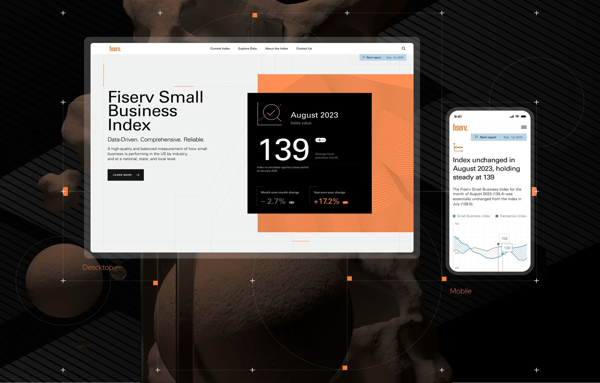
We applied the same approach to a small-business economic data platform: the site architecture and content taxonomy were verified directly with users before a screen was built, so the filtering and hierarchy matched how people actually wanted to explore spending trends. The economic data did not define how the dashboard was structured; the structure came from what the user wanted to glean from it.
The strongest signal is a team that can walk you through a specific instrumentation decision from a real, named product. Ask them which metric they picked, why they picked it over the obvious alternative, and what the qualitative research added. A team that has done this kind of work before will answer without hesitating.
Conclusion
A doctor doesn’t diagnose a patient from a blood test alone. Test results are important, but so are conversations, medical history, and the doctor’s own experience. Together, they reveal what’s really happening.
Product design works the same way. Analytics provides the test results and points you in the right direction. UX research provides the conversation, business goals provide the context, and human judgment connects the dots.
Frequently asked questions
What is data-driven design?
Data-driven design is the practice of using product analytics and user research together to make and validate design decisions, rather than relying on opinion or precedent. It works as a loop: set a goal, choose a metric that represents it, test a hypothesis, and let the result change what gets built next.
What is the HEART framework?
HEART is a user experience metrics framework developed by Google researchers in 2010. It organizes UX measurement into five categories, Happiness, Engagement, Adoption, Retention, and Task Success, paired with a Goals-Signals-Metrics process for choosing the right metric for each goal.
What is the difference between data-driven and data-informed design?
What is the difference between data-driven and data-informed design? In data-driven design, a metric alone decides the outcome, which works for narrow, well-defined optimizations like subject-line testing. In data-informed design, the metric is one input alongside qualitative research and product judgment. Most mature product teams use a data-informed approach because it provides broader context for decision-making.
Analytics or user research: which does a product team need?
A product team needs both because they answer different questions. Analytics shows what is happening and how often across a large user base, while research shows why it’s happening for a specific person. Relying on either one alone produces a partial and often misleading picture of a design decision.
How do you start measuring UX for a data-driven design process?
Start by defining clear product and user goals before selecting metrics. Frameworks like HEART and Google’s Goals-Signals-Metrics process help teams identify measurements that reflect meaningful user outcomes instead of simply tracking available data.
How long does it take to set up a data-driven design process?
A basic instrumentation pass, meaning correct event tracking tied to a small set of HEART-aligned metrics, typically takes two to four weeks for a single product surface. Building the full loop into a team’s regular cadence, including a working hypothesis-and-review habit, usually takes up to three months. The timeline depends on the maturity of the product, the availability of analytics, and existing research practices.
How do I choose a product design agency that works from data?
Ask how the agency conducts UX research, defines success metrics, validates design decisions, and measures outcomes after launch. A strong product design partner should be able to explain its methodology, not just showcase polished interfaces.