Enterprise UX Design: Complete Guide to Building Powerful Business Applications

Here’s a story of the single most expensive mistake a modern business can make!
A massive logistics company spent eighteen months and several million dollars building a custom internal dashboard for their fleet managers. The dashboard checked every box, was chock-full of features and graphs. But nobody used it. The employees kept going back to Excel spreadsheets and emails. The company built a Ferrari, and the employees insisted on driving the horse and buggy.
The problem: the expensive dashboard was engineered, not designed. It was a screen full of data tables with no hierarchy and a workflow that required twelve clicks to do what a spreadsheet did in two.
It was built with the mindset: our employees have to use it, so it doesn’t need to be pretty or intuitive. In this guide, we are going to tear down that misconception.
We talk about:
- What is Enterprise UX?
- How is it different from consumer UX
- Why is it critical for business success?
- Some unique characteristics of Enterprise UX design
- Major challenges we need to overcome in Enterprise UX design
- Essential elements of Enterprise UX design
- Enterprise design systems: why they matter
- Types of enterprise applications and examples
- Best practices for Enterprise UX design
- Enterprise UX design trends for 2026
What is Enterprise UX?
Enterprise User Experience (UX) Design is the practice of designing software used by businesses and employees to do their jobs.
We are not talking about Instagram or TikTok here. We are talking about the heavy lifters: Customer Relationship Management (CRM) systems, HR portals, Supply Chain Management dashboards, medical record interfaces, and SaaS (Software as a Service) platforms used by B2B clients, are some examples of Enterprise UX.
Consumer UX is about engagement. It wants the users to stay on the app, scroll more, and watch more. Enterprise UX is about productivity. Good enterprise UX design wants the users to get in, complete the complex task accurately, and get out.
If users spend three hours on Instagram, that’s a success for Instagram. If a user spends three hours on their expense reporting tool, that is a failure for the business and the UX design.
This core difference in functionality means Consumer UX focuses heavily on aesthetics and is designed for simplicity of use to cater to a broad demographic. Also at the backend, the metrics for success are retention, engagement, and user satisfaction. On the other hand, Enterprise UX is only for a small group of users, where the intuitiveness/ease of use can be sacrificed to productivity (and substituted with onboarding training).
Enterprise UX vs. Consumer UX: Key Differences
Comparing consumer apps to enterprise apps is like comparing a sports car to a freight train. Both are vehicles, but they have very different purposes.
While consumer design chases engagement, enterprise UX is the engine of efficiency for a business. Recognizing the unique constraints of the enterprise environment is critical for bridging the gap between software purchase and actual adoption in any business.
When done correctly, enterprise UX design transforms mandatory tools into business assets that drive productivity, reduce costly errors, and ensure the business gets a return on its technological investment.
The Buyer vs. The User
In consumer apps, the person who buys the app and the person who uses it are usually the same. You download Spotify because you want to listen to music. In an enterprise ecosystem, the person buying the software (the CIO, the VP of Sales) is rarely the person using it eight hours a day (the data entry clerk, the sales rep). This creates a dangerous disconnect wherein software is bought based on feature checklists rather than usability.
Complexity and Scale
Consumer apps usually do one or two things very well. Uber books a ride. Airbnb books a room. But enterprise apps are the many-armed goddesses of software. They have to handle thousands of edge cases, massive datasets, and intricate permissions. One cannot just ‘simplify’ an air traffic control interface by removing buttons; people might die. We have to design ‘for’ complexity, not avoid it.
Motivation
No one wakes up excited to log onto their ERP system. The motivation is extrinsic (doing the job), not fun. While, of course, the employees are mandated to use the system and have no choice but to learn it, continued usage and adoption can be helped by reducing friction in the workflow.
Legacy systems
Unlike B2C apps, enterprise software will need to consider the existing software and hardware infrastructure of the organization. The design might need to change to accommodate legacy systems.

Why Enterprise UX Design is Critical for Business Success
Why should a mid-to-large company invest six figures in designing an internal tool? We list the reasons below!
Increasing Employee Productivity & Efficiency
Good UX streamlines workflows and improves productivity. It turns a 10-step process into a 3-step process. And that is direct ROI; that is operational efficiency that can be quantified in dollars!
For example, if you have 1000 employees/users working with a piece of software, and a hard-to-find button causes a 2-second delay on a task they perform 50 times a day, that is 100 seconds lost per person, per day. Across 1000 users, that is roughly 27 hours of lost productivity every single day. If you were to put a dollar value on this time, it would add up to hundreds of thousands of dollars lost – all because a button was in the wrong place.
Improving Internal Collaboration
Let’s take the case where an enterprise marketing software doesn’t talk to the sales team’s software, or when the interface is so confusing that teams resort to emailing PDFs back and forth. The result: leads that don’t reflect on CRM systems, clients that don’t get proposals, Excel sheets abound, people frantically search for files in Slack channels, and time per task skyrockets – all this equals the death of collaboration.
Great Enterprise UX bridges these collaboration gaps. It creates a ‘single source of truth’ that everyone in the enterprise can understand and trust, regardless of their department.
Simplifying Data-Rich Interfaces
We live in the age of Big Data complexity. But data is useless if you can’t read it. Take the example of a fintech startup that has a great algorithm for predicting market trends. However, its dashboard looked like a spreadsheet. The employees were overwhelmed, but slogged on as they had no choice. Data visualization principles, such as progressive disclosure (showing headline numbers first and allowing users to drill down as needed), helped prioritize this data. The change reduced complexity and cognitive load, while shaving off minutes from each task!
Good UX is also about democratization. It puts a friendly interface on complex databases, allowing non-technical managers to access, understand, and use data analytics independently.
Unique Characteristics of Enterprise UX Design
Enterprise UX design is like architectural engineering. It’s not just about the paint on the walls (the pretty outer shell); you need everything to be tip-top under the hood as well! To supercharge productivity, effective Enterprise UX design requires a robust structural foundation. Here are some distinguishable features:
Complex User Workflows and Processes
In a consumer app, for example, in an e-commerce one, the user workflow is linear: Search > Compare > Add to Cart > Checkout. In enterprise applications, workflows are circular and dependent. Let’s take the example from users from the finance department – a manager approves a request, it goes to the finance head, who raises a query and sends it back to the manager for clarification. This, in turn, triggers an email chain for clarification to various employees and departments. Often, these approvals and details are mapped on long email trails, cut off from the enterprise applications such as ERP systems, and require manual search and input. Designing for this requires Service Design thinking. The UX design team has to map out the entire ecosystem and workflow, not just the screen.
Data Complexity and Information Architecture
One key feature of any enterprise software is data – namely, the massive amounts of data sets of varying complexity that have to be crunched, displayed intelligently, while some of it changes in real time!
One example of this use case is displaying a table with 50 columns and 10,000 rows on a laptop screen. To address UX data complexity, techniques such as sticky headers, customizable columns, advanced filtering, and smart search are embedded in the information architecture. The key is to establish a clear and repeatable hierarchy, design tropes that make navigation predictable, and logical workflows based on real-world processes.
Role-Based Access and Permissions (RBAC)
A common feature of most enterprise systems is user access control and permissions. With user data privacy, cybersecurity, and strict regulatory compliance, it has become critical to map who (users) can see or do what (permission) to which resource.
For example, the CEO sees a different screen than the intern. The admin has a ‘delete’ button; the users don’t. Role-based access demands a fluid approach to design, where we are building a modular system that adapts based on who is logged in; it is a system in which permissions across the system are mapped very carefully to roles. For RBAC (Role-Based Access Control) to work seamlessly, UX design should focus on building a clear, logical structure that is flexible to evolve with organizational changes.
Multi-User and Multi-Department Systems
Enterprise tools are communal systems. At any given point, there could be multiple users across different departments accessing, editing, or reviewing the same file or data set. Hence, Enterprise UX has to be designed for concurrency. But beyond collaborative real-time work, it also has to factor in how different datasets, information, or files may be used and viewed by enterprise users in different roles.
For example, John in Marketing might want to see the quality of online leads or segregate them based on their source on his system, while Rachel from Sales might be more interested in which regions or states the leads have come from. At the same time, the business owner would be more interested in conversion rate, deal size, or ROI on the ad budget. UX design teams must ensure that each stakeholder can manipulate the data to present the insights they require.

Major Challenges in Enterprise UX Design
Every Enterprise UX design project has its own set of challenges, and the same is true for Enterprise UX design. Here are some common challenges we face – and must work around – in almost every enterprise project.
The User vs. Buyer Disconnect
We mentioned this earlier, but it bears repeating. The person buying the enterprise software is usually not the user. This disconnect – unless dealt with – often makes the adoption of the enterprise software slower and harder. In most organizations, a VP of Procurement or a CFO is the decision maker. While the buyer might prioritize flashy dashboards for the board of directors, actual users just want a faster way to enter data. Also, sometimes the decision-maker doesn’t have an intimate understanding of each department’s process, resulting in roadblocks during implementation.
The Fix: We insist on user research. We go and sit with the data entry clerks and interact with each department. We watch them work and understand their processes. Then we design a system that helps everyone – the top management/buyer as well as the people using it. And we back our design with real-world productivity gains!
Integration of Legacy Systems
“We have a mainframe from 2002 that holds all our customer data, and we can’t turn it off.” We hear a version of this almost 90% of the time from our enterprise clients. Enterprise UX is rarely built on a green field. We usually build a modern interface on top of a Frankenstein of old code/legacy systems. It is surface level cosmetic integration.
The Fix: While there is always the option of a rip-and-replace redesign, it comes with its own challenges, costs, and risks. Our approach is more iterative, where we treat the UI as an abstraction layer. We might not be able to fix the backend legacy system immediately, but we can make it more accessible and logical.
Security, Compliance, and Regulatory Requirements
GDPR, HIPAA, COPPA. In consumer apps, these are checkboxes. In enterprise, compliance dictates the design. For example, we might want to keep a user logged in for convenience, but security protocols say they must time out after 10 minutes, or we need to design customer consent actions that are clear and meet industry compliance, and most importantly, also promote trust. Role-based Access Control, mentioned above, also plays a part in keeping security tight.
The Fix: We design for ‘graceful friction’. For example, if we have to time them out because of regulatory reasons, we save their state so they don’t lose work when they log back in. We make consent and cookies transparent and with a clear opt-out action area.
Balancing Information Density
There is a trend in modern design for ‘whitespace’: lots of open space and large fonts. However, in Enterprise interfaces with lots of information complexity, whitespace might not work so well! We often deal with a lot of data and information that needs to be packed on one screen. For example, a trader might need to see 20 stock prices at once, but too much whitespace will lead him to scroll to find the information. That could cost milliseconds, and in trading, milliseconds equal money.
The Fix: We design for ‘density with clarity’. Using strict grids and typographical hierarchies to pack information tightly and reduce complexity, without making it look cluttered.
Limited Testing Opportunities
A large part of enterprise application design is validating the final design. In fact, the process itself is iterative, with the final solution being a product of several feedback and testing loops from end users. Most enterprise applications are spread across departments, which means that design teams need the buy-in and time from all departments. Feedback and testing is necessarily time-consuming and often involves breaking down resistance to new systems from users who are well adjusted to legacy designs.
The Fix: We secure organizational and departmental buy-in from section heads to ensure they understand the UX design objectives and support them. We also make the project collaborative, and make our timelines and processes transparent and public.

Essential Elements of Enterprise UX Design
We have discussed the challenges of Enterprise UX design and several differentiating features above, but what are some of the essential components of Enterprise UX design that cannot be missed to make the project a success? Let’s find out below:
Specialized Onboarding and Training
By now, you are well aware that one of the key differences between Enterprise UX and B2C applications is that it is built for ‘work.’ The metric of success is whether employees can do their work better, faster, and gain more from the data that comes their way! This makes the design not particularly intuitive or user-friendly.
You can’t just drop a user into a complex ERP system and say ‘Good luck!’ But you also don’t want them to read a 500-page training manual. This requires design teams to build contextual onboarding. Instead of a long tour at the start, we use tooltips and walkthroughs that appear when the user is trying to do a specific task. It’s ‘Just-in-Time’ onboarding.
Advanced Interactions and Edge Cases
As the system is built for work, we must ensure it handles edge cases as well as routine low-touch interactions. In any software, there are always situations where things don’t go smoothly. In enterprise situations, this is more prevalent. What happens if the Internet cuts out while uploading a 2GB file? What happens if the data format is wrong? What if files get corrupted or data sets don’t load accurately? In these situations, a generic ‘Error 404’ is unacceptable. The design itself must give solutions, for example, instead of an error, say, ‘we couldn’t upload the file because it’s too large. Try compressing it or contact support here.’
It is also important to test the enterprise systems against the most complex situations and interactions rather than the easier ones. Often, this is an iterative process that requires constant UX design interventions to fix issues as they crop up.
Precise UX Copy and Terminology
In consumer apps, we want personality. We want to stand out and delight the user! But in Enterprise UX, clarity is the only metric that matters.
When a user is managing a $50,000 transaction or administering a patient’s medication, they don’t want a quirky error message. They need to know exactly what went wrong and how to fix it.
To ensure clarity, we create a strict Taxonomy glossary at the start of every project. The goal is to ensure we use business-relevant (for example, a healthcare ERP system would have specific terminology) and fixed UX copy throughout the design. If we decide to call a button ‘booking,’ it cannot be changed to ‘reservation’ on some other page.
Additionally, we use microcopy to problem-solve for confusion that can arise from ambiguous or complex terms. This type of UX copy includes adding tiny, helpful text below the field to explain what the user is expected to fill in.
Comprehensive Design Documentation
The biggest friction point in enterprise software development is the ‘Handoff Gap’, the moment a designer hands off a static image to a developer who must build a functional system. This is also critical for internal teams, who will need to take over and run the system in the long term.
Our documentation includes not just the design and the basic structure, but also the logic that underlies the interconnected system – not just the what, but the why. Without design documentation, future development teams iterating and changing the system might run into unexpected problems. For example, in enterprises with a large, distributed development team, a document detailing how a specific dropdown menu was designed to overcome legacy issues can prevent unintentional glitches a few years down the line.

Enterprise Design Systems: Why They Matter
If you take one thing away from this article, let it be this: you need a design system. Period. A design system is a collection of reusable components – we are talking buttons, forms, tables, navigation bars – everything aligned to a clear and thoughtfully built standard/hierarchy, and a consistent visual code.
Without an enterprise design system, every time a developer needs a button, they code a new one. After five years, you have 50 different types of buttons. Every time the user encounters a difference, he/she hesitates subconsciously trying to figure out what the change means. This might not seem like much, but the cognitive load this lack of consistency increases can lead to significant productivity losses when compounded across 100s of employees and 1000s of man-hours.
With an enterprise design system, you can build for the long term:
- Consistency: Every tool looks and feels the same. Keeping things similar signals to users that no matter where they go on the platform, the basics will remain the same. This reduces cognitive load, freeing up mind space to focus on core activities.
- Speed: Developers can stop re-inventing the wheel. They just grab the templated component and move on, leading to faster development turnaround time.
- Scalability: Design systems also keep your UX aligned to organizational changes and growth. For example, if you decide to rebrand from blue to green, you change it in one place, and it updates across 500 screens instantly. Or if your business expands from 50 to 5000 employees or from one country to six, you can keep organization-wide interfaces similar all across the board.
Types of Enterprise Applications/Software and Examples
It’s important to understand that each enterprise application and its design are standalone projects. Enterprise application/software is NOT a single genre. It isn’t a ‘business skin’ template that requires a logo and color change.
Designing an enterprise application for a high-frequency stock trader is completely different from designing a portal/software solution for an employee to request time off. The ‘user intent’ is different. We have to understand the specific psychological and functional demands of each vertical. Here is a run-through of the major use cases/examples where Enterprise UX design comes into play:
CRM (Customer Relationship Management)
The core focus of CRM software design is to manage the chaos of sales pipelines, contacts, deals, and customer interactions.
For busy salespeople, if a CRM feels like a chore, they won’t use it. The key UX challenge is preventing data entry fatigue, which can be addressed through low-touch interactions, such as smart defaults (auto-filling date and time fields), voice-to-text for logging notes, and one-click actions.
ERP (Enterprise Resource Planning)
An ERP is the central nervous system of the organization that connects all departments and services into one massive database. The key UX challenge is usually navigating massive complexity, where everything is connected to everything.
HRMS (Human Resource Management Systems)
The system handles the entire employee lifecycle from hiring to payroll to performance reviews and beyond. Users log in here to see if they got paid, to request maternity leave, or to read their performance review. These are sensitive moments. Here, the UX challenge leans towards maintaining privacy and interacting with empathy. Design here must be ‘human-first’ and must think beyond efficiency to incorporate the right tone for each activity.
Project Management & Collaboration Tools
This includes systems like Jira and Trello that manage task tracking, resource allocation, etc. The main UX challenge is around visualizing time and progress. The UX magic lies in allowing users to switch perspectives instantly without losing context and in designing for intuitive, repeatable, commonly used actions such as drag-and-drop and sticky notes.

Best Practices for Enterprise UX Design
In Enterprise UX, we design for livelihoods, not likes, and a bad interface doesn’t just annoy a user, it can stop a supply chain, disappoint a customer, and cost money. Here are some rules that cannot be broken when designing for enterprise customers. Here are some best practices we follow at Fuselab.
Function Over Form – But form should be good too!
The real test of the Enterprise UX pudding is in how it performs. While it doesn’t need to be pretty, it MUST be clear. A messy interface destroys trust; users assume the data is messy too. The real test of a UX team’s design chops lies in ensuring all relevant data and information are available, but in a way that reduces cognitive load, is easy on the eyes, and, above all, is logical and built for daily use!
Aggressively Minimize Cognitive Load
Enterprise users are often tired and multitasking. Hence, one of the critical functions of UX design teams is to reduce cognitive load. This can include tactics such as progressive disclosure, where we show data as needed and let the user click to reveal details. Hide the complexity until the user asks for it.
Accessibility is Universal (Device, Language, Ability)
Accessibility isn’t just a compliance checklist for screen readers; it’s about usability in the real world. Enterprise UX design teams work towards maximum usage, factoring in disabilities, disparate devices and network access, language, and localization. An organizational system could be used by someone with color blindness, in noisy environments, by field agents with spotty Internet, or across different languages. Design teams not just have to consider the current state of the organization, but also design for future expansion.
Security by Design
Security often undermines UX with frequent logouts and complex passwords. Good enterprise UX design makes security seamless. This can range from integrating seamless role-based access controls and regulatory compliance to masking sensitive data on the main dashboard or auto-saving drafts before auto-logout.
Stress-Test with Real-World Data
Real data is messy. In enterprise settings, we never test with Lorem Ipsum; it is always with real-world data, whether that includes a super-long German last name, currency amount in billions, or charts with zero data.
Speed is a Feature (Keyboard First)
We build for power users doing a task 100 times a day. Which means the mouse is too slow and the keyboard reigns supreme. Enterprise UX design must build keyboard-first workflows with hotkeys and shortcuts – because they just save time!
Enterprise UX Design Trends for 2026
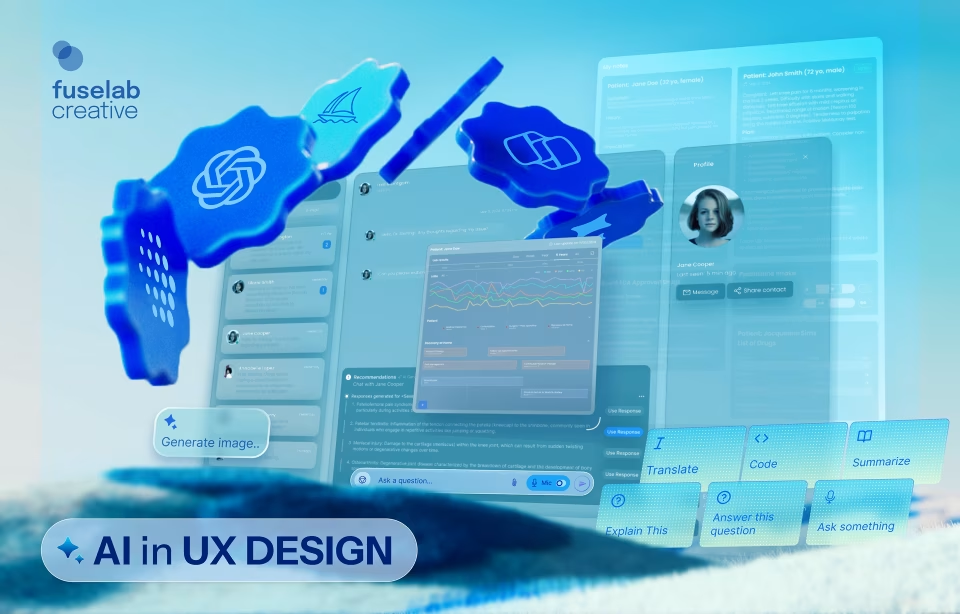
AI and Machine Learning Integration
The unprecedented innovation of Gen AI has put it firmly in all development and design conversations. What was once seen as backend intelligence is now integrated and used front and center, moving from ‘Dashboards’ to ‘Co-pilots.’
Instead of a user staring at graphs to find dips and make sense of them, a key enterprise UX design trend is the shift towards building conversational intelligent AI that, for example, will pop up and say, “Sales in the Northeast region are down 15%. Here is a report.” The UX challenge here is trust. We build that by ensuring users have access to the data and information behind the AI synopsis.
Voice and Natural Language Processing Innovation
Both these technologies have existed for several years, but the current growth in Gen AI has supercharged this trend. UI UX teams in enterprise setups need to design for interfaces that can show conversational output to queries such as ‘show me sales for Q3.’
Hyper-Personalization
The interface of the future will adapt to the user, and this trend will be powered by AI. With predictive recommendations and automated interface improvements, AI will give enterprise UX design teams the ability to personalize in real time – in a way never possible before. For example, if the system notices you never use the ‘Export’ button, it might hide it in a menu to declutter your view. It might map the actions you do routinely and adjust the interface to highlight and place these actions more conveniently. The ultimate aim, of course, remains to improve speed, accuracy, and user satisfaction.
Seamless Cross-Platform Experiences
Users are increasingly working across devices; shifting between desktops at work, voice-enabled mobile devices during their commute, and laptops at home. They also expect to resume exactly where they left off when switching between devices. Enterprise design UX must also build seamless transitions into its design processes.

Conclusion: Building Better Enterprise UX Design Experiences
In today’s highly competitive market, businesses must maximize every little bit of competitive advantage they can get. And speed and productivity are two such value-adds!
Moreover, with so much work done on devices and online, the business software has become the users’ workplace, making Enterprise UX far more than a ‘nice to have’ feature. After all, if your office had broken chairs, flickering lights, and clunky air conditioning, would your employees/users be able to work? Bad software is the broken chair of the digital age.
Investing in Enterprise UX design is investing in your people. It respects their time. It empowers their intelligence. And ultimately, it drives your bottom line.
So you CANNOT and MUST NOT settle for ‘it works’ and aim for ‘it works great for us.’
We are sure you have questions
After all, designing the spine of your business is a decision that needs time and information. So, feel free to set up a discovery call with our team.
Author
Related posts