Designing Intelligent Dashboards: How AI Enhances Decision-Making and User Experience

There seems to be a dashboard for everything! From Social media to sales CRM to data-heavy technical ones – there is a dashboard for everything.
Organizations literally run on dashboards. They are the first thing a product manager checks in the morning and the last tab a marketing head closes at night. It really wouldn’t be an exaggeration to equate them to our eyes and ears for data!
And while they have been immensely useful to make sense of all the data thrown at us, one must wonder – can they be better? For all their data density and design finesse, most dashboards share a frustrating flaw: they show us what is happening, but not why, and certainly not what to do next.
That’s because dashboards, in their traditional form, were designed as data viewers, not decision assistants. They excelled at presenting information, but as data grew, the cognitive load of making sense of it was transferred to users who were not always data analysts!
However, Artificial Intelligence is reimagining how we interact with data, turning dashboards from passive interfaces into proactive, conversational, and context-aware systems – for the rank and file professional, juggling multiple activities a day.
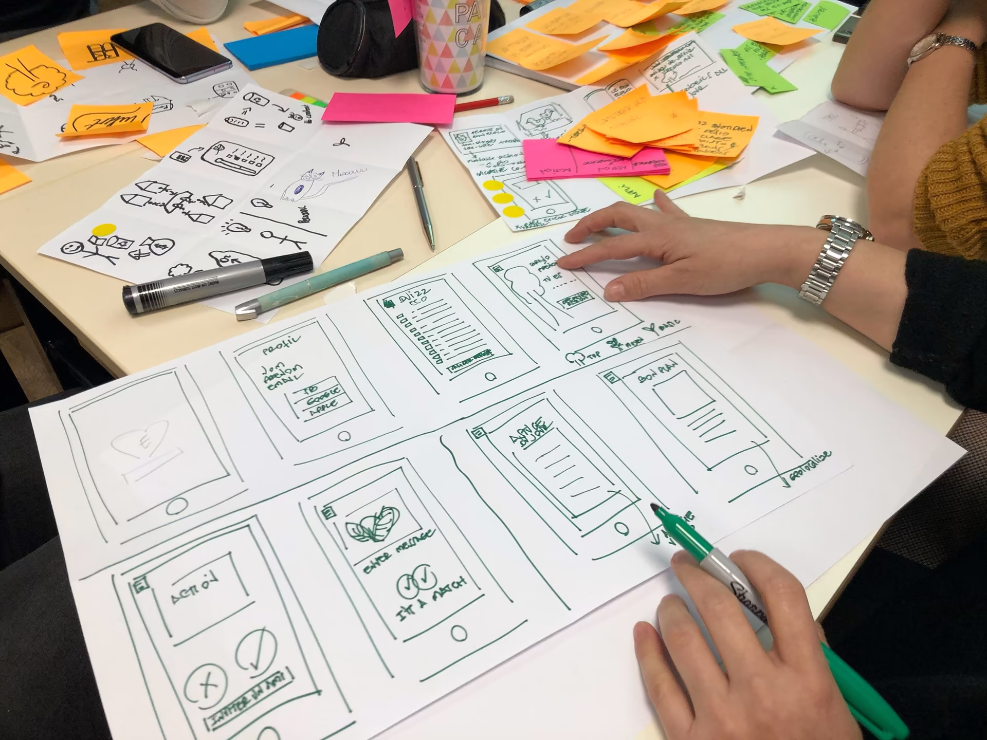
Beyond the tech integration, this evolution must also be centered around UX design, putting the user journey at the heart of AI-enabled dashboards.
The Role of Dashboards in Modern Decision-Making
From sales tracking to healthcare monitoring, dashboards have helped us make sense of complex datasets. At their best, they make data accessible and actionable. But as industries digitize further and teams become more data-driven, the expectations placed on dashboards have also increased and transformed. Let’s simplify:
Today’s decision-makers are dealing with three core challenges:
Information Overload – Business intelligence systems can aggregate millions of data points, but displaying them all leads to cognitive fatigue. The human brain can only process so much at once.
Static Dashboard Rules – Traditional interfaces lack the fluidity to adapt to shifting business goals. As businesses pivot their strategies, the fixed interfaces and algorithms often fail to keep pace.
One-Size-Fits-All Design – Conventional dashboards often present identical data layouts to vastly different users. For example, analysts, executives, and engineers could all be looking at a similar interface with minimal personalisation. This traditional approach completely ignores unique cognitive patterns and goals of a broad base of professionals.
The result? Dashboards that are data-rich but insight-poor.
This is where AI-enhanced dashboards enter the picture. They go beyond surface-level data visualization AI to embed intelligence directly into the interface, providing insights tailored to each function and sometimes to each individual’s personal preferences. They also go beyond just showing information to recommending the next course of action!
For example, instead of simply showing a drop in customer retention, an intelligent dashboard might automatically identify reduced engagement in a specific user segment as a reason for it and then go on to suggest a corrective game plan.
AI-enhanced dashboards also solve another problem of using real-time data pipelines and multimodal AI systems, as their flexibility allows them to become smart analytics tools for collaborative, intuitive decision making.
In the sections that follow, we will explore how this intelligence is embedded through predictive analytics, personalization, adaptive interfaces, and decision-centered UX design principles.
From Data Display to Decision Support
AI introduces capabilities that transform dashboards into decision-support tools through four shifts:
From Descriptive to Predictive – Instead of reporting what happened, AI predicts what’s likely to happen next.
From Reactive to Proactive – Dashboards don’t wait for user queries; they, without prompting, show trends and potential risks autonomously.
From Static to Adaptive – Layouts, visuals, and insights adjust based on user context, goals, and role.
From Data Presentation to Decision Facilitation – The system recommends actions, not just reports results.
So, what does this look like in real life? Imagine logging into your analytics panel and being greeted not by a wall of charts, but by a concise, AI-generated summary like, “Revenue rose 7% last quarter, primarily due to improved conversion in Region A. However, first-time users are dropping off. You can consider changing onboarding flows, adding loyalty campaigns, or running a survey on select customer groups to gather more data.”
Rather than just being a tool that tells you the problem, the dashboard tells you what the problem is, why it could be occurring, and how to fix it!
Core Capabilities of AI-Enhanced Dashboards
Predictive and Prescriptive Analytics
At the core of AI- predictive analytics dashboards lies predictive modeling, which is the ability to forecast trends based on historical data. Instead of just reviewing what happened in the past, it now uses past data to predict the future.
For example, a sales dashboard might anticipate regional or seasonal performance dips and trigger early alerts. Prescriptive analytics takes it further by recommending specific actions, like reallocating marketing spend or adjusting pricing models.
From a UX standpoint, predictive insights must be visualized thoughtfully in order to convey uncertainty without confusion (for example, through sensitivity sliders or scenario visualizations).
Natural Language Interfaces (Conversational Dashboards)
Natural Language Processing (NLP) and conversational AI UX are revolutionizing how users query data. Instead of navigating filters and dropdowns, a user can simply ask, “Show me sales trends by region for the last quarter”, and the business intelligence dashboard generates relevant visuals and summaries.
This makes data more accessible and understandable to non-technical users. When combined with voice or gesture-based features, dashboards become multimodal systems capable of responding across sensory channels.
Personalization and Context Awareness
AI enables dashboards to adapt content based on role, intent, and usage patterns. Executives see strategic KPIs; analysts see diagnostic depth. This adaptive dashboard design ensures mental efficiency by balancing the data and its density and complexity with the user’s needs and skill level.
Personalization can also extend to contextual awareness, such as with location, time, device, or even stress level (through emotion detection UX), to tailor visual feedback or notification frequency.
Anomaly Detection and Automated Alerts
Machine learning algorithms can detect deviations or anomalies, like a spike in traffic or an unusual drop in engagement, before humans even notice. A well-designed anomaly alert should not only flag the issue but contextualize it: “Engagement dropped 14%, mostly due to lower mobile sessions after version 3.2.1 update.”
Cognitive Load Reduction through Smart Summaries
AI-driven dashboards can also translate raw metrics into notes. By combining visual AI interaction with text-based summaries, dashboards enhance comprehension and reduce mental strain. A good example of this is a “smart summary” feature that can generate daily performance digests or briefs, ensuring the user grasps the big picture before diving into the details.
Best Practices: Predictive Analytics, Personalization, and Real-Time Data
Building intelligent dashboards requires thoughtful integration of AI capabilities within human-centered design frameworks. The following best practices are a great way to getting a final product that empowers users instead of overwhelming them.
Designing Predictive Insights for clarity, not complexity.
Visualize uncertainty transparently, use gradient bands, probability ranges, or confidence markers.
Offer why explanations alongside what predictions.
Use scenario modeling (“What if…?” simulations) to engage users in decision play.
Another thing to keep in mind is that insights are most easily digested when they are revealed gradually. Start with a summary; allow deeper exploration for advanced users. This is immensely useful to reduce cognitive overload. Users should leave an interaction smarter and feeling informed – not more confused and overwhelmed.

Smart UX Starts Here
See how the next generation of UX/UI is changing the way teams interact with data. With predictive analytics, real-time visualization, and personalized insight layers, modern AI-powered dashboards require clarity, focus, and a human-centered approach.
Explore the key ideas and design principles shaping tomorrow’s intelligent digital products – and how you can apply them to your own platform.
Beyond Surface-Level Customization
True personalization isn’t just about saved layouts or themes; it’s about adaptive intelligence.
Let AI learn from user behavior (what metrics they check first, what filters they apply).
Adjust layout data density: executives get summaries; analysts get details.
Adapt tone and feedback using emotion detection UX to reflect user context, calm under stress, or dynamic when in exploration mode.
Real-Time Data Visualization and Responsiveness
The power of AI is amplified when paired with live data streams. However, design is critical to balance the speed of real-time demands with the longer time taken to absorb and understand it all.
Prioritize latency reduction: visual updates must feel instant to sustain engagement.
Use motion design carefully to improve focus and not distract.
Introduce alerts that appear only when relevant, minimizing notification fatigue.
Sensory and Multimodal Design Integration
With the rise of multimodal AI UX, dashboards are no longer confined to screens.
Voice commands, gesture-based controls, and haptic feedback can expand interaction possibilities. Designers must craft coherent cross-sensory experiences where touch, sound, and sight reinforce each other rather than compete.
Ethical, Responsible, and Transparent AI
Every AI-driven insight carries implications. Designers should ensure transparency in:
Data provenance (where information comes from)
Algorithmic bias prevention
Clear distinction between human and AI recommendations
Transparency and Explainability
Users must understand why the AI reached a conclusion. Incorporating explainable AI (XAI) elements like confidence scores, traceable data sources, or “why this insight” notes builds trust.
Feedback Loops and Learning UX
AI thrives on feedback. Dashboards that let users validate, dismiss, or refine AI-generated insights improve over time. This two-way interaction fosters co-learning.
Case Studies: AI-Driven Dashboards in Healthcare, Finance, and Enterprise Apps
Healthcare: Predictive Patient Monitoring
In hospitals, intelligent dashboards powered by AI have transformed patient care.
Several leading medical centers have implemented predictive models that analyze vitals, lab reports, and sensor data to flag patients at risk of sepsis hours before symptoms appear. Predictive patient monitoring can also extend to monitor patients most at risk of hospital-borne infections.
These dashboards often present color-coded alerts with contextual explanations, why a patient was flagged, and what intervention might help.
Finance: Personalized Investment Insights
Financial institutions are increasingly relying on AI dashboard designs that provide decision-centered investment recommendations.
One example of this is the immensely powerful Aladdin, an AI-powered risk & portfolio management platform by BlackRock, which provides real-time insights across public/private markets, operations, and data.
In finance dashboards, there is high pressure for risk transparency, real-time adaptation, and actionable recommendations. The AI portion can handle large data volumes, identify patterns, and present scenario/predictive insights. However, the design must also help users trust the AI while still letting them explore.
Enterprise Operations:
For large organisations, aligning data across sales, marketing, service, and operations becomes a bottleneck. Dashboards may show metrics, but insights and actionable intelligence are often buried.
HubSpot’s platform has become the go-to software for organisations looking to combine and mine disparate data meaningfully. It has evolved significantly to support intelligent dashboards, advanced analytics, and AI-assisted role-specific insights.
These cases reveal a pattern: AI dashboards succeed when they blend context, trust, and actionable design into one smart package. Intelligence alone doesn’t drive adoption; people need confidence and clarity as well!
Success doesn’t come from dashboards that are simply “smart”
it’s in intuitive, actionable design that drives real impact.
The Future of AI Dashboards: Decision-Centered Design
In traditional UX, the dashboard was a mirror, reflecting performance or progress. But reflection is no longer enough. Modern organizations need dashboards that go beyond presenting the current state to interpreting it and providing recommendations.
If designed to leverage the full potential of AI, then dashboards could very well redefine what it means to see and act on data. Shifting from an information-first to a decision-first approach.
In a decision-centered model, the dashboard understands what decision the user faces, shows the right information at the right time, and adapts its tone, visuals, and complexity to the user’s state of mind and decision urgency.
Instead of passively reporting KPIs, it becomes a cognitive partner. To make this interaction even more human-centered, future AI decision-making dashboards will personalize to overcome cognitive loads and make data more actionable to individual needs.
So, what will a future AI-powered dashboard look like?
An emotion-adaptive dashboard that perhaps detects emotional hesitation in voice input or uses computer vision or biometric sensors to read cognitive load or stress, and adjusts the aggressiveness of its recommendations or simplifies its visuals?
Or a software that learns a decision-maker’s biases (e.g., risk aversion) and presents a balanced perspective.
Or dashboards that go beyond the screen, incorporating voice-guidance that narrates insights in real time during meetings, or maybe AR/VR immersive spaces, where executives can walk through a 3D data landscape, using gestures to simulate scenarios.
This transition, from a data tool to a decision partner, marks the true leap in human-AI interaction. In the near future, the most successful dashboards will not be those with the most widgets or charts, or the best graphics or layout, but those that best aid human decision-making.

Challenges and Ethical Considerations
With influence comes responsibility, and no article on AI-led products would be complete without pointing out some pitfalls of the technology that we must proactively guard against.
Algorithmic Bias and Decision Integrity:
We all know the limitations of training data and the biases that can creep into AI systems. In many real-life scenarios – for example, hiring or budget reallocations – who ensures fairness? In fact, how do you even know if the decision is fair?
Designers must therefore build bias-auditing tools directly into dashboards, enabling transparency about why certain insights are surfaced. The goal isn’t to eliminate bias overnight, but to make it visible and correctable.
Explainability and User Trust:
AI recommendations must not feel like black boxes.
Dashboards should display reasoning paths, data sources, and confidence scores in plain language. A decision-maker should always know why an insight appeared and how confident the system is about it.
Accountability and Human Oversight:
As dashboards begin to act autonomously, triggering alerts, prioritizing leads, and even rebalancing logistics, questions arise around accountability for things that go wrong. How much autonomy should AI be given, and when and how much human oversight should be built into the loop? And finally, where does the buck stop?
Designers must clarify the boundary between suggestion and automation, between AI advising and AI acting.
Privacy and Consent in Adaptive Systems
As AI dashboards become adaptive, they will learn from user patterns, how fast a person reads charts, what they click, and what they ignore. While it speeds up the process and makes it more helpful, it also carries a privacy risk. Responsible design demands explicit consent for behavioral data collection, anonymization frameworks for sensitive patterns, and options to minimize unnecessary data transfer. In industries like healthcare, finance, and defense, privacy-by-design must be non-negotiable.
The Bottomline
Dashboards have come a long way – from static spreadsheets to pivot tables to living, learning systems that go beyond showing data to helping us think with it.
In the age of AI, the true value of design will not lie in how beautifully data is visualized, but rather in how intelligently it interacts with us and how much we trust it.
Ready to Reimagine Your Dashboard Strategy?
Whether you are building a next-generation analytics product or rethinking how your team interacts with data, an AI Dashboard Strategy Session can help you get there faster.
Get in touch with our team and tap into our expertise to define a roadmap for smarter analytics, adaptive UX, and AI-driven decision support tailored to your business.
Author
Related posts