Top Dashboard Design Trends 2025 To Watch For

Surveys suggest that for 50% of consumers, the impression of a business depends on its website design. But while the frontend could be made as seamless and informative for the end user, what about the backend systems that business staff and owners use for decision-making? How do businesses adjudge and analyze vital metrics for operations and growth? How do they keep track of performance, achievements, and lags across verticals?
This is where an effective business dashboard steps in.
Businesses across industries use dashboards for quick, effective, and informed decision-making. Dashboard visualizations represent key data points and metrics in an easily digestible, interactive format with a real-time snapshot of business performance. Stakeholders can monitor progress, identify trends, and make data-backed decisions no matter the size of their organization – from small startups to large enterprises, and across verticals like finance, marketing, sales, operations, and healthcare.
However, dashboard design trends are so dynamic that they can change significantly year after year. Technological advancements, changing user expectations, and the ever-increasing volume and complexity of data influence these trends, making it important to stay updated for a competitive edge. Let’s explore some of these in this article.
Business Dashboards, Types, and Evolution
Gone are the days when businesses relied on manual recalls and reports to assess company performance and growth. This is the age of advanced dashboards that render deep insights into company operations and decision-making. And there are specific dashboards for all types of business needs and functions.
For instance, operational dashboards monitor key performance indicators (KPIs) related to day-to-day activities in real time, including production, supply chain, and customer service. These dashboards help identify bottlenecks, track progress toward operational goals, and ensure smooth business processes.
Analytical dashboards, on the other hand, use historical data to uncover trends, patterns, and anomalies. Marketing, finance, and sales trend dashboards fall under this category, enabling businesses to analyze past performance, identify areas for improvement, and make data-driven predictions.
Finally, strategic dashboards offer a high-level overview of key business objectives and progress toward long-term goals. Executive and board members typically use these dashboards to track overall company performance for strategic decision-making. For a closer look at types of dashboards in business, read this article.
The catch here is that each of these dashboard types has evolved significantly over time, from static reports to dynamic and interactive tools. The integration of advanced technologies like artificial intelligence (AI) and machine learning is further fuelling these evolving dashboard trends. Let’s see how.
Where is Dashboard Design Heading For in 2025?
While the top dashboard design trends for 2025 were interesting and fast-paced, 2025 will see continued development in dashboard design driven by a focus on user experience, data-driven insights, and technological advancements.
The following key trends are set to emerge this upcoming year, shaping the future of how businesses visualize and interact with their data.
#1 AI-Powered Personalization
One of the latest dashboard design trends is the increasing adoption of AI-powered personalization. Dashboards will become more intelligent, learning user preferences and adapting to individual needs. They will likely leverage ML algorithms to analyze user behavior and identify patterns in data access and interaction.
Based on these insights, dashboards could dynamically adjust the presentation of information, highlighting relevant metrics, suggesting visualizations, and even proactively alerting users to critical events. AI-driven insights and predictive analytics will further enhance their value from simple data visualization to actionable predictions and recommendations.
For instance, a trend analysis dashboard might predict future sales trends based on historical data and market conditions, so businesses can proactively adjust sales strategies. Personalized visualizations and alerts tailored to specific user roles and responsibilities can be implemented for the most relevant information to individuals. A CEO, for example, may require high-level overviews of key performance indicators, while a sales manager may need detailed breakdowns of sales performance by region and product.
#2 Increased Focus on User Experience (UX)
2025 will see a continued focus on UX/UI design in dashboard development. Dashboards would be designed with simplicity in mind, minimizing clutter and distractions to ensure that users can quickly and easily find the information they need. Clean and uncluttered designs, with a focus on clear and concise labeling, will enhance readability and improve the overall user experience.
Prioritizing accessibility for users with disabilities will also be vital. Designers should focus on ensuring that dashboards are compatible with screen readers, providing alternative text for images, and offering adjustable font sizes and color contrasts.
Interactive elements will continue to play a vital role in enhancing user engagement. Features such as drag-and-drop, filtering, zooming, and drill-down capabilities will empower users to explore data in depth, uncover hidden insights, and gain a deeper understanding of business performance. These interactive features will make the trending dashboard more dynamic and engaging.
#3 Data Storytelling
Effective dashboards will go beyond simply presenting data; they will transform data into compelling narratives. Effective visualization elements like charts, graphs, and maps will help communicate complex information better. Data storytelling techniques will guide users through the data, highlighting key trends, identifying anomalies, and revealing insights that might otherwise be missed.
Interactive storytelling techniques will further enhance user engagement. Interactive interactive elements like animations, tooltips, and narratives, dashboards would create a more immersive and engaging experience for users. Modern dashboard design will focus on clear and concise communication of key findings, ensuring that users can quickly grasp the most important insights and make informed decisions based on the data.
#4 Mobile-First Approach
90% of websites have already implemented responsive design today. Given this increasing reliance on mobile devices for work and personal use, a mobile-first approach to dashboard design will become increasingly fundamental. This would include designing dashboards specifically for mobile devices, prioritizing user experience on smaller screens, and seamless adaption across different orientations.
Complex visualizations that may be difficult to interpret on smaller screens should be avoided. Interactive elements should also be carefully designed to be intuitive and easy to use on touchscreens.

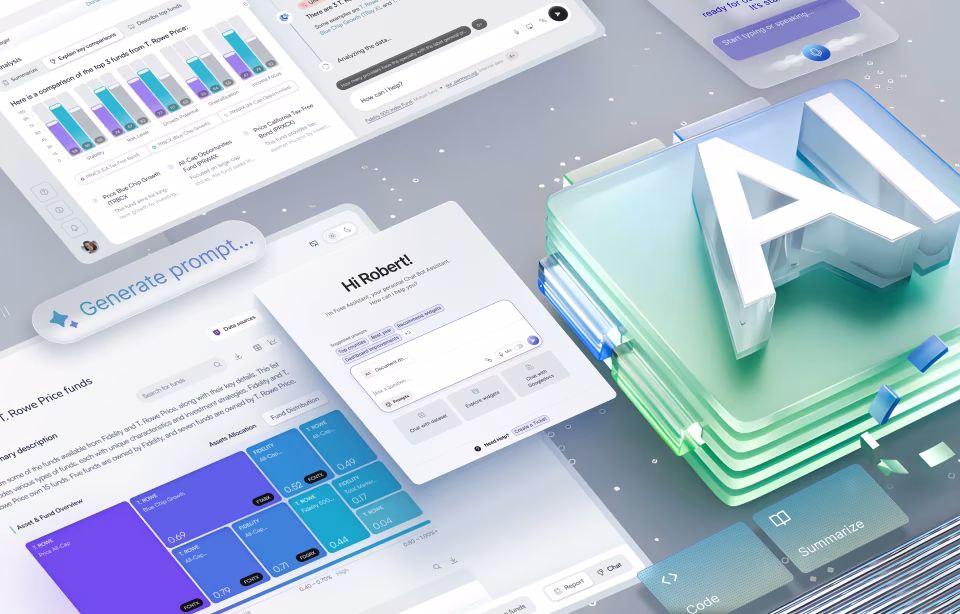
#5 Chatbot-First Approach
In this era of no-code and low-code options for designers, there is also a huge focus on how seamlessly users can interact with dashboards. Given the complex interfaces with menus and filters, a chatbot-first interface is an up-and-coming trend set to grab the limelight in 2025.
With this feature in place, users can simply ask questions in natural language, much like talking to a colleague from their sales or marketing team. For instance, a user might ask “What were our top three selling products in Q3?” or “Show me the trend in customer churn over the past year”.
The dashboard, equipped with natural language processing capabilities, would then interpret the query, retrieve the relevant data from the underlying data sources, and present the information through text-based summaries, charts, graphs, or a voice-based response. This conversational approach lowers the entry barrier for users, making it easier for them to access and understand dashboard insights irrespective of technical expertise.
#6 Micro interactivity with Data
Modern dashboards are more than just panel UI design, basic filtering, and simple graphs. They are embracing the next level of interactivity with micro-interactions. These subtle yet powerful features go beyond simple data manipulation, so users can engage with data in more dynamic and intuitive ways.
One prominent example is “what-if” analysis. It allows users to adjust parameters like pricing, marketing spending, or inventory levels, and instantly observe their impact on key metrics like revenue, profit, or customer churn. With this interactive capability, users can experiment with different scenarios, understand the potential consequences of their decisions, and make more informed choices.
Features like data annotations will also become more popular, allowing users to directly interact with visualized data. They can add notes, comments, and highlights to specific data points, charts, or dashboard sections. Apart from exploration and understanding, this will also foster sharing insights, discussing findings, and collectively building upon dashboard information between teams.
Gesture-based interactions will further enhance this dynamic engagement. Touch and gesture recognition will allow users to intuitively navigate and explore data. Picture swiping across a time series chart to scroll through historical data, or pinching gestures to zoom in or out on specific areas of interest. These intuitive interactions will make data exploration more fluid and engaging.
#7 Zero-Interface Style Approach, Nothing But Everything
Zero interface design features at the very top of our top ten UX/UI Design Trends for 2025 compilation – and rightly so. This style approach aims for an experience so seamless that it almost disappears into the background. Users are not required to actively interact with the dashboard through menus, filters, and queries – instead, the dashboard anticipates and fulfills user needs proactively.
But how?
Picture a dashboard that understands the user’s current context and proactively displays relevant information without explicit instructions. Say, a sales manager is reviewing a particular region – the dashboard automatically surfaces KPIs specific to that region, highlights potential challenges, and suggests relevant action items. If you think about it, we are always looking for the same kind of data and information, it just so happens that we have systems that understand our habits and help us access critical data without having to ask.
Behind this proactive approach are personalized recommendations based on individual user preferences and past interactions. The dashboard learns user behavior and anticipates their information needs. It can then present relevant data and insights before the user even asks.
Automated alerts can be set up to notify users of critical events like significant deviations from expected performance or emerging trends. This ensures they are always informed of the most important developments. Context-aware data visualizations take the seamless experience to the next level. The dashboard dynamically adjusts the presentation based on the user’s current task or situation. When a user is preparing for a meeting, the dashboard automatically summarizes key findings in an easily digestible format, for example.
All said, achieving a true “zero interface” may be challenging after all. And yet, this concept represents an ambitious, futuristic goal for dashboard design. Businesses striving for seamless and intuitive interactions are in for faster, more informed decision-making with this feature.
Dashboard Development Best Practices for 2025
These upcoming dashboard UX/UI design trends all point to one direction – effective dashboard development that combines technical expertise, design skills, and a deep understanding of business requirements. Here are some dashboard development best practices that businesses can swear by.
Tools and Technologies
The tools and technologies available for dashboard development today are vast and varied. Business intelligence (BI) platforms, such as Tableau, Power BI, and Qlik Sense, offer user-friendly interfaces and pre-built connectors to various data sources, making it easier to create interactive and visually appealing dashboards.
Data visualization tools, such as D3.js and Plotly, provide greater flexibility and customization options for developers with programming skills. Programming languages like Python and R, with libraries like pandas, matplotlib, and seaborn, offer powerful tools for data manipulation, analysis, and visualization. For instance, the Robodog AGV project uses powerful analytics to optimize warehouse workflows.
Data Integration and Preparation
Before any data can be visualized, it must be integrated and prepared. This involves connecting to various data sources, such as databases, spreadsheets, APIs, and cloud storage platforms. Once the data is collected, it needs to be cleaned, transformed, and prepared for analysis. This may involve handling missing values, identifying and correcting errors, and transforming data into a suitable format for visualization.
For instance, the Health Monitor Application changes the approach to electronic healthcare with seamless data integration, preparation, and presentation.
Design and Development Process
The trend micro dashboard development process is typically iterative, involving close collaboration between developers, designers, and end-users. The process begins with a thorough understanding of business requirements and user needs. This is followed by data exploration and analysis, design prototyping, and development. User feedback is critical throughout the process. Regular testing and iteration are essential to ensure that the dashboard meets the needs of users and provides the desired insights.
For instance, the Fiserv Small Business Index displays consumer spending trends across the US using interactive data visualization.
Conclusion
Dashboard design is undergoing a significant transformation, and advancements in technology and user expectations are the key drivers. Key trends like AI-powered personalization, enhanced user experience, data storytelling, mobile-first design, and sustainability considerations, are shaping the future of how businesses visualize and interact with their data.
Organizations that embrace these trends can create more impactful and insightful dashboards that drive better decision-making, improve operational efficiency, and gain a competitive advantage. While the future of dashboard technology holds exciting possibilities, there is so much potential for businesses to unfold.
If you are looking for dashboard design services grounded in time-tested principles with the trimmings of the latest technology and trends, Fuselab Creative is where your search ends. Our skilled team can help you design a product that matches your business requirements while being easy to scale and adapt. Connect with us right away and let’s get the conversation started.