UI/UX design trends for 2026: what to adopt, test, or skip
The UI/UX design trends that matter in 2026 are accessibility as a baseline, AI you can check and override, and role-based personalization. Close behind are consistent behavior across desk, phone, and tablet, and predictive insights that show their reasoning. Visual trends such as Liquid Glass and default dark mode matter less than the attention they get.
Each of the UI/UX design trends below gets two verdicts: one for enterprise and data-heavy products, one for regulated and public-sector software. The same pattern can help one and create audit risk in the other.
The verdicts use a three-step scale. Adopt means build it into the design system now. Test means pilot it in one workflow, measure task time and errors, and decide from the results. Skip means spend no budget on it this year. Each verdict also names the evidence behind it, listed in the summary table.
Structural UI/UX design trends for 2026
Five structural trends lead 2026: accessibility as a launch requirement, AI copilots with a visible override, role-based personalization, cross-platform continuity, and predictive insights that show their reasoning. They change how a product behaves rather than how it looks, which is why they carry most of the adopt verdicts.
1. Accessibility is now a launch requirement
Accessibility is the one UI/UX design trend on this list with legal force behind it, and in more markets it is now a launch condition. The European Accessibility Act has applied to consumer banking and e-commerce services, among others, since June 28, 2025, and US federal software already answers to Section 508.
The safest target is W3C’s WCAG 2.2 at Level AA, which covers the older WCAG versions that EU and US rules cite. Meeting it late costs more for a structural reason: much of accessibility lives in the design tokens: contrast values, focus styles, target sizes, and color rules. Fixing them once at the token level carries the fix to every screen, while a pre-launch audit leaves each screen needing its own repair.
Accessibility also covers comprehension, which data products often forget. The DHCS long-term care dashboards track services for more than 784,600 Californians. They were designed so policy staff, public health administrators, and program managers could reach conclusions without technical training.
Verdict. Adopt in both segments. For enterprise products, build contrast, focus, and target-size values into the tokens and keyboard behavior into shared components, then test every table and chart without a mouse. For regulated software, treat a WCAG 2.2 AA audit as a launch blocker for every core workflow.
2. AI copilots: beside the structured view
The ClyHealth clinical platform generates supplement protocols from genomic data, lab results, and health history. Its interface shows the formulation reasoning beside every recommendation, so providers review that logic before they approve a protocol. The ClyHealth case study puts it plainly: in clinical settings, a recommendation without visible justification does not get followed.
That rule now applies well beyond healthcare. NN/g’s State of UX 2026 calls this the year of AI fatigue and names trust as a major design problem for AI experiences. Its prescription is transparency, control, consistency, and support when the system fails, with AI as a tool that recedes into the background.
In practice, the chat box works best as a shortcut. A user types a question to filter a dataset or stage an action, then confirms the result in the structured view they already trust. A confident wrong answer costs more than an openly uncertain one, so the override path deserves design time before the happy path does.
Verdict. Enterprise: adopt AI as an assistant beside structured views, and skip an open chat box as the primary interface. Regulated: test it with visible sources, an action log, and a manual confirmation before any change is committed.
3. Personalization built on role presets
Personalization is often borrowed from consumer apps. In business software in 2026, it means the interface changes based on who is using it and what they have saved. The guesswork version, where an algorithm predicts what they want next, is the one to avoid. The reliable form is role-based: an admin, an analyst, and an approver open different default views, because their jobs are different.
Where personalization fails is the consumer version imported into work tools. Moving menus or reordering panels based on tracked behavior breaks muscle memory for someone who opens the same screen forty times a day. It also breaks training material, support scripts, and screenshots in audit files, which all assume the screen looks the same tomorrow.
The Train experiment-tracking product Fuselab designed for Grid AI, now Lightning AI, shows what stable personalization looks like. Its navigation never changes, regardless of what the engineer is viewing, while the display area beside it adapts to the task.
A useful middle ground is suggestion without movement. If a user applies the same three filters every morning, the product can offer to save them as a view. Nothing moves until the user says yes, and the saved view can be shared, renamed, or deleted like any other object.
Verdict. Enterprise: adopt role presets and saved views, and skip behavior-driven layout changes. Regulated: test saved preferences only, and skip anything algorithmic that would make two users’ screens differ in a way a trainer or auditor cannot predict.
4. Cross-platform: same data, different density
The DHCS dashboards had to work on desktop and on mobile for the same audience, none of whom had technical training. Counties became a choropleth map, age groups across years became a Sankey diagram, and ethnicity and language data became a bubble plot. Each chart was chosen for the question it answers, and each had to stay readable on a phone.
Cross-platform design rarely means identical screens. The job is to keep the data, the meaning, and the navigation consistent while the density changes. A phone view should lead with status and the next action. A workstation can hold the dense grid, the comparison, and the full filter panel.
The Automatize fleet platform takes the same approach for tablets, with a live map and expandable floating cards. The principle worth copying is that core interactions, such as filtering, selection, and navigation, should behave identically on every device while the layout adapts to the screen.
Verdict. Adopt in both segments. Regulated products should also guarantee that every essential citizen or worker task, including signatures and approvals, can be completed on any supported device.
5. Predictive insights must show their reasoning
A predictive insight is a pattern, anomaly, or forecast the interface surfaces from the user’s own data before the user goes looking for it. It saves time only when the reasoning is visible. A flagged number with no explanation leaves the user two options, blind trust or dismissal. Dismissal is the easier habit to form, so unexplained alerts are usually the first thing a busy team learns to ignore.
The simplest form of visible reasoning, even without any prediction, is a number shown beside the value it should be. Automatize’s cost cards set unit cost against should-cost for each critical area, so the card explains its own significance without a chart. Predictions need the same treatment, plus the time window, the data source, and a plain statement of confidence.
Dashboards are where most of this lands, and the dashboard design trends worth tracking follow the same principle. Keep measured values and forecasts visually separate, so no one has to work out whether an event was detected or predicted. A forecast drawn like a measurement will be read as fact.
Verdict. Enterprise: adopt predictive cards that link to their source data and state their confidence. Regulated: test them with auditable sources and a required human review before anyone acts on a prediction.
Visual trends: dark mode and Liquid Glass
Two visual trends make this list, dark mode and Liquid Glass, and both deserve a narrower role than the coverage suggests. Each one adds a second set of contrast conditions to test, and on data-dense screens that testing cost usually outweighs the aesthetic gain.
6. Dark mode: a toggle, not a default
Dark mode is a light-on-dark color scheme, and for most readers it is a preference, not an improvement in readability. Nielsen Norman Group’s review of the research found that people with normal vision read and proofread more accurately in light mode, and the gap widens as font size shrinks.
The same review, published in 2020 and still the clearest summary available, found no significant difference in fatigue between the two modes. That removes the usual argument that dark mode is easier on the eyes. It does help some users with cataracts and similar conditions, and a study NN/g cites suggests sustained light-mode reading may be linked to myopia.
For product teams, the real cost is maintenance. Every chart color, status badge, and focus ring now needs two tested values. On a dashboard where a shade of red means a breach, a second theme is a second place for that meaning to fail. That cost is worth paying when users ask for dark mode, and hard to justify when nobody has.
Verdict. Enterprise and data-heavy: adopt dark mode as a user toggle where users ask for it. Make it the default only where operators request it, such as some control rooms, and treat that as a practitioner call rather than a research finding. Regulated and public sector: skip it as a default, and ship the option only after both themes pass the same contrast checks.
7. Liquid Glass: on navigation, off the data
Liquid Glass is the translucent interface material Apple introduced with iOS 26, where controls and navigation float over content and refract what sits behind them. Google’s Material 3 Expressive, released the same year, moved toward bolder shapes and spring-based motion instead.
Apple’s own guidance is narrower than most coverage suggests. The Human Interface Guidelines say not to use Liquid Glass in the content layer and to use its effects sparingly. They also note that the material changes when users turn on settings that reduce transparency or increase contrast.
For data-dense screens, that guidance is the verdict. Text over a translucent surface changes contrast as content scrolls beneath it, so a table that passes a contrast check in one position can fail it in the next. Floating navigation is a different case, because users glance at it rather than read from it.
Verdict. Enterprise: test it on floating navigation and short-lived overlays, and skip it anywhere users read numbers. Regulated: skip it on operational, tabular, and form screens entirely.
Emerging trends: AR, digital twins, simulation
AR, digital twins, and simulation interfaces matter to a narrower group of products: those with a physical system, a live sensor feed, or an expensive real-world decision behind the screen. For everyone else they can wait. These are also areas Fuselab designs for, so the verdicts below lean on project evidence and should be read with that in mind.
8. AR and spatial: for hands-busy work only
Hyperfab builds wall panels for commercial buildings with industrial robots. Its operators wear AR goggles on the factory floor and use a desktop dashboard for planning and monitoring. Fuselab’s work on the existing product covered UX research, UI/UX design, and animation.
Hyperfab’s setup shows where spatial computing earns its place. The goggles carry what a person needs while their hands and eyes are on physical work, and the desk carries everything that needs comparison, history, or typing. Spatial interfaces earn their cost where a flat screen would force someone to look away from the task. Most office software gains little from them.
Attention is the hard design problem here. In a headset, every alert competes with the physical world, so the interface has to decide what may interrupt and what waits for a glance. Gesture vocabularies are still inconsistent across platforms, which means every product currently teaches its own.
Verdict. Enterprise: test AR for floor, field, and maintenance work, and skip it for desk-based software. Regulated: test it only in supervised training or pilot settings.
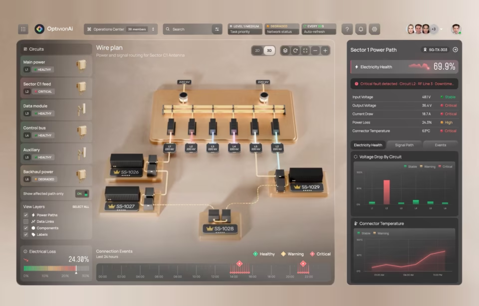
9. Digital twin interfaces need live data to count
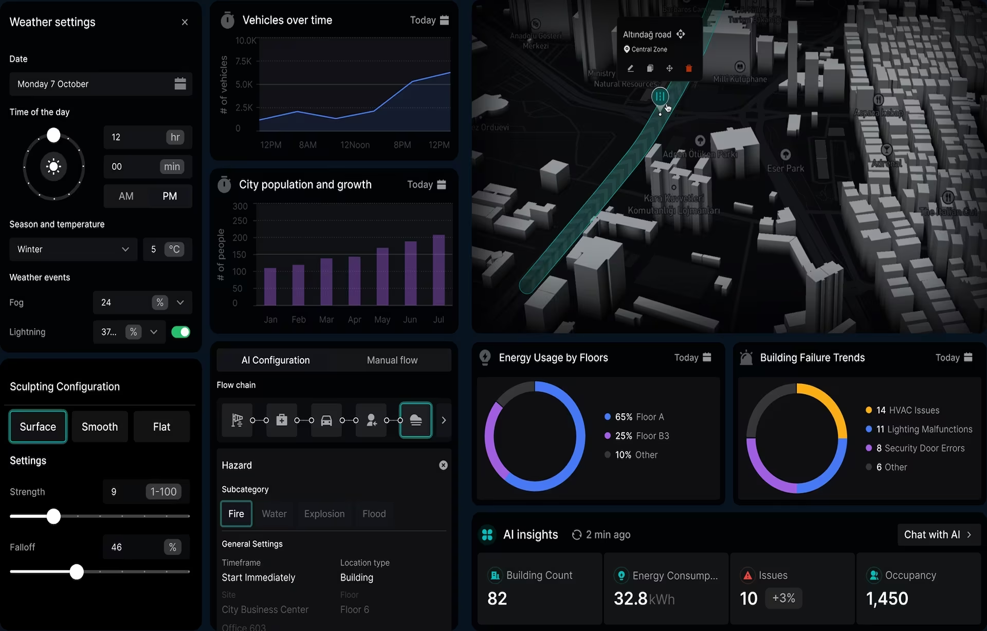
A digital twin interface is a model of a physical system, such as a city, a plant, or a building, kept in sync with that system through live sensor data. Without the live feed it is a 3D visualization, however detailed. The interface work is mostly about deciding which of thousands of signals deserves the screen right now.
The DMF digital twin builder Fuselab designed spans smart cities, manufacturing and logistics, construction, and oil and gas. Its 3D city view carries traffic density, air quality, and emergency layers. A control center holds live state for every asset, a timeline lets users move through everything the twin recorded, and an AI panel answers plain-language questions.
Most twin projects underestimate the timeline. Operators rarely ask what is happening now in isolation. They ask what changed and when, so replay matters as much as the live view. Fuselab’s digital twin interface design work covers that point in more depth.
Verdict. Enterprise: adopt where continuous sensor data already exists, and skip it where it does not. Regulated: test it, keeping live readings clearly separated from simulated or forecast states.
10. Simulation: preview a decision first
Hyperfab’s AI simulation interface lets operators preview a robotic cutting, labeling, or assembly process before the robot executes it. The value is plain: a mistake caught on screen costs little, and the same mistake on the floor costs material and time. The gap between those two costs decides whether a simulation interface is worth building.
EffiTrack, the energy analytics platform Fuselab designed, applies the idea to planning. The platform pairs simulation tools for scenario planning with monitoring that drills from a global view down to individual buildings, so users can test assumptions against numbers they already track.
The design challenge grows as simulation engines run more scenarios than anyone can review. The interface has to show which assumptions produced a result, how certain it is, and where a person can change the inputs. Users also need to rerun a scenario without leaving the screen.
Verdict. Test in both segments, starting where a wrong real-world decision is expensive. Regulated products should keep a human approval step between any simulated result and a live change.
What changed from last year’s list
The previous edition of this UI/UX design trends list ranked dark mode first and treated it as a new standard. The research does not support that position, so dark mode drops to an on-request option. The 2025 section on AI chat centered on voice assistants and natural language processing. It is replaced by copilots that sit beside a structured view, because the design problem moved from understanding language to earning trust.
Minimalism, an honorable mention last year, is gone. Clear hierarchy and restrained color are baseline expectations now, not a trend. Location-based UX is folded into personalization and cross-platform design, where context gets applied in practice. Broad “data-driven design” narrows to predictive insights with visible reasoning, the one part of that idea where the design choices have changed.
UI/UX design trends 2026: all ten verdicts
Three kinds of support appear in the evidence column. Research means a published study, standard, law, or platform guideline, such as NN/g, W3C, the EAA, or Apple’s guidelines. A project means a named Fuselab build where the pattern shipped. Practitioner judgment means a reasoned position without a study behind it, and those verdicts deserve the most scrutiny from your own team.
Which trend to act on first
Start with accessibility, because it is the only one of these UI/UX design trends already backed by law, and the one that makes every later change cheaper. Then check any AI features for a visible override path. Then work through the remaining adopt verdicts in the table, and let your own pilot results decide the tests. For help planning that order in your own product, see Fuselab’s UI/UX design services.
Frequently asked questions
What are the biggest UI/UX design trends in 2026?
The biggest UI/UX design trends in 2026 are accessibility as a launch requirement, AI assistants with override paths, role-based personalization, consistent behavior across desktop and mobile, and predictive insights that explain themselves. Visual trends such as Liquid Glass matter mostly on navigation, not on data screens.
What is the difference between a UI trend and a UX trend?
A UI trend changes how an interface looks, such as translucent materials, color themes, or type styles. A UX trend changes how the product works, such as how AI suggestions are checked, how screens adapt by role, or how a task continues across devices. UX trends usually cost more to adopt and matter more to the outcome.
Is Liquid Glass accessible enough for business software?
Liquid Glass can meet accessibility needs on navigation and controls, but it is risky on screens full of text and numbers. Contrast changes as content scrolls beneath a translucent surface. Apple’s guidelines advise against using it in the content layer and note that it adapts when users reduce transparency or increase contrast.
Do consumer app design trends apply to enterprise software?
Consumer UI/UX design trends apply to enterprise software only when they make a repeated task faster or clearer. Patterns built for novelty or engagement, such as layouts that rearrange themselves, usually slow down people who use the same screen all day. Enterprise teams should adopt the underlying principle and skip the surface style.
How should a product team decide whether to adopt a design trend?
A product team should test any trend against its users’ environment, data density, compliance duties, and the cost of maintaining it for years. If a pattern hides a critical number, breaks muscle memory, or adds a second theme nobody requested, it fails the test regardless of how common it is.
What should a design agency show before recommending a trend-led redesign?
Any design agency recommending a redesign should show a shipped product where it used the trend, not a concept mockup. It should explain how that screen behaves with dense data, for a user with low vision, and when a decision needs auditing later. Without that evidence, treat the recommendation as a style preference.
How much does a trend-led redesign cost?
A trend-led redesign costs less when the change sits in design tokens, such as contrast values, than when it forces component rewrites, such as translucent navigation. Fuselab’s published rates on Clutch are $100 to $149 per hour with a $25,000 project minimum.