UX metrics: how to measure UX with the numbers that matter

Start from the business decision, not from whatever the analytics tool already tracks. That is the short answer to how to measure UX in an enterprise product. Name the decision the numbers must support, pick the two or three measurements that reduce uncertainty around it, and capture a baseline before anything changes. Then review on a cadence that outlives the redesign.
UX metrics are the behavioral and attitudinal measures of how well people get real work done inside a product: task success, error rate, completion time, and the satisfaction and confidence users report along the way. Collected for their own sake, they report activity; attached to a decision, a redesign, an audit or a funding request, they become evidence that holds up in front of finance and compliance reviewers.
Most enterprise teams have the opposite: dashboards full of adoption counts, session lengths, and NPS scores that nobody can connect to a redesign or defend in a budget review. This guide walks through the method we use to choose, baseline, and report the numbers that survive that scrutiny, in the order the decisions get made.
What UX metrics measure, and what they don’t
UX metrics quantify how well a person can complete a goal inside a product and how the experience felt. Behavioral measures such as task success and error rate describe the interaction itself; attitudinal measures such as satisfaction and confidence capture the user’s judgment of it. Business metrics such as revenue or churn sit several steps downstream of both.
Product teams treat the two as interchangeable because both arrive on the same dashboard. The downstream gap is what makes that a mistake. Revenue can grow in a quarter while onboarding quietly loses a third of new users, because the customers who get through are covering for the ones who do not.
The reverse happens just as often. A team lifts task success substantially and sees no revenue movement for months, because the fix was never the reason buyers held back. Interface numbers explain why business outcomes move; they rarely move them alone, and pretending otherwise is how UX teams lose credibility with finance.
Enterprise products sharpen the distinction further. An internal claims platform or clinical tool is not trying to hold attention; it exists so employees, clinicians, and case workers finish complex work faster and with fewer mistakes. Success is completing the task and moving on. That inversion changes which measurements deserve a place on the dashboard, and it is where most enterprise UX design engagements start.
Start with the business decision, not the metric
Choosing what to measure starts with the decision the measurement must support. A redesign case, a compliance review, and a funding request each demand different evidence, and no single number answers all three. Work backwards from the decision, then keep only the measurements that reduce uncertainty around it.
The people in the room make this concrete. A product manager wants to know whether a workflow needs redesign at all. The compliance officer in the same meeting needs documentation proving errors decreased after the last one. And the CFO is only asking whether the change has cut enough operating costs to fund the next phase. Same product, three different evidentiary bars.
Forcing the question through whatever the tool already tracks (session length, page views, click counts) produces an answer that no on is happy with, in fact, it only causes more frustration. The mapping below is the version of this exercise we run at the start of measurement work: the decision first, the thing being proven second, the metric last. We are making it sound easier than it is, we know.
Running the exercise in this direction also filters out the most common measurement mistake in enterprise work: tracking what is easy instead of what is useful. Analytics platforms generate hundreds of behavioral numbers with no effort. A number that cannot change a product, funding, or compliance decision is reporting activity, not measuring success.
Choosing UX metrics with the HEART framework
Google’s HEART framework groups user-experience measurement into five dimensions: happiness, engagement, adoption, retention, and task success. Its Goals-Signals-Metrics process forces a team to name the goal, the user behavior that would signal progress, and only then the number to track. It is a widely recognized starting point for deciding what to measure.
Published by Google Research in 2010, HEART was designed for large-scale consumer products, and its five dimensions reflect that origin:
- Happiness: how users feel about the experience, measured through satisfaction or confidence surveys.
- Engagement: how often and how deeply users interact over time.
- Adoption: how many new users take up a feature or workflow.
- Retention: whether users come back.
- Task success: whether users can complete the workflows that matter.
The framework’s authors flagged its enterprise limits themselves. The paper notes that engagement “may not be meaningful in an enterprise context, if users are expected to use the product as part of their work.” The same logic weakens adoption and retention wherever use is mandated. A clinician completing patient records gains nothing from a stickier interface. Regulated work also adds role segmentation and audit defensibility on top of anything HEART suggests.
Why weak metrics stay on the dashboard
Nearly every enterprise measurement program we have walked into inherits a dashboard built years earlier, for a different product, a different leadership team, or a different objective. Once those reports enter the quarterly review deck, they become surprisingly hard to remove, and almost nobody is assigned to ask whether each number still deserves its place.
Inertia does most of the work. Analytics platforms surface session counts and page views by default, so those are the numbers that get discussed, and replacing them means admitting they were never worth tracking. That is a harder conversation than leaving them alone, so they stay.
Collection cost does the rest. Measuring task success or workflow completion takes instrumentation, usability testing, or observation, while clicks are already sitting in the tool. Weak numbers also flatter: more clicks and longer sessions look like progress in a slide, and teams under pressure present what is easiest to defend.
The case for deleting them is practical, not aesthetic. Rising time-in-app on a claims tool usually signals confusion, not satisfaction. A compliance dashboard that holds users for ten minutes is hiding the answer they came for. And every number like that on a review slide makes the one meaningful number harder to see and easier to argue away.
Metrics for operational efficiency
Redesigns of complex workflows are usually justified on routine-work friction, so the operational question is direct: can users finish critical work with less effort than before? Four measurements answer it, each from a different angle, and together they describe the cost of getting work through the system.
- Task success rate: the share of users who complete the workflow correctly, the first number a redesign has to move.
- Time on task: how long completion takes a practiced user, the closest interface proxy for operating cost.
- Number of attempts: how many tries a first-time user needs, an early read on training and support load.
- Workflow completion time: end-to-end duration across steps, queues, and handoffs. Queues and handoffs are shared with operations, so credit interface work through time on task and use this one for context.
Metrics for quality and compliance
Regulated industries weight accuracy over speed. Healthcare, financial services, insurance, and government products operate under legal requirements where a fast workflow that produces more errors creates downstream rework and organizational risk. The measurements that matter most are the ones an audit can stand on.
- Error rate by workflow step: where mistakes happen in the process, not just how many.
- First-time completion: submissions that pass validation without rework, the cleanest quality signal on this list.
- Exception rate by role: cases routed off the standard path, and which user groups generate them.
- Rework after submission: corrections that come back later, each one carrying review and reporting cost.
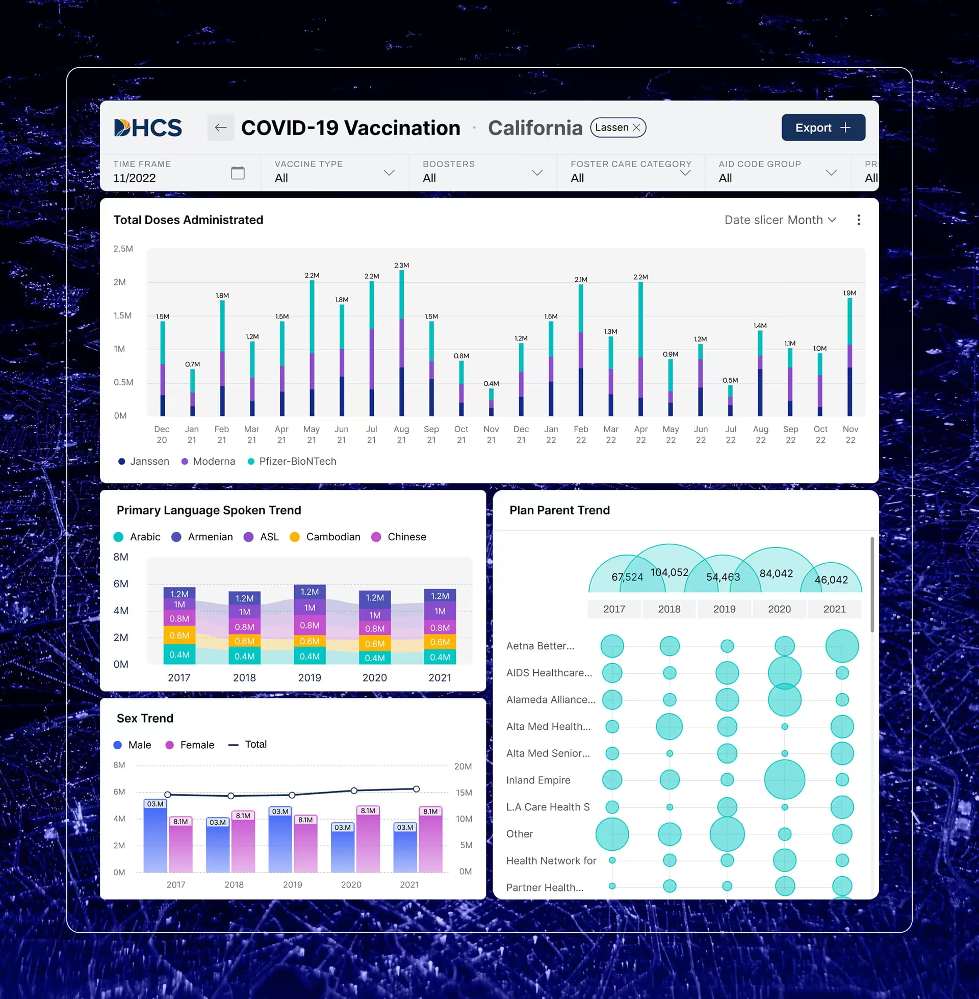
In our work with DHCS on their Medicaid administration tools, a few key project parameters emerged: the interfaces had to balance usability against accessibility standards and public-sector process constraints, and the measurements that carried weight with reviewers were error and exception rates broken down by user role. Nobody in an audit meeting ever asked about engagement, probably because everything we were doing is part of a CMS (Centers for Medicare & Medicaid) mandate and needed to follow strict delivery requirements.
Metrics for trust in the data
Not every enterprise product is a workflow. Some interfaces exist to make a data source credible, and there the measurement question changes: not how fast users finish, but whether they read the data correctly and believe it. Comprehension and confidence become the success measures, tested through moderated sessions rather than analytics.
The Fiserv Small Business Index is the clearest example from our own work. The index publishes monthly small-business performance figures built from point-of-sale activity at more than 2 million US businesses, and it informs public conversations about the sector. When we tested the design, the questions were comprehension questions: could a reader tell what the index was built from, and did the visualization signal confidence in the number.
Those goals produce different instruments: comprehension checks on how the data was sourced, first-click tests on where supporting detail lives, and confidence ratings on the visualization itself. This is standard practice in data visualization design for public-facing data products, and none of it shows up in a pageview count.

Those goals produce different instruments: comprehension checks on how the data was sourced, first-click tests on where supporting detail lives, and confidence ratings on the visualization itself. This is standard practice in data visualization design for public-facing data products, and none of it shows up in a pageview count.
Connecting the numbers to outcomes a CFO or compliance officer accepts
UX metrics earn budget when they explain a business outcome rather than sit beside it. Executives rarely fund a task-success improvement for its own sake; they fund it because higher task success reduces support cost, compliance exposure, or churn. The connection is a cause-and-effect chain, and the chain has to be stated, not implied.
Task success connects to onboarding cost through a chain finance already tracks. A user who fails a critical task on the first attempt generates a support ticket, a training session, or a manual workaround, and each has a price. Error rate connects to compliance risk the same way, because an error in a regulated workflow must be logged, reviewed, and sometimes reported.
Support ticket volume connects to retention through the renewal conversation: a customer who files three tickets to finish one workflow remembers it at contract time. Framed as chains rather than isolated scores, the numbers tell a story a CFO can check line by line.
A worked example, with invented numbers, shows the shape. Say a claims-intake team baselines task success at 70 percent, redesigns the steps where drop-off concentrates, and measures 88 percent three months after launch. Tickets tied to that workflow fall, onboarding for new adjusters shortens, and the report to finance ends in a training-cost figure they can verify. That chain, not the 18-point rise alone, is what funds the next phase.
External benchmarks support the chain argument without proving any specific case. Nielsen Norman Group’s research on the ROI of usability work, first published in 2003, measured average metric improvements of 135 percent across 42 website redesigns, with intranet metrics slightly under 100 percent. NNGroup’s own later analysis shows average gains shrinking as baseline usability rises, which strengthens the case for measuring: the easy wins are already gone.
McKinsey’s 2018 Business Value of Design study, which tracked 300 publicly listed companies for five years, found that top-quartile scorers on its design index grew revenue 32 percentage points faster than industry counterparts. Neither number proves a specific redesign will pay back. What they establish is that design performance and business performance move together, and the organizations able to show the link are the ones measuring it.
Building a measurement practice that survives leadership changes
A measurement practice survives when it is small, owned, and scheduled. That means one business-critical workflow measured first, a baseline captured before any redesign, a named owner for the numbers, and a review cadence that continues after launch. Programs die from too many metrics at the start or from nobody looking after the first success.
Overreach kills programs early. Without a research base, the instinct is to track every plausible number, which produces a dashboard nobody has time to act on. Picking the single highest-risk workflow, defining success for the specific role performing it, and capturing a baseline before anything changes gives you one clean before-and-after comparison. That is enough to prove whether one change worked.
Abandonment kills them later. A redesign launches, the team reports improved task success, everyone moves on, and the dashboard quietly stops being read. Six months later the next redesign starts with no baseline and no idea whether the last changes held. Getting the start right is not enough on its own; only a standing review cadence keeps the numbers alive past the first success story.
Four practices keep the program alive between reviews:
- Measure before the redesign. Without a baseline, improvement cannot be demonstrated, only asserted. This is the cheapest step to take and the most expensive to skip.
- Concentrate on business-critical workflows. Gains on a high-stakes process move executive decisions; incremental wins on low-impact screens do not.
- Keep a standing review cadence. User behavior shifts as products, regulations, and teams change, and a scheduled review surfaces trends while they can still shape strategy.
- Pair the numbers with qualitative evidence. Metrics locate the problem; interviews, usability sessions, and structured UX research explain it. The pairing is what turns a chart into a recommendation a team will act on, and it is the main reason to bring in outside research help at all: root cause, not reporting.
As the practice matures, the measure of progress is the quality of decisions the numbers support, not the volume of data collected. The maturity ladder looks like this:
Measure less, decide more
The organizations that get the most from measurement rarely track the most numbers. They keep the few that answer questions someone with a budget is asking, and they can name the decision behind each one. Build the chain once, from decision to proof to metric to baseline to cadence, and every future redesign argument starts from evidence instead of assertion. The workflow to start with is the one where failure costs the most.
Frequently asked questions
What is the difference between UX metrics and business metrics?
UX metrics describe the quality of an interaction: whether a user completed a task, how long it took, and how many errors occurred. Business metrics describe downstream outcomes such as revenue, conversion, or churn, which pricing, market conditions, and sales all shape. A product can score well on one and poorly on the other at the same time.
How are UX KPIs different from UX metrics?
UX KPIs are the small set of user-experience measurements an organization commits to reporting at leadership level, usually two or three per product. A team may track a dozen measurements during design work, but only the ones tied to a business objective and reviewed on a schedule function as KPIs.
What is a UX baseline and why does it matter?
A UX baseline is the measured performance of a workflow, its task success rate, completion time, and error rate, captured before any redesign work begins. Without one, improvement can only be asserted, not demonstrated. Baselines are the difference between reporting that a redesign shipped and proving that it worked.
What counts as a vanity metric in enterprise UX?
Vanity metrics are numbers that move without saying whether users completed their work: total clicks, screen views, session duration, and daily active counts on tools people are required to use. In an internal product, rising time-in-app more often signals confusion than value. A metric earns its place only when it can change a product, funding, or compliance decision.
How do I start measuring UX without a dedicated research team?
Measuring UX without a research team starts with one business-critical workflow and two or three measurements, typically task success rate, error rate, and completion time. Capture a baseline before making changes, then pair the numbers with a handful of user interviews to understand why people struggle. A small, repeatable process beats a large dashboard nobody reviews.
How do I demonstrate UX ROI for an enterprise product?
UX ROI is a chain of evidence rather than a single number: link task success, error rate, or completion time to operational costs finance already tracks, such as training, support tickets, and compliance exposure. Executives fund the chain, not the metric. Tie each measurement to a specific line item or risk register entry, and the argument becomes checkable rather than rhetorical.
How do I choose a UX research partner for a regulated product?
A UX research partner for regulated work should show shipped products in environments with audit, accessibility, and compliance requirements, not just consumer portfolios. Ask how they segment findings by user role and how they connect research output to operational measures a reviewer would accept. A partner who cannot describe that connection will deliver reports, not decisions.
Author

Related posts