12
min read
12
min read
 Oct 7, 2026
OEE dashboard design: manufacturing metrics operators trust
An OEE dashboard is the real-time visual layer on top of the Overall Equipment Effectiveness calculation, Availability × Performance × Quality, built so operators and supervisors can spot production losses as they occur instead of discovering them at the end of the shift. It is also read under conditions that no office dashboard faces, by people whose attention is first to running machinery and second to any screen.
What is an OEE dashboard?
Functionally, an OEE dashboard is an operational tool rather than a reporting one: it exists to interrupt losses, not archive them. Where a monthly OEE report tells a plant what its equipment effectiveness was, the dashboard shows which of Availability, Performance, or Quality is currently losing production, while intervention is still cheap.
Real-time manufacturing data is the part most teams get wrong. The screen has to answer a question in the moment: is this line running the way it should be right now, and if not, what changed? Most failed projects start from the opposite direction, designing for the weekly management review first and then speeding up the refresh rate.
Genuinely real-time needs an operational definition, because acceptable latency differs by metric. A stoppage indicator has to update within seconds to be worth acting on; OEE component rollups can refresh on a one-minute cycle without misleading anyone; shift trends can lag further with no harm done. The design rule is to match each metric’s latency to the decision it feeds, then label the refresh rate on screen.
The display also serves three different relationships to the same number, and each role reads it at a different rhythm: the operator in seconds, the supervisor across lines, the plant manager across shifts. Defining these views before wireframing keeps each screen answering one question instead of three:
Serving all three at once is a design problem shaped by the floor itself. Operators work around noise, heat, and shift fatigue, often in protective equipment, managing machinery that demands constant attention. Three design pillars decide whether the screen survives that environment: glanceability, alarm discipline, and operator trust. The rest of this guide takes them in that order, because the first two create the conditions for the third.
OEE dashboard vs. manufacturing KPI dashboard vs. production dashboard: what’s the difference?
These three terms get used interchangeably, but they answer different questions. A production dashboard tracks throughput and output. A manufacturing KPI dashboard is the broad umbrella covering any operational metric a plant tracks. An OEE dashboard is narrower: it is the loss-diagnostic layer that explains why output fell short of what the equipment could have made.
If a production dashboard tells you the line made 8,400 units this shift, then the OEE dashboard tells you it should have made 9,600 and points to the cause of the loss. That on-the-spot diagnostic function is the whole point of OEE.
Teams scoping a broader operations view, safety, cost, and delivery performance alongside output, are really having a manufacturing KPI dashboard conversation, and that deserves its own design approach. This article stays on the OEE and real-time monitoring layer, because that layer has design rules a general KPI rollup does not need.
One more boundary worth drawing: an OEE dashboard is not an MES or SCADA replacement. MES, SCADA, and historians manage and collect operational data; the dashboard sits on top of them, turning selected production data into a decision interface for understanding equipment effectiveness and losses. Plants usually need both layers, one feeding the other.
What a trustworthy OEE dashboard shows: Availability, Performance, Quality
Seiichi Nakajima’s TPM framework defines Overall Equipment Effectiveness as Availability × Performance × Quality. The often-cited world-class benchmark is 85%; OEE.com, which works with thousands of manufacturers, reports that typical scores sit closer to 60%. The practical value of OEE is therefore less about chasing a universal target than about identifying which losses are blocking improvement.
Each component maps to a category of loss an operator can recognize from the floor, and the mapping is what makes the score coachable rather than abstract. A single OEE percentage with no loss category attached tells a crew something went wrong without telling anyone what to do about it. The components split the story three ways:
- Availability measures how much of planned production time was actually spent producing.
- Performance measures whether the equipment runs at its intended speed while it is producing.
- Quality measures how much output meets specification the first time, without rework.
Together, these categories form the Six Big Losses framework, which translates the three OEE components into events a crew has actually lived through: not availability loss in the abstract, but the jam that stopped line two, or the changeover that ran long. The canonical six map to the components like this:
One caution on the data feeding all of this: manually logged OEE consistently reads higher than sensor-measured OEE, because paper logs miss the micro-stops sensors catch. Every decision made against a manual number is made against an inflated one, which is the strongest argument for automating the measurement before designing the display.
Designing for glanceability: what an operator should read in three seconds
An operator should be able to read three things from an OEE dashboard in about three seconds: the one number that matters right now, sized larger than anything else; the trend direction, climbing or falling; and one unambiguous green, yellow, or red status tied to a defined threshold. Everything else is secondary and should look secondary.
Shop floor dashboards are glanced at, not studied, usually while the operator is checking equipment, moving material, or responding to something else. Nielsen Norman Group’s work on cognitive load describes what happens when incoming information exceeds what a person can process: they slow down, miss details, or abandon the task. On a production line, abandoning the task means ignoring the screen.
A useful field check is the three-second test: if someone walking past the screen cannot name the production state in about three seconds, the display is showing too much or emphasizing the wrong things. Car dashboards pass this test at highway speed. A needle position and a few colored icons carry the whole story without a single word being read.
Glanceability is a prioritization decision made before any chart is drawn. The design team decides which single number, which trend, and which status signal earn the first three seconds, then deliberately demotes everything else to a second look or a drill-down. Teams that skip that decision end up printing the whole data model onto one screen and calling it a dashboard.
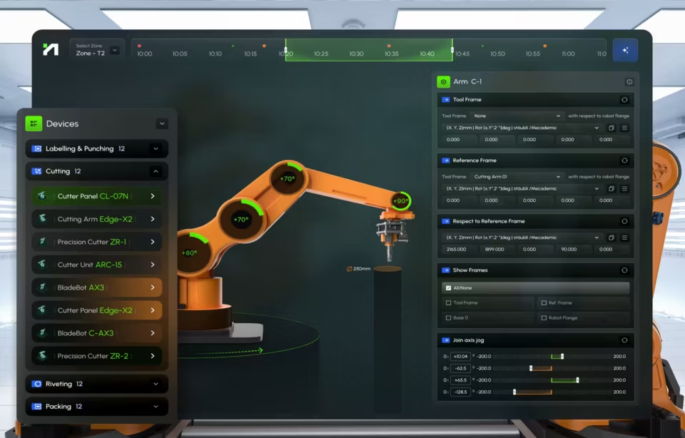
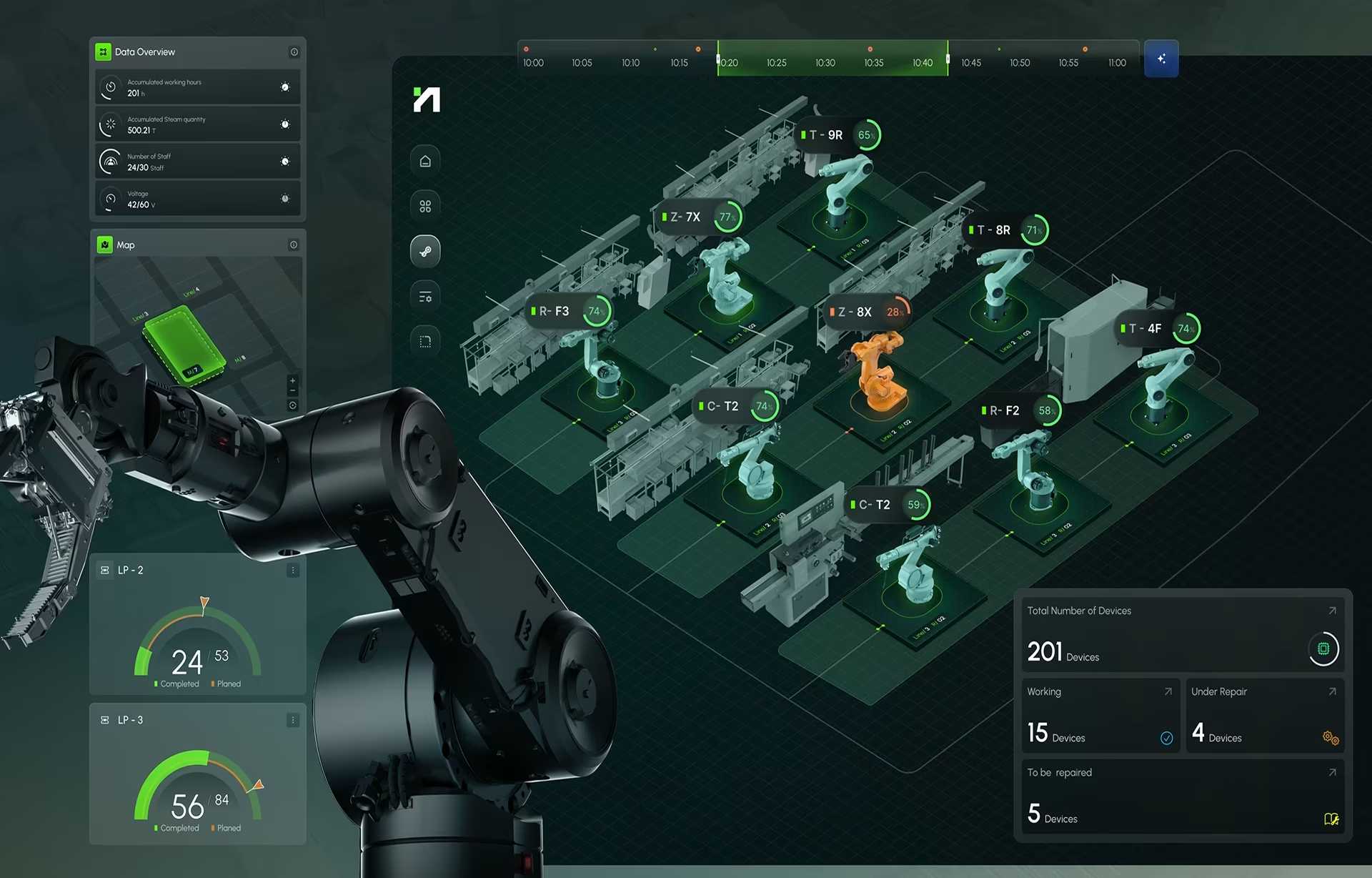
Hyperfab, a real-time robotics dashboard and AR interface we designed for smart-factory environments, is a working example of this discipline. We kept the same green, yellow, and red conventions operators already knew from other industrial systems, sized them for reading at a distance, and ran the identical indicator logic across the desktop dashboard and the AR headsets worn on the floor.
Its OEE view breaks Performance, Quality, and Availability out hour by hour instead of collapsing them into one end-of-day number, so a floor manager can see which loss category is driving a shift without opening a second screen. See our broader industrial interface design work for how the same constraints play out beyond OEE.
Designing alarms operators actually act on
EEMUA 191 and ANSI/ISA-18.2 are the widely used references for industrial alarm management. EEMUA 191 treats roughly six alarms per operator per hour as a steady-state target, with around twelve per hour as a practical upper limit for sustained handling. Past that, alarm flooding degrades response time and decision quality until alerts stop being information.
Alarm fatigue works exactly like a smoke detector with a low battery. The first chirp gets a reaction; by the twentieth chirp at 3 a.m., most people pull the battery out. Operators do the same thing with a flooding alarm layer, except what they pull out is their attention, and nobody notices it is gone until something real gets missed.
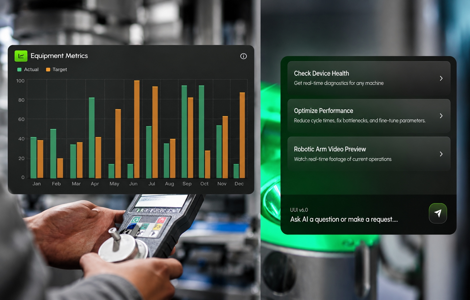
Testing whether something actually deserves to be an alarm is surprisingly simple. Asking what the operator should do when it appears is another challenge altogether. If the answer is not clear and immediate, it belongs in a status view or a report, not the alarm layer. This keeps operators sane and not overburdened. Only information requiring intervention right now earns an interruption and helps to build trust with users.
The discipline has to be applied before the interface gets built, because retrofitting alarm philosophy onto a shipped product means renegotiating every threshold with every user who has already learned to ignore it. Three practices do most of the work:
- Set an alarm-rate target and hold to it in steady state. Startup, shutdown, and abnormal situations legitimately run hotter. But if the system consistently exceeds the target during normal operation, it is the alarm philosophy and threshold logic that need review, not the operators.
- Distinguish priority levels visually, not just categorically. A line-down event and a 5% speed dip should never look the same on screen, even if both technically qualify as alerts in the backend.
- Reserve color and motion for states that require action. If yellow is always on screen, yellow means nothing. Save it, and red, for moments that need a human response.
This is also where alarm design and glanceability (Yes, this is a real word.) start pulling in opposite directions. Glanceability wants color on screen to draw the eye; alarm discipline wants color held in reserve so it still means something when it appears. Resolving that tension, rather than defaulting to more color more often, is the hardest judgment call in the whole project.
Designing for operator trust: why some dashboards get used, and others get ignored
Even a visually polished dashboard fails if operators do not trust what it shows. Trust accumulates each time the number on the screen matches what the operator can verify with their own eyes on the line, and it drains each time they disagree. No visual style compensates for a screen that the floor has caught lying on.
Data that is actually real-time. A screen labeled “live” that refreshes every 15 minutes is misleading by omission, and it only has to be caught once. The first time an operator watches a stoppage happen and then watches the dashboard stay green for ten more minutes, every number the system shows afterward carries a discount.
Numbers that match the floor. If the screen reports 94% Availability while the operator watched the line shut down twice in the past hour, the interface loses the argument, not the operator. Reconciling sensor data against what is visibly happening on the line is the baseline requirement for the system to earn trust at all.
Consistent behavior. People learn an interface’s habits quickly. If colors change meaning between screens, machine states carry different labels between shifts, or similar events produce different alarms, users start second-guessing the display instead of acting on it. Consistency is what lets a glance be enough; without it, every reading becomes a small investigation.
Trust is the pillar that fails last and loudest. A cluttered screen or a flooding alarm layer shows up in week one; the doubt they create compounds quietly until even accurate data gets ignored. Getting glanceability and alarm discipline right creates the conditions for trust. Whether it holds depends on the system consistently matching the floor, from sensor accuracy to loss definitions that survive a shift change.
How to design an OEE dashboard operators trust
A successful OEE dashboard project runs four steps in sequence: define the loss taxonomy with the floor team, design the glanceable layer before any charts, set alarm thresholds against the EEMUA rate target, then validate on the actual factory floor. The order matters because each step constrains the next.
Many dashboard projects start with a workshop and end in the boardroom, and the gaps only appear when the product hits the production floor, where changing the design is expensive. In our industrial engagements, the designs that survived were shaped by how operators actually work rather than by what data happened to be available. This is the sequence those projects follow:
- Define the loss taxonomy with the floor team. Every plant’s Six Big Losses look slightly different in practice. Sit with operators and maintenance before wireframing anything, ask what actually stops the line, and agree on what each loss means, what it is called, and how it is represented. A shared taxonomy prevents arguments later about what the numbers mean.
- Design the glanceable layer first. Resist starting with charts. Decide what someone should understand within three seconds, build that layer with one number, a trend direction, and a status color, and only then add secondary views.
- Set alarm thresholds with discipline. Apply the EEMUA 191 rate target as a real constraint, and get operator sign-off on what counts as alarm-worthy before anything ships.
- Validate on the actual floor, not in a conference room. A design that tests well on a laptop can fail under floor lighting, floor noise, and floor distance. Have an operator use it mid-shift, with structured usability research if the stakes justify it, before release.
Three failure patterns show up repeatedly across all four steps and are worth checking for by name: an OEE percentage with no loss type attached, a target number with no realistic-range context beside it, and a real-time label on data that is actually fifteen minutes behind.
None of these is difficult to fix. The difficulty is spotting them before operators quietly stop relying on the screen, because that kind of abandonment rarely gets reported; usage just fades. That is why final validation belongs on the shop floor, mid-shift, with the people who will read this display every working day.
Conclusion
The best OEE dashboards never become the center of attention: operators glance, trust what they see, and get back to work. Getting there takes glanceability decided first, alarms held to a disciplined rate, and data the floor can verify. Our dashboard development work covers the build side; the design side starts with a conversation on the floor.
Frequently asked questions
What is OEE (Overall Equipment Effectiveness)?
OEE is a manufacturing metric that measures how effectively a piece of equipment or an assembly line is running, calculated as Availability × Performance × Quality. It is the industry-standard way to compare a factory’s actual output against its theoretical potential and to identify where production losses occur.
What is a shop floor dashboard?
A shop floor dashboard is any real-time display mounted on or near the production line that shows operational status to the people working there. An OEE dashboard is one specific type of shop floor dashboard, focused on equipment effectiveness and loss diagnosis rather than general throughput or safety metrics.
What's the difference between an OEE dashboard and a production dashboard?
A production dashboard tracks output: units made, throughput rate, and cycle time. An OEE dashboard goes a step further and explains why output fell short of expectations, breaking the shortfall into Availability, Performance, and Quality losses.
Operational dashboard or analytical dashboard: which fits the shop floor?
An operational dashboard fits the shop floor better than an analytical one because it presents real-time information that supports immediate action. Analytical dashboards suit supervisors, engineers, and managers who investigate trends, compare historical performance, or run root-cause analysis after production events.
How much does it cost to build a custom OEE dashboard?
A custom OEE dashboard typically starts at $25,000 for a focused, single-line design and build. Multi-line or plant-wide systems run well beyond that, driven mostly by the number of data sources and machine types being integrated.
How long does it take to design and implement an OEE dashboard?
A single-line OEE dashboard, from floor-team workshops through validated deployment, typically takes six to ten weeks. Multi-line or plant-wide rollouts, especially where data integration spans different machine types, commonly run three to six months.
What should I look for in an OEE dashboard design partner?
An OEE dashboard design partner should understand both industrial operations and user experience, with shipped work in manufacturing workflows and real-time data visualization. Familiarity with alarm-management standards such as EEMUA 191, and a habit of usability testing in production environments rather than conference rooms, separate specialists from general design agencies.