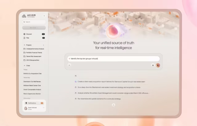
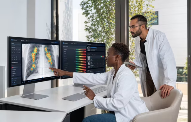
A detection nobody sees did not happen. Fuselab's cybersecurity UX design covers SOC consoles, risk reporting and identity platforms: triage queues an analyst can clear in a shift, evidence that sits beside the alert, and severity a CISO reads in one pass.
Security operations UX design expertise
Built for: SOC and SIEM · threat detection and NDR · threat intelligence · vulnerability management · GRC and compliance · identity and access
Every engagement starts with a role and data-access map: which operator sees which evidence, and what can never leave your environment. Those decisions shape the flow before the first wireframe.









How a cybersecurity UX design engagement runs
The roles come first. Who triages, who investigates, who tunes detections and who only reports upward decides what every screen defaults to, so a cybersecurity UX design engagement settles the role map in research and before any wireframe exists.

Security UX Research
- Operator Interviews
- Alert and Triage Audit
- Role and Permission Mapping
- Competitor Console Review

Threat and Role Mapping
- Data Access Boundaries
- Evidence and Audit Requirements
- Severity and Escalation Logic
- Section 508 and VPAT

Flow Design
- Triage Queue Architecture
- Investigation and Pivot Paths
- False-Positive Handling
- Escalation and Case Handoff

Interface Design
- Severity Visual Hierarchy
- Data Density Management
- Role-Based View Architecture
- Security Component Library
- Interactive Prototyping

Operator Usability Testing
- Task-Based Triage Scenarios
- Live Incident Simulation
- Redacted-Data Sessions
- Multi-Role Access Testing
- Alert Fatigue Observation

Design System Delivery
- Component Library
- Severity and State Annotations
- Developer Handoff Specs
- Design Token Documentation
Security interface design examples
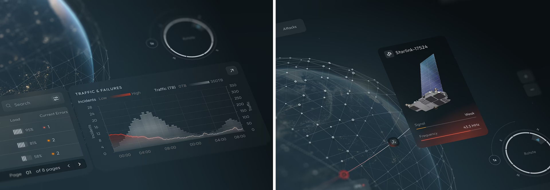
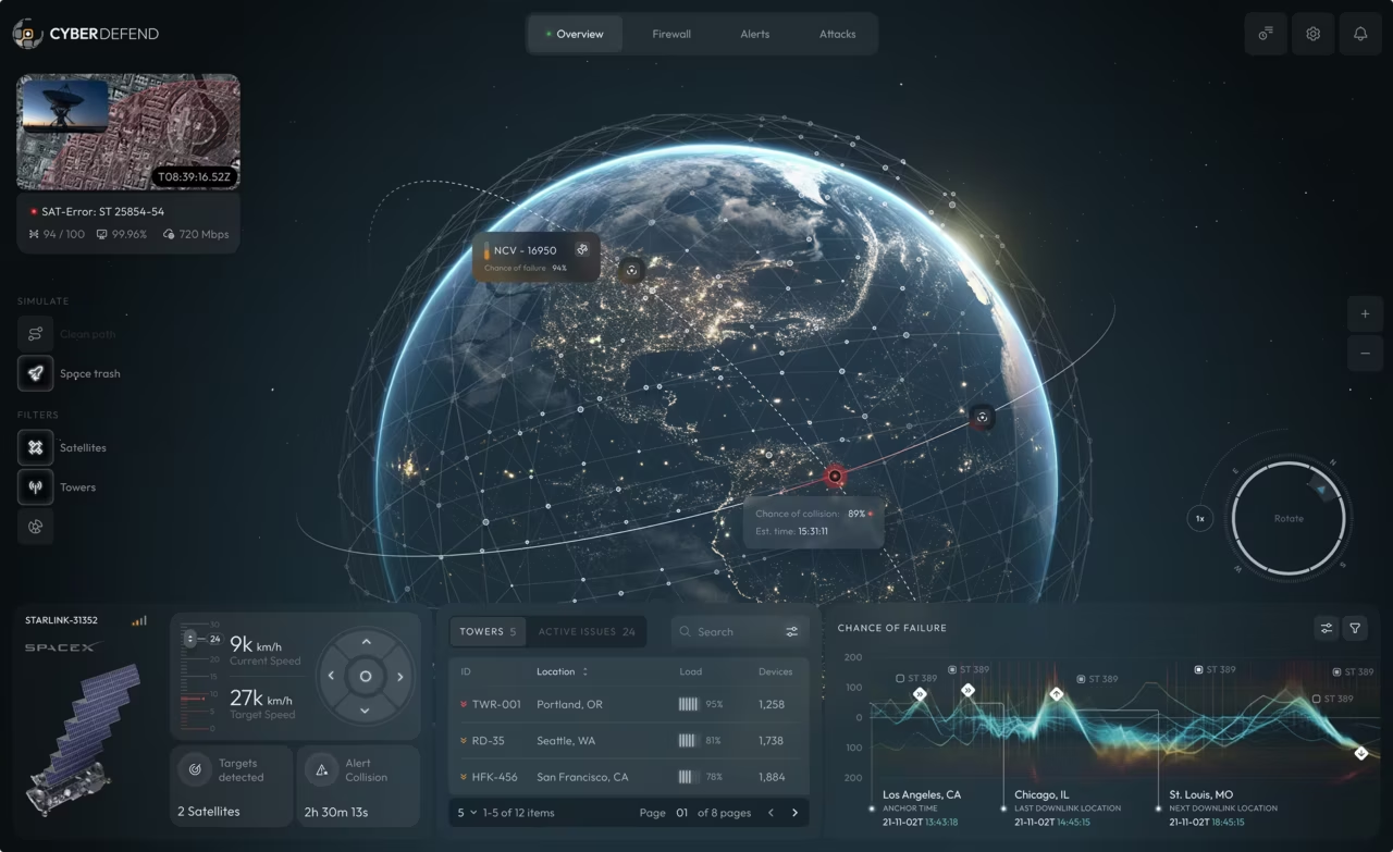
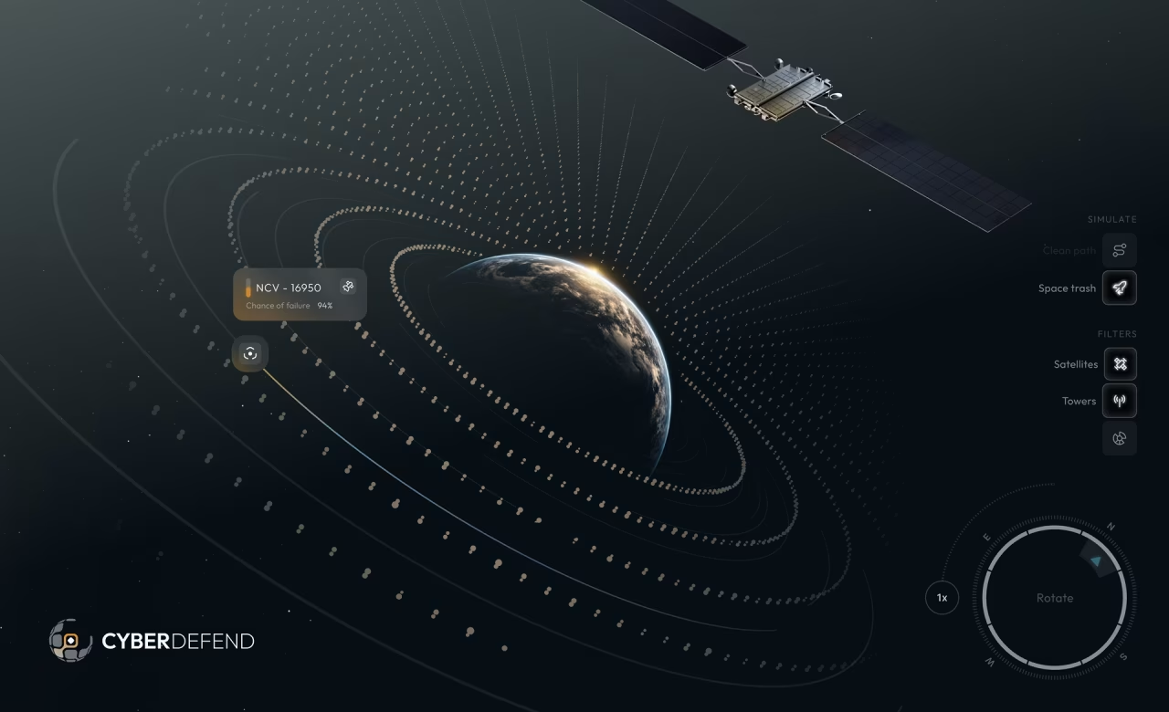
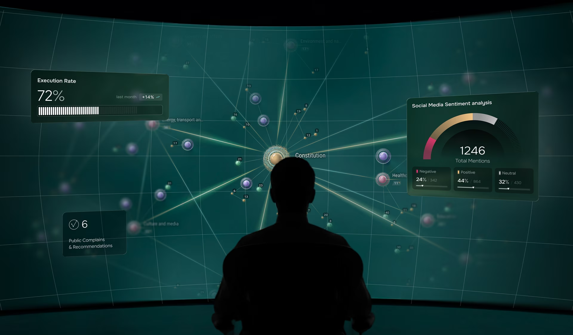
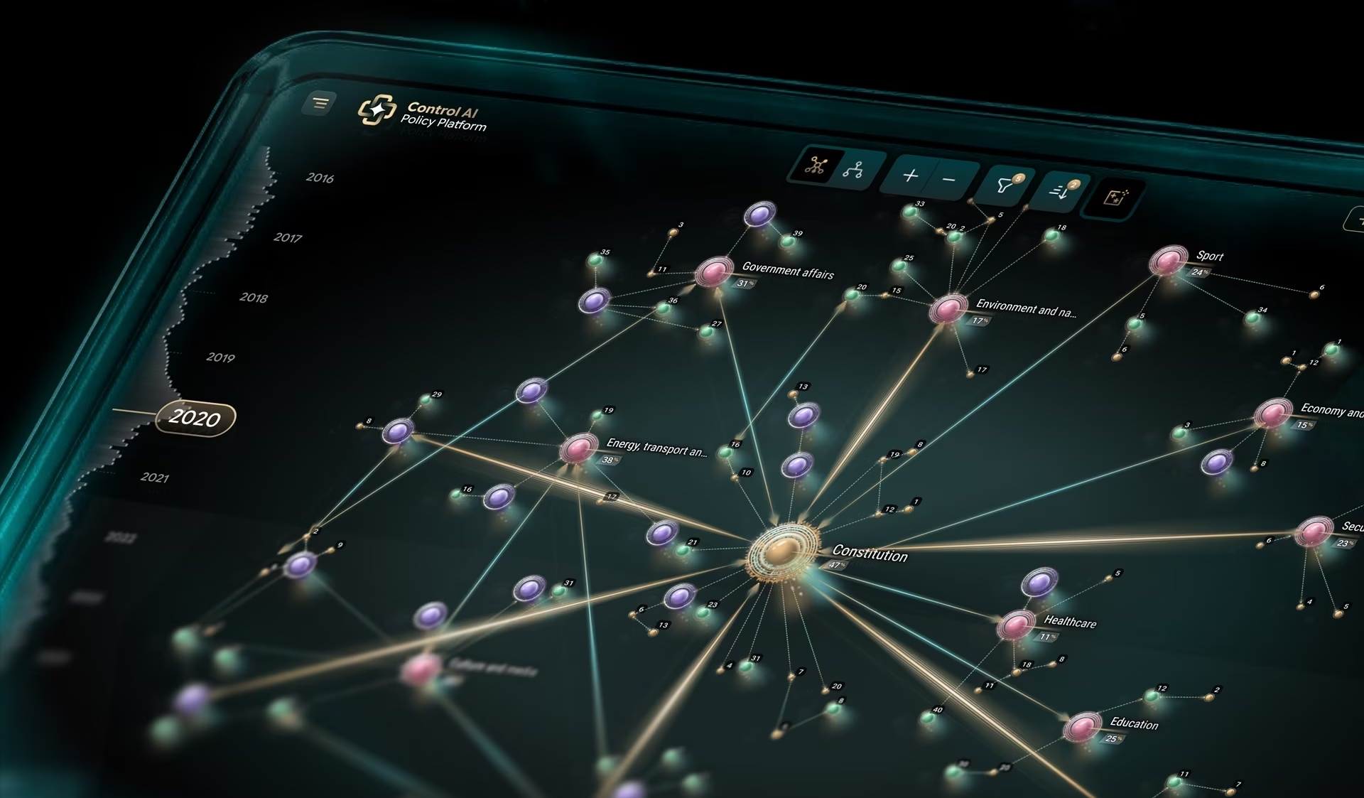
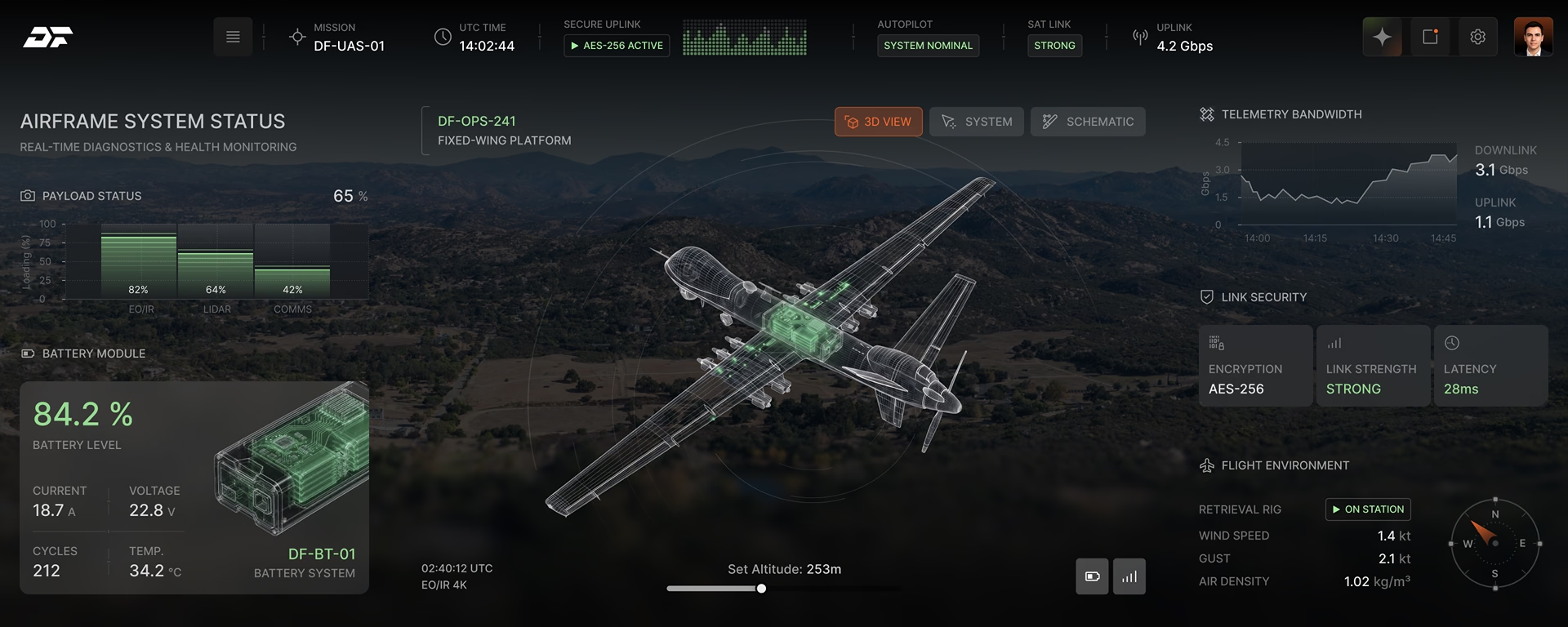
These are operator consoles: alert queues, investigation views, posture reporting. The design problem in this category is not density but ordering. An analyst opens the queue already behind, so the first screen has to say what to work on next rather than what happened in total.
Selected security work

Security platforms we design
Each one puts a different operator in front of a different decision. An analyst opens on a queue, a CISO on a trend, inside one product.
SOC and SIEM consoles
Alert queues, correlation views and the investigation surface behind them. Ranking is the whole problem. A SIEM dashboard sorted by timestamp gives an analyst a scroll rather than a shift plan, and the pivot from an alert into its supporting evidence is where most consoles lose the thread.
GRC, risk and compliance
Two audiences read the same numbers for opposite reasons. An auditor is looking for the evidence trail and an executive is looking for the exposure, so most GRC dashboard work goes wrong by serving the reviewer and leaving the decision maker guessing.
Vulnerability and exposure management
Scanners produce more critical findings than any team can clear, so a vulnerability management dashboard has to do the prioritising the scanner will not. Asset context next to the score is the whole job: CVSS 9.8 on an isolated test box and 9.8 on a production gateway are not the same morning.
Threat intelligence platforms
Indicators, actor profiles and feed reconciliation. The test for a threat intelligence dashboard is whether it can match an indicator to something the organisation actually runs, because intelligence that cannot be checked against the estate is a reading list.
Executive and CISO reporting
The board view fails in the opposite direction to the operations view. Showing every metric leaves an executive with no position to defend. A security posture dashboard is an editing problem: choose the three numbers that survive a board question and show the trend under each.
Identity and access management
Access review is the task nobody wants and everyone signs. The bulk certification screen decides whether an IAM dashboard works, because a reviewer facing four hundred entitlements will approve all of them unless the risky ones are impossible to miss.

Alert and Triage Design
In a security console the interface is part of the threat model. A screen that buries a real detection under four hundred low-severity events has not merely inconvenienced an analyst, it has produced the same outcome as a detection that never fired.
Operators judge a product by what it does on a bad day. A console that is clean at forty alerts and unusable at four thousand fails at the moment it is most needed. The queue gets designed at peak volume first and the empty state second, which is the reverse of how most teams work.

Designing Your Security Product Without Becoming a Risk
The first question a security vendor asks is what the design team will be allowed to see. Usually the answer is almost nothing, and that shapes the engagement rather than blocking it.
Research runs against redacted exports your team generates rather than a live console, because production detection data leaving your environment is a disclosure. Sessions are observed rather than recorded where policy requires, and synthetic alert sets replace real ones. Federal buyers add a layer: a product sold into government needs a VPAT and Section 508 conformance, and Fuselab has run that process on delivered federal work.

One Security Platform, Four Different Users
A triage analyst, a threat hunter, a security engineer and a CISO share one product for four different reasons. For the analyst it is a work queue: the next item, and enough evidence beside it to close or escalate without opening three other tools.
The hunter wants out of the queue, into raw telemetry with a query bar. Configuration, detection tuning and integration health belong to the engineer, the view most often bolted on last and designed least. The CISO needs posture and trend with no alert-level detail, because handing an executive the operational view turns a board conversation into a debugging session.

Threat Data Visualization
Security data arrives as volume, and volume is the hardest thing to chart honestly. A log spike that looks alarming on a linear axis and unremarkable on a logarithmic one is the same data telling two different stories, so the axis choice is an analytical decision.
Colour cannot carry severity by itself. Red, amber and green collapse for analysts with colour vision deficiency and on a dimmed night-shift display alike, so position and size carry the ranking instead. Default time range does the same work: a window that hides last week’s spike is an editorial choice. The same rules govern data visualization design in any dense product.

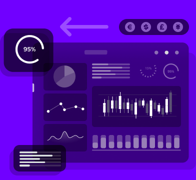
SOC Dashboard Design
What a security dashboard leaves out matters more than what it displays. Choosing each role’s default view is a permissions decision as much as a design one, because a screen that shows an analyst too much is also a screen that shows the wrong person too much.
Live data adds a problem static dashboards avoid. When a queue reorders while an analyst is reading it, the interface has to hold their place and mark what changed, because a silent re-sort loses the item they were about to open. Auto-refresh is a setting the analyst should own, not the product. More on how these decisions are made in dashboard design.
What Procurement Will Ask For
A security product sold into government or a regulated enterprise gets reviewed by people who never use it. Accessibility conformance, an accurate VPAT and a documented remediation path decide whether the product clears that review, and none of them can be added after visual design is signed off.
Section 508 scope is set at wireframe stage on every engagement. Focus order, screen-reader announcement behaviour for live-updating alerts, and colour-independent severity are specified before the visuals, because retrofitting them once a design is approved costs more than building them in.
Don't Listen to Us, Read What Our Clients Are Saying.
We know that trusting an outsider with your vision can be scary. This is why if you're not satisfied with us after the first two weeks, you can walk away owing us nothing.
"We went from prototype to usable software lightening fast, and our customer reviews have never been better."


"Their creativity and mastery of UX UI design has made our years of working together enjoyable and incredibly successful!"

"If you need to re-think your product and need some truly unique design talent , Fuselab Creative design team is your answer."

"We needed a nimble team of UI UX designers to work with our development team and they quickly became one of our most vital resources and far exceeded our expectations."


Related Services and Solutions


Frequently asked questions
What is cybersecurity UX design?
SOC and SIEM consoles, threat detection and intelligence platforms, vulnerability and GRC reporting, and identity review are the products cybersecurity UX design covers. The work sits inside the security product itself, not on the marketing site that sells it.
How much does cybersecurity UX design cost?
$25,000 is the starting point for a security platform engagement, at hourly rates of $100 to $149 as published on Clutch. The number moves on how many operator roles need distinct default views, whether detection tuning and configuration screens are in scope, and whether a full design system is included or screens only.
How long does a security platform redesign take?
10 to 20 weeks covers research through design system delivery. A single-role console with an existing design system sits at the short end, and multi-role platforms with investigation, configuration and reporting surfaces sit at the long end.
How is cybersecurity UX design different from enterprise SaaS UX?
Consequence and permission are the two real differences. A cluttered SaaS dashboard is an annoyance, while a security console that hides a real detection inside a day’s noise has produced the same outcome as a detection that never fired. What each role sees by default is also an access decision here, not a design preference.
Do you need access to our production threat data?
No. Research and testing run against redacted exports your team generates, or against synthetic alert sets built to match your volume and severity distribution. Production detection data does not need to leave your environment for the work to proceed.
Can you work with our existing dev team and SIEM integrations?
Fuselab works inside the client’s existing stack rather than around it. Design covers the screens your team will build, with component specs written against the framework already in use and integration states documented for each connected source. Where detection logic or third-party feeds constrain what an interface can show, those constraints get named in week one rather than discovered at handoff.
Contact Us
Fill out the form!