13
min read
13
min read
 Sep 26, 2026
Cybersecurity dashboard design: what to show first in 2026

A cybersecurity dashboard design is a single interface that pulls signals from detection, identity, endpoint, network, and vulnerability tools into one view of current activity and exposure. Most organizations already own every tool that feeds it. What they lack is one screen where those tools agree on what is happening, ordered by what each reader has to decide first.
What a cybersecurity dashboard is, and why one screen rarely serves everyone
In practice, a cybersecurity dashboard design works as a decision surface. It generates almost no data of its own. Its value lies in choosing which few of thousands of daily signals get a fixed position on screen, for a named reader, on a known cadence. Four jobs sit under the one name: monitoring, posture, investigation, and executive reporting.
Who operates it depends on the job that staff member is doing. Monitoring belongs to analysts on shift, posture to security engineering, investigation to threat hunters, and executive reporting to whoever reports upward. Oh, and worrying obsessively is reserved for the CEO. These categories are really different products running on different clocks. Collapsing them into one screen is the most common structural mistake we see in the category, and teams usually do it to save maintenance and design efforts.
Aggregation also introduces lag, and lag belongs in the design brief. A vulnerability scanner reporting daily and an endpoint agent streaming continuously cannot share one timestamp in the header. Each module needs its own freshness indicator. Without one, the reader assumes the slowest number on the screen is as current as the fastest, and acts on it.
Cybersecurity dashboard vs SOC dashboard, and where the SIEM console fits
A SOC dashboard is one kind of cybersecurity view: the operational one, read continuously by shift analysts and organized around the live alert queue. The broader category also covers posture views for engineering, investigation surfaces for threat hunters, and executive reporting. Cadence and reader separate these four views more reliably than the data they display, and vendors are often asked to stand in for all of them.
Cadence drives more layout decisions than audience does. A SOC dashboard is read all shift by people who did not choose to open it, so high density is acceptable and idle motion is expensive. Anything that animates without meaning pulls attention off the work. On a wall display, the whole room pays that cost at the same moment.
An investigation surface works the opposite way. The questions change every session, so it should favor query flexibility, saved views, and fast filtering over fixed metric tiles. Designing it for glanceability is mostly wasted effort, because nobody sits and watches a hunting surface waiting for it to change.
The SIEM or XDR console is the case teams argue about. For many organizations it is the only dashboard they have, and it can serve. Its information architecture is inherited rather than designed, though. It follows the vendor’s data model and licensing boundaries, so it shows what was indexed rather than what the organization treats as material.
Teams default to the console because anything purpose-built becomes one more thing to maintain. Splunk’s State of Security 2025, a survey of 2,058 security leaders run with Oxford Economics in late 2024, found 78 percent describe their security tools as disconnected and dispersed. Most were bought by different people at different times as the organization evolved, with no unified approach to security – sound familiar? The same survey found 46 percent spend more time maintaining tools than defending the organization. Any new dashboard has to justify its upkeep against that second number.
The operational and executive split is the one most often collapsed. A useful test is to name the decision the reader makes within thirty seconds of opening the screen. If it is what to work next, the view is operational. If it is what to fund or escalate, it is executive. If no decision exists at all, the request is probably for a report.
Who opens the dashboard, and what each role needs first
Role decides what goes first on a cybersecurity dashboard more reliably than industry or company size. A triage analyst opens it to find what to work on next. A security engineer opens it to find what is broken in the detection stack, and a CISO opens it to find what must be reported or funded. Each question calls for a different first module and a different density.
Level one analysts need a ranked queue with enough context inline to keep or close an alert without opening a second tool. That context is the source, the affected asset, the rule, and whether similar alerts were dismissed recently. How the ranking itself should work is a separate design problem, covered in our guide to alert triage. On the dashboard, the queue is one module among several.
A security engineer arrives with a system question. Which detections fire too often, which data source stopped reporting, which control has drifted since last month? This reader benefits from trend lines and rule-level breakdowns. They also tolerate far more density than a triage analyst, because they are diagnosing infrastructure while nothing is on fire.
For a CISO, the first question is often an obligation. Under the SEC’s cybersecurity disclosure rules, a US-listed company generally files an Item 1.05 Form 8-K within four business days of determining that an incident is material. The rules prescribe no interface. The executive view still has to support a materiality judgment under time pressure, which is a different job from counting incidents.
Small teams reverse the logic. Where eight or ten people cover every role, separate views become overhead that nobody maintains. One well-ordered screen with role-based sections serves them better than three products that slowly drift apart. No published research sets that cut-off. It is a judgment about team structure, and it moves with how clearly the roles are divided.
How to lay out the first screen
A cybersecurity dashboard layout works best as four bands in fixed order: whether the data can be trusted, what changed since the last look, what to work next, and historical trend. Keeping the screen under about eight fixed modules protects that order, because a glance ranks only a few things and reads everything past them as equal weight.
Environment state comes first: detection coverage, ingestion health, stale connectors, and muted rules. It leads because nothing below it is worth reading if it is failing. Most products bury this information in a settings screen. Putting it at the top tells every reader, before they look at a single alert, whether the picture in front of them is complete.
Below it sit exceptions, meaning what changed since the reader last looked, and then the work itself, with owner, asset, severity, exposure, and age carried inline. History goes last. Trend charts are legitimate, but they answer questions nobody asks in the first minute, so they belong below the fold.
That eight-module ceiling is practitioner judgment from our own projects rather than a measured threshold, and it loosens on wide operations displays. What does not loosen is how modules relate. If the open critical count reads twelve, clicking it should filter the queue below. A layout grouped by data source, when readers think by decision, leaves them doing the join in their heads.
Many SOCs now place a model in front of the queue, and that changes the top of the screen. The 2026 SANS AI Survey, drawn from 536 practitioners and 57 senior security leaders, found 63 percent of practitioners report significant AI shortcomings in threat detection and response, up from 45 percent in 2025. When a model proposes dispositions, the evidence behind each proposal needs the prime position.
On the dashboard, that means two things. Confidence appears as a band with its inputs visible, because a bare percentage invites the reader to stop checking. Every machine-made disposition also leaves a trail someone can reconstruct months later. How an analyst reviews and overrides an individual model decision belongs to triage design, and the dashboard should link out to it.
Encoding severity without confusing it with risk
Severity should be encoded twice, with color and a text label, and kept separate from priority. The CVSS score most security data arrives with describes how bad a flaw is in general. Priority also depends on how critical the affected asset is and whether the flaw is being exploited, and position on the screen should carry that combined judgment.
Pre-scored data is an advantage worth using. The CVSS v4.0 specification maintained by FIRST produces a zero-to-ten score that maps onto five qualitative bands, from none to critical. Those bands are already ordinal, stable across vendors, and familiar to every analyst reading the screen. Version 4.0 also replaced the old Temporal group with a Threat group that captures exploit maturity.
The trap is sorting by that score alone. The National Vulnerability Database states that CVSS measures severity, not risk. A critical flaw in an internal-only system can wait behind a high-rated one on the VPN gateway. Most organizations also lack a maintained asset-criticality field, so a screen that ranks by exposure depends on data nobody owns. Showing that gap beats hiding it behind a default.
Color alone fails for three separate reasons. Hue is not ordinal to the eye, it washes out in a bright operations room, and it excludes readers with color vision deficiency. Wall displays add distance, so type needs sizing for the back of the room. Critical state changes also need an accessible announcement, since animation carries nothing to a screen reader.
Metrics that earn a place on the screen
A metric earns a place on a cybersecurity metrics dashboard when it changes a decision. Detection coverage against a threat framework changes what engineering builds next. Alert volume by rule changes what gets tuned. Total events processed changes nothing, and it usually appears only because it is easy to compute.
Mean time to detect and mean time to respond anchor nearly every cybersecurity KPI dashboard, and both average a long-tailed distribution. A median shown with a 95th percentile describes the same incidents far more honestly. Reporting the mean alone lets one contained incident hide a month of slow ones, inverting what the metric was meant to show.
Definitions matter as much as the math. Detection can start at first malicious activity, first telemetry, or first alert, and the three can sit days apart. Response is looser still, standing in for acknowledgment, containment, and recovery. Naming the lifecycle event in the label, such as time to contain instead of response time, stops teams from comparing figures that measure different things.
A cybersecurity dashboard for a board of directors serves a different reader entirely. Directors have minutes, little vocabulary for detection engineering, and a duty of oversight. The Govern function in NIST’s Cybersecurity Framework 2.0 is a sensible scaffold, because it names outcomes for oversight, roles, and policy. Borrow its vocabulary for the risk conversation, since it was never designed as a reporting template.
Tool count looks like an activity metric but passes the decision test, because it drives consolidation and funding choices. IBM Institute for Business Value research, run with Palo Alto Networks, puts the average organization at 83 security products from 29 vendors. On an executive view, that benchmark puts the integration cost in front of the people who approve the budget.
Cybersecurity dashboard examples: three types and what each teaches
Most published cybersecurity dashboard examples fall into three types: vendor demo screens, working operational consoles, and board reporting packs. Demo screens are built to impress in a sales meeting, so they overweight maps and motion. Working consoles and board packs are rarely published, which is why the examples most people study are the least useful ones.
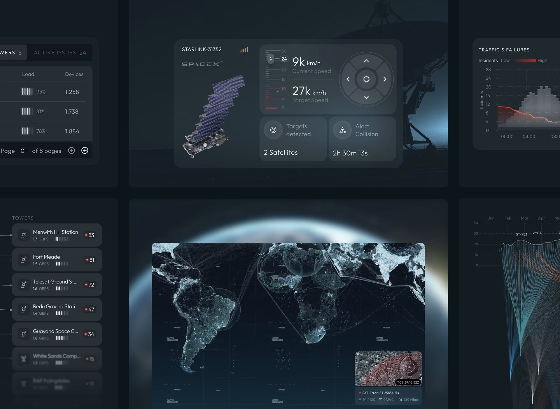
The CyberDefend security operations dashboard is an operational console we designed for satellite infrastructure. Operators had to watch the health and traffic of an entire satellite constellation and, in the same view, inspect one satellite in detail. The hard part was keeping that overview readable while a drill-down stayed open, because the operator needed both at once and switching screens lost context.
One decision from that project applies well beyond satellites. An anomaly is only useful next to the activity that produced it, so each flagged event appears with the logs, timing, and baseline behavior it departs from. Irregular movement there can mean a collision risk or an attack on control systems. The interface presents the evidence and leaves the conclusion to the operator.
Vendor demo screens are still worth studying for one thing: they show what a product can render, which sets the ceiling for any configuration. Read them for component patterns such as severity badges, drill-down behavior, and filter placement, and ignore the layouts. A demo has no shift pattern, no stale connectors, and no analyst who has to live with it for eight hours.
Board packs are the rarest published example and the most instructive when you find one. The good ones show three or four trends against a stated risk appetite, name the obligations in play, and explain every change in plain language. The weak ones paste the SOC view into a slide, which gives directors detail they cannot act on and hides the trend they need.
Five ways security dashboards fail
Security dashboards most often fail through content decisions rather than visual ones. Although, most agencies blame the designers because no one wants to take the blame. The five that recur are a decorative threat map, severity carried by color alone, silence mistaken for safety, volume standing in for outcome, and one default view for every role. Redesigns that change only the surface leave all five in place, and the same complaints return after the refresh.
The decorative threat map. A globe with arcs between countries takes prime space and supports no decision, because source geography rarely changes the response. It survives because it demos well. If one screen must serve both demonstrations and operations, build two screens and let each do one job.
Severity carried by color alone. Hue loses its ordering whenever the screen is projected, photographed, or exported into a report, and it never had one for readers with color vision deficiency. A text label and a consistent position cost almost nothing and let the hierarchy survive once it leaves the browser.
Silence mistaken for safety. No failure on this lists cost more. A quiet screen can mean nothing is happening, or that a connector stopped sending data, or that someone muted a noisy rule in March and never revisited it. Unless suppression is visible, showing who muted what and when, the reader cannot tell those three states apart.
Making suppression visible costs screen space and creates upkeep that busy teams let decay. In regulated environments it is worth both, because an auditor will eventually ask why an alert class went unreviewed for a quarter. Splunk’s survey found 55 percent of teams dealing with too many false positives, and quiet muting is the usual response to that pressure.
Volume standing in for outcome. Events ingested, alerts generated, and tools deployed are easy to chart, and every one of them describes activity. They drift upward whether or not the program is improving, which makes them comfortable to present and useless for deciding anything.
One default view for every role. What starts as a sensible compromise. It ends with each role customizing the screen into something private, and the shared picture the product was meant to create disappears. Role-based defaults built on shared metric definitions keep both personalization and common ground.
Before you brief the design
Before commissioning a cybersecurity dashboard, write down each reader’s first decision, the cadence they read on, and the module that answers it. That short list settles most layout arguments before design starts and exposes the views nobody needs. We cover the broader questions around security operations products in our work on cybersecurity UX design.
Frequently asked questions
What is a cybersecurity dashboard?
A cybersecurity dashboard is the screen a security team reads to decide what to act on, built from data its existing tools already collect. Alerting, identity events, endpoint and network telemetry, and vulnerability status are the usual inputs. Its defining job is selection: deciding which few signals hold a fixed, visible position for a named reader.
What data sources feed a cybersecurity dashboard?
Security dashboards typically draw on endpoint detection agents, identity providers, firewalls and network sensors, cloud posture tools, vulnerability scanners, email security, and a SIEM that aggregates several of these. Threat intelligence and asset inventory usually arrive as enrichment on top. Each source reports on its own cadence, so every module needs its own freshness indicator.
What is the difference between a cybersecurity dashboard and a SOC dashboard?
A SOC dashboard is the operational subset, built for shift analysts and organized around the live alert queue, ownership, and pace. The broader category also includes posture, investigation, and executive views, each read on its own cadence. The SOC view is a work surface, while the others describe the state of the environment and can carry less density.
How many dashboards does a security team need?
Most security teams need three standing views: monitoring for the queue, posture for detection coverage and data health, and executive reporting. Investigation works better as an on-demand surface than as a fixed dashboard. Teams of about ten people or fewer usually do better with one screen divided by role.
Should a cybersecurity dashboard be built in-house or bought?
Buying a vendor dashboard makes sense when the workflow fits inside one vendor’s ecosystem and its schema can express what your roles need. Building makes sense when the workflow spans vendors, when your definition of asset criticality differs from theirs, or when a role’s decisions have no home in existing products. The deciding question is whether the gap is configuration or structure.
Is a SIEM console the same as a cybersecurity dashboard?
A SIEM console can serve as a dashboard, and for many teams it is the only one. Its structure follows the vendor’s data model, indexing, and licensing, so it shows what was ingested there. A purpose-built view is organized around a role’s decisions and can span several vendors at once.
Who should own the cybersecurity dashboard inside a security team?
Dashboard ownership should sit with whoever is accountable for the decisions it supports: security operations leadership for operational views and the CISO’s office for governance views. Detection engineering owns rule quality. Handing ownership to a separate BI team tends to fail because metric definitions drift away from their operational meaning.