Dashboard design system: components for data-heavy products
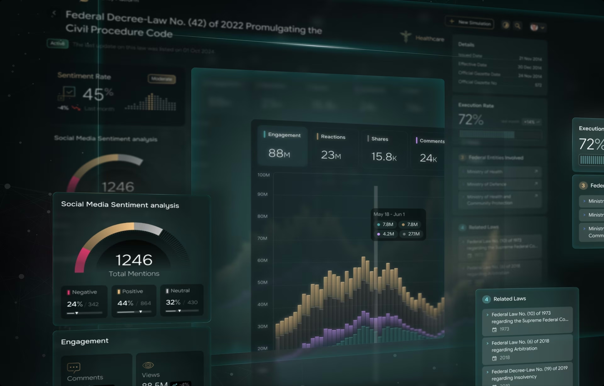
A dashboard design system is a layer of reusable components, tokens, and interaction rules built specifically for data-heavy products: chart color palettes, table behaviors, filter patterns, and density modes that a general system never defines. The gap usually surfaces after launch, when twenty charts and three large tables built by different departments stop looking like one product, and every screen teaches users a new convention.
What is a dashboard design system?
The definition is narrow on purpose: a dashboard design system covers how data is read, through categorical and sequential chart palettes, table behaviors like pinned columns and sticky headers, filter patterns, KPI cards, and comfortable and compact density modes. General systems define the chrome around the data; this layer defines the data surface itself and ultimately saves developers hours of back-and-forth with designers trying to understand the intent of design elements.
That gap has a lineage: design systems grew out of brand style guides, and they inherited a brand-first scope. A typical system specifies how a button looks and how a form validates, but says nothing about how eight categories stay distinguishable on a stacked bar chart or when a table should switch to compact spacing. Each team answers those questions alone, and the answers drift.
The scope covers the dashboard components that analytical products rely on every day:
- Chart color systems with categorical, sequential, and diverging palettes
- Interactive legends that filter or highlight series consistently
- Large data tables with sorting, pinning, and inline filtering
- Cross-dashboard filter behavior, so a date range means the same thing on every screen
- Drill-down interactions from summary views to detail records
- KPI cards and status indicators with thresholds defined once
- Empty, loading, error, and partial-data states for every component
The list looks long, but most of it already exists in any mature data product. It just lives in five different heads instead of one system, and once the rules are shared, users stop relearning conventions every time they switch screens.
Dashboard design system vs. general design system vs. UI kit
A dashboard UI kit is a set of visual assets, chart styles, icons, and a type scale, with no defined behavior. A general design system governs how components behave product-wide. The dashboard-specific layer goes deeper, specifying how charts, tables, and dense analytical screens work, not just how they look.
If your product is mostly forms and settings screens, a general design system covers you. If the core screen is a dashboard your users work in for hours, the generic layer runs out of answers quickly. Analytical work raises questions no brand guide addresses:
- How many colors can represent categories before users stop telling them apart?
- How should missing data appear across every chart?
- When should tables switch from comfortable spacing to compact density?
- How should pinned columns behave on smaller screens?
- Which status colors still work for people with color vision deficiencies?
These questions rarely come up on marketing sites or consumer apps, but they are daily work for analytics teams. A product that answers them ad hoc answers them differently on every screen, and a design system for data products earns its keep in exactly these details.
When you need the dashboard layer, and when you don’t
You need a dashboard design system when analytical screens are a primary surface: several dashboards, multiple teams shipping charts, or an embedded analytics product. You do not need one when data appears on a handful of screens; a well-documented chart section inside the general system covers that case at a fraction of the cost.
The signals that the dedicated layer will pay for itself:
- Multiple teams ship charts independently, and the palettes have already drifted
- The same data appears in different components with different conventions on different screens
- An embedded or white-label analytics view exists or is on the roadmap
- Accessibility requirements apply, Section 508 or WCAG, and tables must pass audits
- Designers re-specify charts per project instead of pulling from a shared library
Skip the dedicated layer when the product has one or two dashboards owned by a single team, when charts are static reporting rather than interactive analysis, or when the general design system is itself less than a year old. Sequencing matters here: a dashboard layer built on unstable foundations inherits every wobble underneath it.
Core building blocks: chart tokens, table components, and density modes
Three component families do most of the work in a dashboard design system: chart tokens that govern how data gets color and emphasis, reusable table components that standardize how records are sorted and compared, and density modes that let the same screen serve a 34-inch analyst monitor and an embedded widget.
Chart tokens extend the token stack with a vocabulary for data: categorical palettes for distinct groups, sequential palettes for values that rise or fall, diverging palettes for movement around a midpoint, and states for tooltips, hover, selection, and missing data. IBM’s Carbon Design System publishes its data visualization palettes with the color sequence ordered so neighboring categories stay distinguishable, a useful benchmark for how specific these rules need to be.
One distinction matters in practice: chart tokens are not semantic tokens. A semantic token maps a value to product meaning: warning, positive, disabled. A chart token maps a value to a data role: series three, midpoint, missing. The same red can mean an error in a form and a downward trend in a chart, and only separate token layers keep those meanings from colliding.
The practical rules that make chart tokens hold up in production:
- Cap categorical palettes before they blur. Past roughly eight series, adjacent colors stop being reliably distinguishable; group the tail into an “other” category, and accept the tradeoff: “other” changes composition between periods, so its tooltip should list what is inside.
- Define the all-series-off state for interactive legends. If users can toggle every series away, the chart needs an explicit empty state and a one-click reset; charts that simply go blank generate support tickets.
- Never encode meaning in hue alone. Pair color with a label, shape, or pattern so the chart survives grayscale printing and color vision deficiency.
- Reserve diverging palettes for a true midpoint. Above-and-below-target reads correctly; an arbitrary two-color split does not.
- Give missing data its own treatment. A neutral pattern or a gap, never a zero, because a zero is data.
Table components deserve the same rigor. In the enterprise products we audit, people spend more of the working day in tables than in charts: sorting records, comparing values, building exports, and drilling into detail. A mature component library standardizes a small set of behaviors first, because these are the ones every screen repeats:
- Sticky headers and pinned key columns, with a priority order for which pins survive narrow viewports, decided by design rather than by the breakpoint
- Multi-column sorting with visible sort state, announced to assistive technology
- Column-level inline filtering that stays consistent with global filters
- Row selection and expandable rows with keyboard equivalents
- Tabular numerals and shared decimal rules, so columns of figures align and compare cleanly
Density modes complete the trio: comfortable spacing for readability and touch targets, compact spacing so experienced users scan more rows at once. They are the layer public systems document least, which is why they get their own section below rather than a paragraph here.
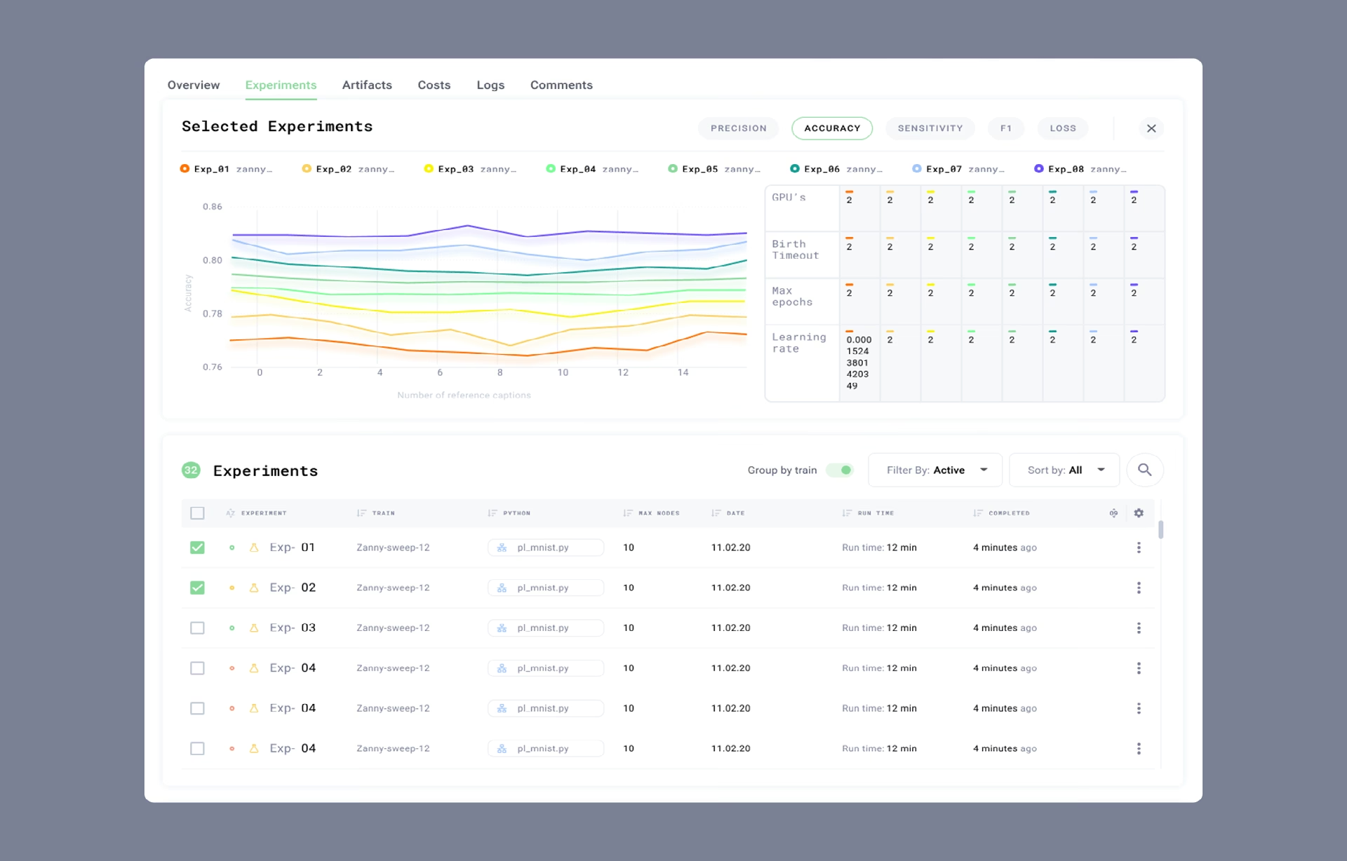
AI dashboards stretch this layer further. Model-driven analytics needs component states that classic libraries never define: streaming outputs that arrive in fragments, confidence indicators attached to predictions, and annotations that flag anomalies a model surfaced. In our Grid AI work, experiment-tracking screens needed to be loaded and uncertainty states specified as carefully as any color token.
Empty, loading, error, and partial-data states
Every chart and table needs four defined states beyond the happy path: empty, loading, error, and partial data. Systems that specify all four prevent the failures users report most, blank panels that look broken, layouts that jump when data arrives, and stale numbers presented as current.
- Empty states explain and direct. Say why there is no data, no results for this filter versus nothing tracked yet, and offer the next action.
- Loading states hold the layout. Skeletons shaped like the final chart or table prevent the content jump that makes dashboards feel unstable. Past a few seconds, switch to a progress message; a skeleton that shimmers too long reads as a hang.
- Error states name the failure. “Data source unavailable since 09:40” beats a generic apology, and a retry control beats a dead end. For global teams, make the timestamp relative or timezone-explicit, because 09:40 means five different things across five offices.
- Partial data declares itself. When two of five sources have loaded, label what is missing; a chart that silently renders incomplete data is worse than one that fails loudly.
Real-time products add a fifth state: staleness. A last-updated timestamp on every panel costs almost nothing to standardize, and it answers the question operations users ask before any other, which is whether the number on the screen can be trusted right now.

Density and context: large monitors, laptops, embedded views, and mobile
Density modes let the same components serve four contexts: a 34-inch analyst monitor, a laptop, an analytics view embedded in another product, and a phone. Comfortable mode favors readability and touch targets; compact mode trades whitespace for visible rows. Defining both as tokens from the start makes context-switching a configuration, not a redesign.
- Large monitors earn multi-column layouts and compact tables; analysts who live in the product will choose density over whitespace almost every time.
- Laptops are the sensible default for comfortable mode and the viewport to design first.
- Embedded views get one job per widget: inherit the host product’s spacing scale where possible and drop secondary chrome.
- Mobile is summary-first: KPIs and alerts on top, tables collapsed to key columns, and full detail deferred to larger screens rather than crammed in.
Compact mode carries a tradeoff worth naming: it assumes a pointer. On touch screens, compact rows fall below reliable target sizes, so the mobile context maps to comfortable density even when users ask for more rows. Density is a per-context decision, not a global preference toggle, and the system should encode that.
Public systems are thin here, which is why teams end up inventing this layer under deadline. IBM’s Carbon is a rare exception, shipping its data table in five row heights, from a 24-pixel extra-small to a 64-pixel extra-large; few systems extend the same idea to charts and KPI cards. Building comfortable and compact together is consistently cheaper than retrofitting either one after components have spread.
Visual hierarchy on dense screens
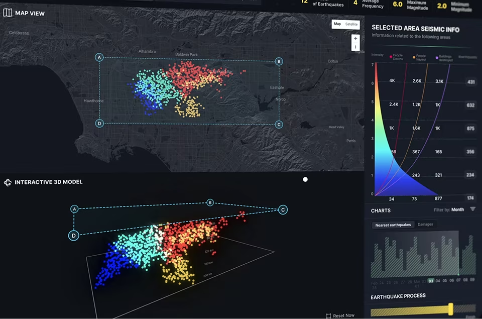
Data density is a hierarchy problem before it is a spacing problem. People process color, size, and position before they read a single label, a mechanism the Interaction Design Foundation documents in its work on preattentive visual properties. A dashboard design system either supports that instinct or fights it, and the components decide which.
When every chart is colorful, every KPI is large, and every alert demands attention, users stop noticing any of them. The job of the system is to ration emphasis: the most important metric gets size and color, related information gets grouped, and everything else gets quieter. Emphasis that is spent everywhere is spent nowhere.
Progressive disclosure keeps dense screens legible without hiding information. The main view answers the most common question with a summary metric; the breakdown lives one click away in an expandable row, a drill-down chart, or a contextual panel. Hover states carry secondary metrics that would otherwise crowd the layout. The top-level screen stays scannable while nothing gets deleted.
Readable KPIs follow rules worth encoding as tokens rather than taste:
- One number per card, paired with the comparison that gives it meaning: versus target, versus last period, or a trend sparkline
- Formatting defined once: units, decimal places, and abbreviation thresholds (1.2M, not 1,234,567)
- Color mapped to meaning, not decoration: threshold colors set per metric and used for nothing else
A well-built system lets a screen carry more information than it appears to carry, because the visual hierarchy does the sorting instead of the user. That is the test worth running on any dense screen: remove the labels and see whether color, size, and position still tell you where to look first.
Accessibility in charts and tables
Accessible dashboards are a component property, not an audit deliverable. Charts need non-color encoding and sufficient contrast for graphical elements; tables need keyboard operation and announced sort and selection state. When these rules live in the design system, every new dashboard inherits compliance instead of re-earning it.
For charts, WCAG’s non-text contrast criterion requires a 3:1 contrast ratio against adjacent colors for the graphical parts users must read: chart lines, bar fills, and legend markers. Pair every color signal with a second channel, a label, shape, or pattern, and the chart also survives grayscale printing and color vision deficiency.
Tables have their own benchmark: the W3C’s WAI-ARIA Authoring Practices define the pattern for a keyboard-operable data grid, down to how sort state and row selection are announced to screen readers. Few of the homegrown table components we audit reference it, and the gap surfaces the first time someone tabs into the table or a compliance audit arrives.
Retrofitting keyboard support into a shipped table component is one of the more expensive fixes in dashboard work, which is why it belongs in the component specification rather than the punch list. For government and regulated products, Section 508 makes this sequencing a contractual matter rather than a preference.
Common dashboard design system mistakes
Four dashboard design system common mistakes we see from inexperienced agencies claiming to know what they are doing: brand colors reused as chart palettes, a single density retrofitted later, accessibility deferred to the audit, and component drift that nobody owns. Each starts as a reasonable local decision, which is exactly why nobody stops it early.
- Brand tokens copied straight onto charts. Primary blue and secondary red were chosen for buttons and links, not to separate eight categories on a stacked bar chart. Reused blindly, they produce charts where several series are indistinguishable, and the fix lands months later as a manual recolor across every dashboard in production.
- One density, discovered too late. A dashboard that looks composed on a designer’s monitor becomes unusable in an embedded analytics view or on a laptop screen. Teams without predefined densities respond by shrinking fonts and squeezing charts, which trades one usability problem for several smaller ones.
- Accessibility deferred to the audit. Charts and tables built without contrast and keyboard rules pass design review, ship, spread, and then fail compliance all at once. The rework multiplies by the number of dashboards that adopted the component, which is why the rules belong in the specification, not the checklist.
- Nobody owns the standard. One department needs a waterfall chart that does not exist, another builds a custom table, a third invents its own filter pattern to hit a release date. None of these is wrong alone; together they produce a patchwork of components that look alike and behave differently, like a city growing without an urban plan.
How to build a dashboard design system, step by step
Building a dashboard design system works best as a sequence: audit the charts and tables already in the product, define primitive, semantic, and chart-specific token layers, build the everyday components first, design comfortable and compact densities together, and validate everything against a real screen with real data. The order matters more than the tooling.
- Audit what already exists. Before designing anything new, inventory the charts and tables in production. The audit alone usually surfaces duplicate date-range pickers, unrelated palettes, and competing filter patterns, and that list is the standardization roadmap ranked by user pain.
- Define the token layers. Primitive tokens hold raw color and spacing values, semantic tokens map those values to meaning like warning or positive, and a chart-specific layer sits on top with categorical, sequential, and diverging series. Layering pays off at change time: updating a token propagates everywhere, instead of hand-editing dozens of dashboards.
- Build the everyday components first. KPI cards, data tables, filters, date pickers, and the line, bar, and pie chart components that appear on nearly every screen come before anything exotic. Once these hold up, specialized visualizations inherit their tokens and patterns and cost a fraction of the effort to add.
- Design both densities from day one. Waiting for users to request a compact version guarantees it will be built under pressure and bolted on. Designing comfortable and compact layouts together forces every component to scale deliberately, and the mobile and embedded contexts stop being afterthoughts.
- Validate on a real screen, not a component-library page. A chart token set that looks balanced in a style guide can still fail on an actual dashboard with realistic data and real workflows. Test complete tasks with the people who run them, because components that pass in isolation regularly fail in combination.
Fiserv Small Business Index, tracking sectoral and regional spending trends across the US. Fuselab Creative, 2026. We ran this sequence on the Fiserv Small Business Index, where the table and density layer had to hold up across financial screens used by teams with very different tolerances for information density. The lesson that stuck: components tested in real workflows behave as a system, and components tested on a specimen page behave as a collection.
Whether this layer belongs inside an existing component library or stands as a separate design system build is a scoping decision worth settling before any tokens exist. The step-one audit usually answers it within a week: mostly divergent chart and table patterns means the layer earns standalone treatment, while a handful of gaps means extending what is already there.
Frequently asked questions
What is a dashboard design system?
A dashboard design system is a set of reusable standards, components, and interaction patterns built specifically for data-heavy products. It extends a general design system with chart tokens, table components, filters, and density modes so dashboards built by different teams read as one product.
What is the difference between chart tokens and semantic tokens?
Chart tokens assign design values to data roles: categorical series, sequential scales, diverging midpoints, and missing-data treatments. Semantic tokens assign values to product meaning such as warning, positive, or disabled. Keeping the layers separate stops the same color from silently meaning “error” in a form and “series three” in a chart.
What is the difference between a dashboard UI kit and a design system for data products?
A dashboard UI kit is a static library of visual assets: chart styles, icons, colors, and a type scale, with no defined behavior. The design system layer adds behavior, specifying how tables sort, how filters interact across views, how charts handle missing data, and how components adapt between densities.
Should we build a general design system or the dashboard layer first?
Build the general design system first: it establishes typography, color, spacing, and core components. The dashboard layer then extends those foundations with specialized chart, table, and density patterns, which is faster and cheaper than defining analytical components against a moving baseline.
How many colors can a categorical chart palette use before it stops working?
Categorical palettes hold up to roughly eight series before adjacent colors stop being reliably distinguishable, especially for users with color vision deficiencies. Beyond that point, group smaller series into an “other” category, or switch to a chart form that separates series by position rather than by hue.
How long does it take to build a dashboard design system?
An initial library covering the most common charts, tables, filters, and layout patterns usually takes 8 to 14 weeks, depending on how many chart types and table variants already exist in production. Larger enterprise systems keep evolving after that as new analytical workflows appear.
What should I look for in a design system partner for data-heavy products?
A design system partner for data-heavy products should show shipped enterprise dashboards and named clients, not consumer portfolios restyled as analytics work. Look for chart and table component depth, documented accessibility practice, token architecture experience, and systems validated on real dashboards rather than component-library pages.
Teams that treat data components as products in their own right see the difference in every subsequent release. Start with the audit, define the token layers, and validate on real screens; the sequence holds whether the work happens in-house or in a dashboard design engagement. The interfaces people stare at all day repay the discipline first.