Data visualization best practices: charts and tables people read
Charts and tables work when a reader can state the message before analyzing the numbers, and data visualization best practices are the decisions that get them there: matching the chart family to the shape of the data, building a visual hierarchy around the main insight, and cutting whatever competes with it. Most published advice on the subject stops at palette and chart-library choices, which is why so many technically correct dashboards still leave readers asking what they’re looking at.
Legibility and accuracy are different tests
A chart is accurate when the numbers are right, which a data check confirms. It is legible when a first-time reader can state the main takeaway without help, which only a person can confirm. Dashboards that fail in production almost always passed the first check and were never given the second.
Nielsen Norman Group’s guidance on dashboard visualizations is blunt about the hierarchy: length and 2D position communicate quantitative information fastest, because human vision processes them preattentively, before conscious attention engages. That is a ranking of encodings, not a style preference, and a design that puts its most important comparison in a weaker channel is working against the reader.
The same research draws a line almost everybody skips. Area is not preattentive. Nielsen Norman Group’s analysis of treemaps concludes they are unsuited to tasks involving precise comparison for exactly that reason. That makes treemaps and bubble charts a weak choice any time the reader needs to judge values, not just getting a sense of a rough scale.
How to choose the right chart for the data
Chart selection follows from two questions: is the data categorical or continuous, and what is the reader trying to find out, whether that is a comparison, a distribution, a relationship, a composition, or a change over time. Answer both before opening a chart library, and the chart design question narrows to a short list.
Working backward from the reader’s question rather than forward from the dataset settles most selection arguments fast. The mapping below covers the cases that come up in practice, and it’s worth agreeing on before anyone opens a charting tool and starts defending a rendering they already like.
Three of those mappings need no argument. Ranking discrete categories takes a bar chart, because length is the encoding readers judge most accurately. Change across a continuous time axis takes a line chart. Testing whether two variables move together takes a scatter plot, where clustering and outliers are visible without any calculation.
Distribution is where teams reach for the wrong tool most often. Averages hide everything that matters about spread, so a histogram or box plot earns its place whenever the question involves variation, clustering, or outliers instead of a headline number.
Composition is the mapping worth arguing about, because the familiar answer is often the weaker one. Past four slices, a pie chart asks readers to compare angles, an encoding the eye judges poorly, especially with monochrome visuals like the one below. In our experience that request comes from a reporting habit, not from the person who has to read the result.
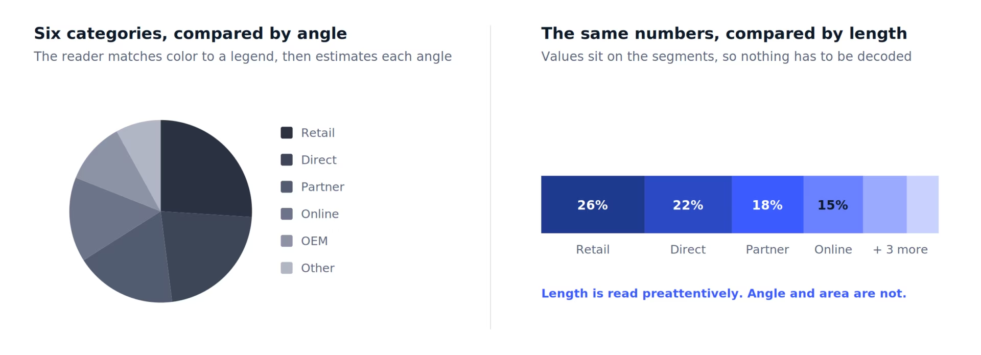
A stacked bar carries the same part-to-whole story in a channel a reader’s eyes can process more reliably, and so does a two-column table with a percentage column, which rarely gets proposed. Neither is a compromise; both are more accurate readings of the same numbers.
Data table design rules most teams skip
Good data table design decides whether a reader can verify a number quickly, and five rules cover most of it: left-align text, right-align numbers so digits stack, show only the precision the decision needs, put totals where the reader compares them, and carry the unit in the column header instead of in every cell. There’s nothing worse than a visual overloaded with percent symbols.
Alignment is the rule everyone knows, and about half of modern design teams decide to override for symmetry. Text reads left to right, so it left-aligns. Numbers compare by digit position, so they right-align and the decimals stack into a column the eye can scan. Centering everything removes one of the few shortcuts a table gives a reader, so don’t get sucked in by the idea.
Totals placement is the rule that costs teams. Financial reporting puts the total at the bottom, and operational dashboards inherit that habit without asking why. Anyone scanning an operational table wants the aggregate first, which puts it at the top. Bottom placement works only when the table is read row by row.
The remaining three rules: Six decimal places in a business dashboard add noise and no information, so one or two is almost always right. Sortable columns need to look sortable, because a reader hunting the highest value will otherwise scan the whole column. Units belong in the header, once, not repeated in every cell.
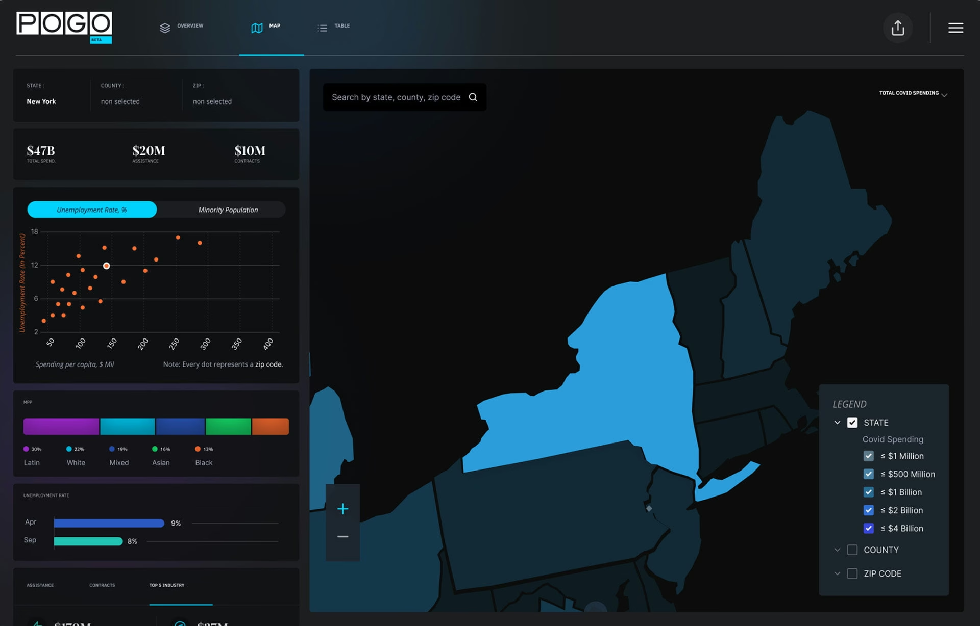
We built the Project On Government Oversight COVID-19 spending tracker on all these principles. Searchable tables sit alongside a map view and supporting charts, so a reader chasing one contract award can look it up while a reader scanning for regional patterns stays in the map. Neither audience gets pushed through the other’s view. Oh, and by they way, it looks amazing in action.
Color, labeling, and the errors that distort meaning
Styling decisions distort meaning more often than chart choices do, because nobody reviews them as decisions. Assigning a unique color to every series, relying on a legend instead of direct labels, and truncating a y-axis all change what a reader concludes from data that is entirely correct.
Hierarchy comes first because it decides what the reader sees before they choose to look at anything. The most important series, trend, or comparison carries the strongest visual weight, and everything supporting it stays visible without competing. When every line is bold and every value is highlighted, the design has communicated that nothing is more important than anything else.
Color should mean one thing and it needs to remains so throughout the experience or platform. If green is completed work in one view, it cannot be risk in another, and a palette that gives every series its own hue encodes nothing. Direct labels beat legends for the same reason: a legend makes the reader look away to decode. This is especially true in long page designs where viewing the legend might require scrolling down and back up – yuck!
Decoration works against the same encodings. Perspective on a 3D bar distorts a length comparison, a drop shadow adds an edge that carries no data, and a gradient fill makes one value read differently at the top of a bar than at the bottom. Each of them taxes the channel it decorates.
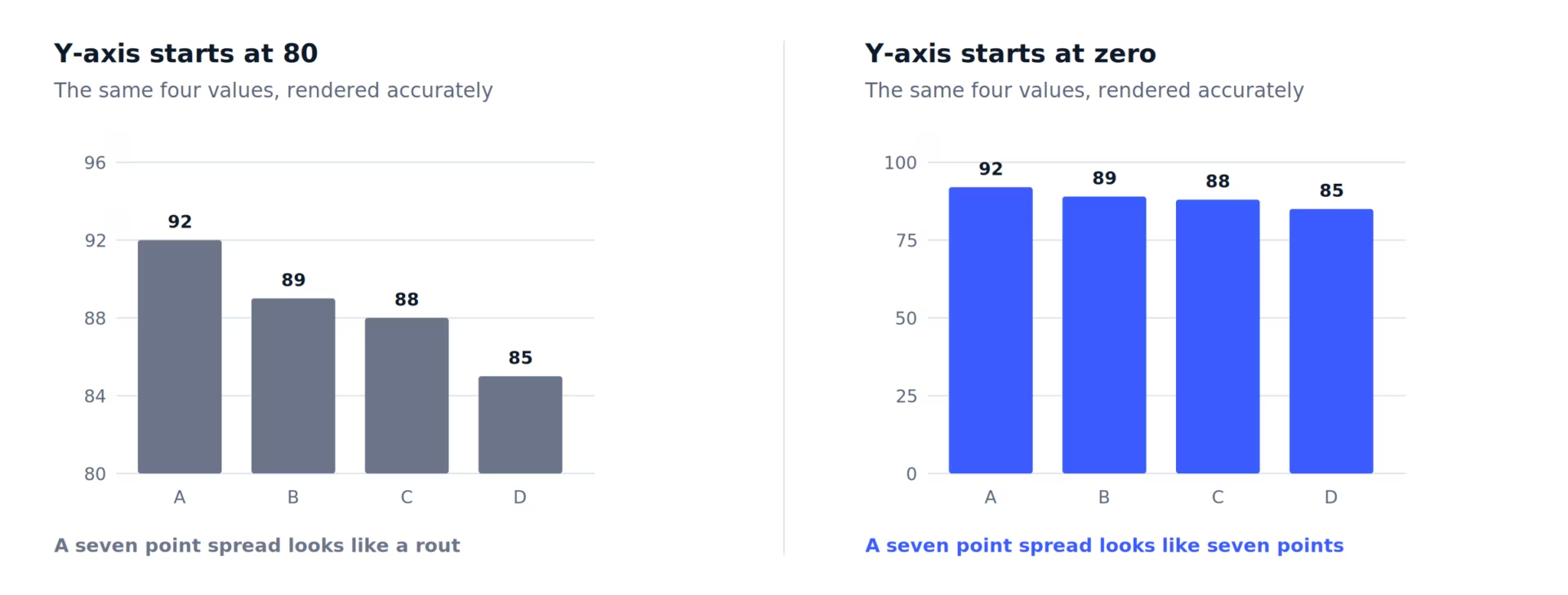
Axis truncation survives review most often, because the chart is still accurate. Start the y-axis at 80 and a three-point gap becomes a decisive lead, so whoever acts on it was misled by a chart nobody meant to mislead. Inconsistent scales across a dashboard do it quietly, since each chart looks fine alone.
Accessibility is not a preference here. That’s the floor. The W3C’s Use of Color criterion requires that color is never the only visual means of conveying information, so every color-coded series also needs a pattern, a label, or a shape. Similar hues fail that long before anyone opens a contrast checker.
Data visualization best practices applied to one bad chart
Fixing a bad chart usually means taking things out, not putting things in. A typical rebuild resets the axis to zero, strips the decoration, replaces the legend with direct labels, and cuts the palette down to one accent color on the series that actually matters. None of that touches the underlying numbers.
Take a chart most people have seen: quarterly performance by region, six series, rendered in a BI tool with the defaults left on. Six saturated colors, a legend parked on the right, gradient fills, a drop shadow, and a y-axis that starts at 60 because the tool scaled to the data. Every number in it is correct.
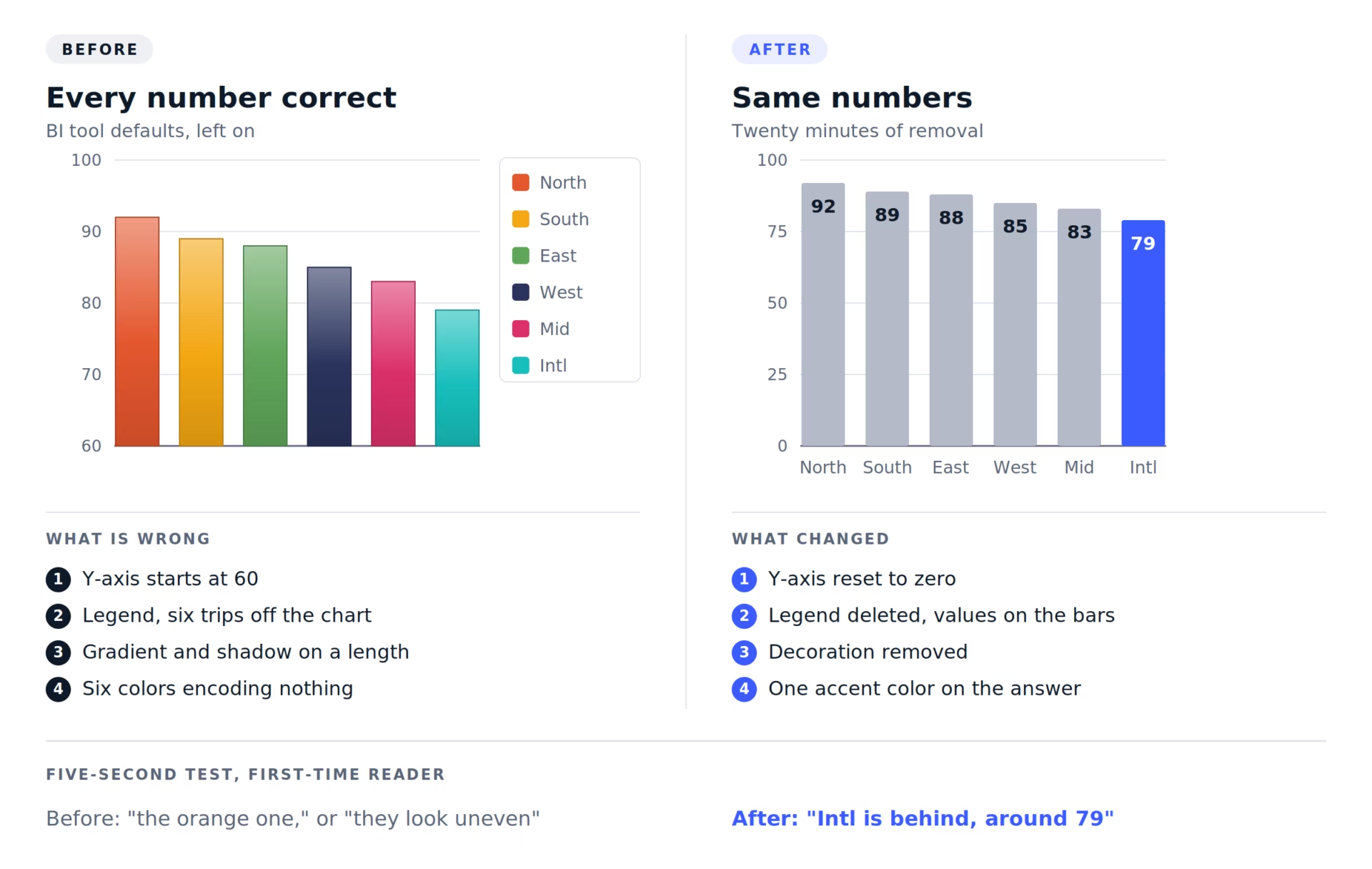
Four things are wrong with it, and none are data problems. The truncated axis inflates a small spread into a dramatic one. Every series costs a trip to the legend and back. Gradient and shadow interfere with the length comparison, and the six colors encode nothing the category labels don’t already say.
The rebuild takes about twenty minutes. Axis back to zero, legend deleted, values printed on the bars, decoration off. Five bars go gray and one takes the accent color, because the chart exists to answer a question about one region and the other five are context for it.
Then the five-second test. Hand both versions to someone who has not seen the data and ask what they noticed first. On the original, the answer names a color or says the bars look uneven. On the rebuild, it’s the region name and a rough number. That gap is what data visualization best practices are for.
How to show uncertainty in a chart
Error bars, shaded confidence bands, and visible gaps where data is missing are how a chart admits what it does not know. Leaving them out does not remove the uncertainty, it just hides it, because a clean line reads as measured fact whether or not the underlying number is one.
Forecast bands are the most misread element on any dashboard. The fan widens as it projects forward, which is the honest part, but readers lock onto the center line and treat it as the prediction. Labeling the band edges with what they represent, an 80 percent range or a worst case, does more than widening the fan ever will.
Missing data is where most dashboards quietly lie. Connect a line across a gap and the chart claims a value existed, when it did not. Breaking the line, or dotting it with a note, costs one design decision and stops someone acting on a number nobody ever recorded.
The most common version is the partial period. Six days of the current month plotted against five full months shows a collapse that is not happening. Shade the incomplete bar, label it in progress, or leave it off. Every dashboard with a live current period needs one of those three.
All of this gets harder when a model produces the number. Any statistical forecast carries a confidence range the model can report, and dropping that range while keeping the point estimate throws away the only part that was honest about its own limits.
What AI and interactive features changed about dashboard design
Modern BI tools added a generation and interaction layer on top of the chart: AI-written summaries, natural-language querying, automated anomaly detection, drill-down, and cross-filtering. None of it removes the legibility problem; it just moves it, because the reader now has to understand both what the chart shows and what state the chart is in.
AI-generated summaries are the biggest change, because a sentence carries more authority than a chart. Tell someone revenue growth slowed, and they believe it over a line they have to interpret themselves. This is just human nature, laziness, or whatever you want to call it, but it’s not going to change. So a summary drawn from a filtered subset while the chart shows the full set is a legibility failure in a confident voice.
Confidence indicators are the answer, and they only work beside the claim, not behind a tooltip. Anomaly detection has the same requirement. A flagged outlier that doesn’t name the threshold that triggered it asks the reader to trust a judgment they can’t check.
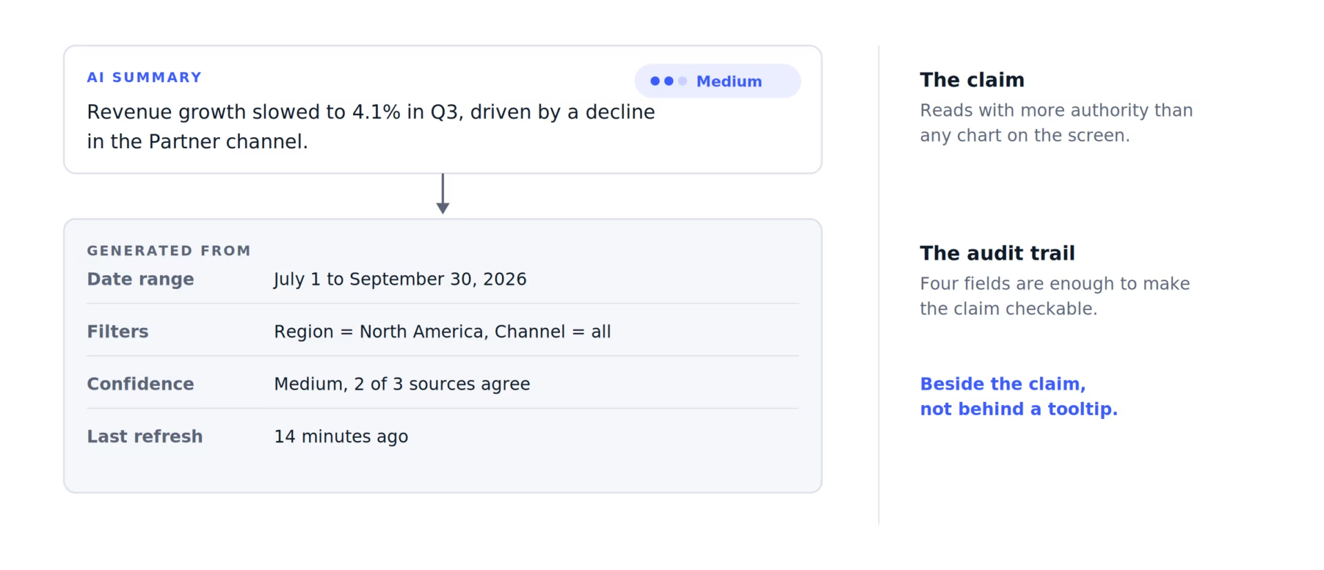
Natural-language querying moves the filter controls out of sight. A reader who types a question and gets a chart back has no record of what was excluded, so the interface has to restate the query as visible filters. Without that, two people ask what they think is the same question and get different answers.
Drill-down and cross-filtering create the same problem at a larger scale. One click quietly rewrites every other chart on the screen, and the design usually doesn’t signal that it happened. Persistent filter chips, a visible breadcrumb, and a reset control are the cheapest fixes, and they’re the ones most often left out of a first release.
Responsive layouts get less attention than any of this, and they often, sadly, undo more of it. Hierarchy built at desktop width comes from position and size, and a narrow viewport that stacks everything into one column throws away both. The mobile view needs its own hierarchy decision, not an automatic reflow of the desktop one. In other words, ask for adaptive design with showing data viz and not responsive.
Data visualization best practices for public audiences
Designing for a public audience changes one assumption: the reader will not learn the interface. A policy team, a journalist, or a member of the public arrives with a single question and leaves if answering it requires training. Plain-language labels, progressive disclosure, and a visible starting point carry most of that load.
Analysts put up with complex interfaces because they open them every day, so the learning pays for itself. Nobody else does. Public and government audiences will abandon a dashboard faster than they will learn one, which inverts the usual tradeoff: the interface has to disappear, and every control that needs explaining is a control that won’t be used.
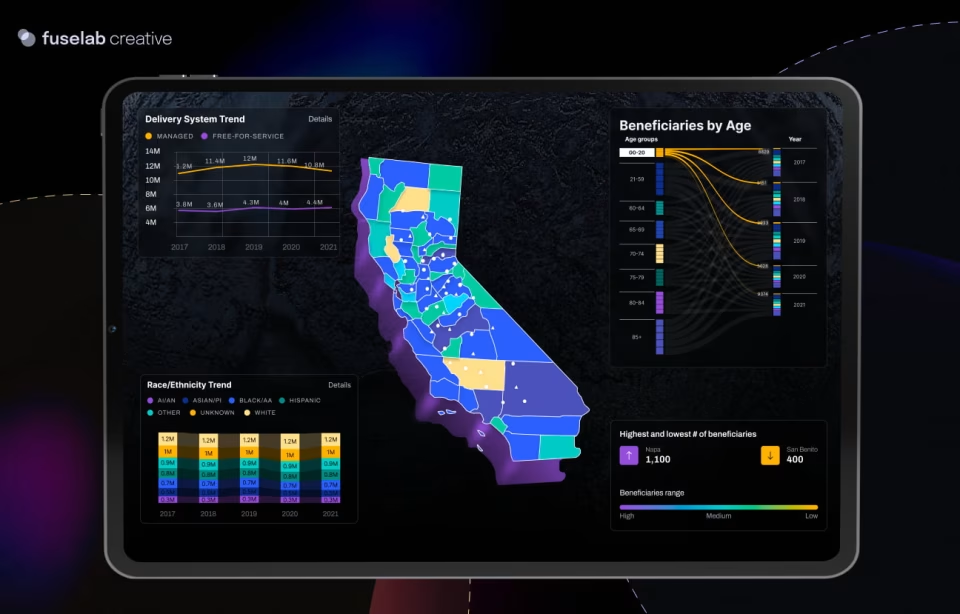
That constraint shaped our work on the California Department of Health Care Services platform for long-term services and supports, which reports healthcare disparity data to non-technical government readers. Making the data available was the easy half. The design problem was making a disparity legible to someone who had never opened the dataset and had twenty minutes with it.
Three data structures took three different treatments. County data went to a choropleth map, where geography is the comparison. Age cohorts went to a Sankey diagram, which keeps the connections between categories visible across years. Ethnicity and language trends went to a bubble plot, which is the exception to the rule stated earlier.
Area is a poor encoding for precise comparison, and that is exactly why it fits here. Nobody needed to know which group was larger by how much. They needed to see which groups were moving and in which direction, and a bubble plot shows that at a glance without promising precision the data could not support.
Forcing every dataset into a familiar chart type is the failure mode this avoids, and it is the difference between a dashboard that survives a review and one that is readable in the field. In practice the chart decisions tend to settle last, after the data structure and the reader’s question are both understood.
How to review a chart or dashboard before it ships
Reviewing a chart before it ships takes three passes: name the single question it answers, run the five-second test with someone outside the project, then check labels, color consistency, axis scales, and table logic. A chart that cannot be reduced to one question is usually two charts sharing a frame.
The one-question test does most of the work. Splitting beats restyling almost every time, and the split usually shows that two audiences were sharing one rendering. That’s a scoping finding, not a design finding, and it’s cheaper to catch in review than in a rebuild – much, much cheaper.
Five-second testing needs someone genuinely unfamiliar with the data, which rules out everyone on the project. It is also the check most likely to catch assumed prior knowledge. Two weeks inside a dataset teaches a designer to read patterns a first-time viewer cannot, and the chart built on that familiarity is missing context its audience never had.
Tables get waved through review because a table cannot be inaccurate, which is true, and it’s beside the point. The wrong default sort order sends everyone to the wrong row first, and four unnecessary decimal places make a column unscannable. Both fail a reader as completely as a mismatched chart, and neither trips a data check.
Running this review once catches a bad chart. Running it on every release is what keeps a dashboard legible after eighteen months of added metrics and three rounds of new requests, which makes it closer to an ongoing dashboard development practice than a one-time design deliverable.
Where the expertise actually sits
Accuracy is a data problem and legibility is a design problem, and only one of them shows up in a QA check. Teams that ship readable dashboards put a chart in front of an outsider before release and treat a mismatched chart type as a defect rather than a preference.
Frequently asked questions
What are data visualization best practices?
Data visualization best practices are the design rules that make a chart or table readable at a glance: matching the chart type to the data structure and the reader’s question, building a clear visual hierarchy, labeling directly instead of through legends, and removing anything that competes with the main insight. Accuracy is a separate requirement, not a substitute for any of them.
What is preattentive processing in a chart?
Preattentive processing is the visual perception that happens before conscious attention, which is why some encodings read instantly and others do not. Length and 2D position are processed this way, so a bar chart is judged accurately at a glance. Area is not, which is why treemaps and bubble charts are weak tools for precise comparison.
Error bars or a shaded band: which shows uncertainty better?
Error bars suit discrete categories where each value carries its own margin, and they stay readable on a bar chart with fewer than about ten bars. A shaded band suits continuous series, where uncertainty widens over time and separate bars would clutter the line. Neither works if the label does not say what range it represents.
Bar chart or line chart: which one fits the data?
Bar charts rank discrete categories against each other, and they work because the eye reads length faster and more accurately than any other encoding. Line charts show change across a continuous time axis, where the shape of the trend is the message. Applying a line chart to categorical data implies a continuity that is not in the data.
Can you trust an AI-generated dashboard summary?
AI-generated summaries are only as reliable as the filter state they were drawn from, and most interfaces don’t show that state next to the sentence. Treat a summary as trustworthy when it names the date range and filters it used, and as unverified when it doesn’t. A confidence indicator beside the claim, not behind a tooltip, is what makes this checkable.
How do you choose a data visualization design partner?
Choosing a data visualization partner comes down to whether the team can show a shipped dashboard with a real audience and describe what changed between the first version and the released one. Ask which chart type they replaced during the project and why, and ask how they handle AI summaries and filter state. Teams with real experience answer both without hesitating.